
Adaptive Planning Personnel Modeling: Step-by-Step Dashboard Guide
Learn how to use adaptive planning for personnel modeling with this comprehensive guide. Discover how to navigate dashboards, update budget versions, analyze key metrics, and make real-time changes to salary and headcount data.
In this guide, we'll learn how to navigate and use the personnel modeling features in adaptive planning. We will cover how to access the relevant dashboards, select the correct data version, and adjust levels to view specific entities. You will also see how to update employee data and observe how these changes affect forecasts and visualizations.
Let's get started
Welcome to the adaptive planning personnel modeling session. The easiest way to access personnel modeling is to go to Dashboards first.
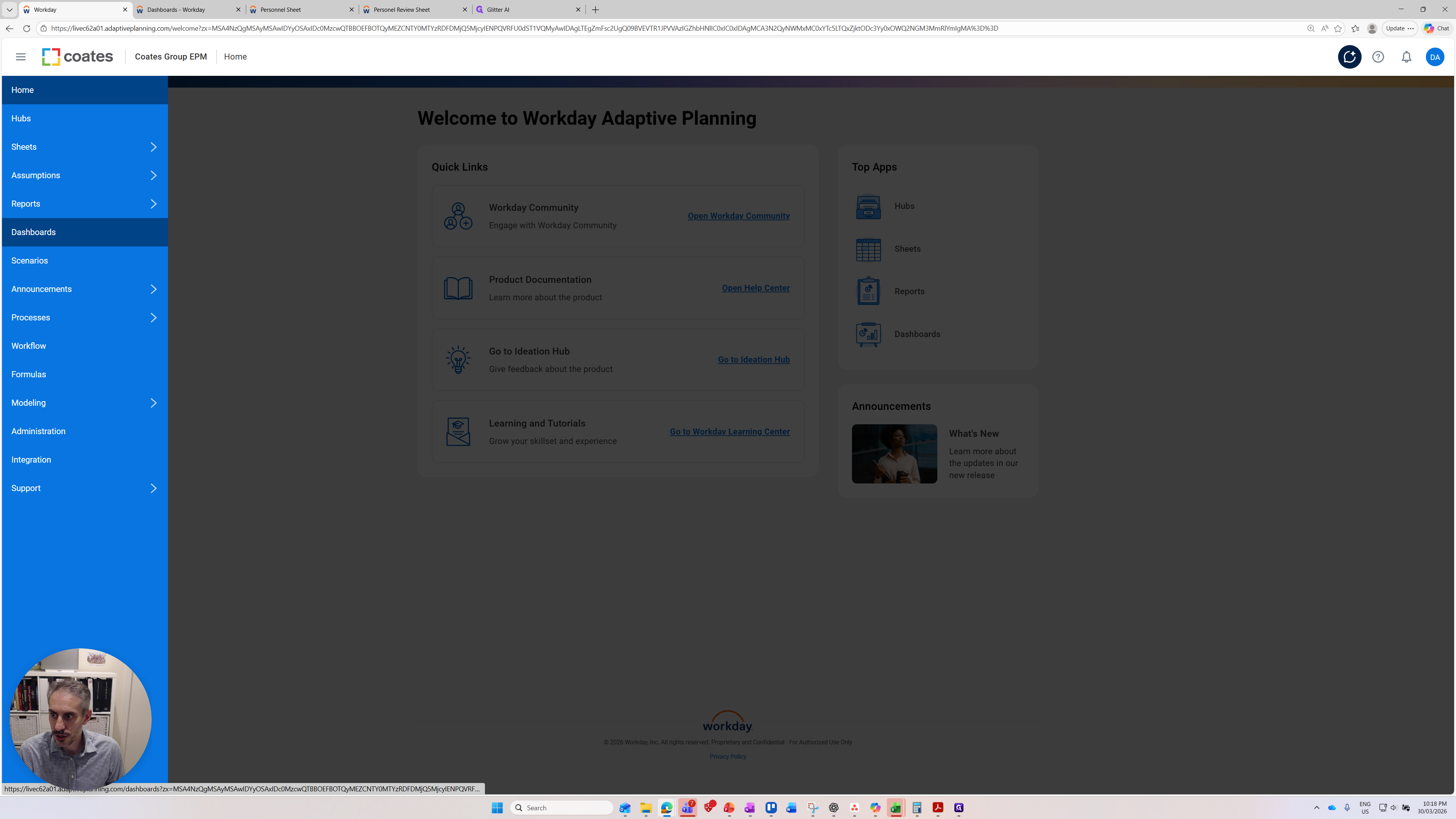
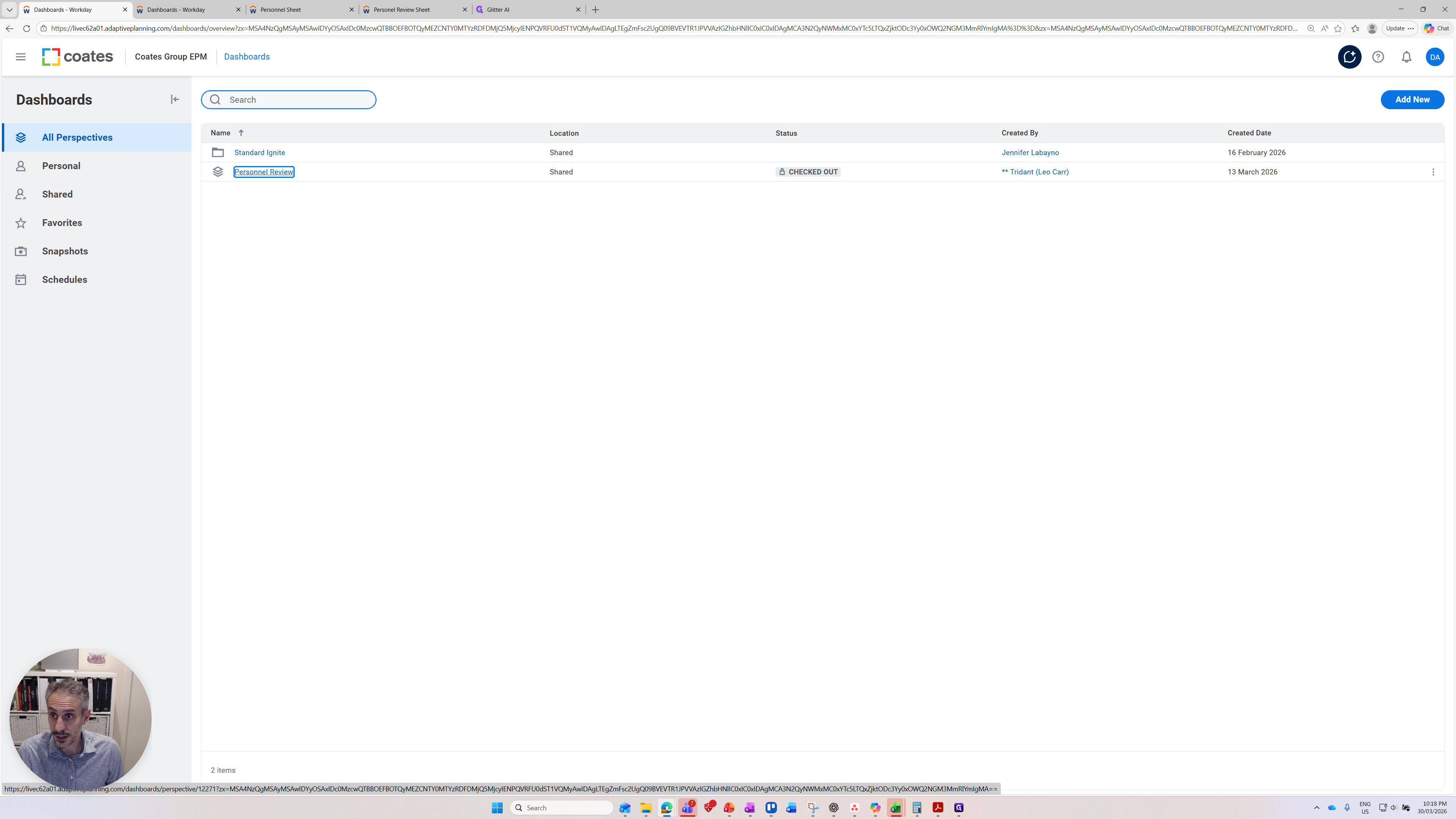
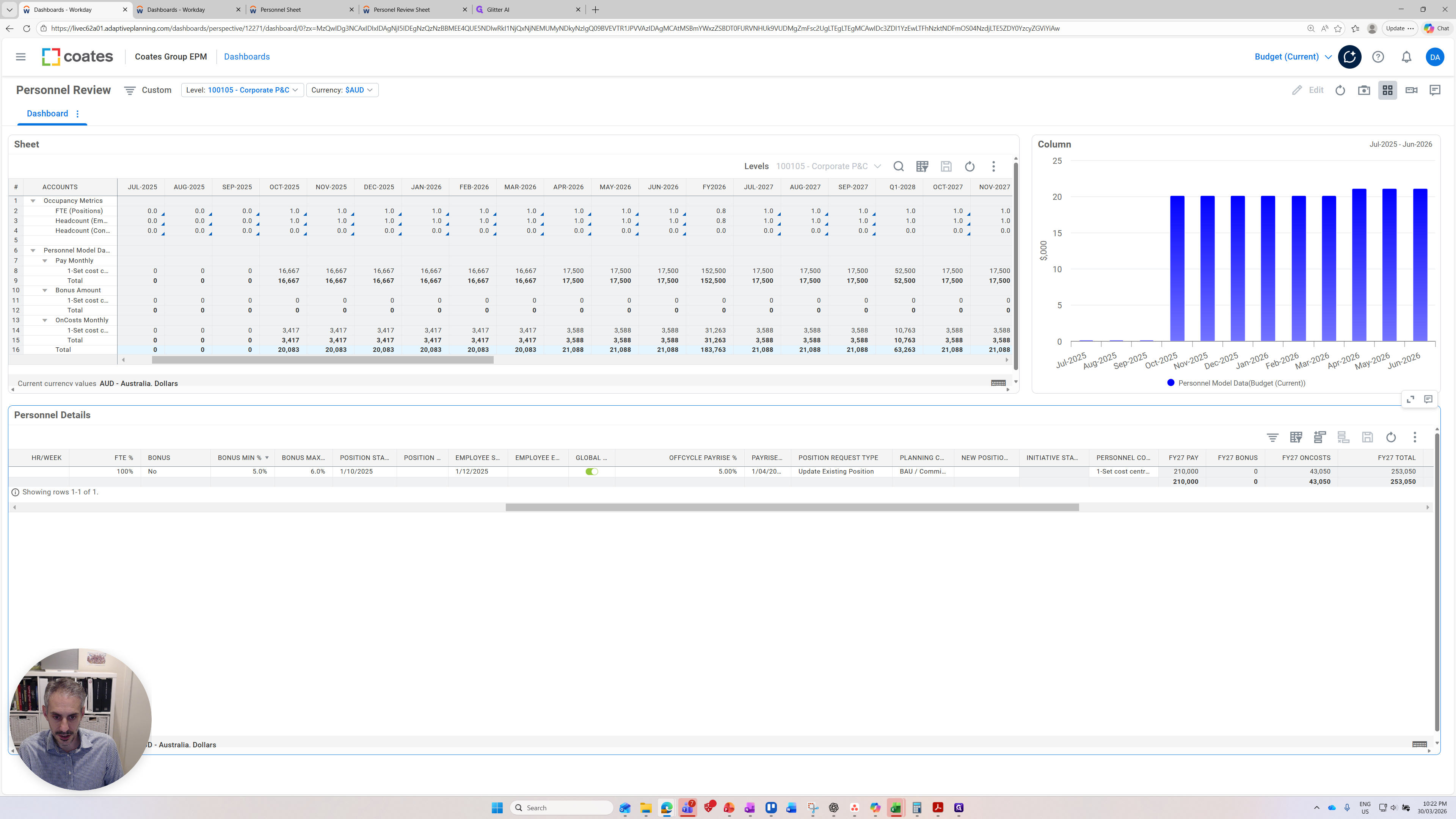
After clicking Dashboards, locate the Personnel Review dashboard. Click on the Personnel dashboard.
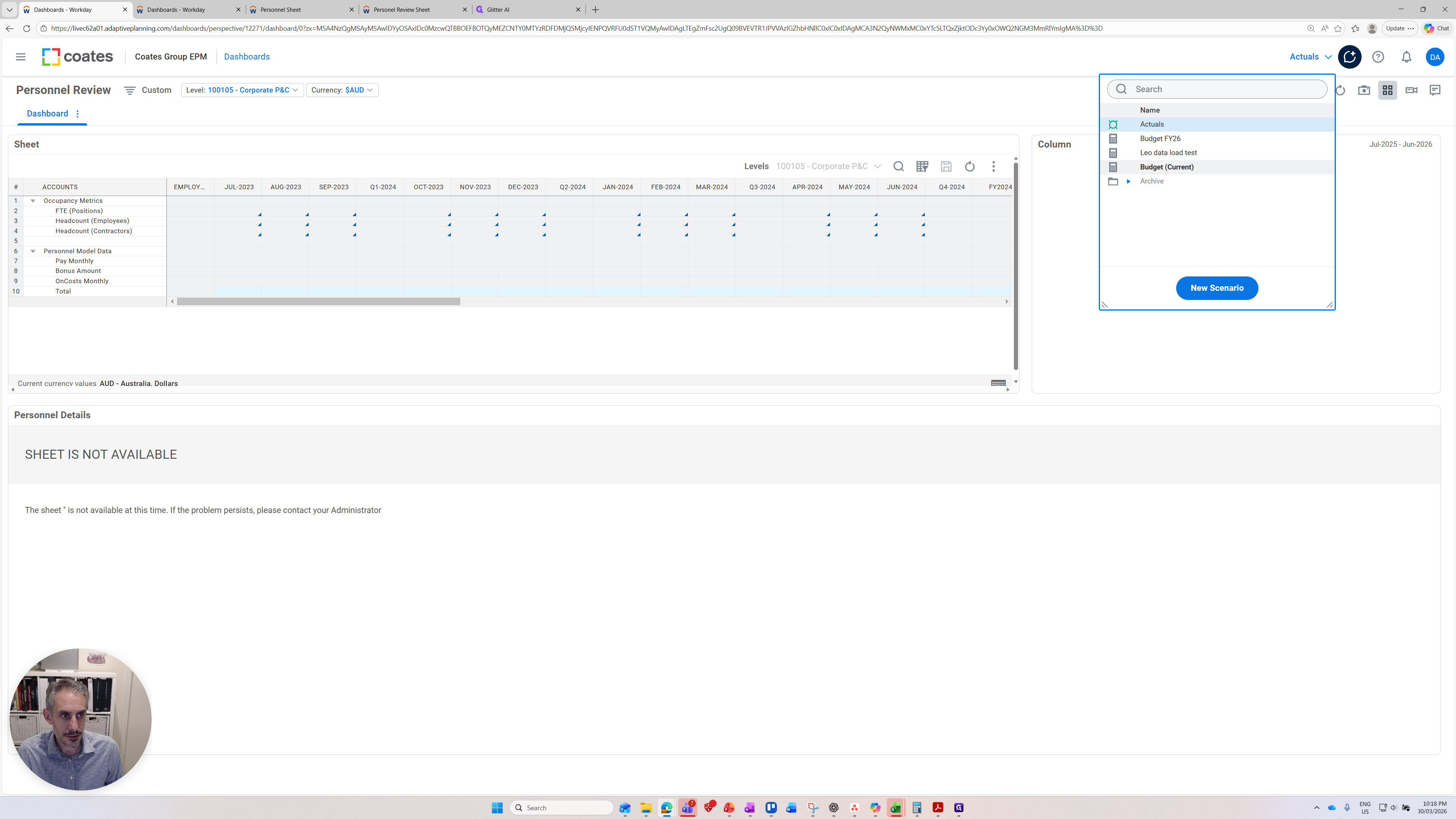
The critical point is that the data appears incorrect because it has loaded the actuals version.
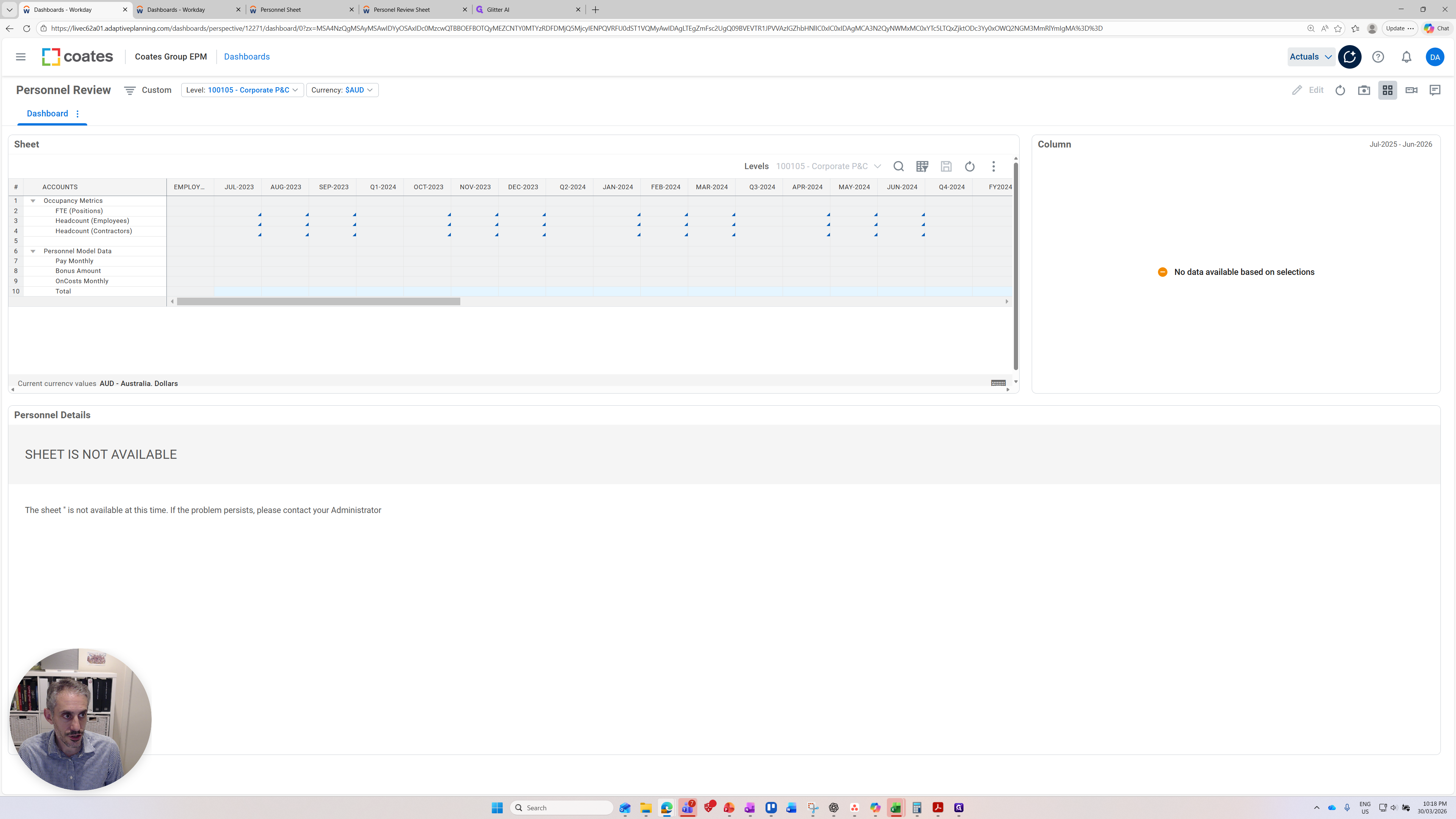
We need to update this to the current version of the budget or forecast we are working on. I'll move it to Budget Current.
Now you can see the data is loaded.
In the top left-hand corner are the levels. Make sure you have the right perspective so you can see the correct levels you want.

You can see here it's a multi-select, so you can select the relevant levels or entities. If I want to select all 100, I can do that, or I can unselect them.
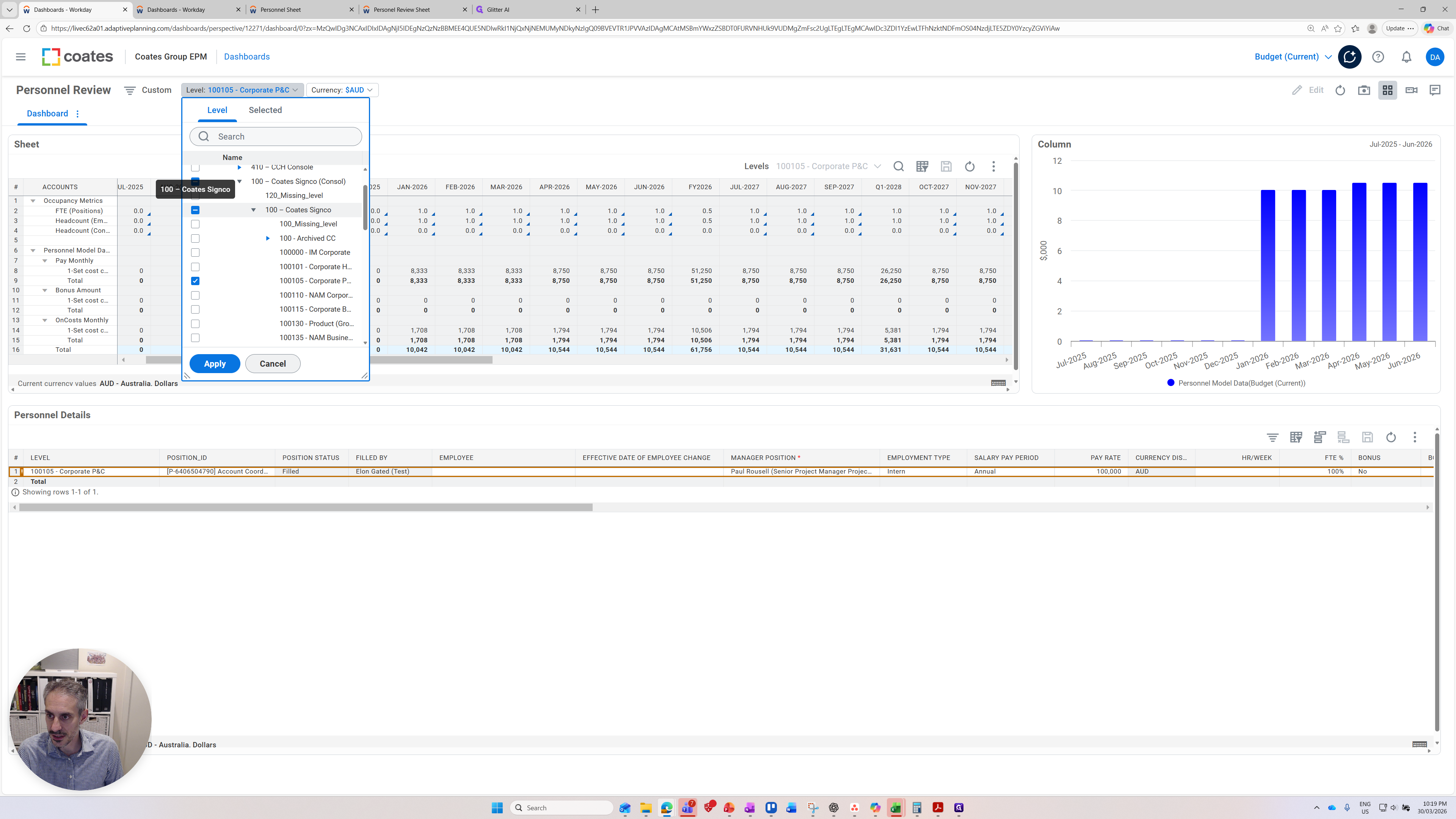
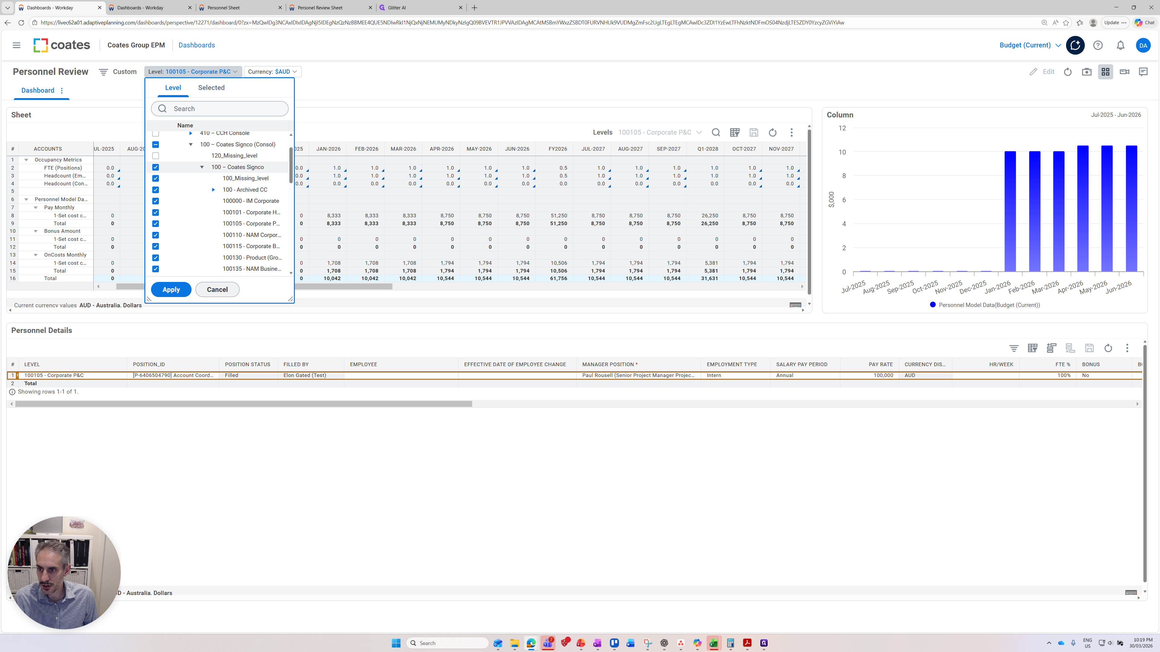
I can pick an individual level if I choose.

Now I will apply the level, and it will refresh.
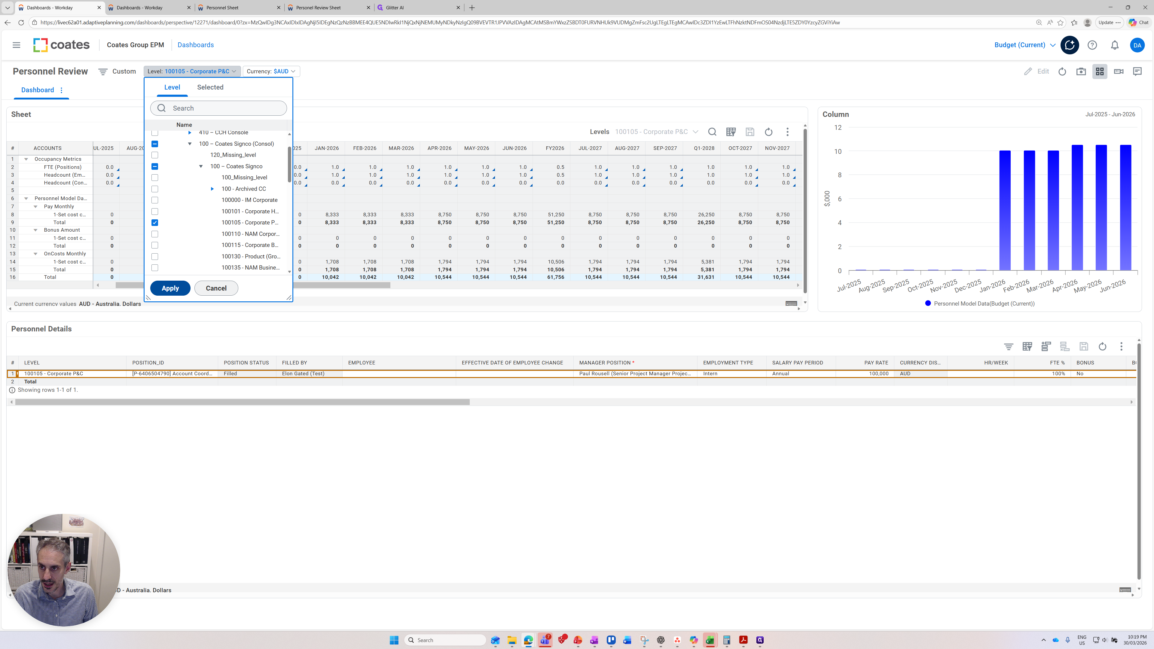
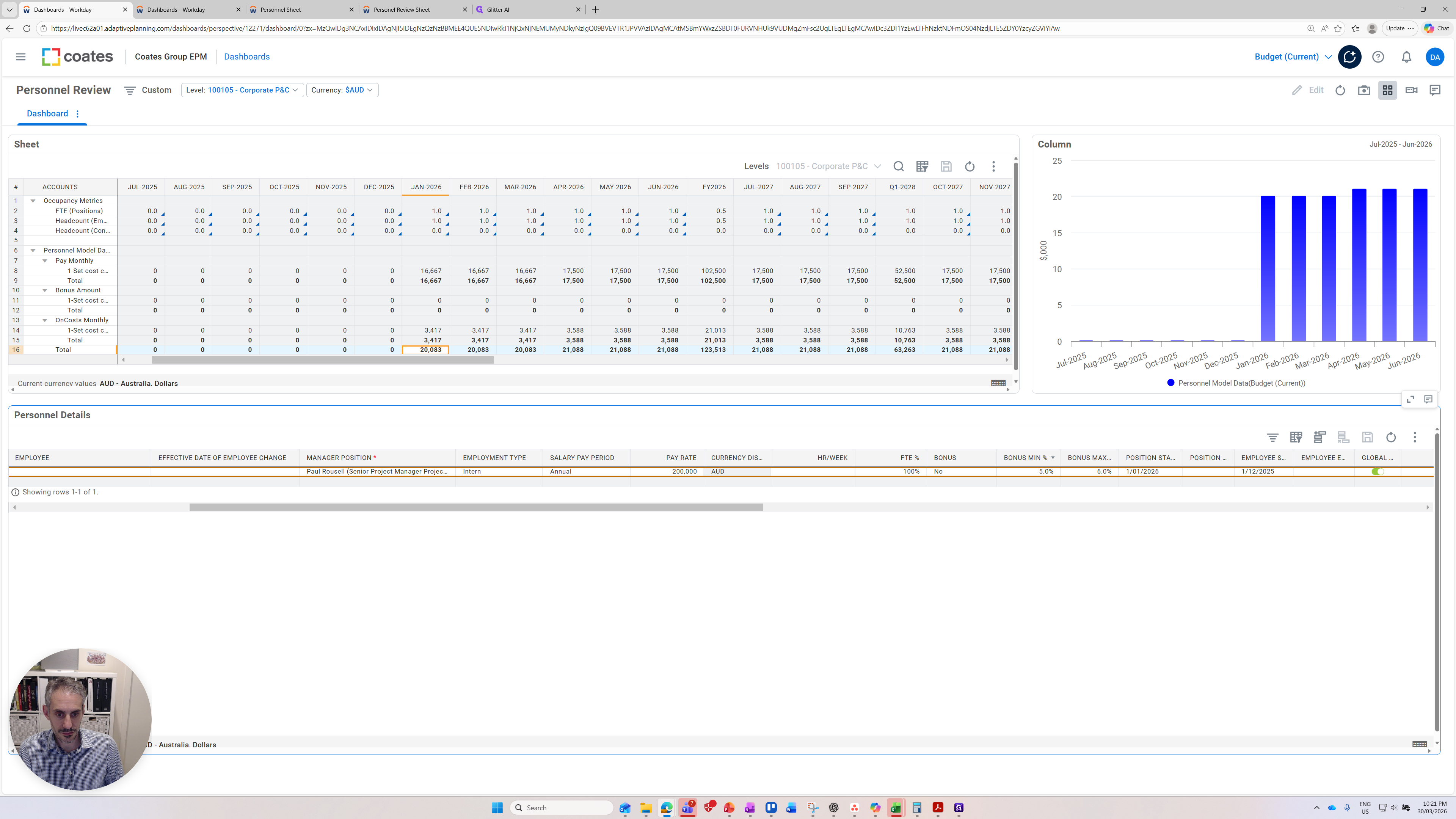
Now you can see the data has come through and everything is refreshed. Let's do a quick orientation of the dashboard. There are three panels on the dashboard. I'll start with the top one on the left. This sheet displays the expenditure for the level we are presenting.
It also shows other key metrics such as FTEs, head count of employees, and head count of contractors.

There are headcount metrics available, and here we have our salaries. Monthly pay, bonus amounts, and any additional costs. The values shown here are driven by the input panel at the bottom, which we will return to later. The second panel I want to show is the graph on the right, which visually indicates the salaries. This aligns with the total row on the first panel.
The 10,042 is the expected monthly expense based on the data in the model for this cost center. You can see that visually depicted here on the right. There is no salary starting from earlier, and that matches the input data provided. Let's move down to the input data at the bottom.
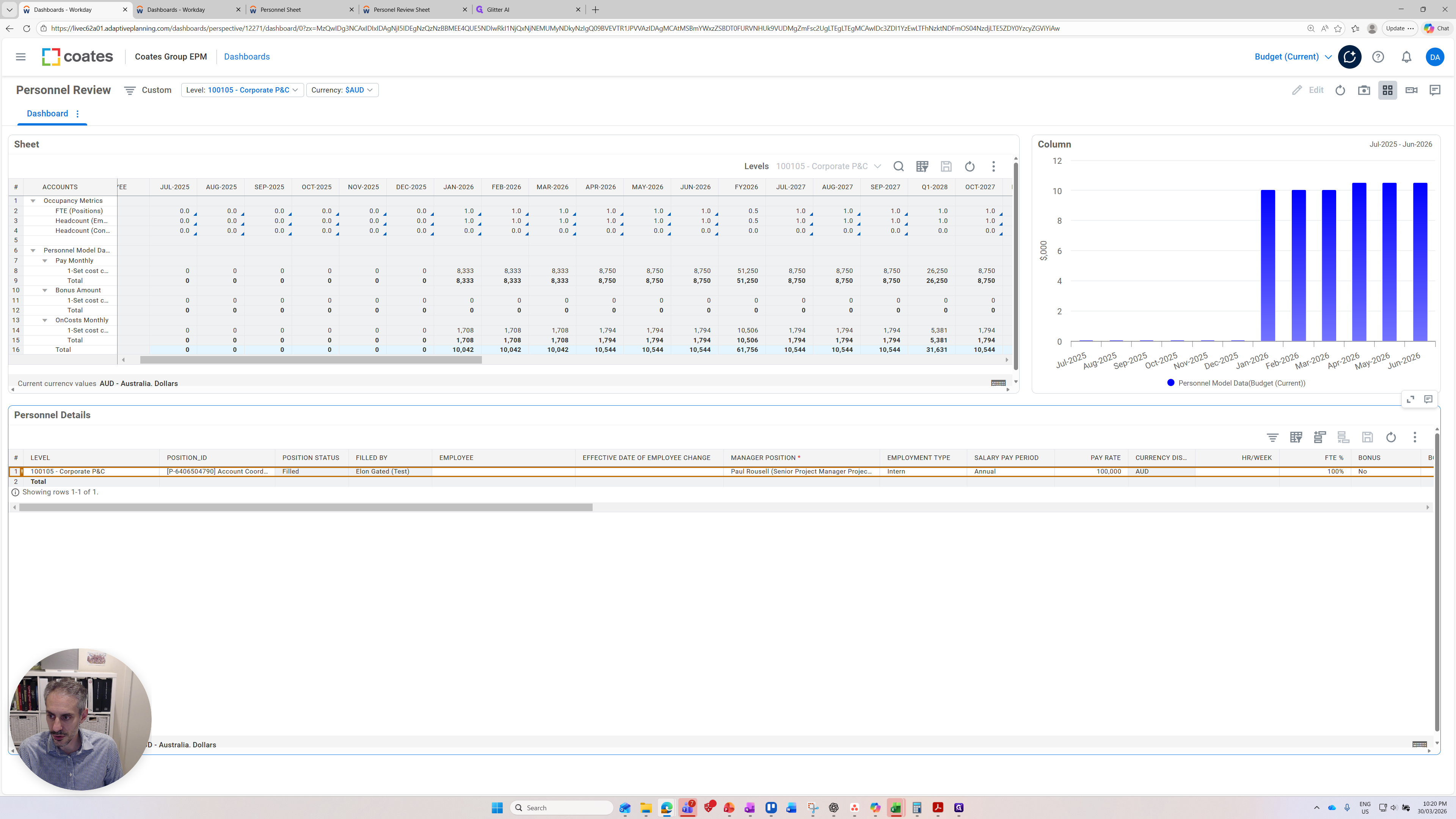
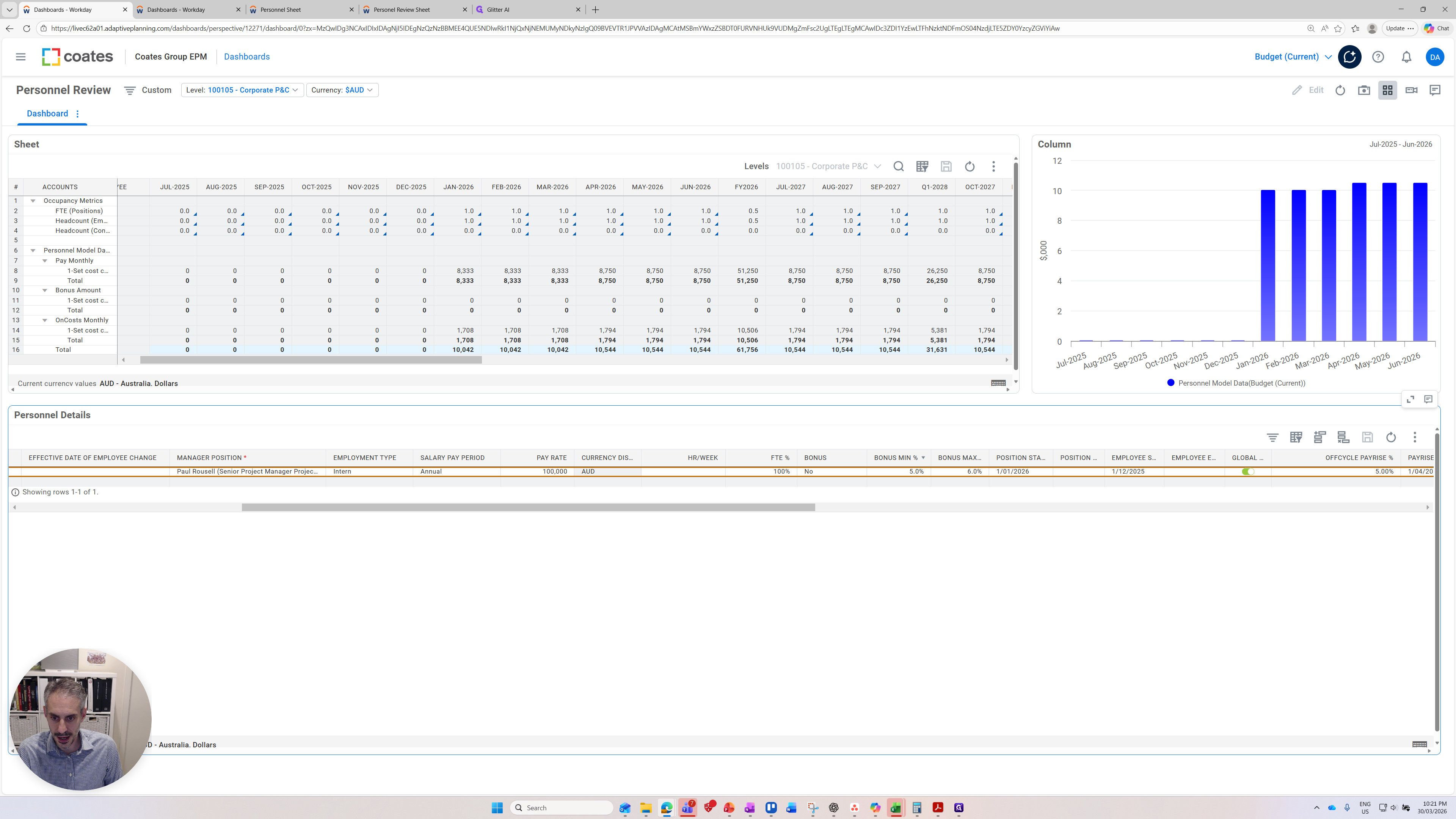
You can see all the relevant data for a fictional employee that has been entered here.

The key point is that you can change values here, which will directly impact the forecast you provide. For example, if I change the pay rate to 200,000 and press enter, the field turns blue. This indicates the change is registered but not yet saved.
Now I need to click the save icon to save the change.
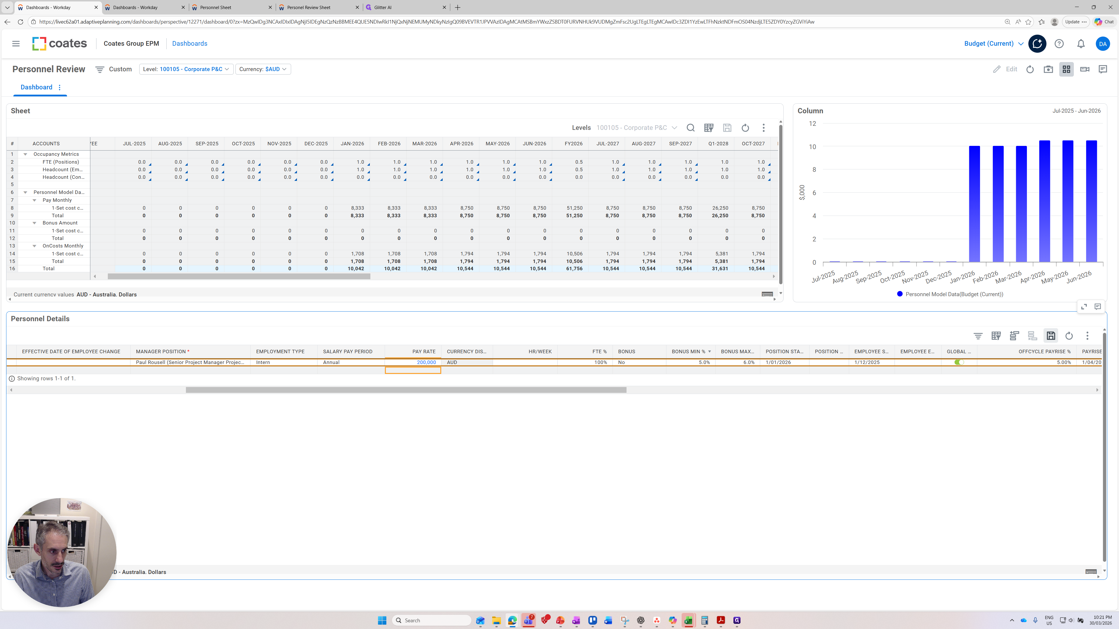
The change is saved, and everything is refreshing. In January, you'll see it is now $20,000, not the previous $10,000.

Our graphs have also updated. Although they look very similar, you can see here that the start is $20,000 rather than $10,000.
Let's make another quick change to show a few more things.
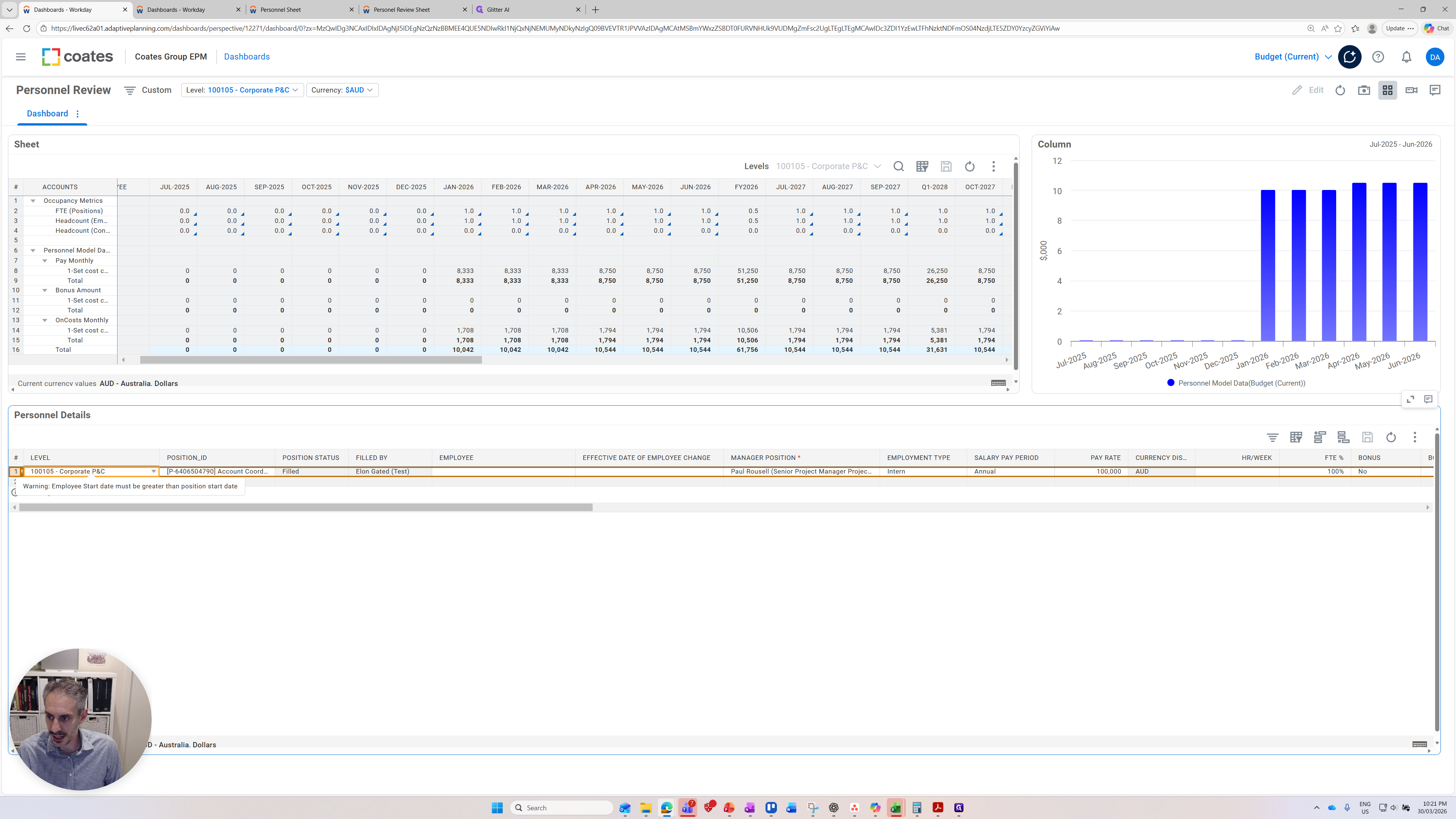
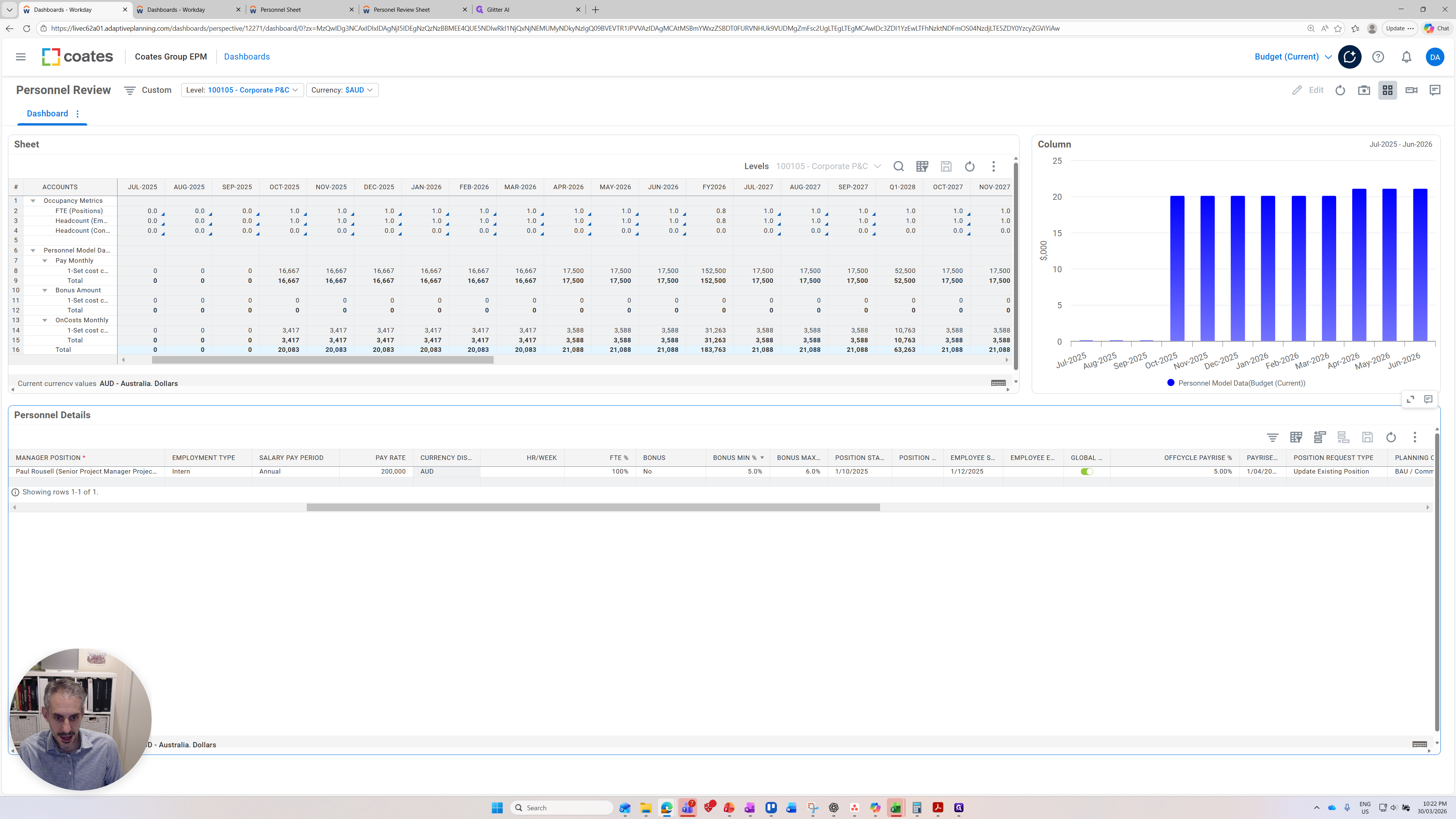
The position starts on January 1st. If we made this earlier, you can see that when we press save and look at the top graphs, as they refresh, additional salary bars appear.

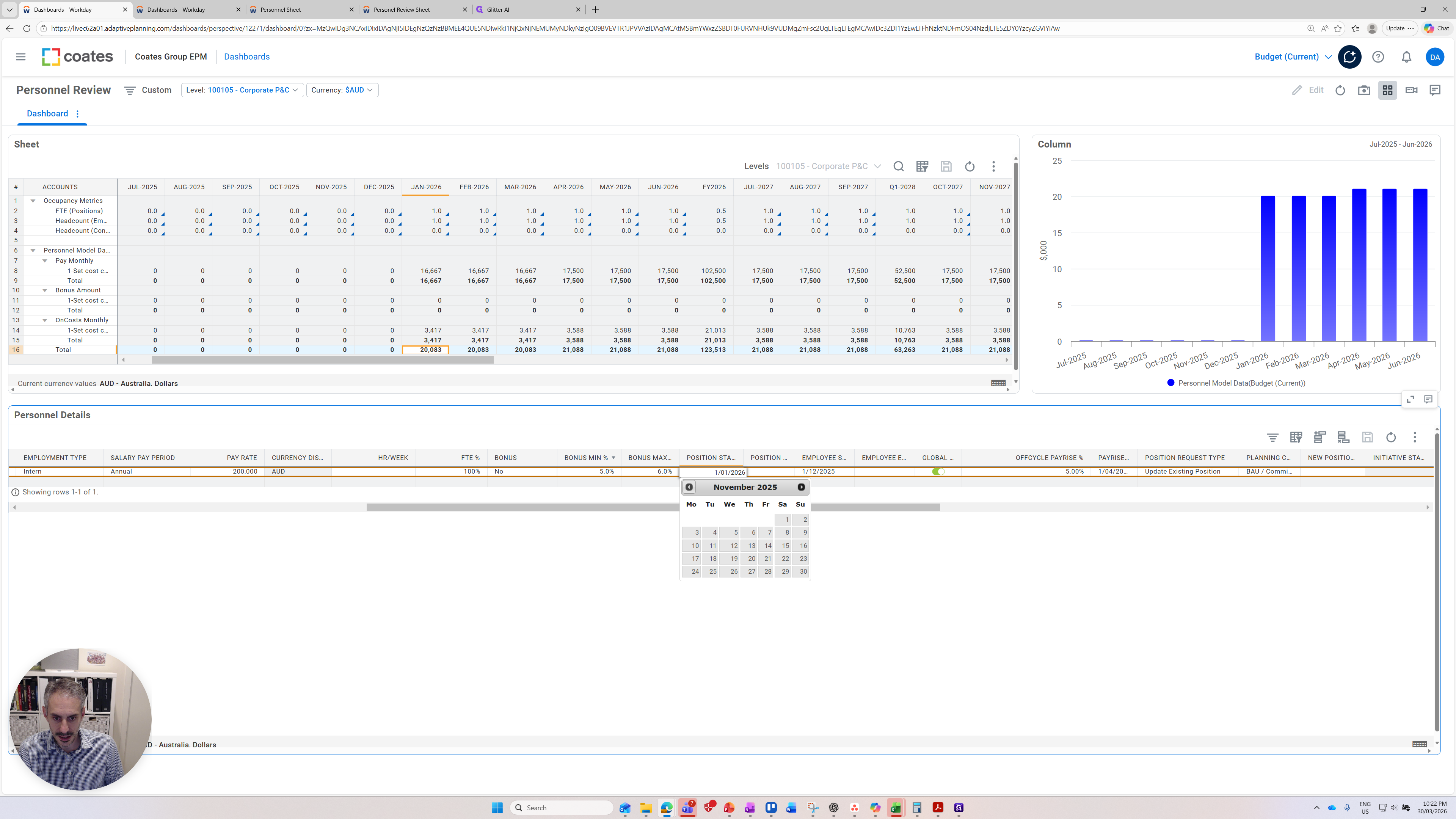

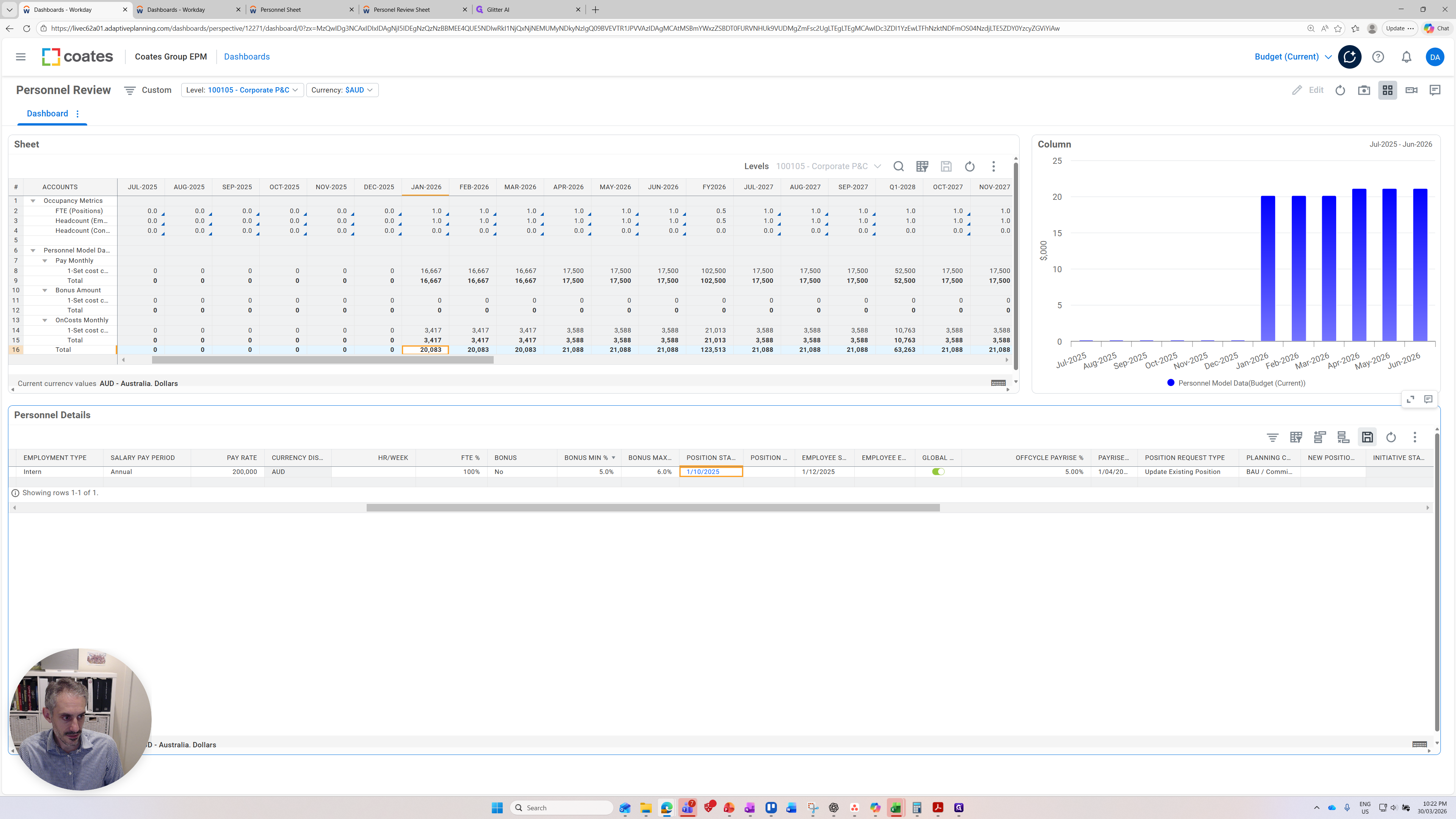
If you change other inputs such as the position start date it will also update the top two pannels
There are other features included. We can consider an off-cycle pay increase.
There is already one in there. It's very subtle, but one is coming through.

If I increase it by 25% for this person and press save, you'll see that when the salary increases take effect for this one-time pay, the blue bars rise significantly.

That concludes the overview of adaptive planning and personnel planning.