How to Create a Custom Peer Group for your bank.
Learn how to create a custom peer group for any bank.
In this guide, we'll learn how to create a custom peer group. We will use SmartBank as an example. Since SmartBank's regulatory peer group is every bank in the US with total assets between $3 billion and $10 billion in total assets, we will create a new peer group of banks in the "South" region with total assets between $3 billion and $5 billion. This process will help SmartBank compare itself to relevant peers, avoiding comparisons with banks in distant states like California or Texas.
We'll explore how to filter and analyze data, including asset classes, loan portfolios, and financial ratios. This will provide insights into SmartBank's performance relative to its peers. By the end, you'll know how to generate a comprehensive peer analysis and export the data for further review.
Let's get started
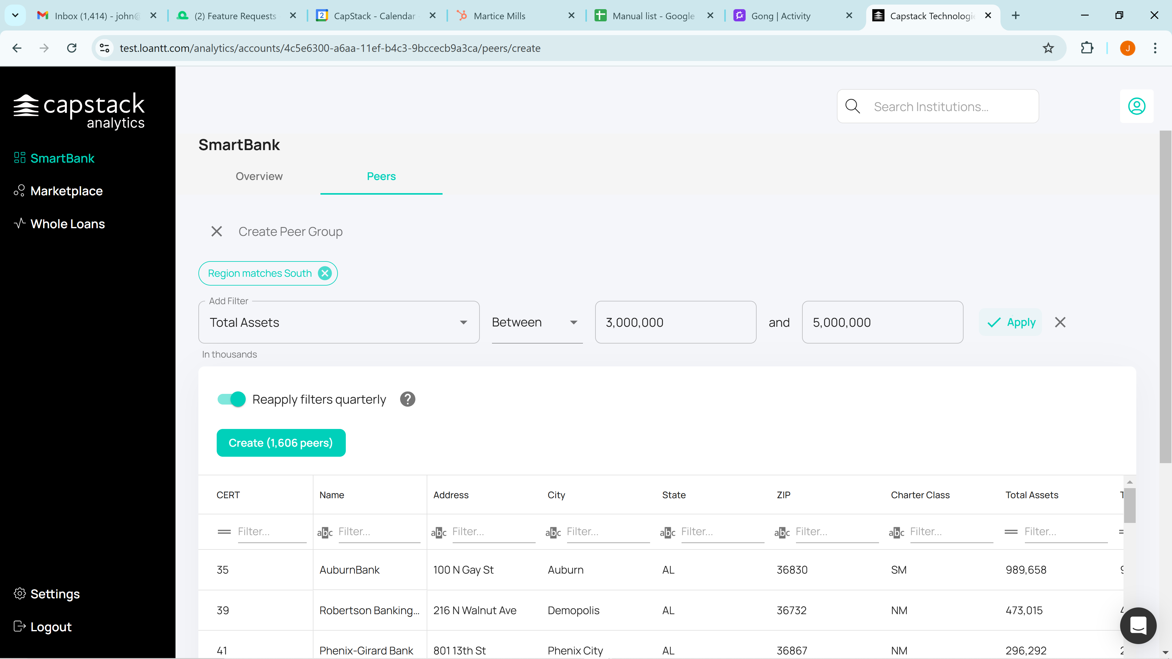
Acting as SmartBank, we click on the Peers tab, a regulatory peer group will typically appear.
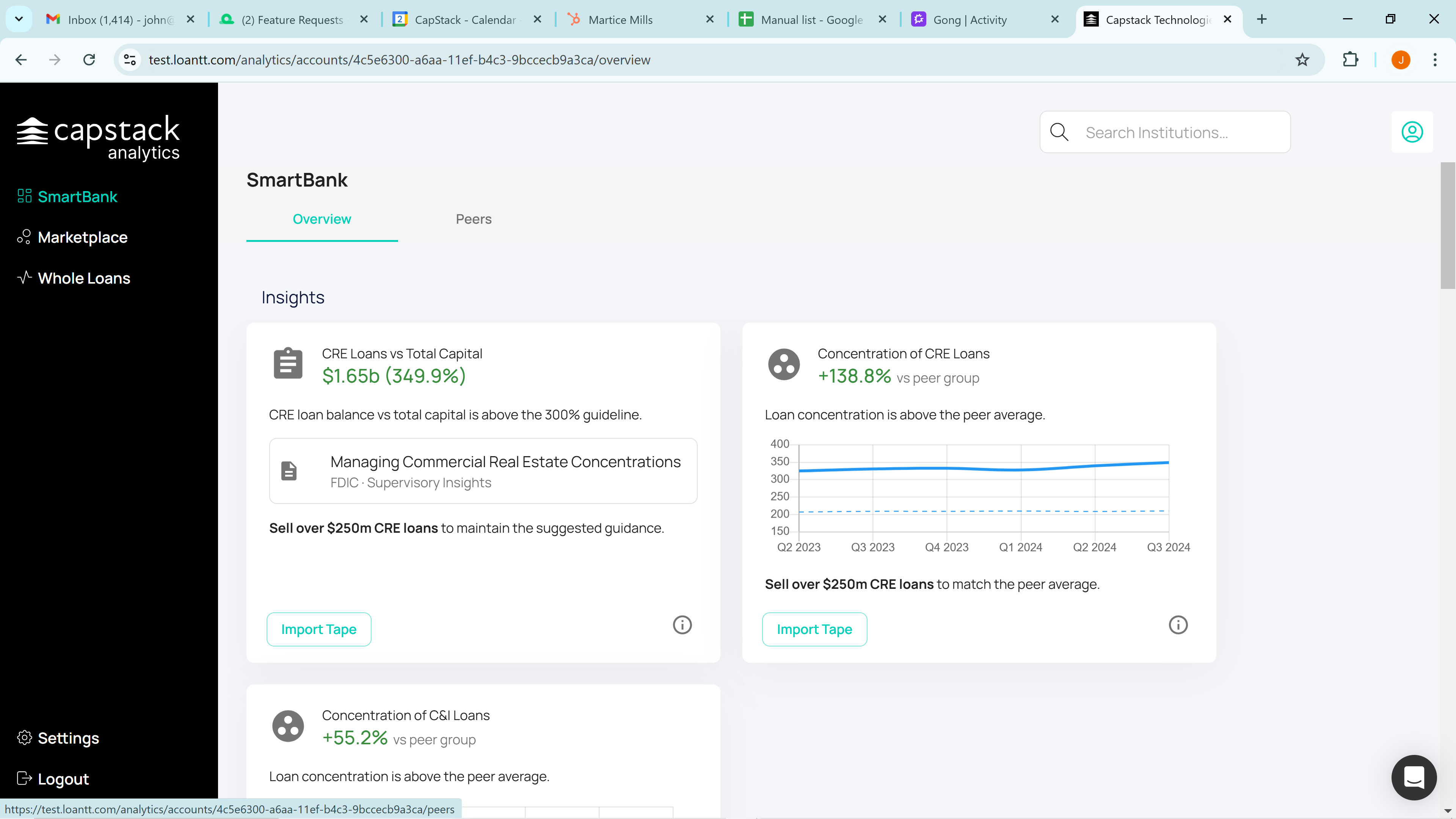
SmartBank's regulatory peer group includes all banks in the country with total assets between $3 billion and $5 billion. However, since they are primarily located in Tennessee, it may not make sense to compare them to banks in California, Texas, or elsewhere in the country.
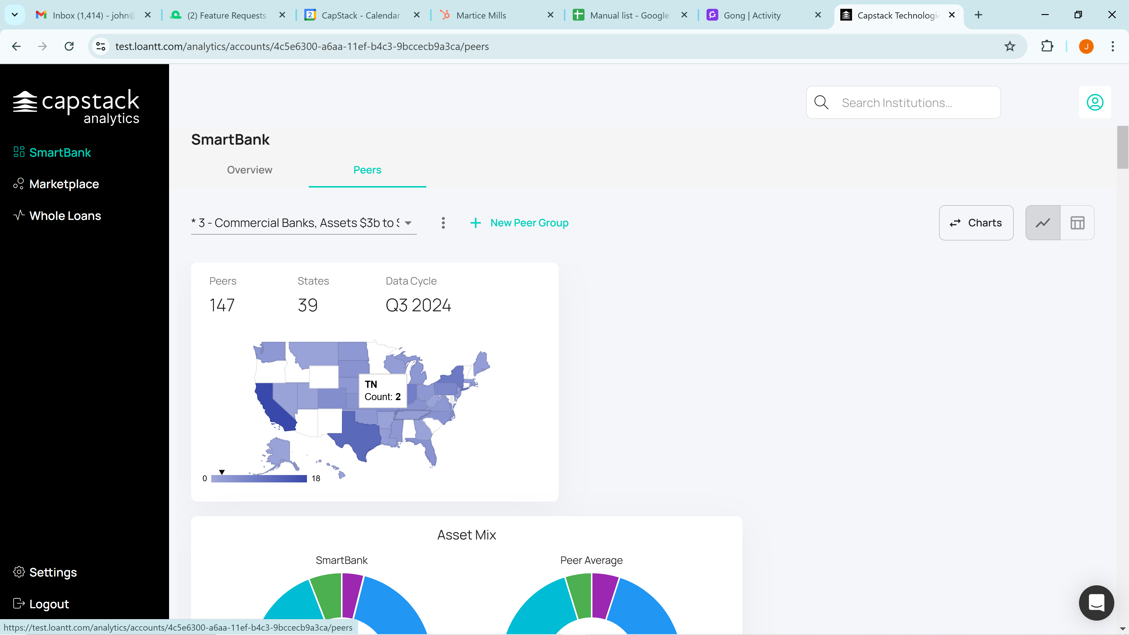
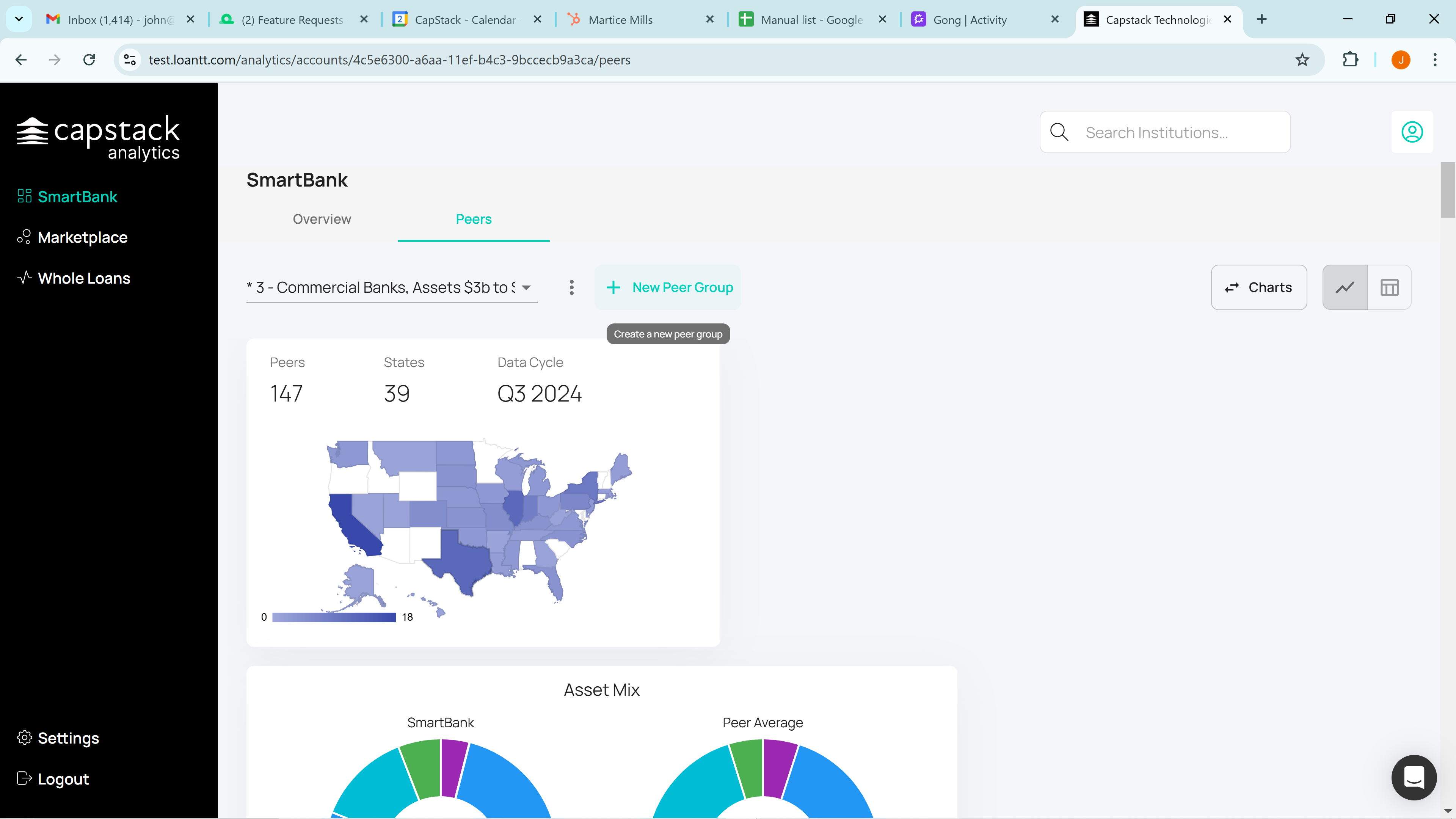
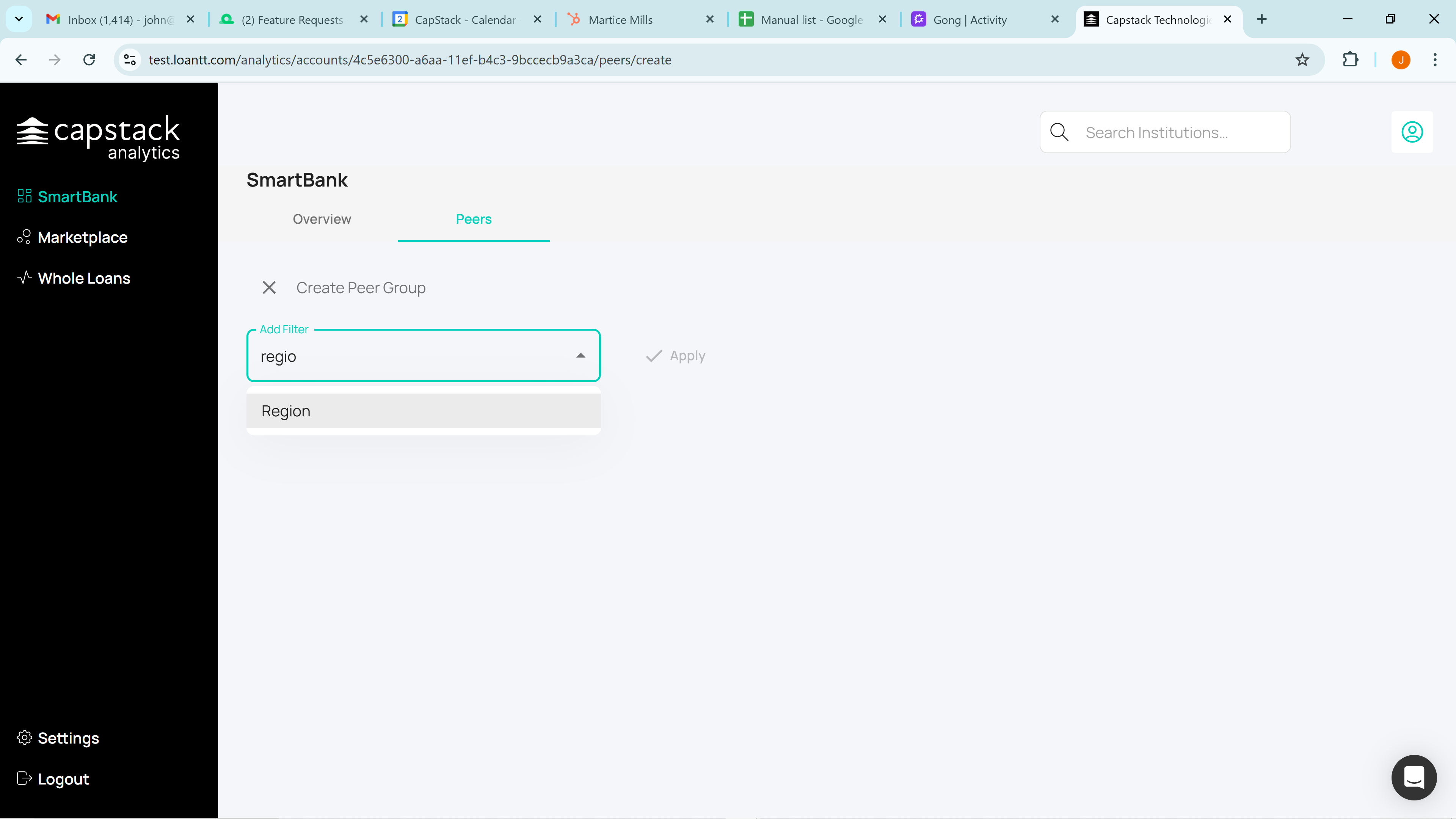
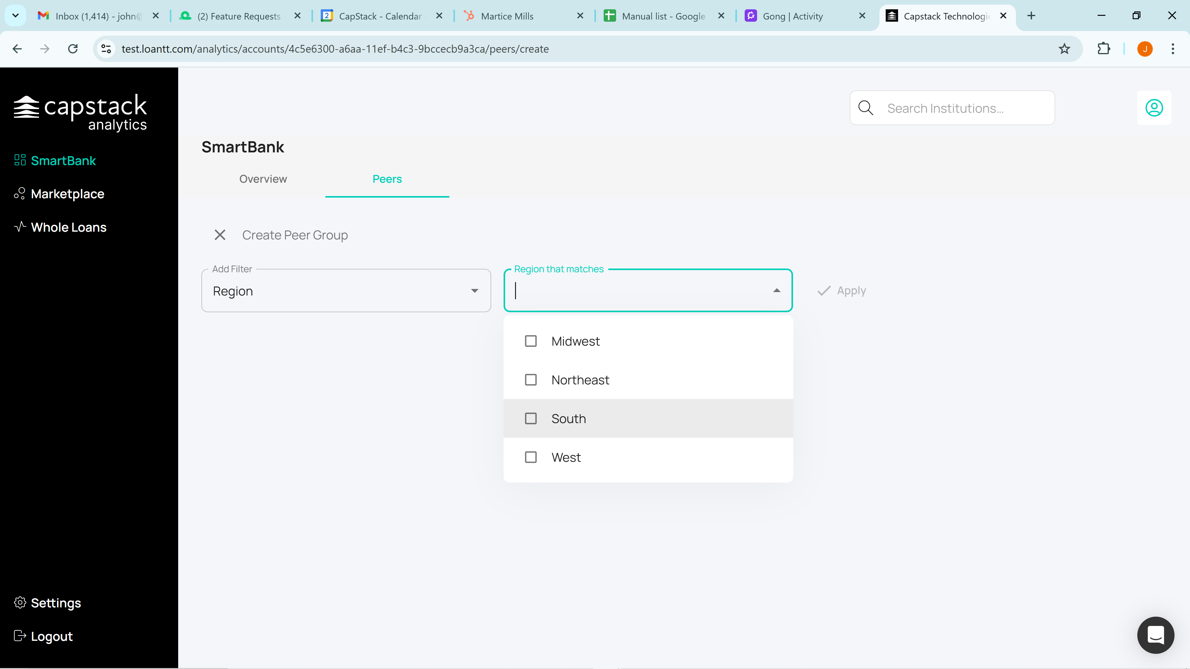
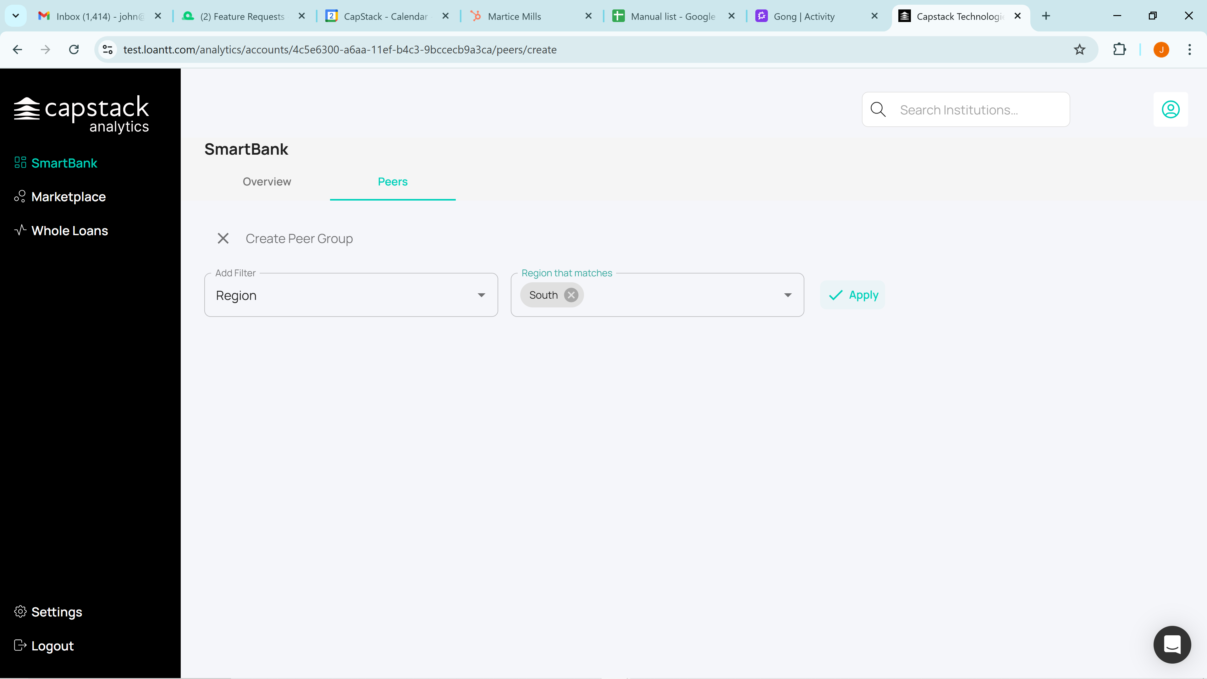
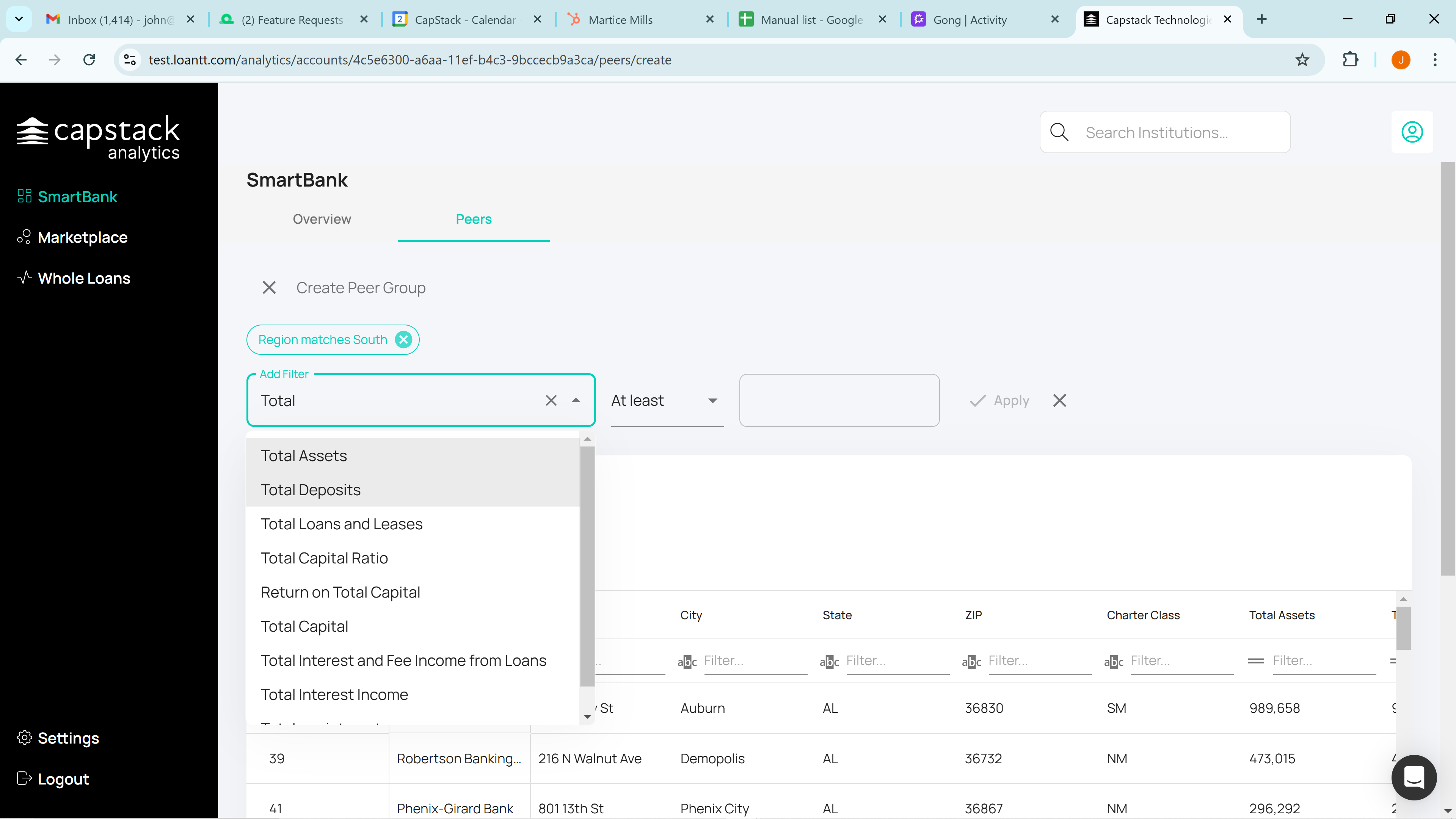
They will create a custom peer group by clicking on "New Peer Group." Let's say they want to focus on banks in the "South" region.
Apply that, and the first thing that will happen is it will return with the 1,606 bank peers in the south.

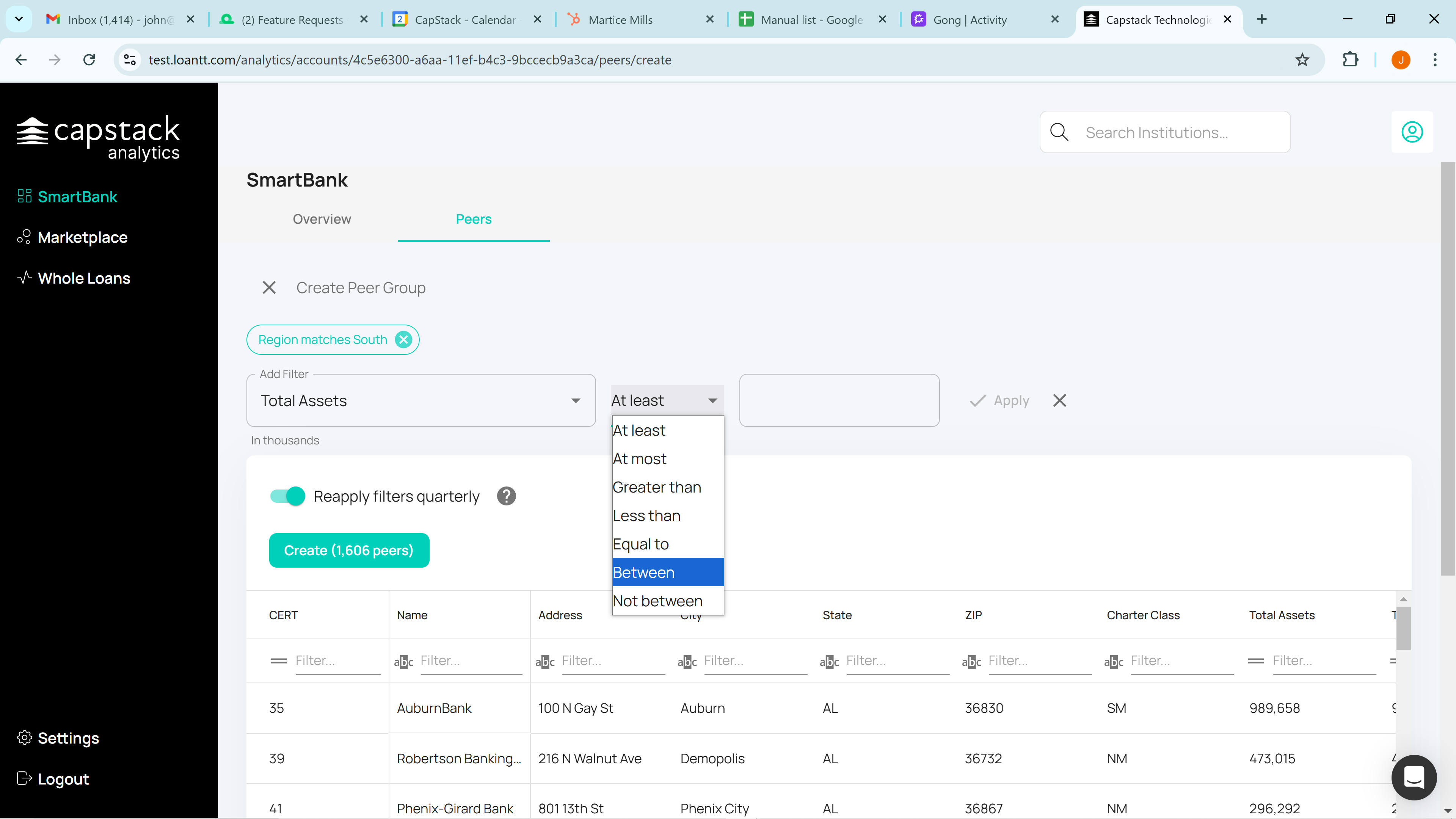
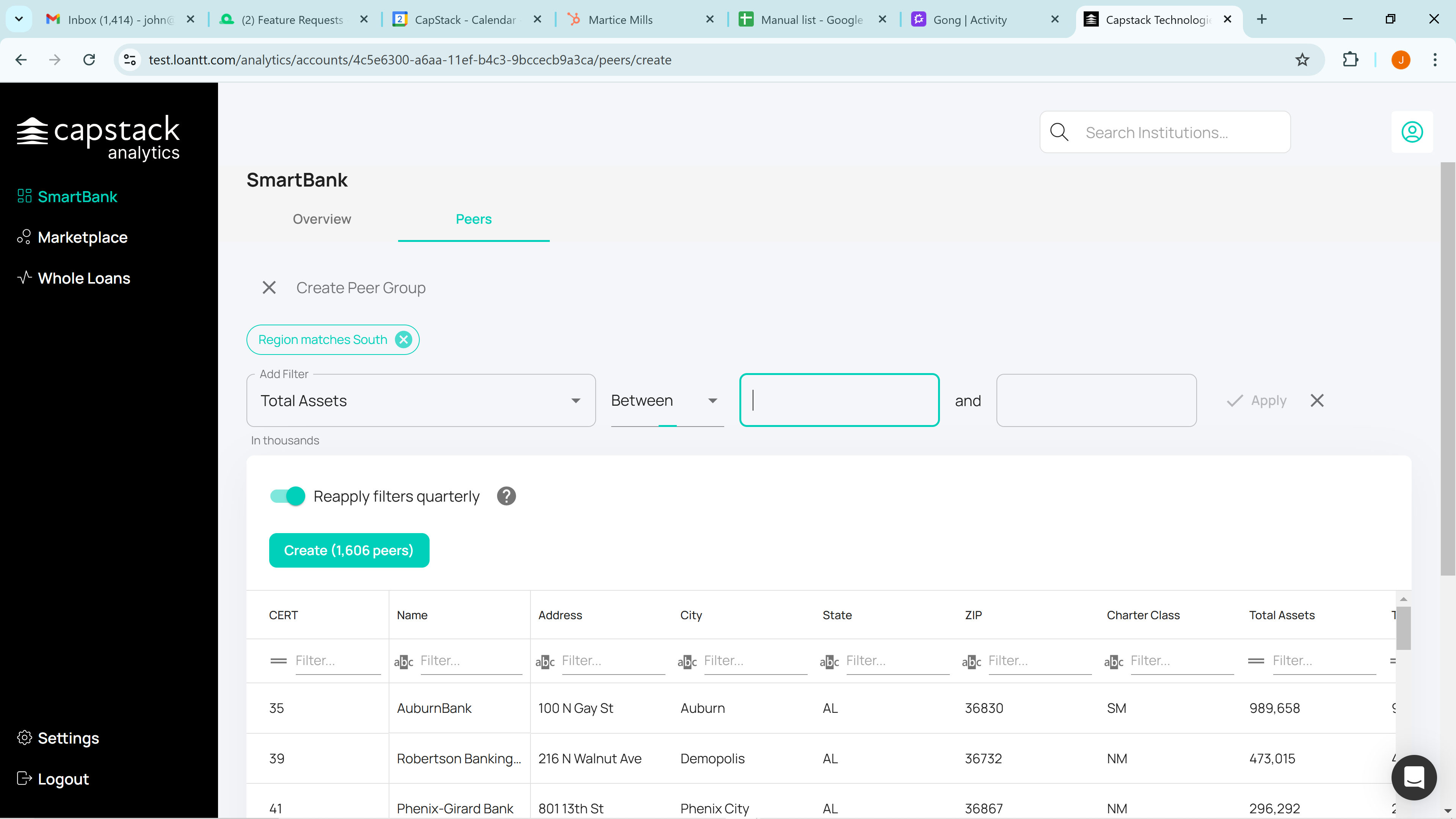
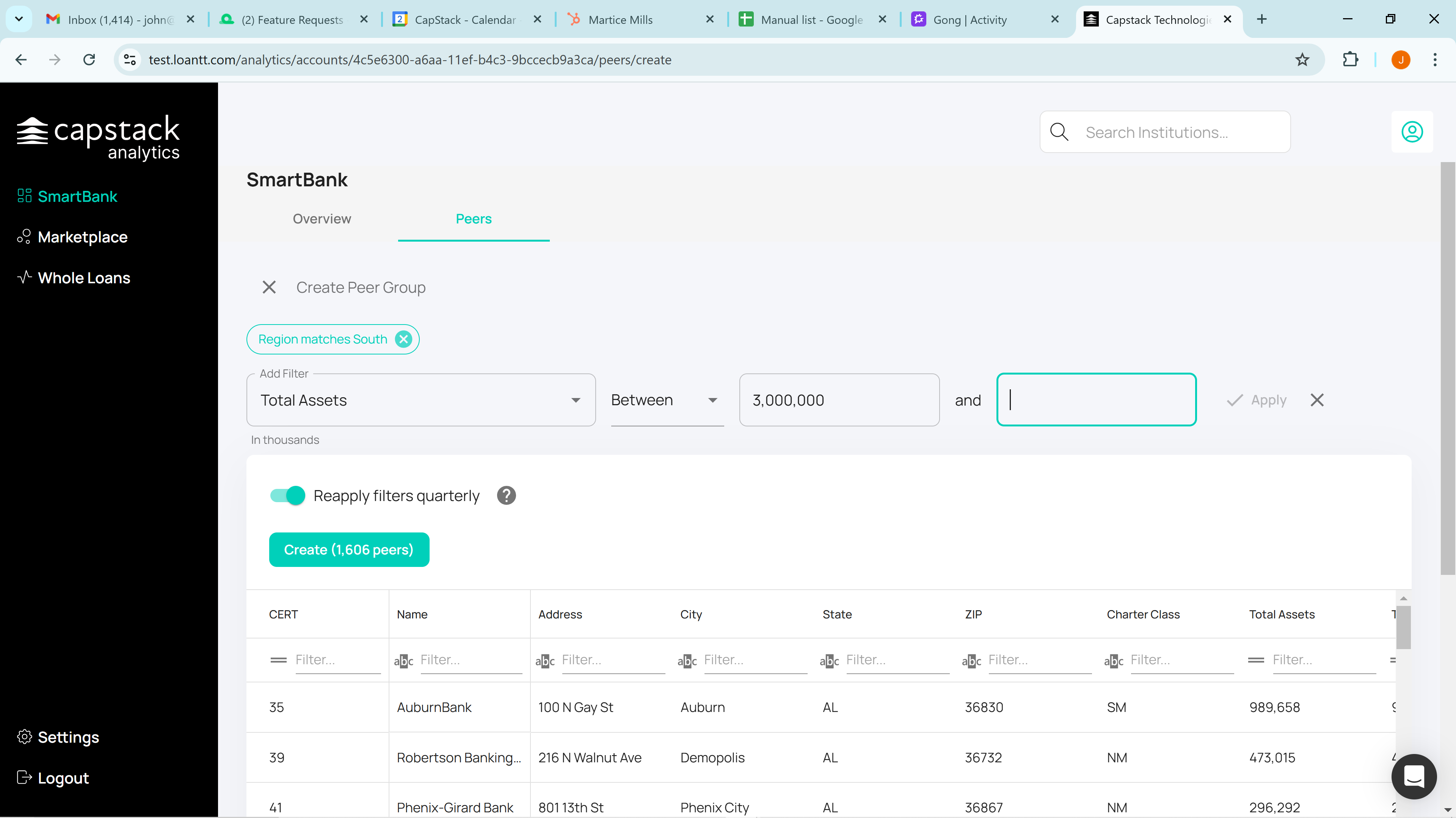
Next, we will add an additional filter, "total assets".
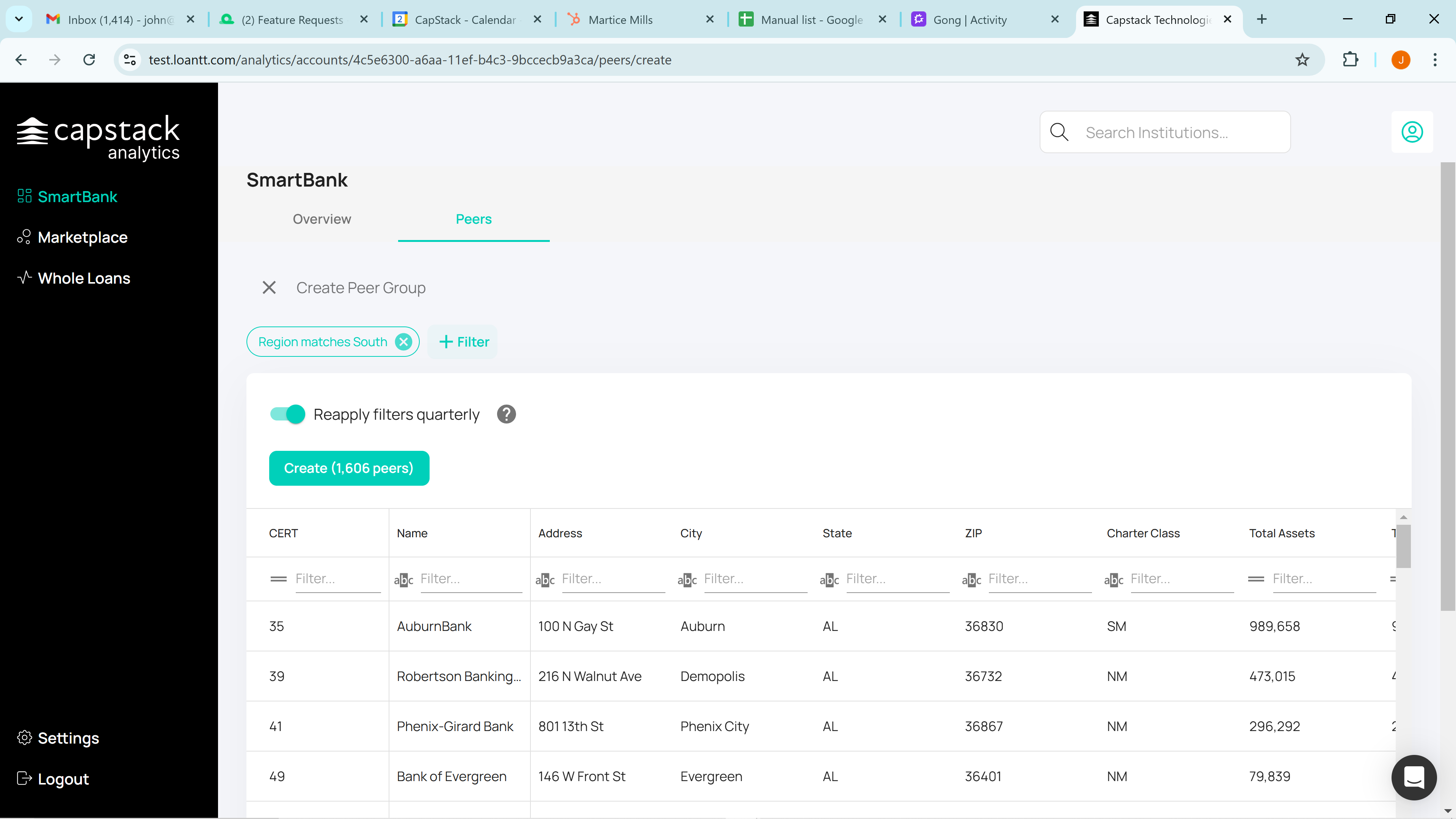
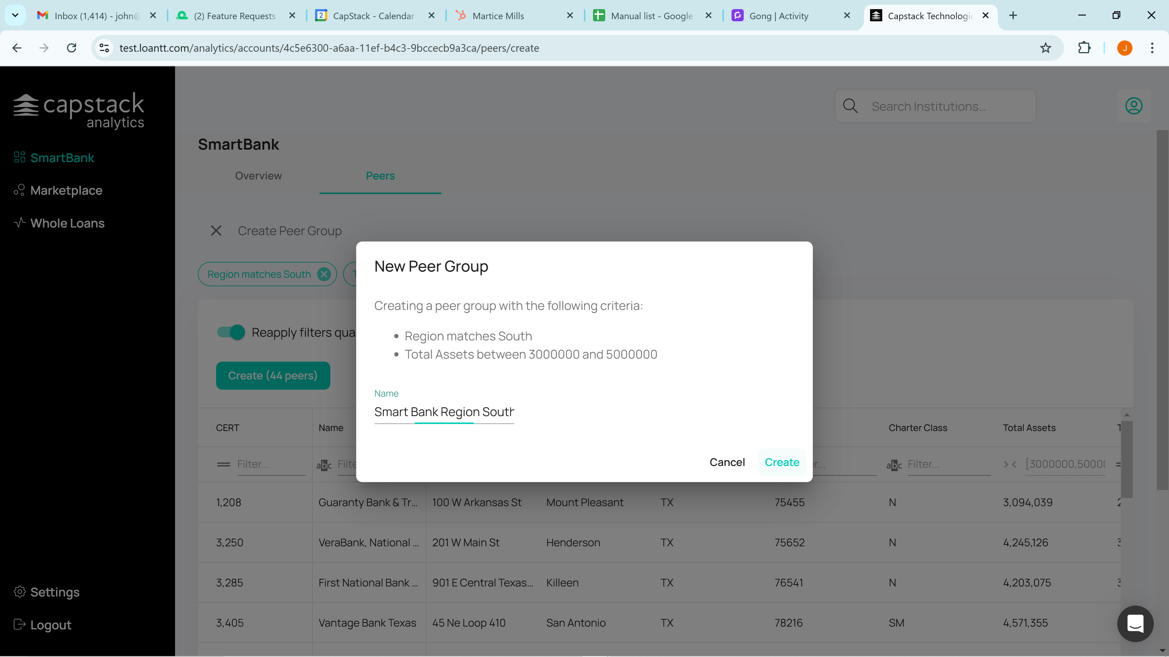
Click on "Create Peer Group."
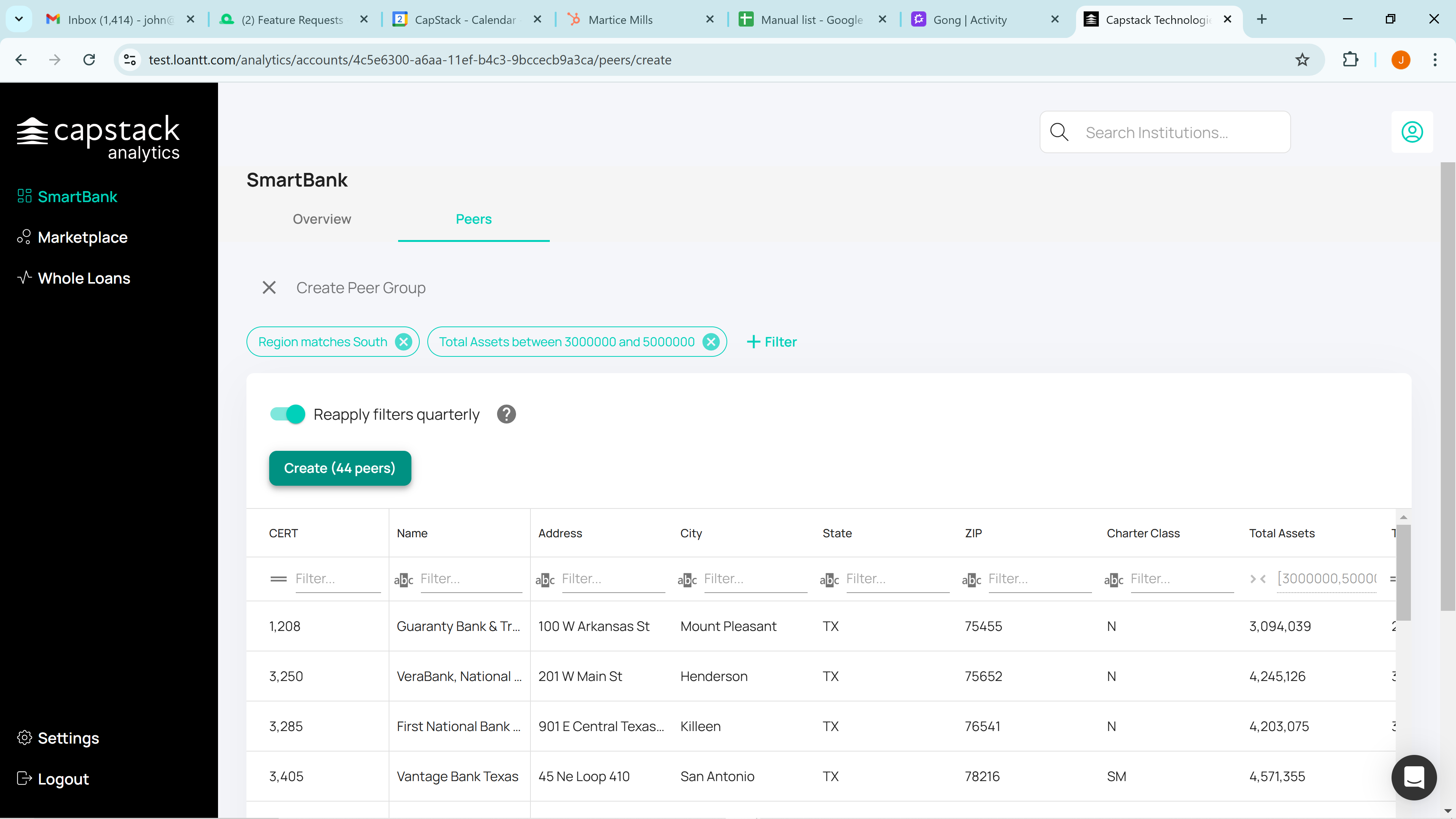
We'll name it SmartBank Region South, with total assets of $3 billion to $5 billion, and create it.
We have now created a custom peer group for SmartBank, comparing it to all banks in the southern region with total assets between $3 billion and $5 billion.
The system will aggregate the data to form this custom peer group.
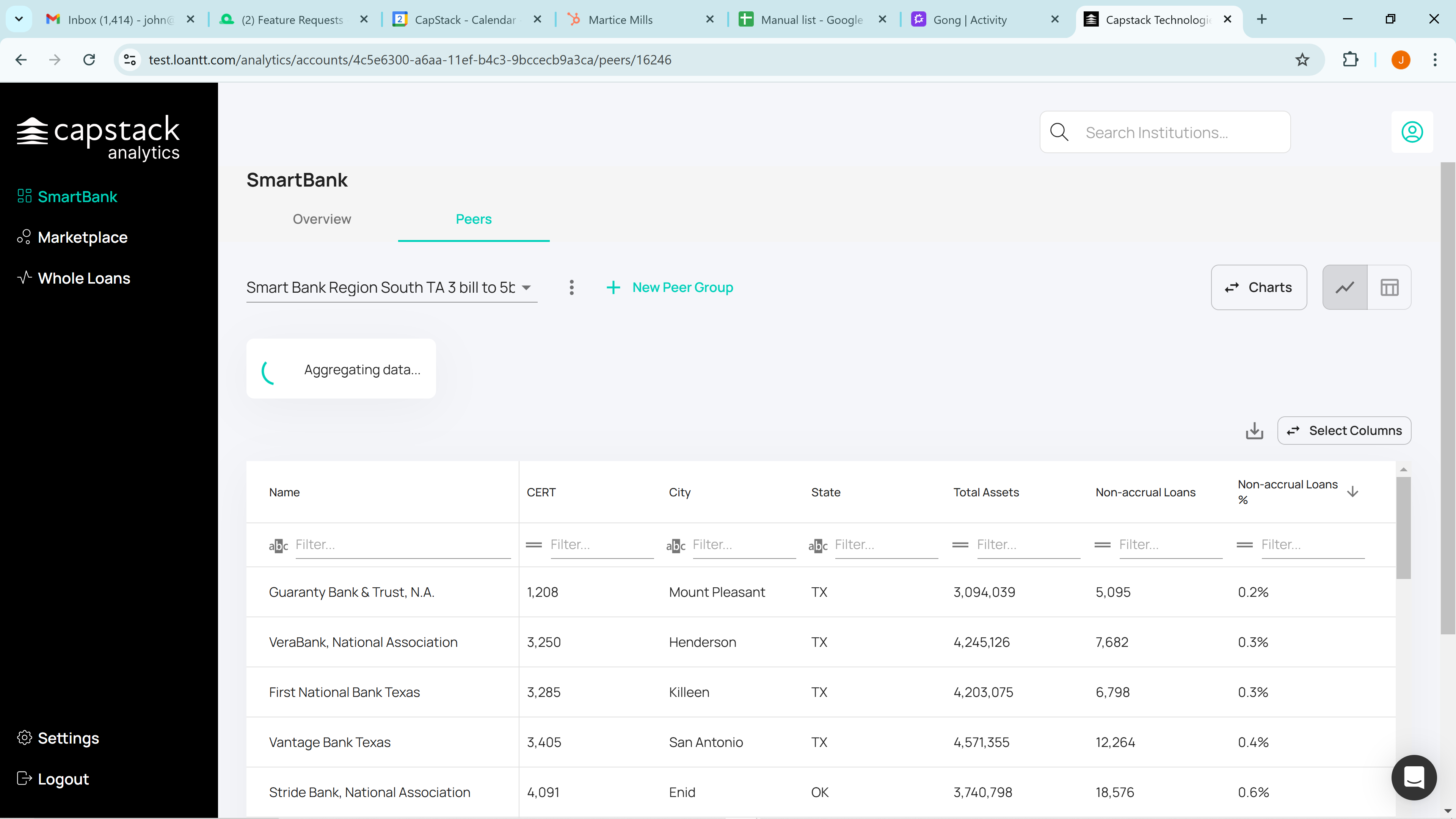
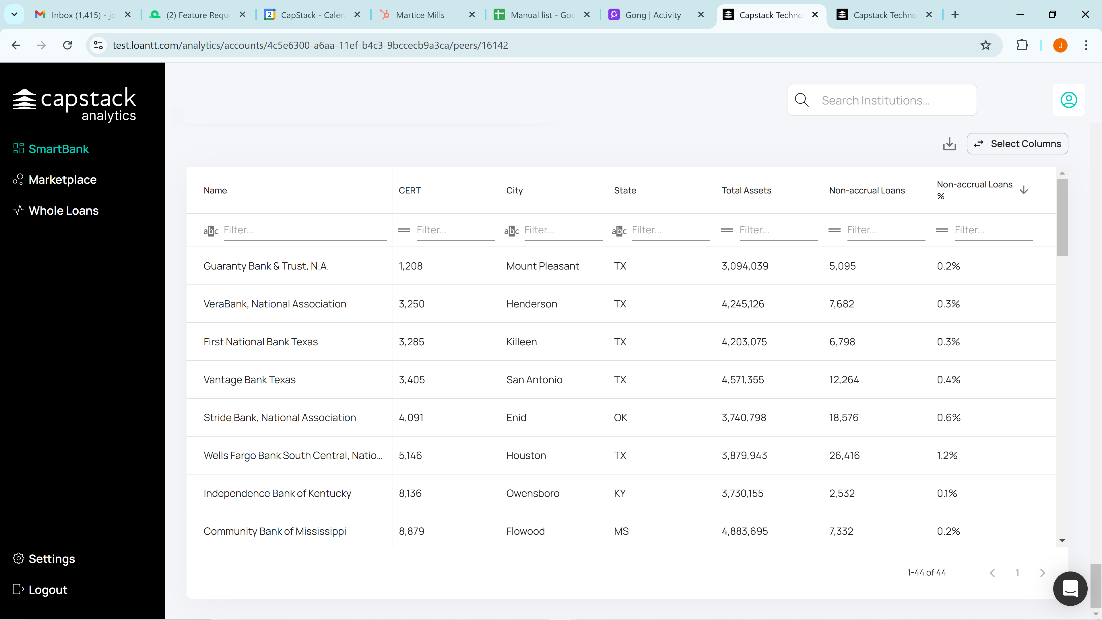
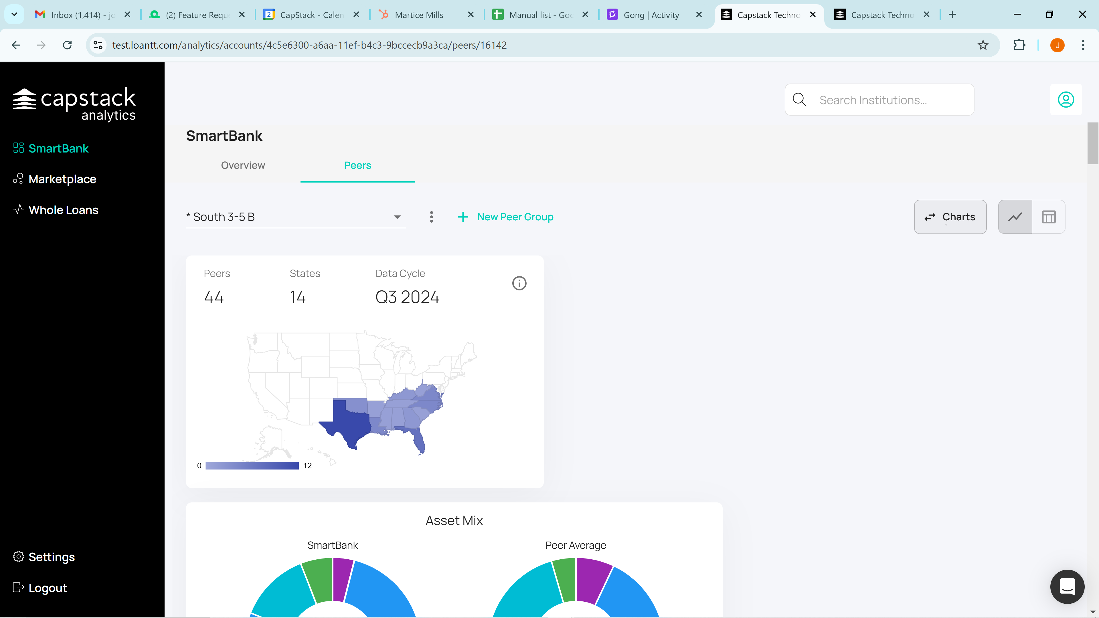
We have 44 peers in this group across 14 states in the South, based on Q3 2024 data.

If you've forgotten what you've created, click on the information tab, represented by the "i" inside the circle. It will show you "Region South" and total assets between $3 billion and $5 billion.

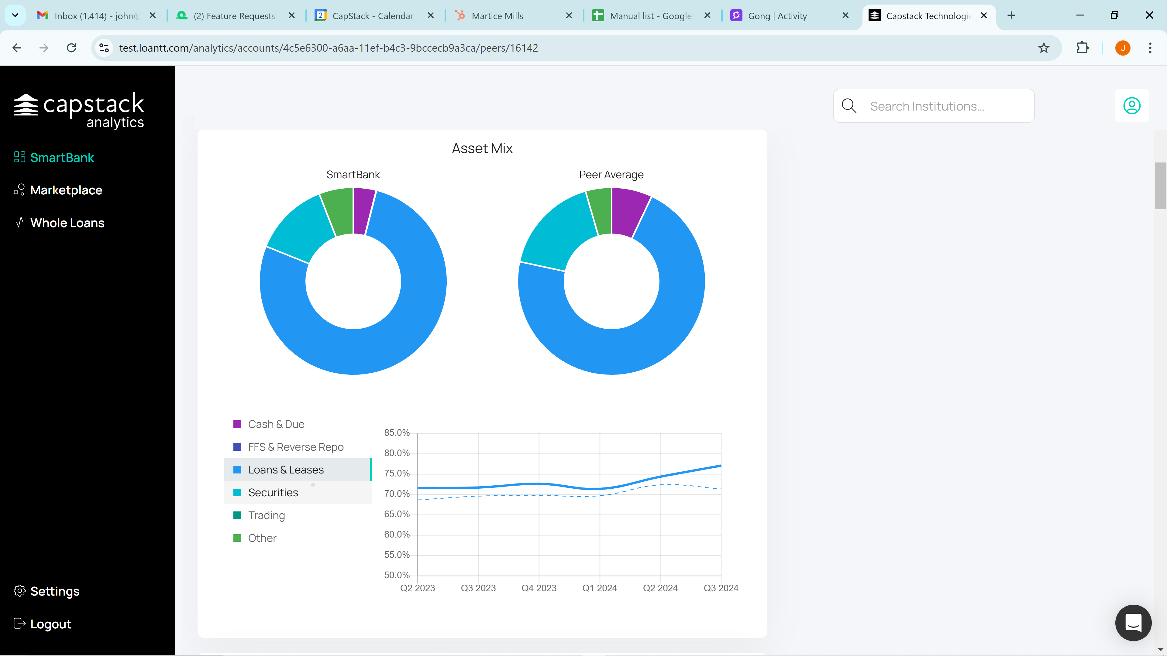
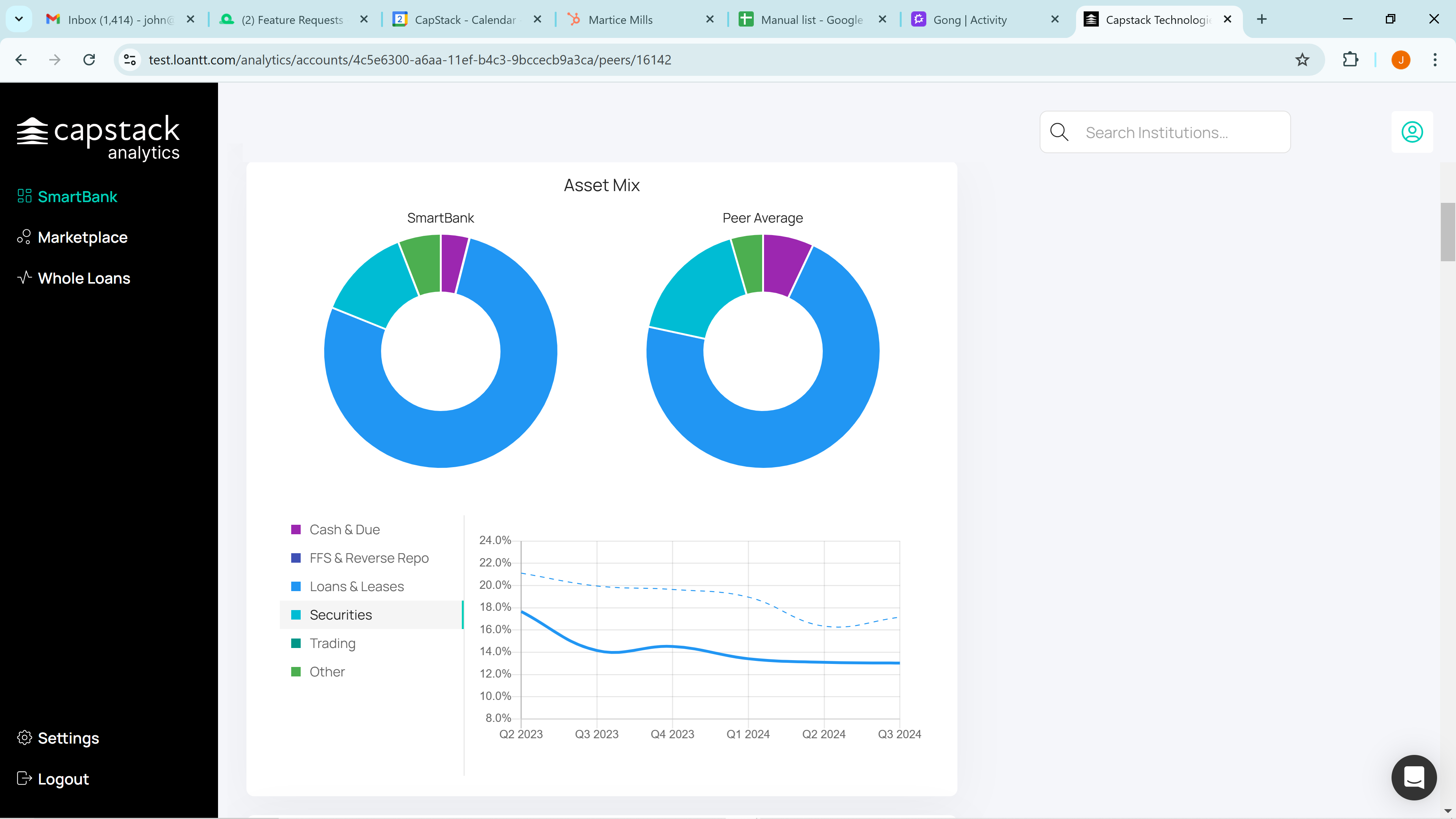
If we scroll down, we can see the total asset mix of SmartBank compared to the peer group that we just created. You can click on Loans and Leases, for example. SmartBank is represented by the solid blue line, while the peer group is shown as the dashed line.

You can review each asset class individually on the total balance sheet.
If we scroll down, we can compare the loan portfolio. You can look at one to four family residential mortgages and see that, in this case, they are below the peer group.

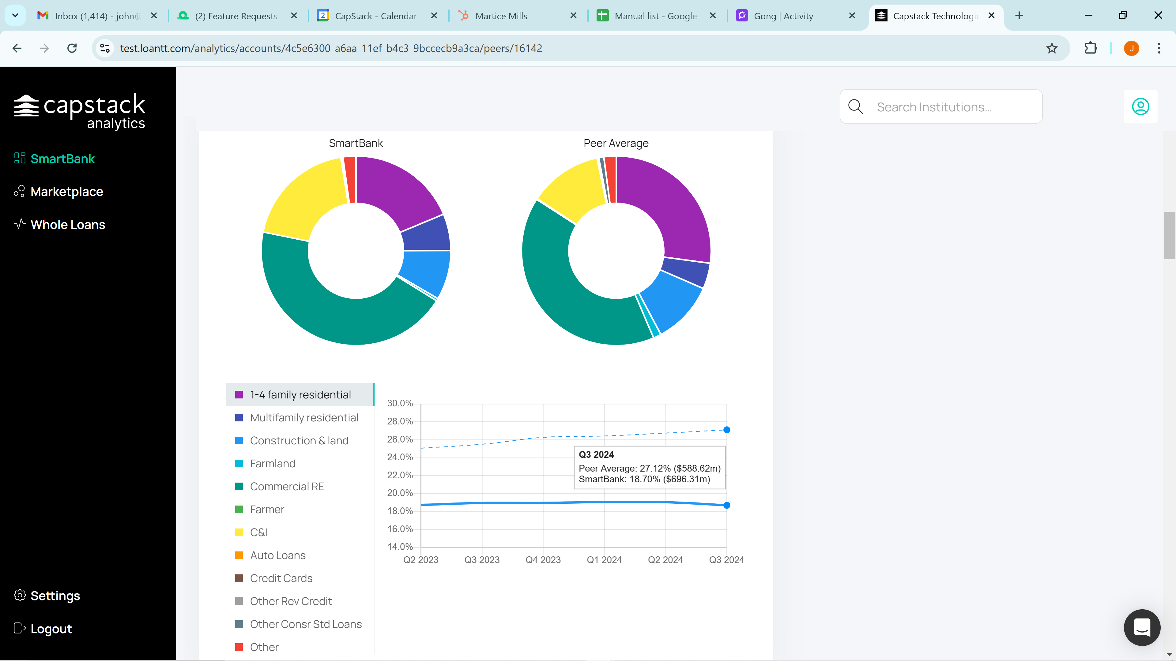
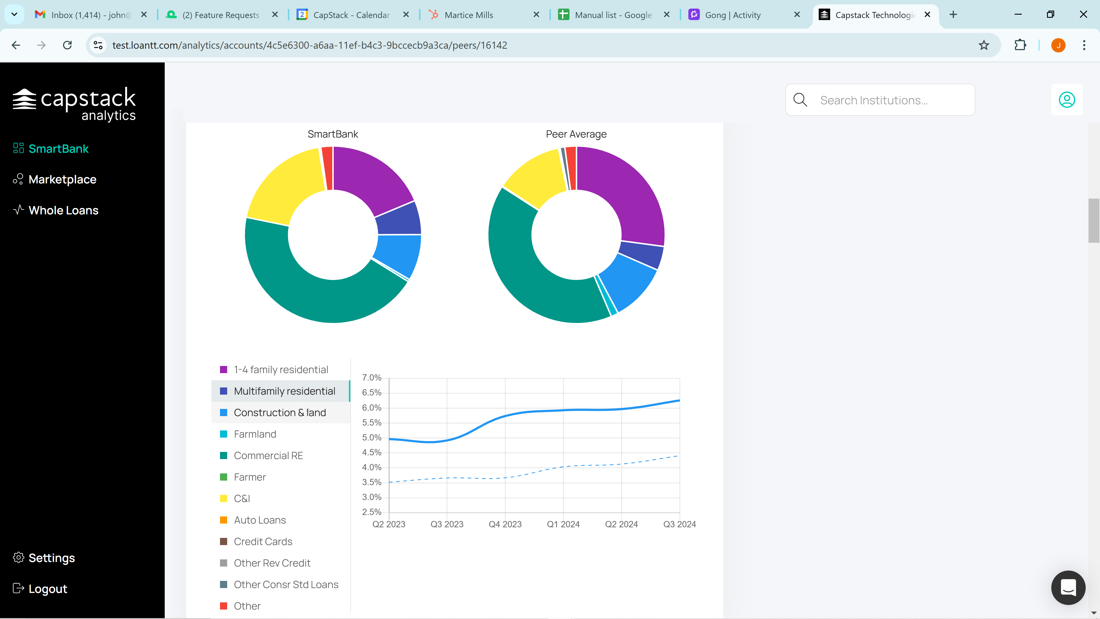
Click on multifamily, and you'll see that SmartBank is above the peer group.
You can continue to review each asset class individually.
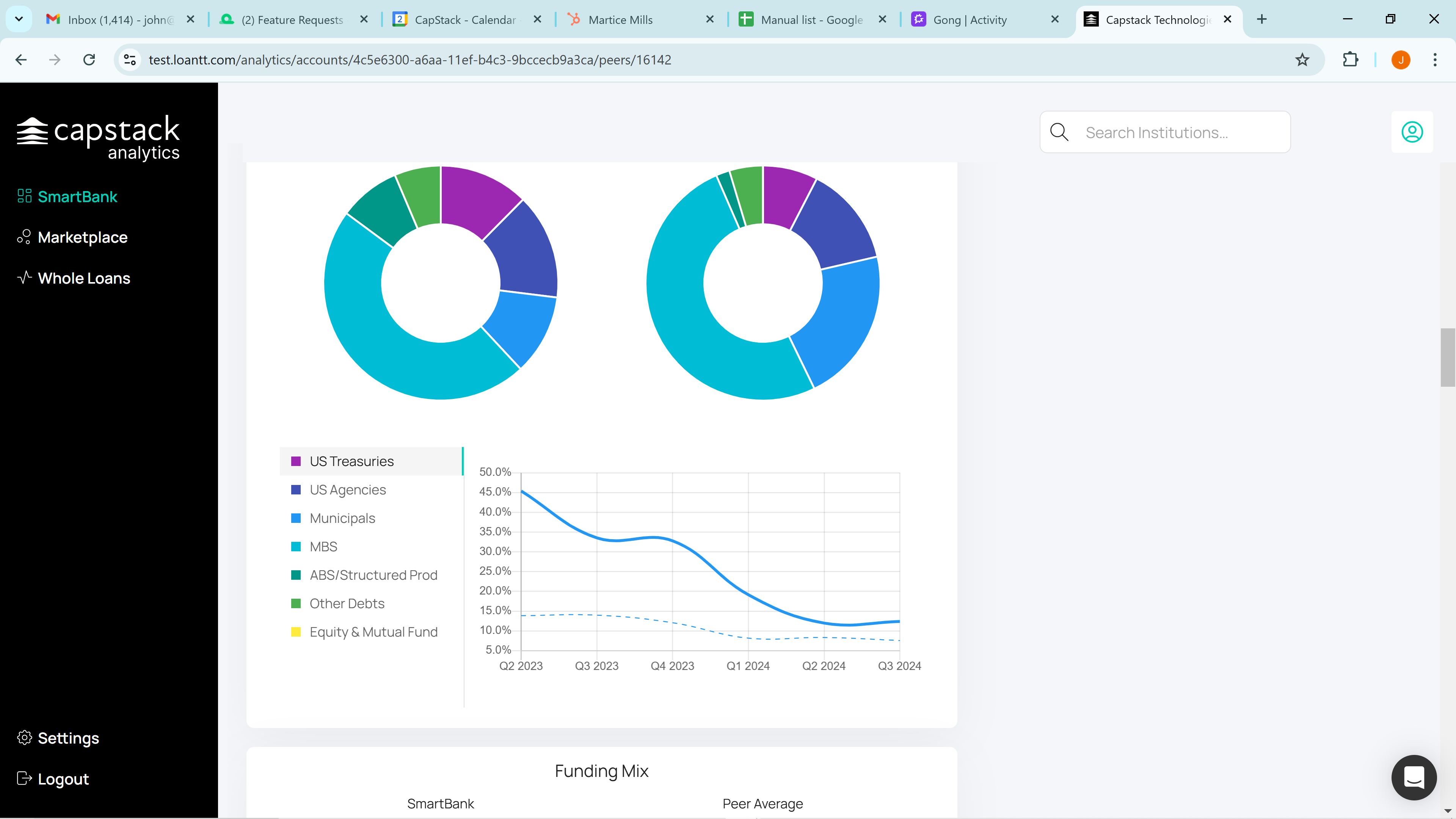
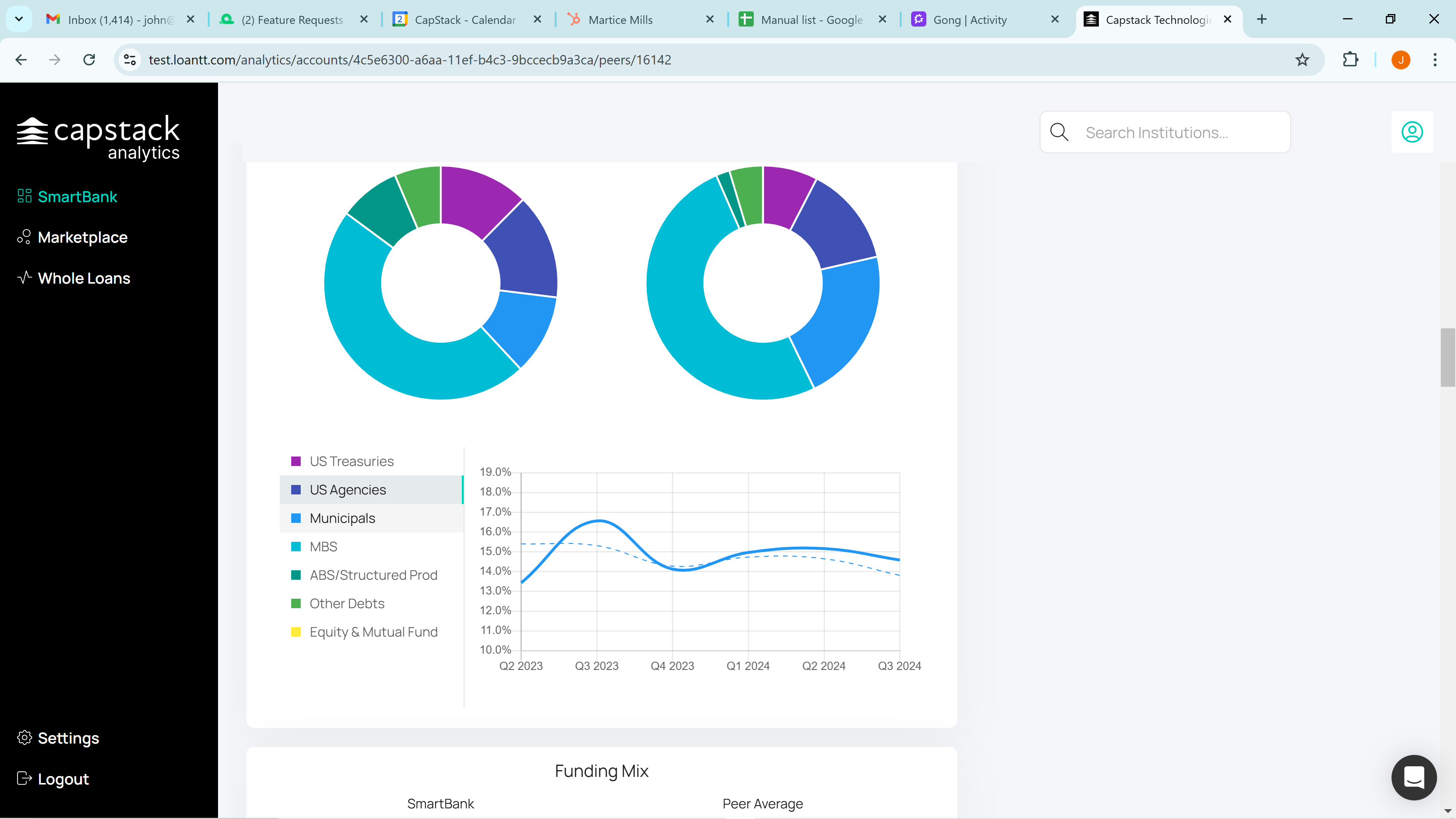
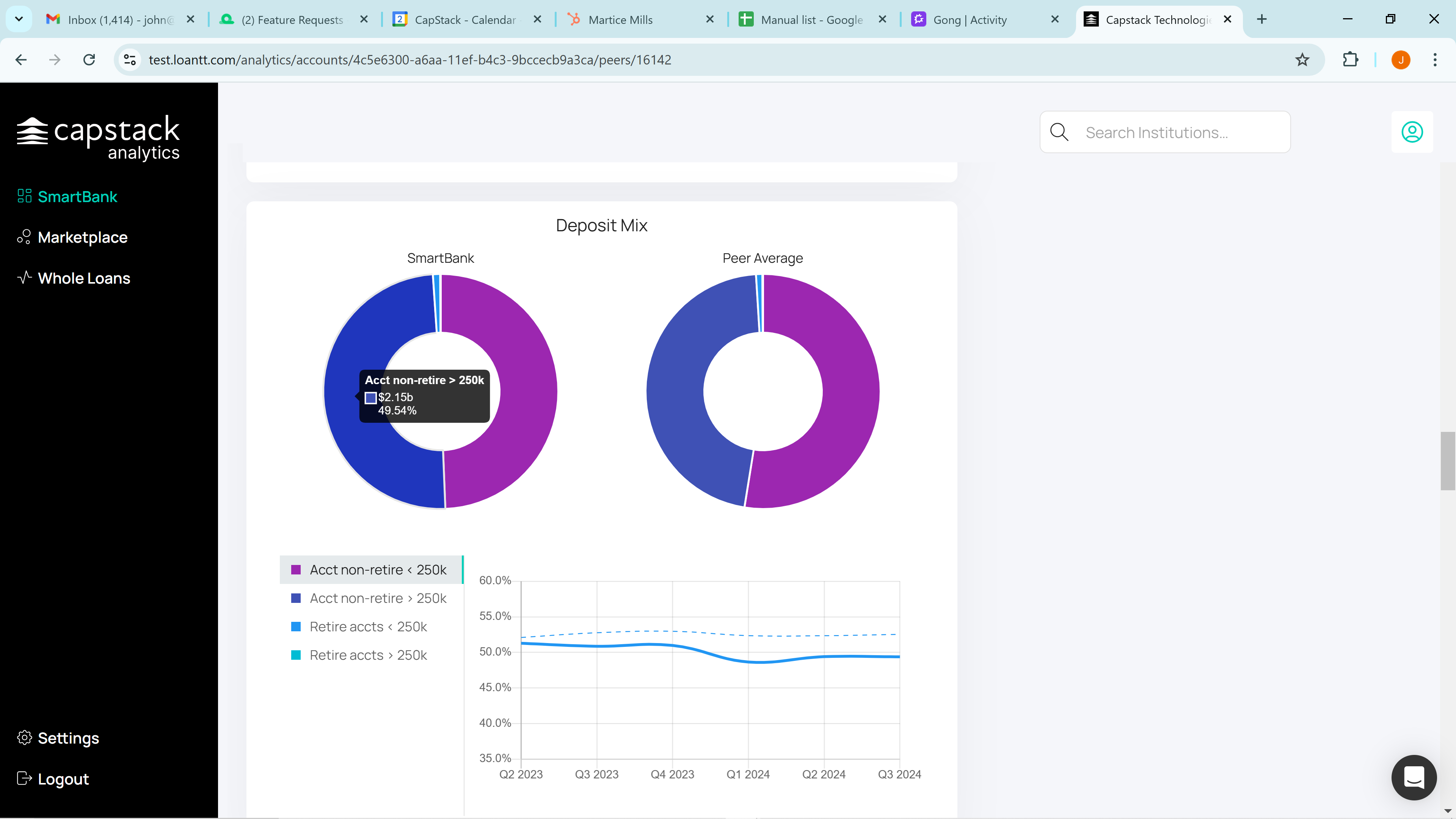
We also have the liquidity portfolio's security mix. You can click on each category: Treasuries, Agencies, Municipals, and MBS. The same applies to the Funding Mix and the Deposit Mix.
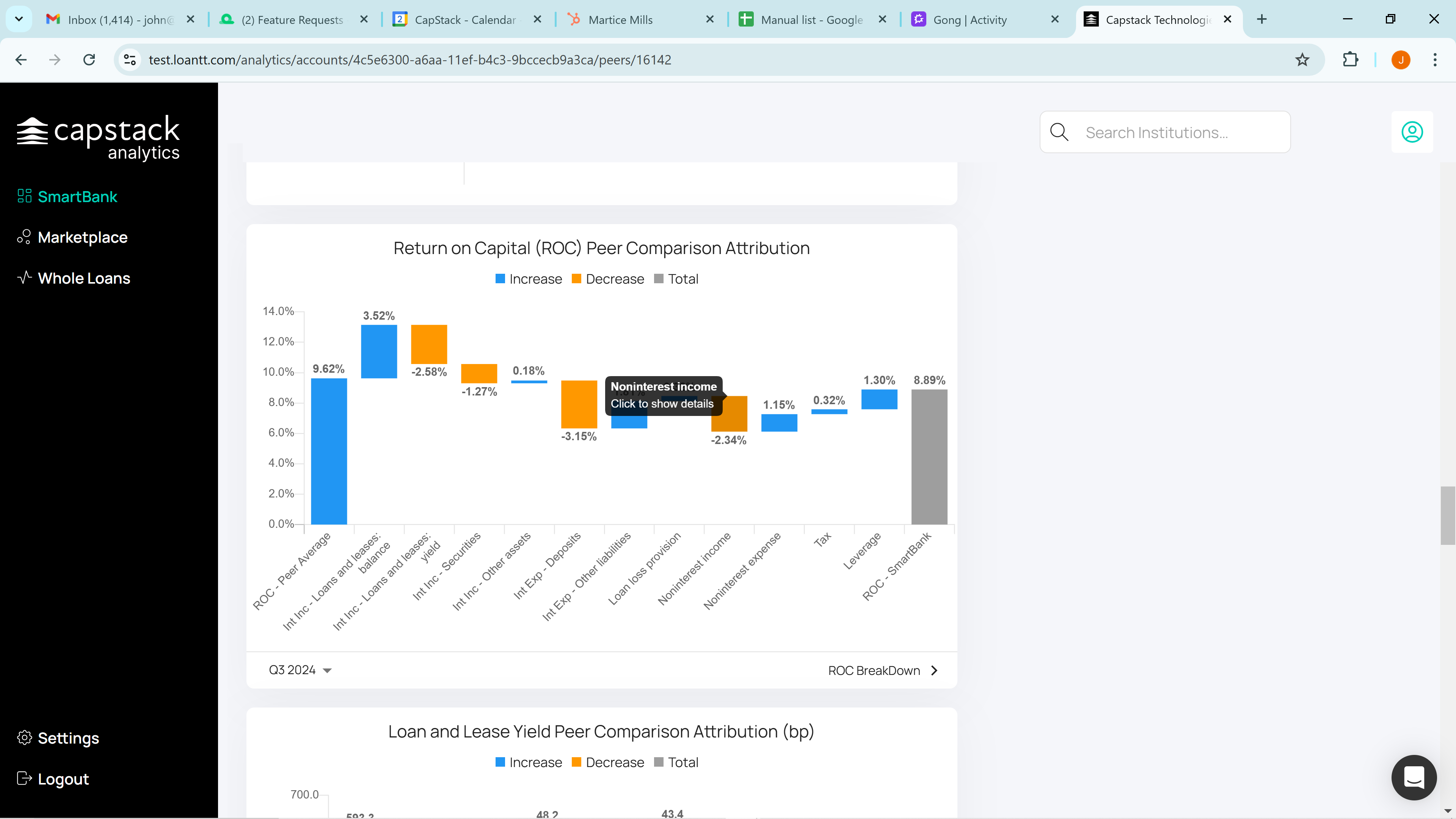
Next, we move to our Return on Capital Peer Comparison Waterfall. As you can see, SmartBank's Return on Capital is 8.89%

while the peer group has a Return on Capital of 9.62%.

Whenever there's a positive number in the waterfall chart, SmartBank outperforms the peer group. Conversely, when there's a negative number, the peer group outperforms SmartBank.
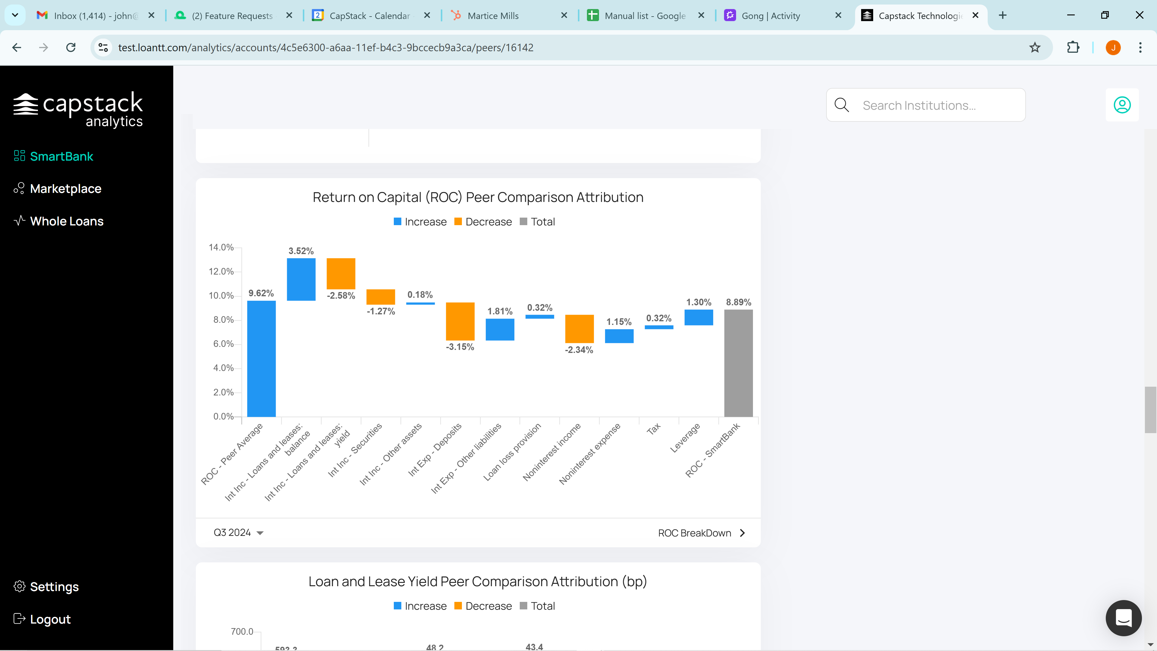
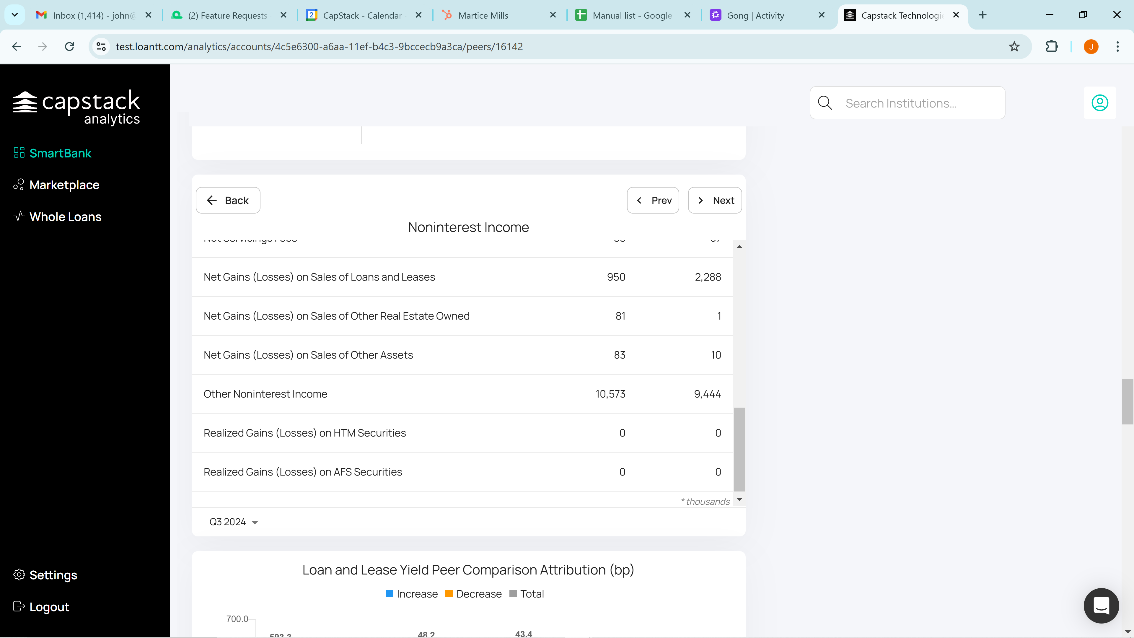
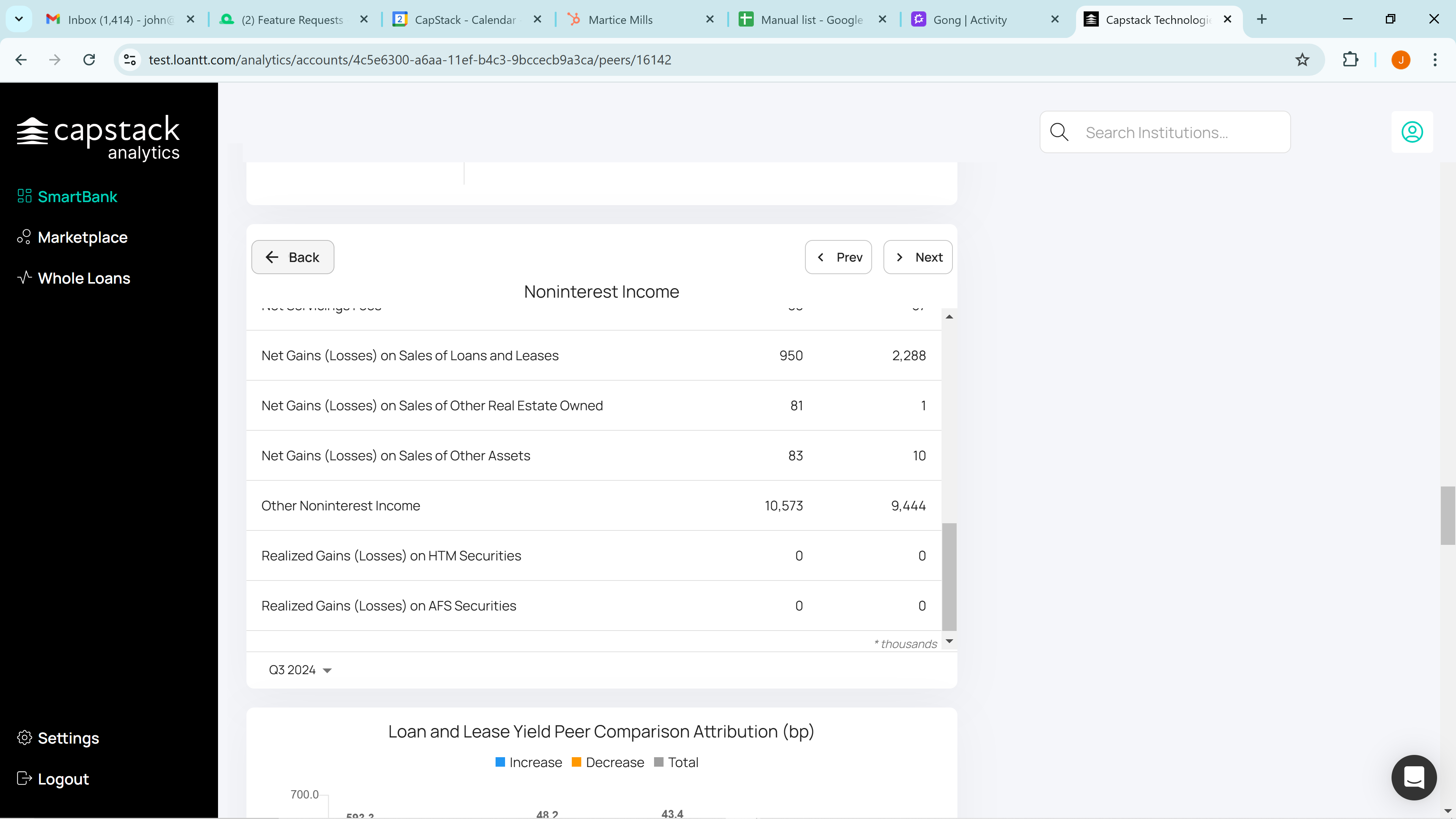
If for example, we click on non-interest income, we'll see that the gain on losses from the sale of loans and leases is $950,000, compared to the peer group's gain of $2,288,000.
You can go class by class there. Click back, and you'll return to the waterfall.
We also present a Loan and Lease Yield Peer Comparison. SmartBank has a weighted average yield of 5.708% on their loan portfolio.
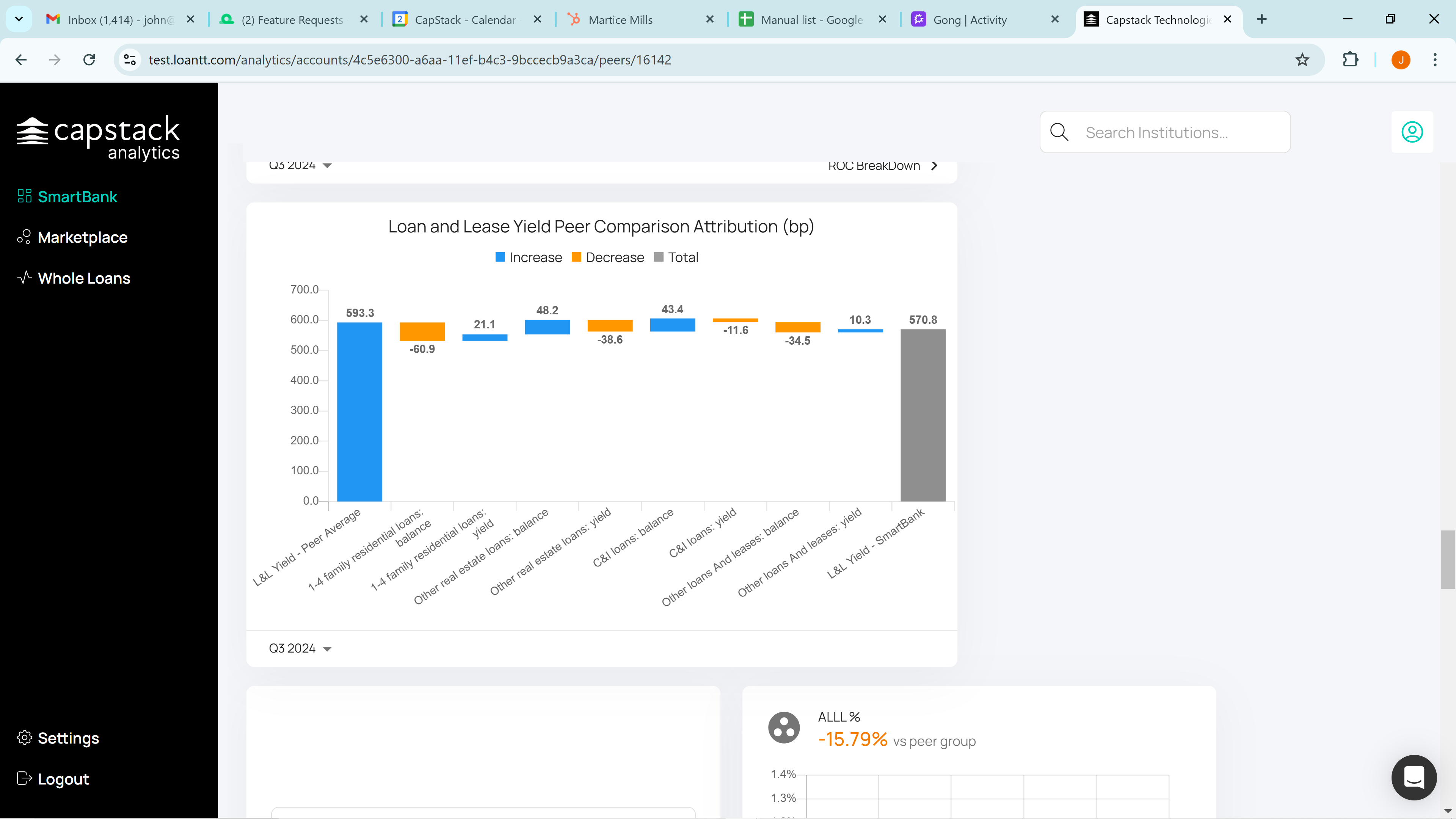
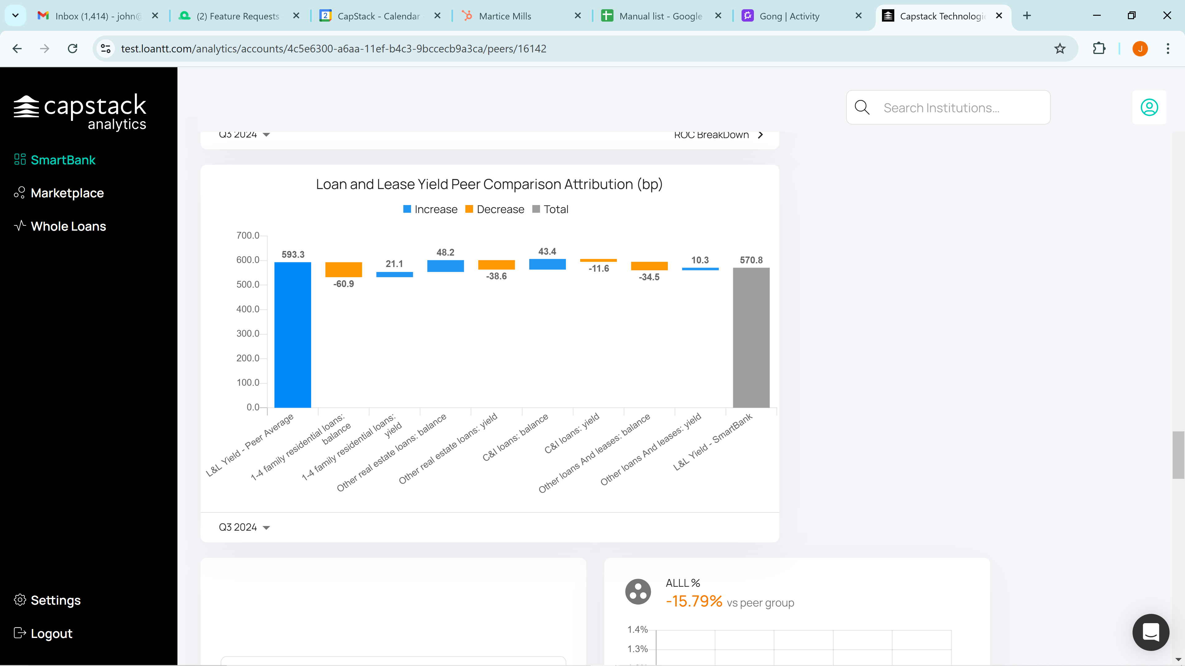
They lose slightly compared to their peer group, for example, in the one-to-four family residential loan balance. We've already noted that their residential mortgage loan balance is lower than the peer group's, so this is expected.
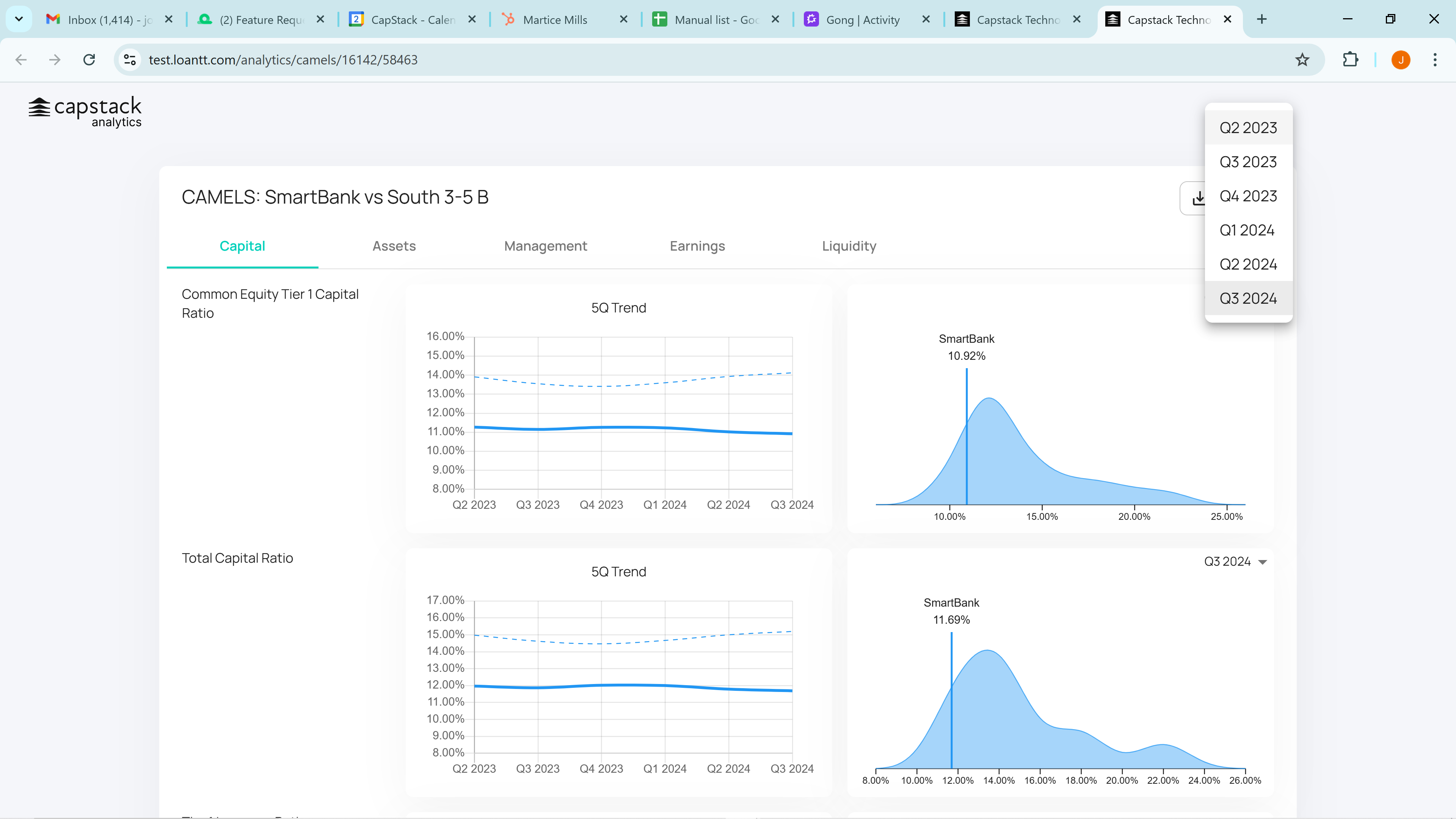
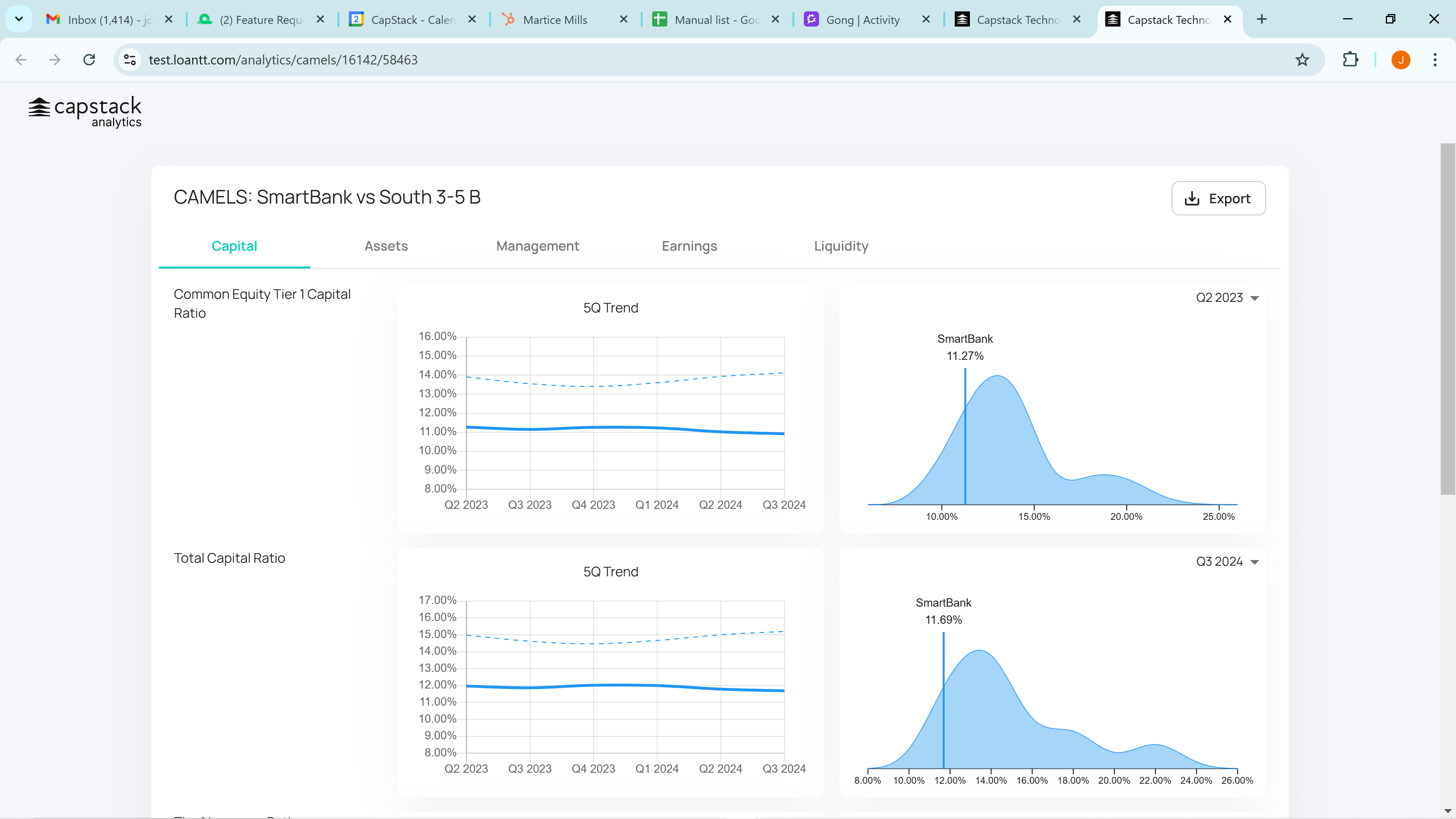
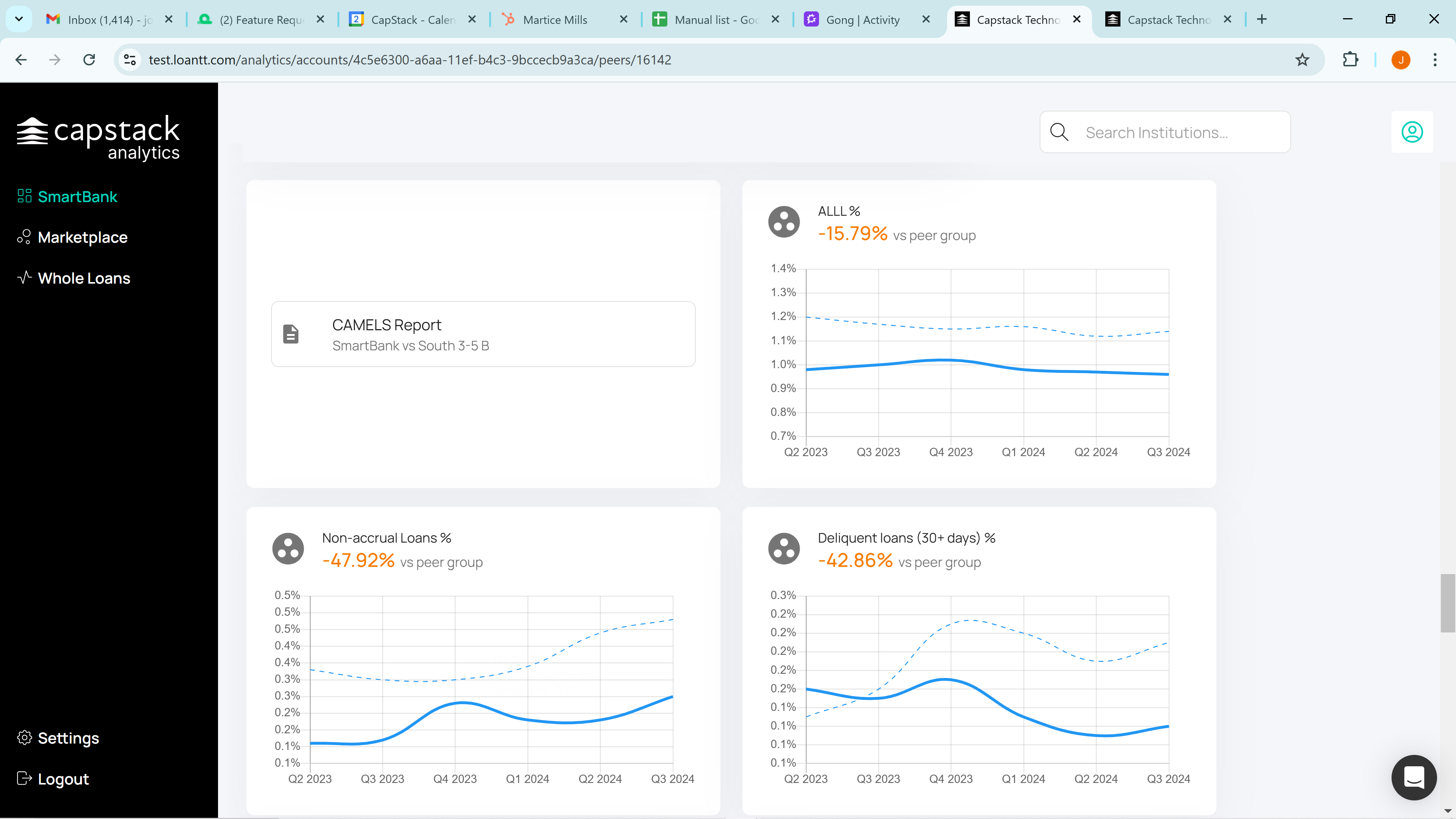
Next, we have our CAMELS style report. CAMELS, as you know, stands for Capital Asset Management Earnings and Liquidity. By clicking on it, we can view the first tab, Capital, which shows the Common Equity Tier 1 Capital Ratio compared to the peer group. Averages don't tell the full story, so we display the peer group's distribution and indicate SmartBank's position with a vertical line.
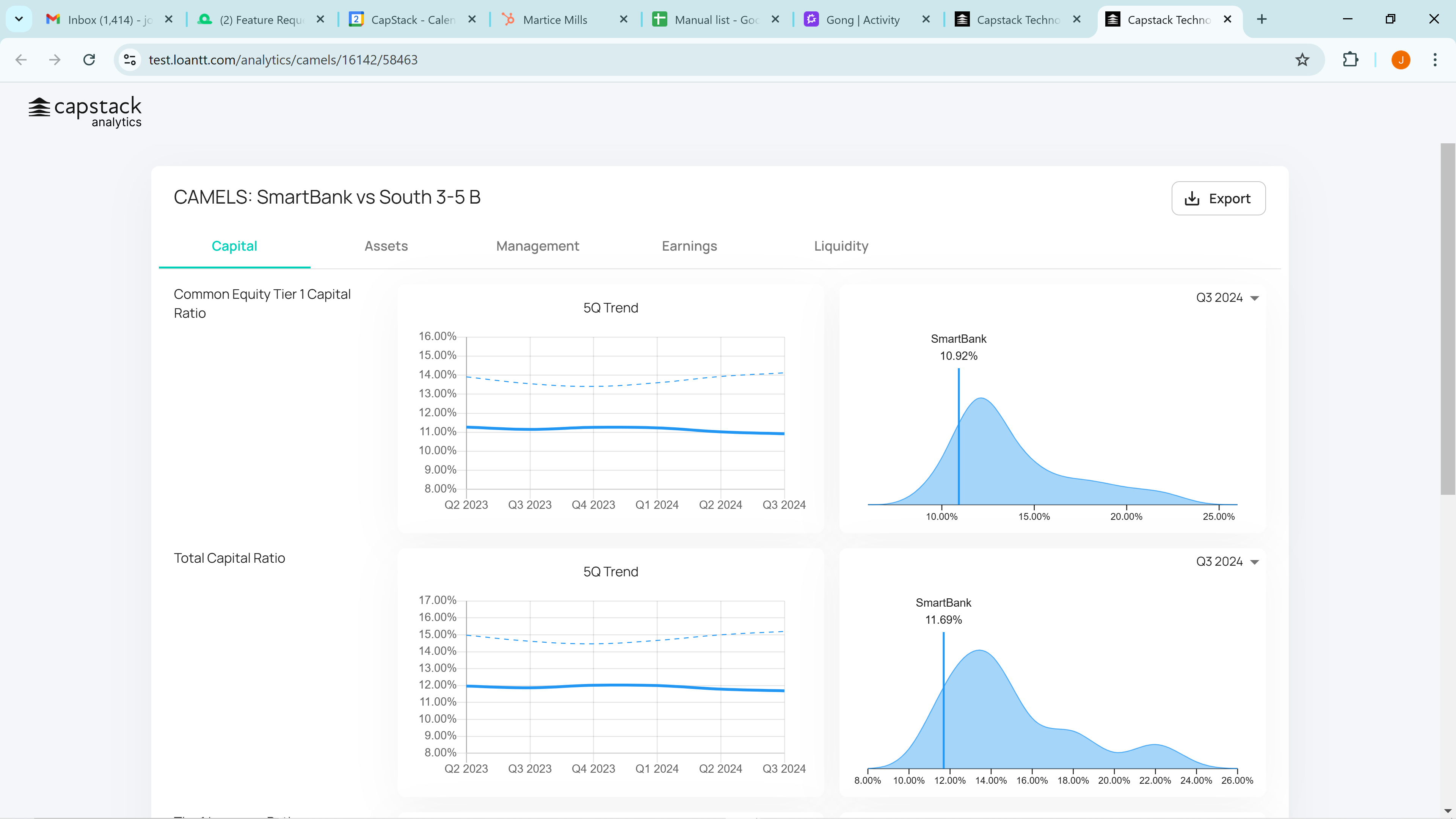
You can review the past six quarters to see the differences quarter over quarter, then return to the current quarter.

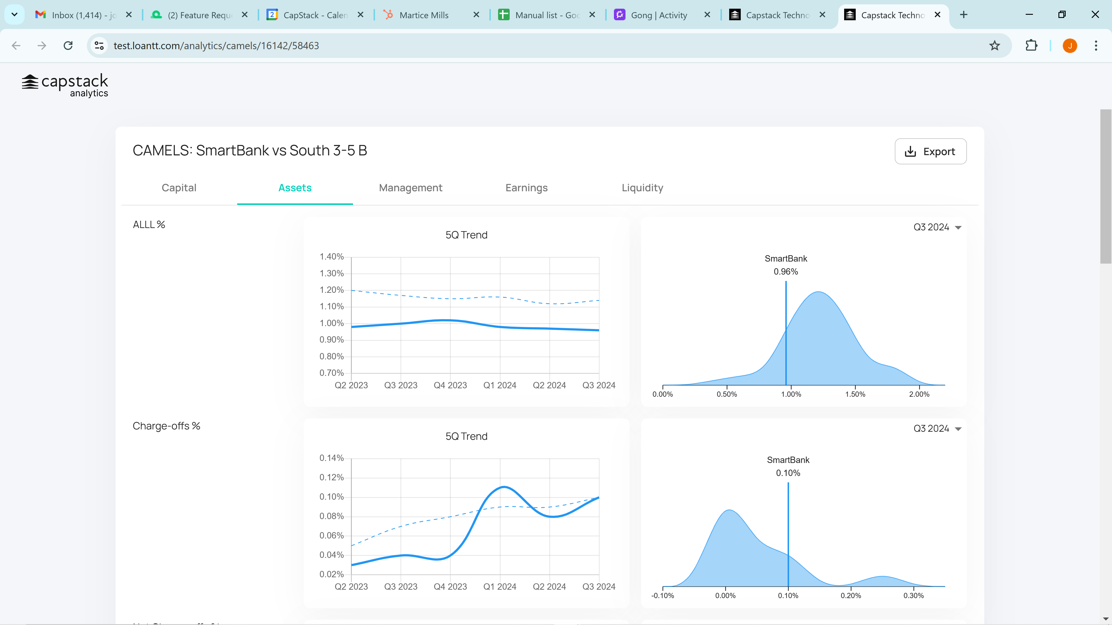
Scroll back to the top and click on Assets.

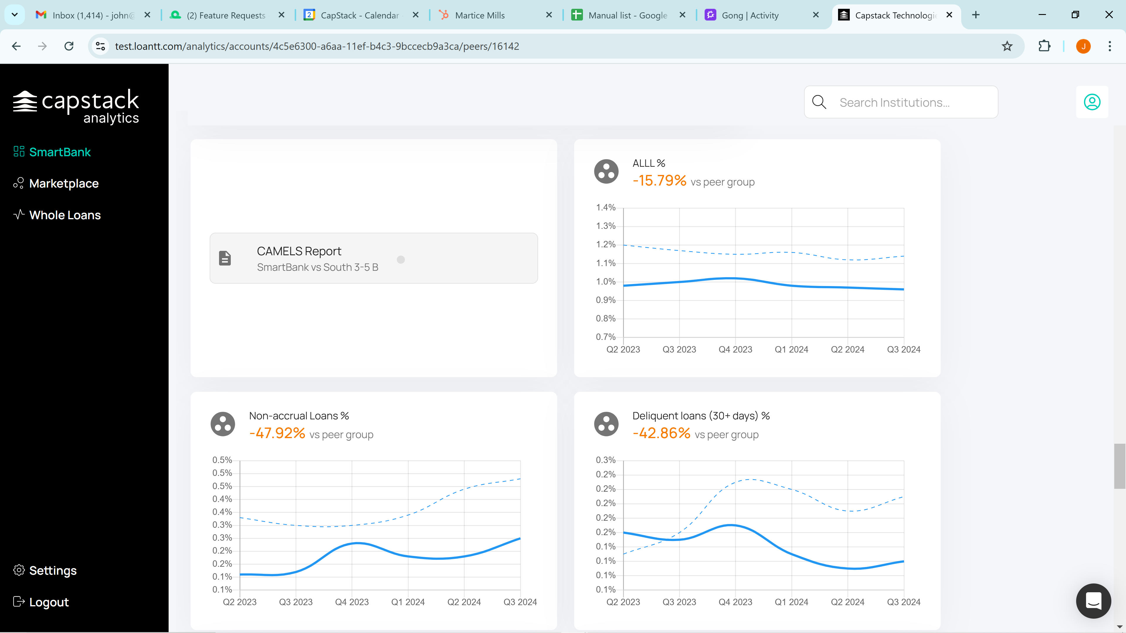
We cover Allowance for Loan and Lease Loss, Charge Offs, Net Charge Offs, Provisions for Credit Losses, Non-Accrual Loans, and Delinquent Loans Still Accruing. Additionally, we will discuss Loan Loss Reserve over Non-Accrual Loans as you scroll down.


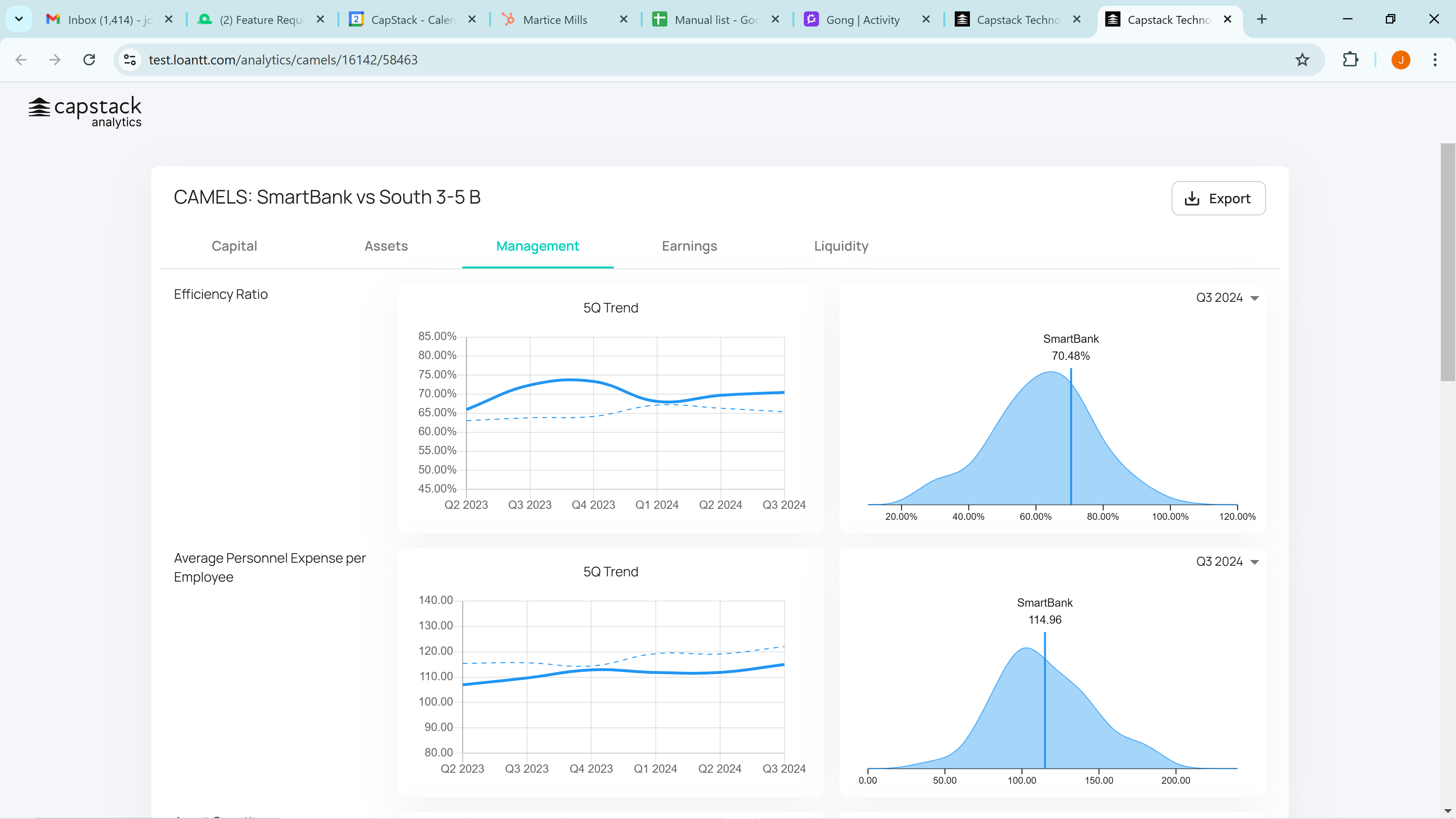
Next, we will cover Management, which includes Efficiency Ratio, Average Personnel Expense per Employee, Asset Growth, Loan Growth, Total Deposit Growth, and Core Deposit Growth.
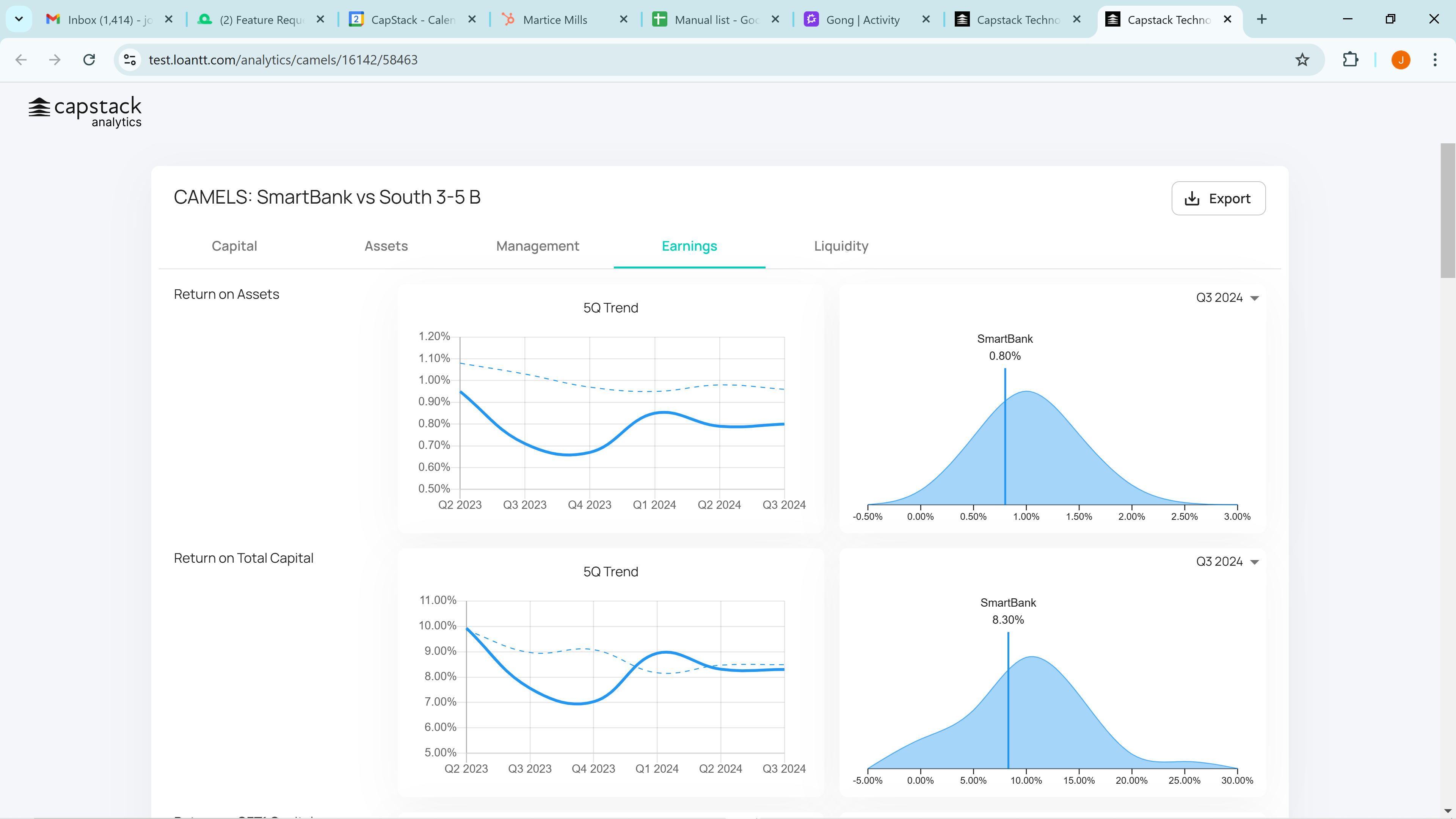
Next, we cover Earnings, which will display Return on Assets, Return on Total Capital, Return on CET1 Capital, Total Asset Yield, Loan and Leases Yield, Securities Yield, Net Interest Margin, Net Interest Income, Tax Ratio, and Payout Ratio.
Return to the top and click on Liquidity. You'll see Loan to Assets, Loan to Deposit Ratio, Liquid Assets as a Percent, Wholesale Funding, Broker Deposits, Core Deposits, Non-Interest Bearing Deposits, Funding Cost, and Interest Bearing Deposit Cost.
And that's how you create a custom peer analysis. If we go back, you can continue to scroll down and see that there are several charts below that display the averages.

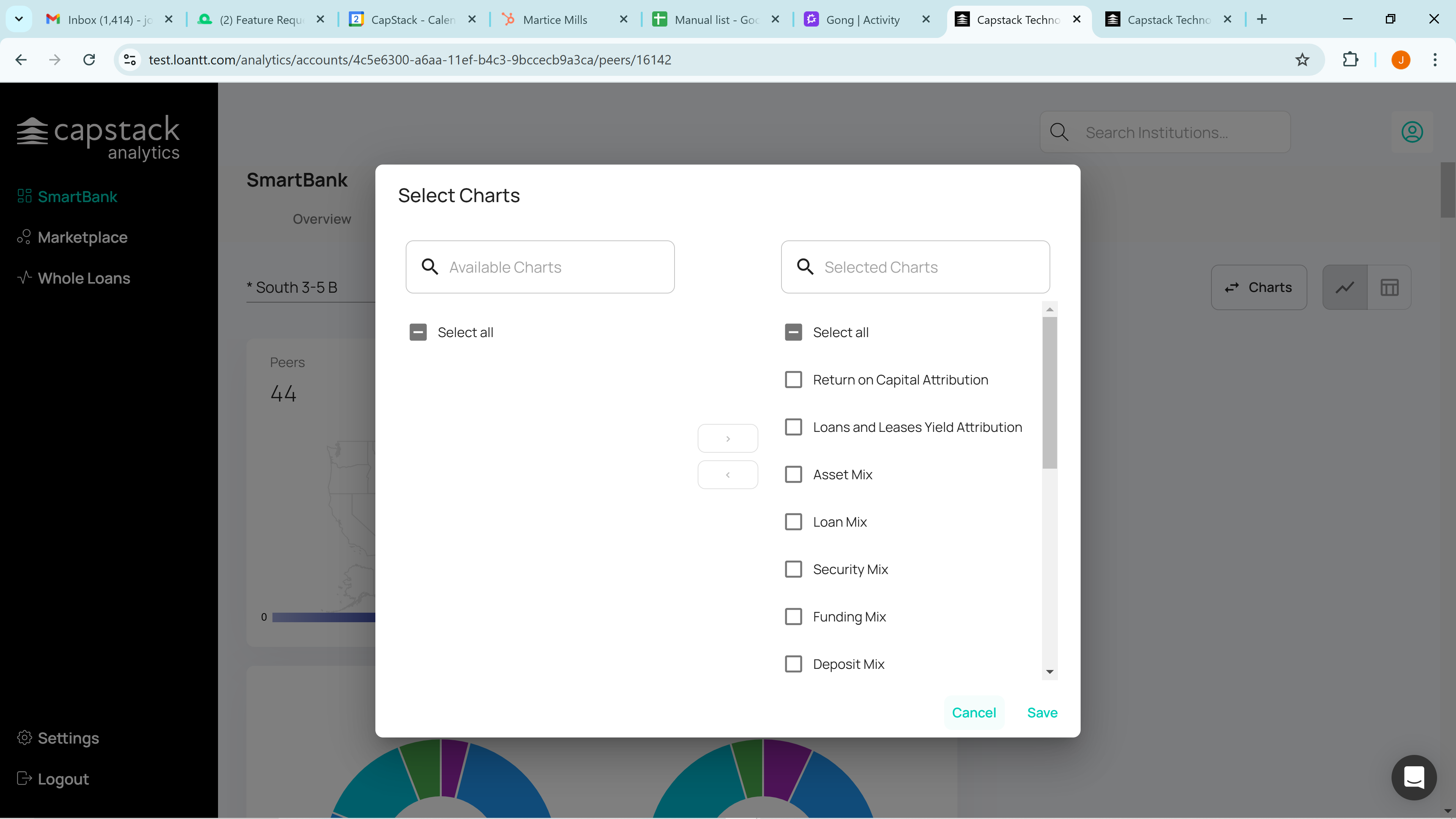
You can select which charts to display in the very top right corner by clicking on the charts and choosing which charts to show or hide.
Last, if you scroll to the very bottom, you'll find all the data for all the banks in this peer group.

You can select the columns you'd like to display and even download the data to a CSV file. Please call or email with any questions. Thank you.