PART TWO: Website Preview Video On After Effects
Learn how to efficiently edit, arrange, and transform images in your project using layers, fit to comp width, and scene management. Follow this step-by-step guide for optimizing your workflow and achieving professional results.
In this guide, we'll learn how to update and arrange images within different scenes of a composition. The steps will cover deleting old images, adding new ones, adjusting their size to fit the composition width, and positioning them for the best visual result. This process helps you control what part of each page or image is shown in your final project.
Let's get started
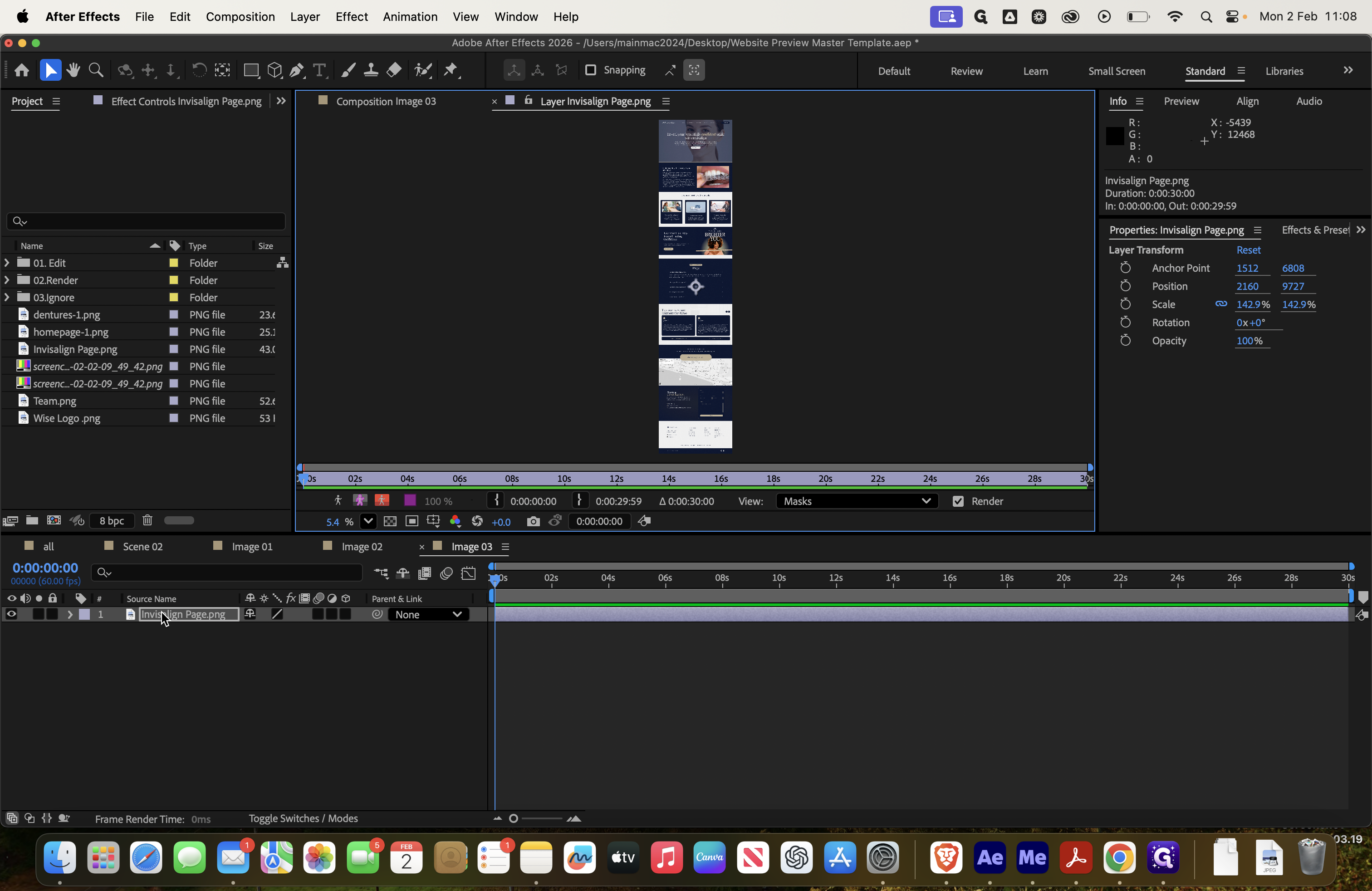
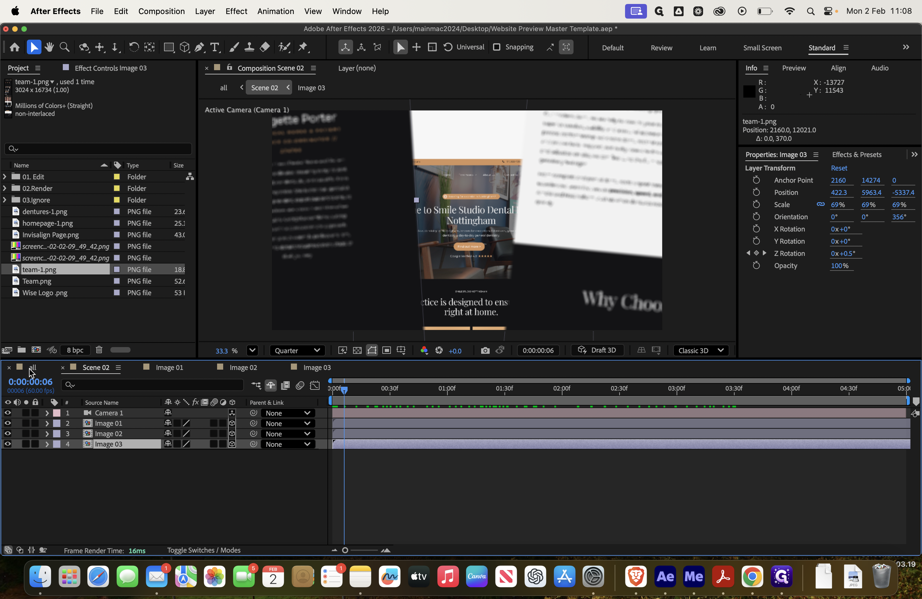
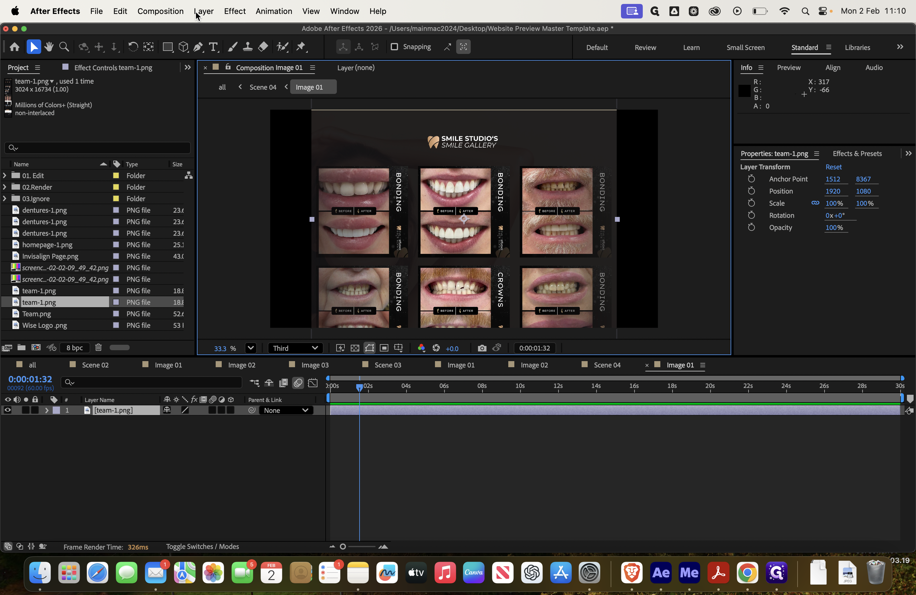
All right, it cut off for some reason. I hope it can resume. We’ve moved to image three. Delete it and add the team page instead.
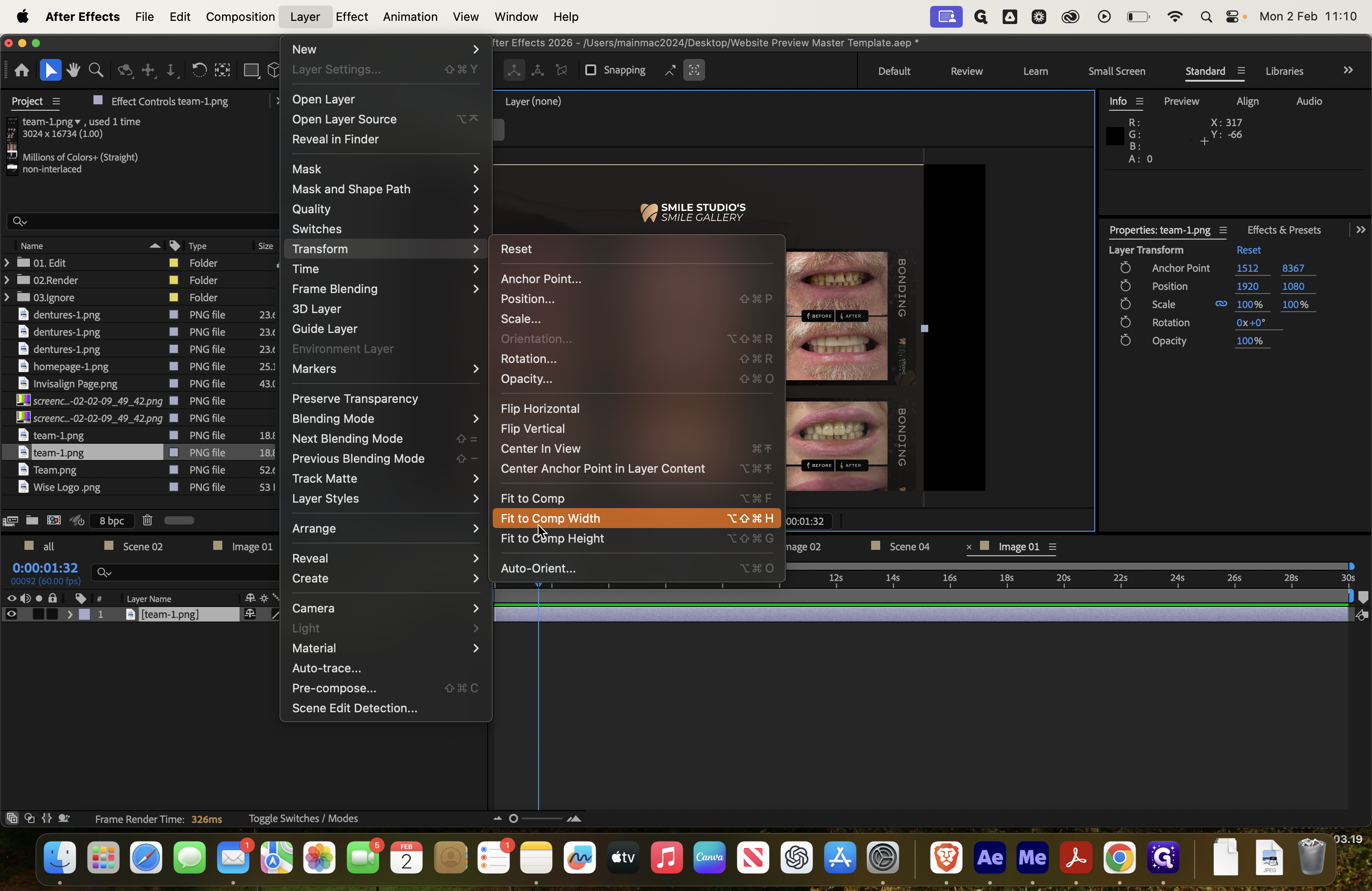
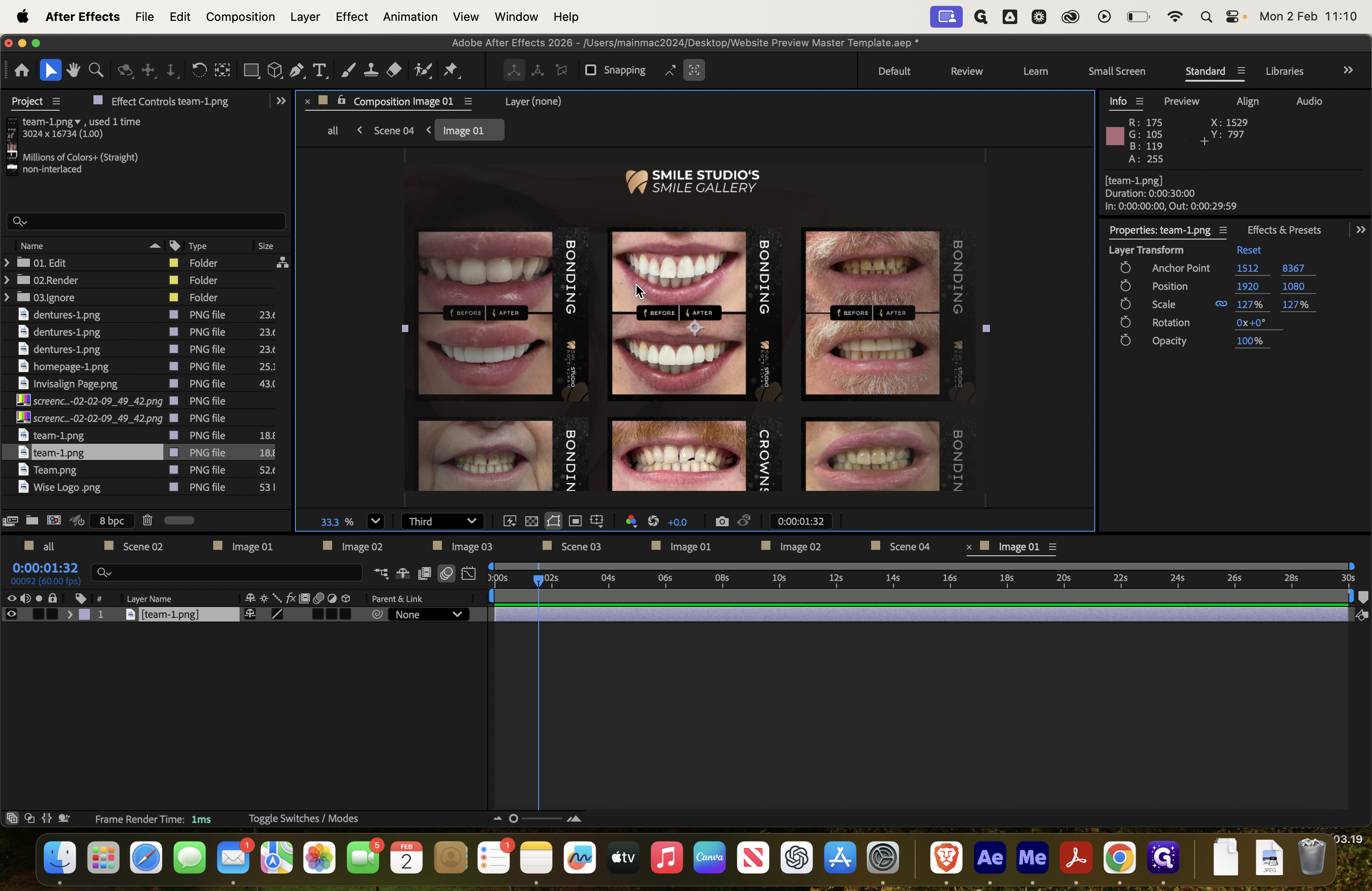
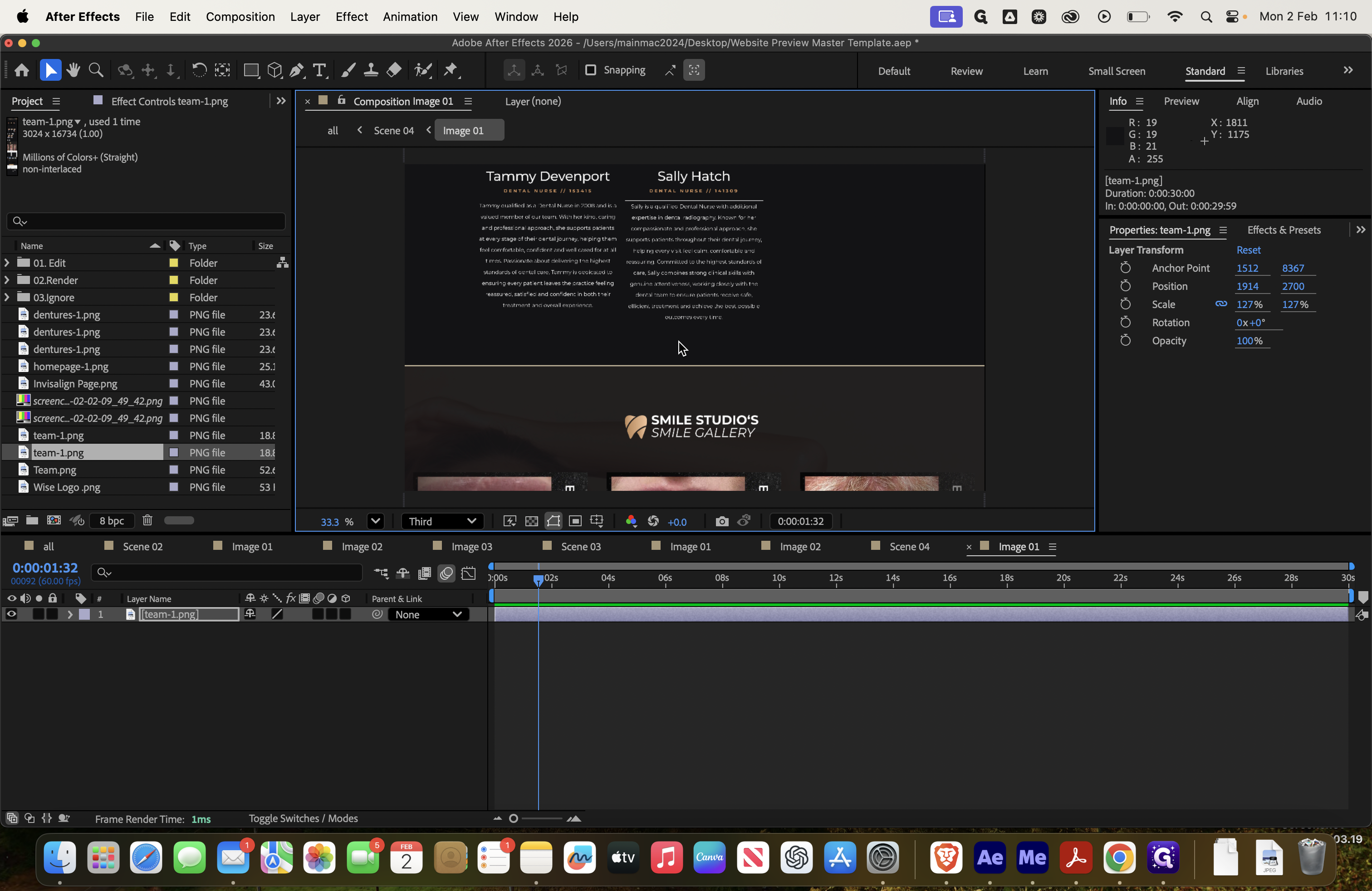
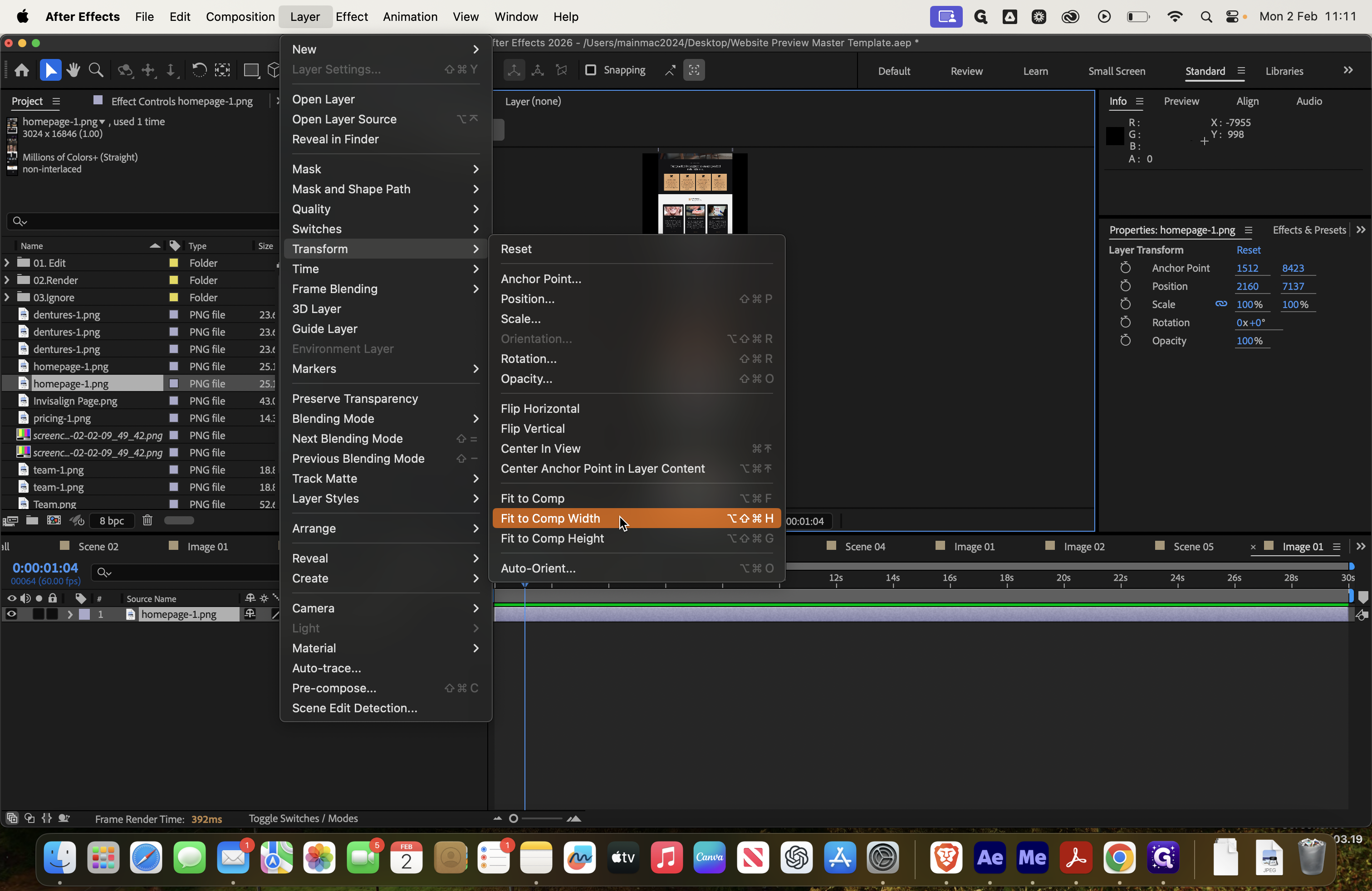
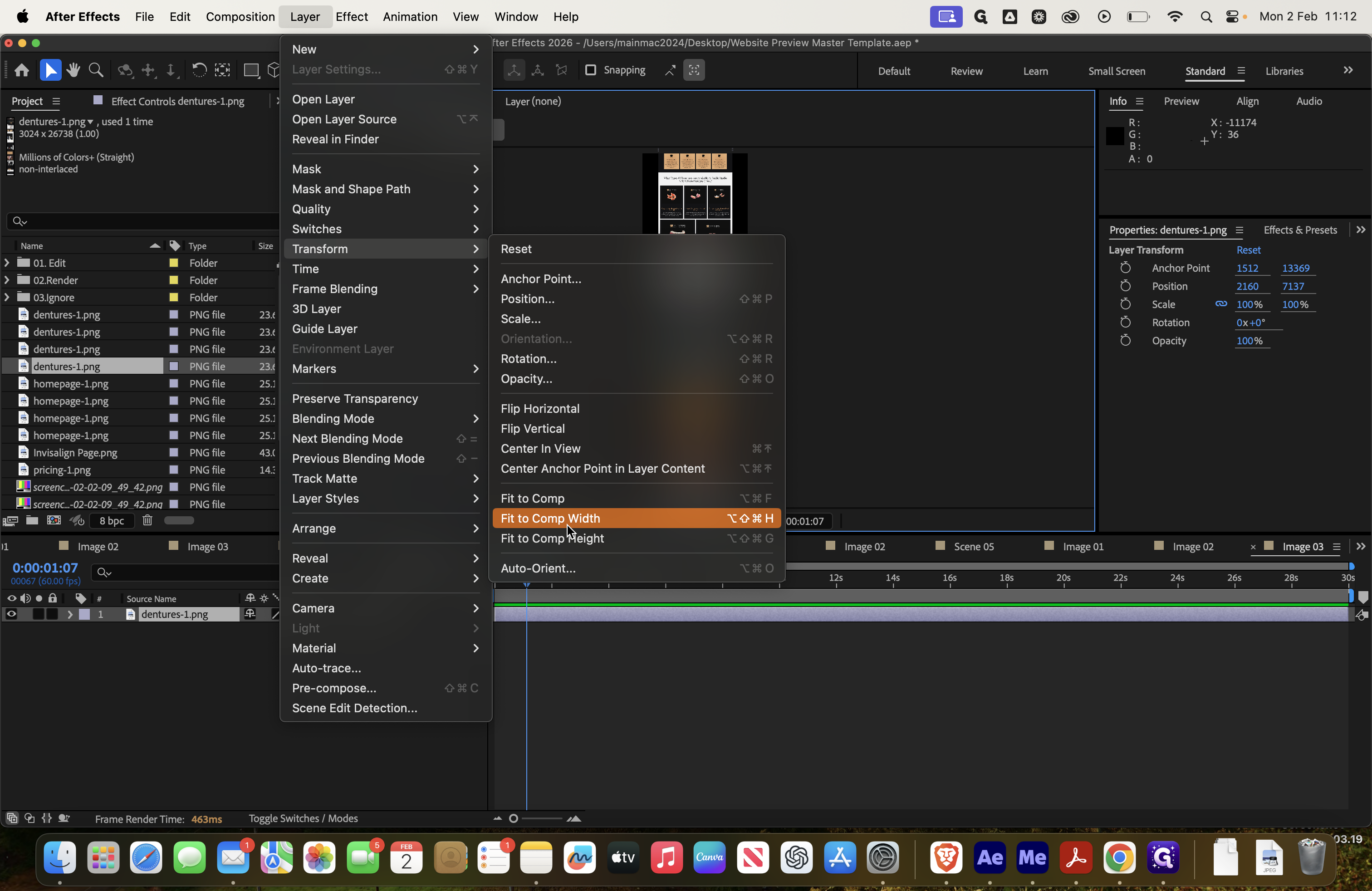
Then, go to Layer, Transform, Fit to Comp Width. Drag it up slightly.
Make sure it is centered and has no borders on either side.
I'm doing this quickly, so you may want to zoom in and check more closely. Then, in scene two, you can see it there.

When we return to the final composition, we can reduce the quality to one-third. This helps it load faster.


We can now see in the final composition that everything is complete.
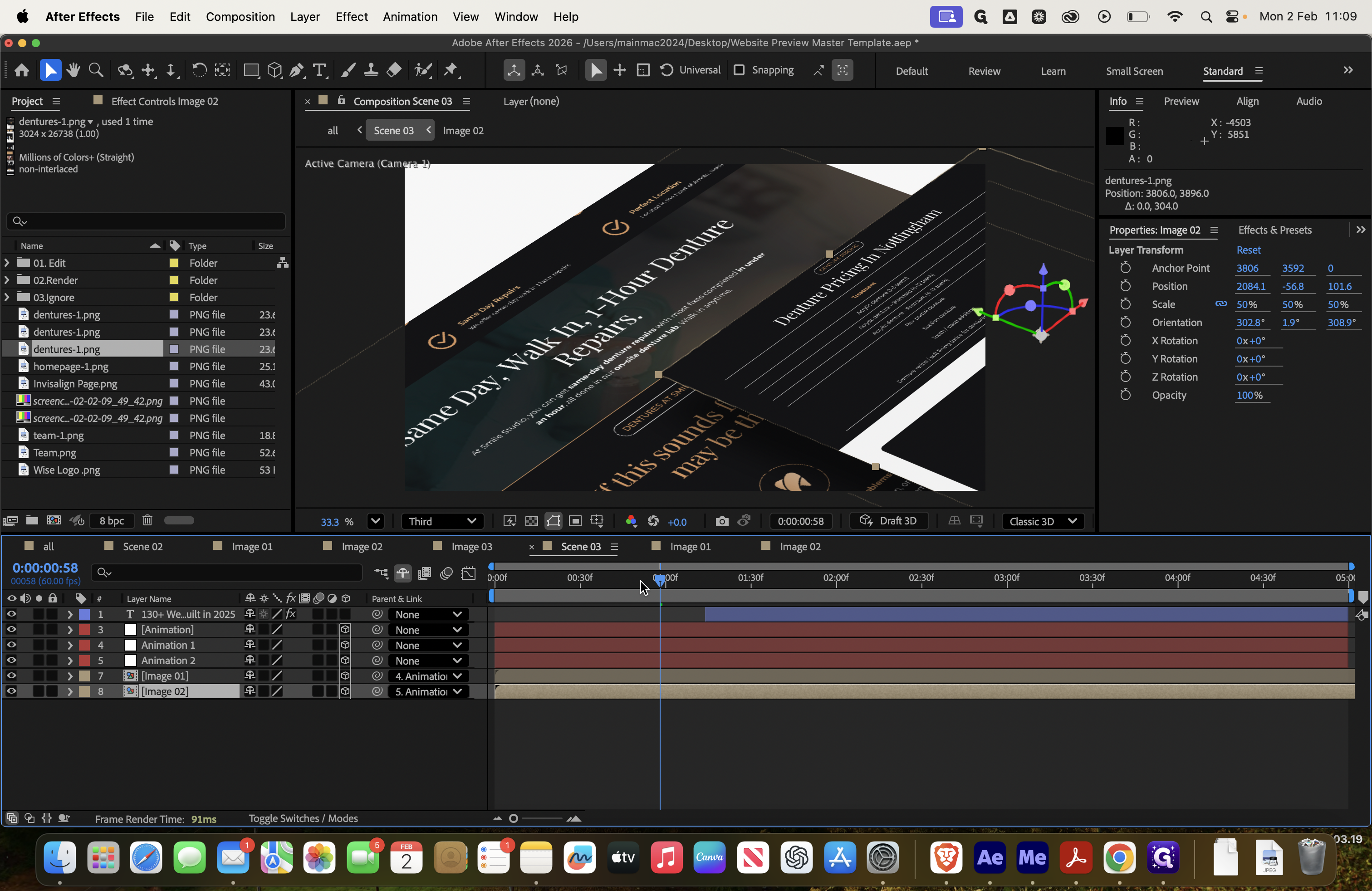
Next, we move to scene three, which requires two images.
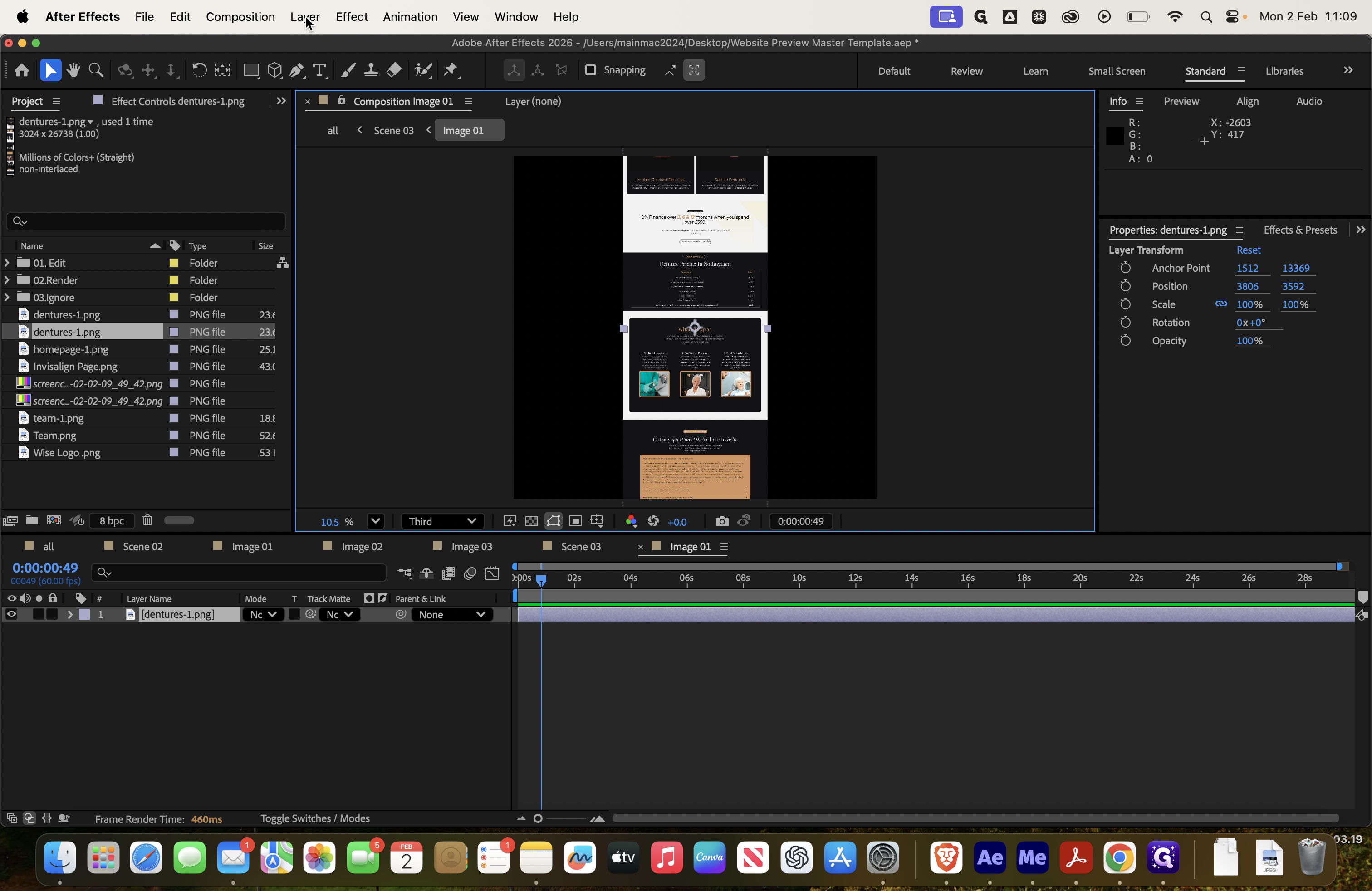
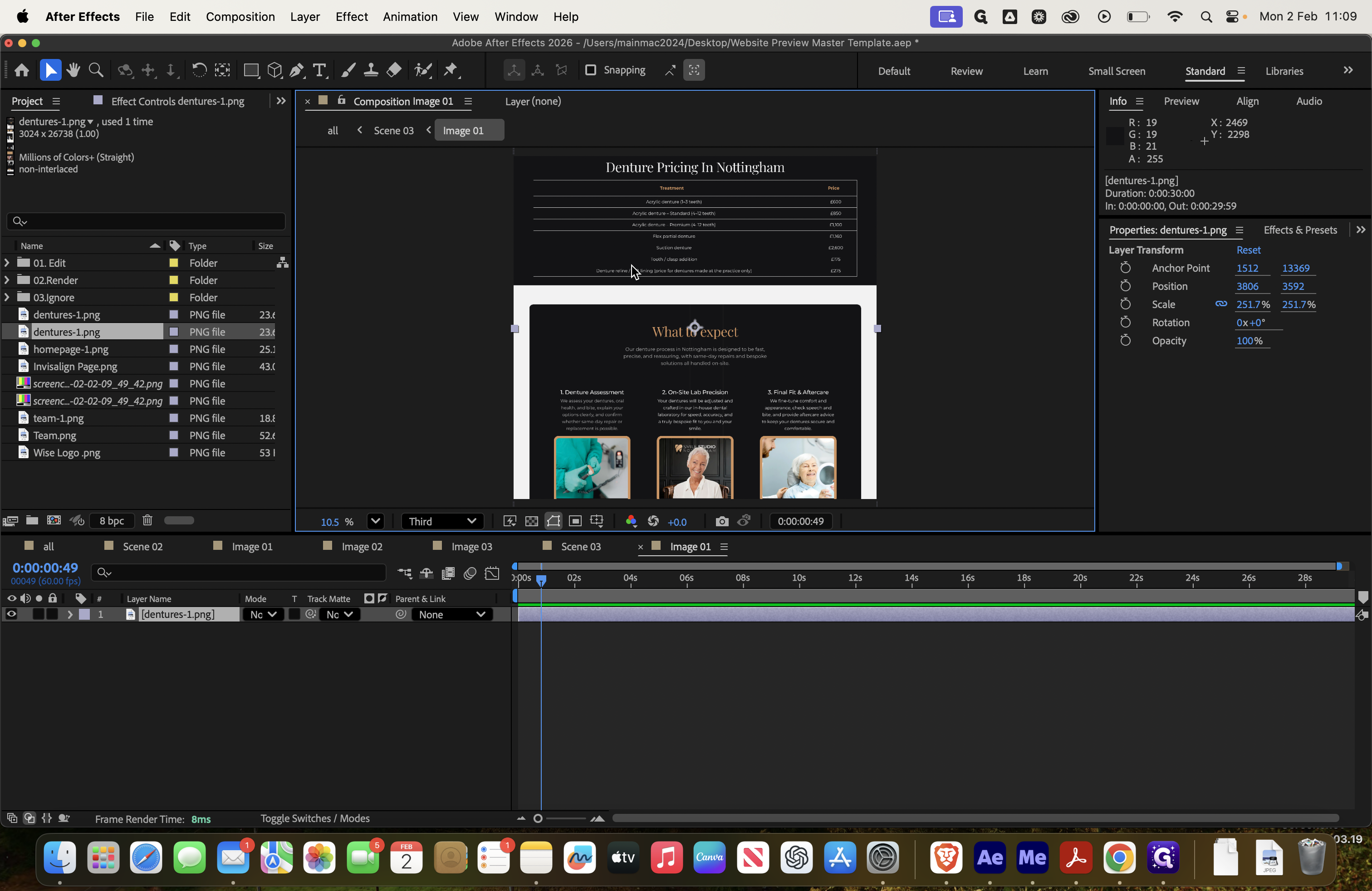
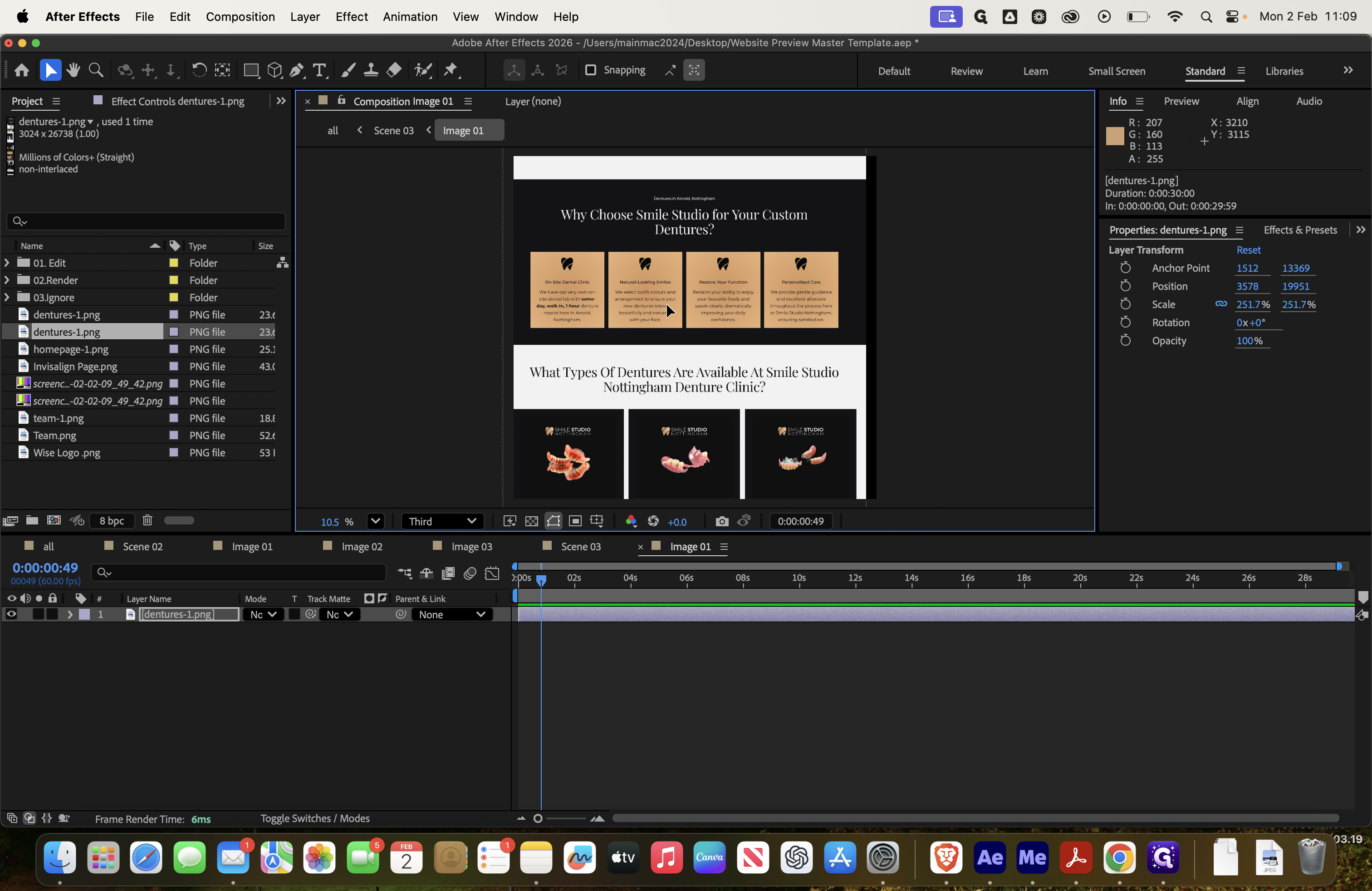
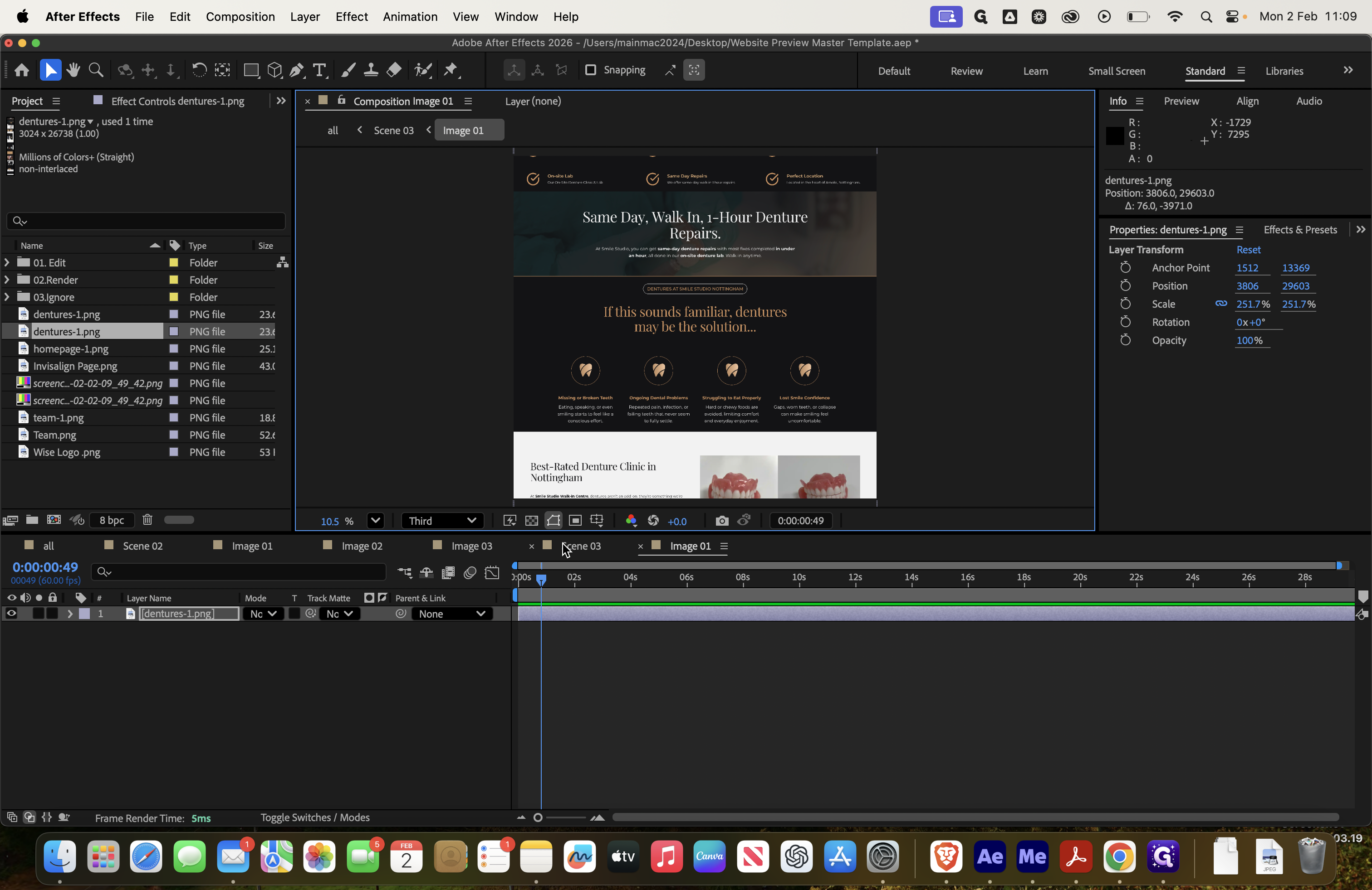
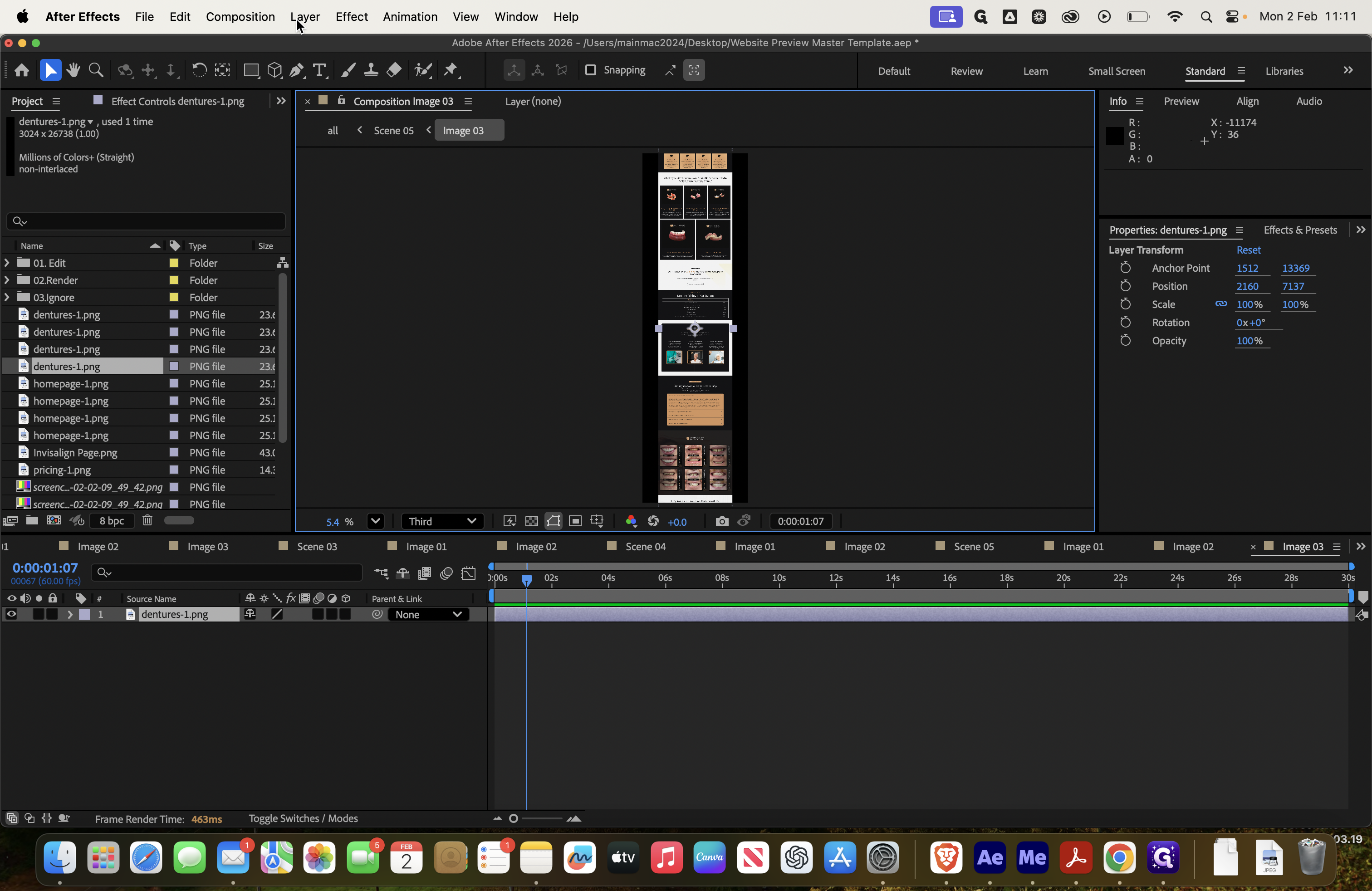
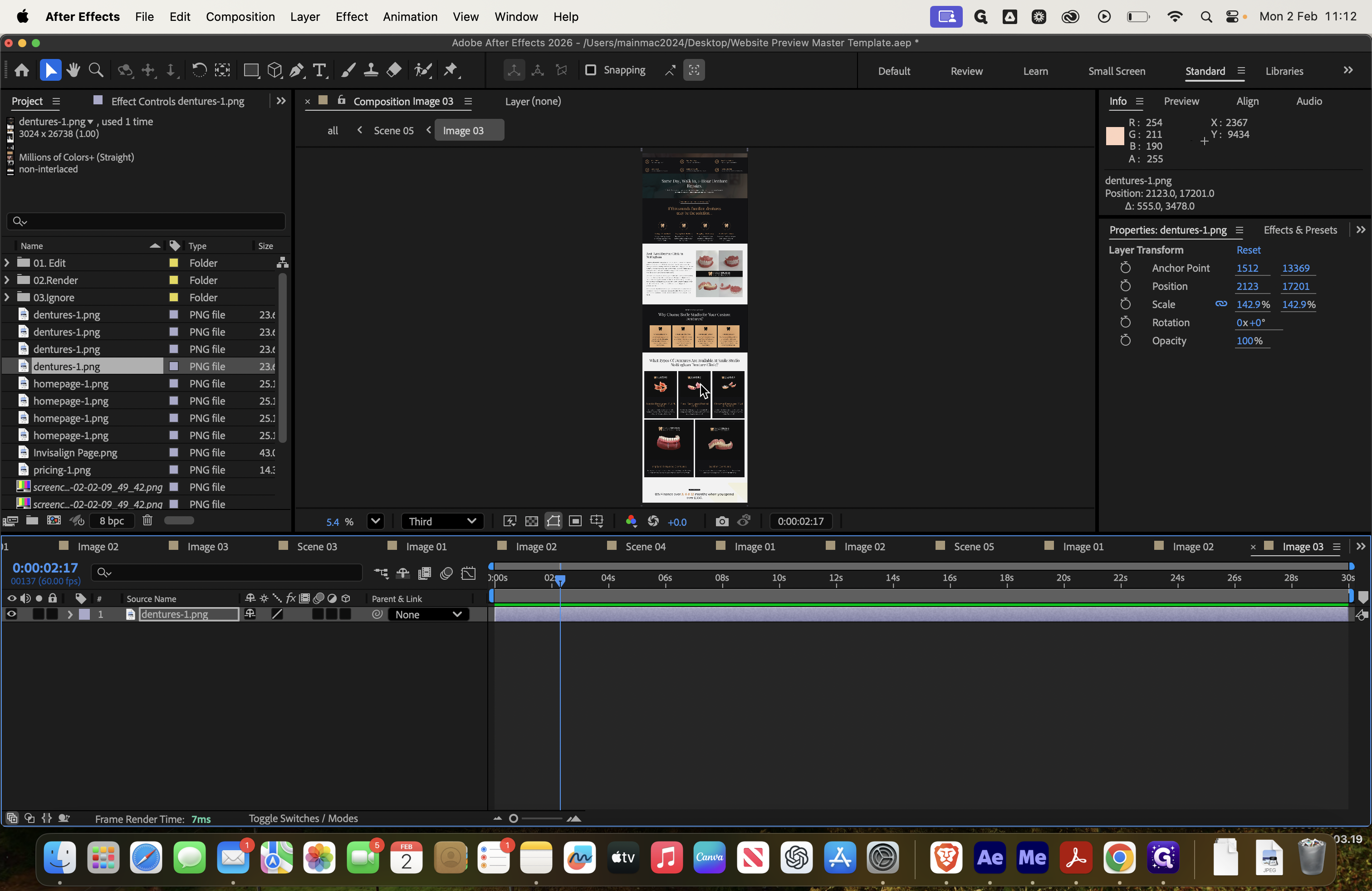
Here, we remove that and add the dentures page.
![Step #22: Double-click on "Image Q1 ]"](https://di8mn0rali2ic.cloudfront.net/uploads/1db3b62b-7f5e-4278-9553-53059233662a/d6297ca0-086d-4d93-ac03-48aa69fe2d95.png)
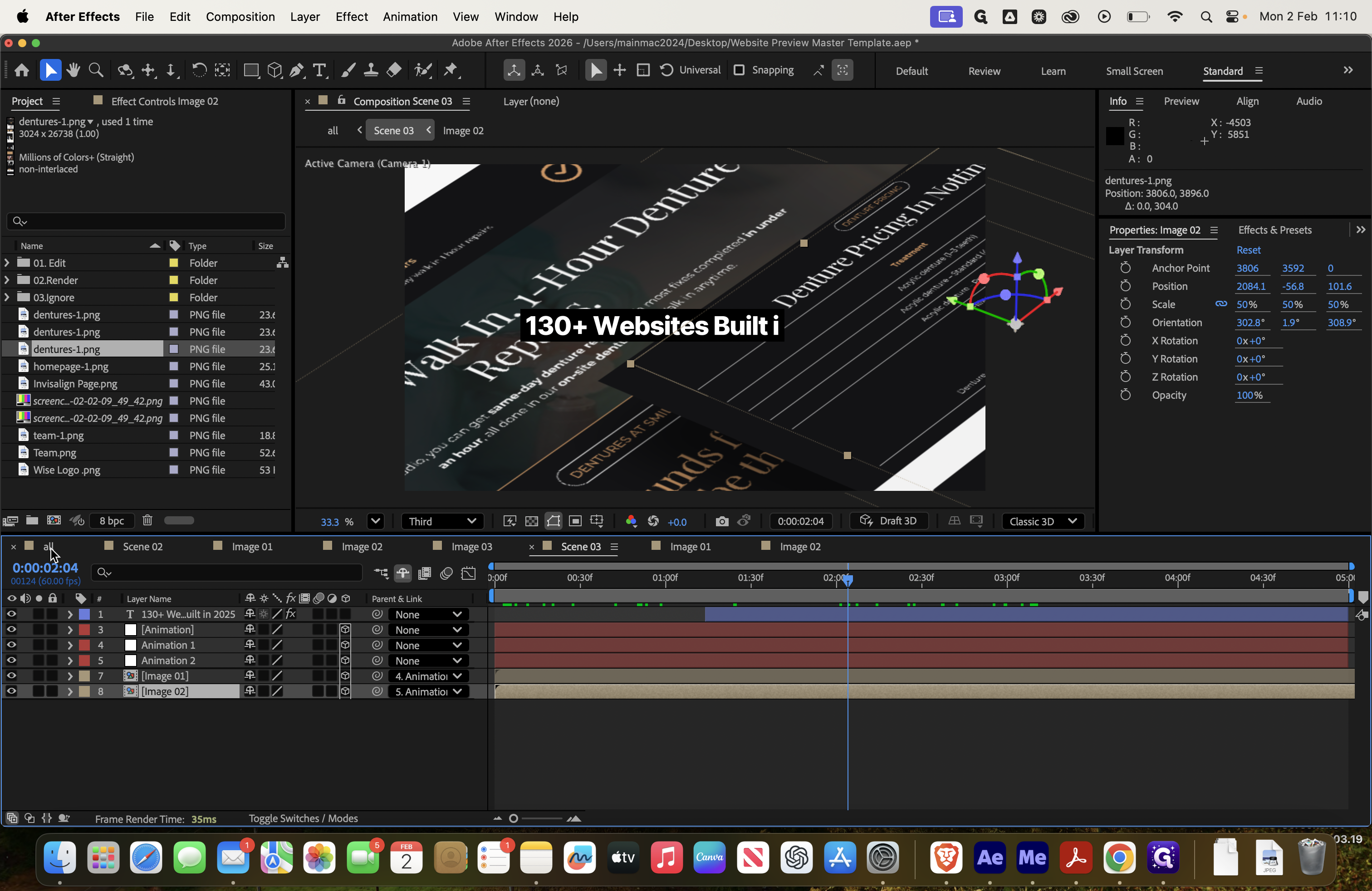
Again, go to Layer, then Transform, and select Fit to Comp Width. You can choose which part of the page to display. For example, if you no longer want to show the top section, you can select a different area that looks more interesting.
Instead of displaying it at the very top, you can drag it down and place it elsewhere, for example, here. You can always preview it in scene three.
Delete the second image, then drag in the new one.
![Step #38: Double-click on "Image 01 ]"](https://di8mn0rali2ic.cloudfront.net/uploads/1db3b62b-7f5e-4278-9553-53059233662a/472b6a22-53df-494e-b5a4-3b35dcf4be15.png)

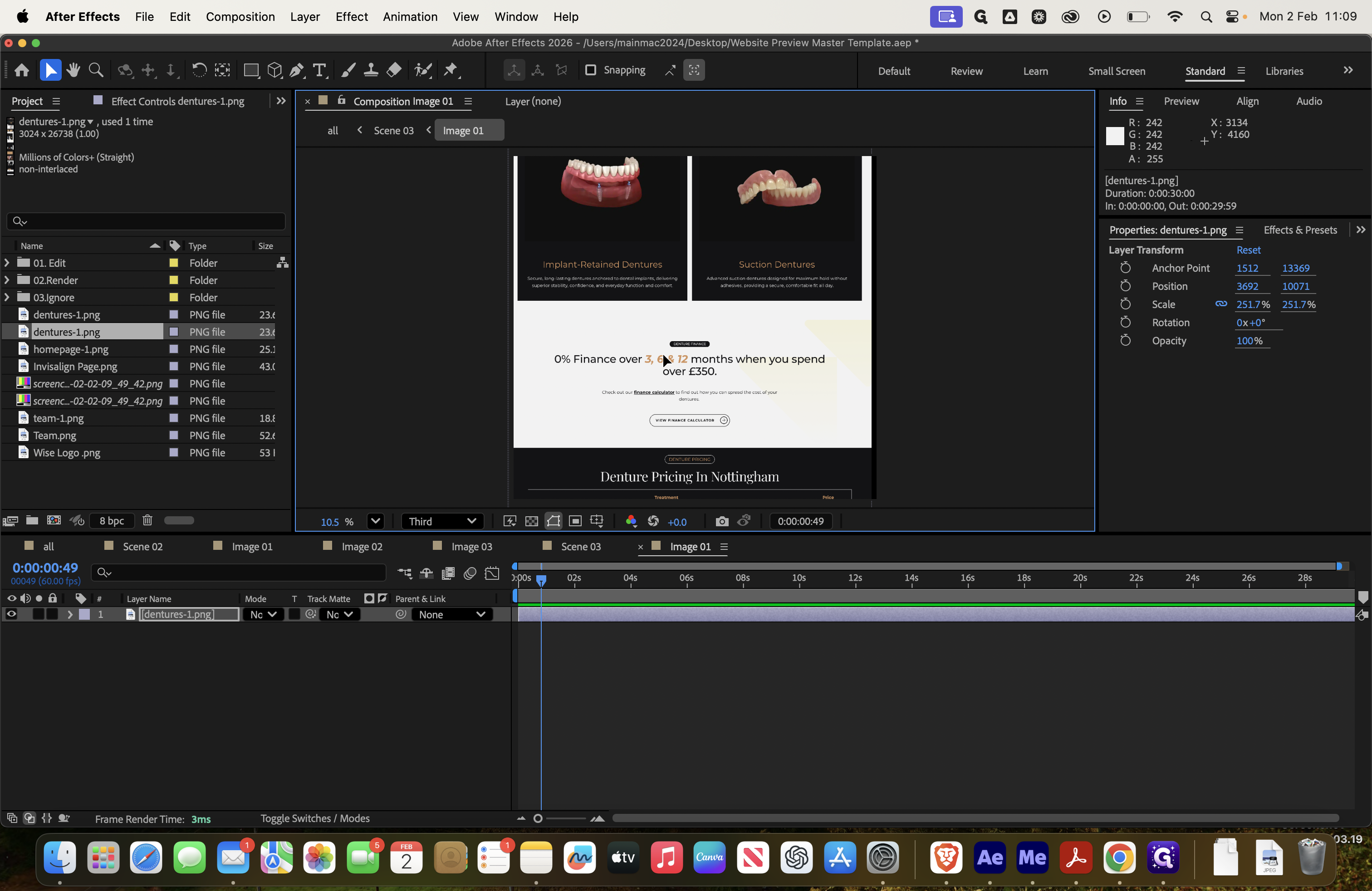
Let's create another dentures page.
Layer, this is a nice page. Fit to comp width, then show this section because it looks cool.
We move to scene three and see these two here.
Then go back, and you'll see more screens—this is scene four.

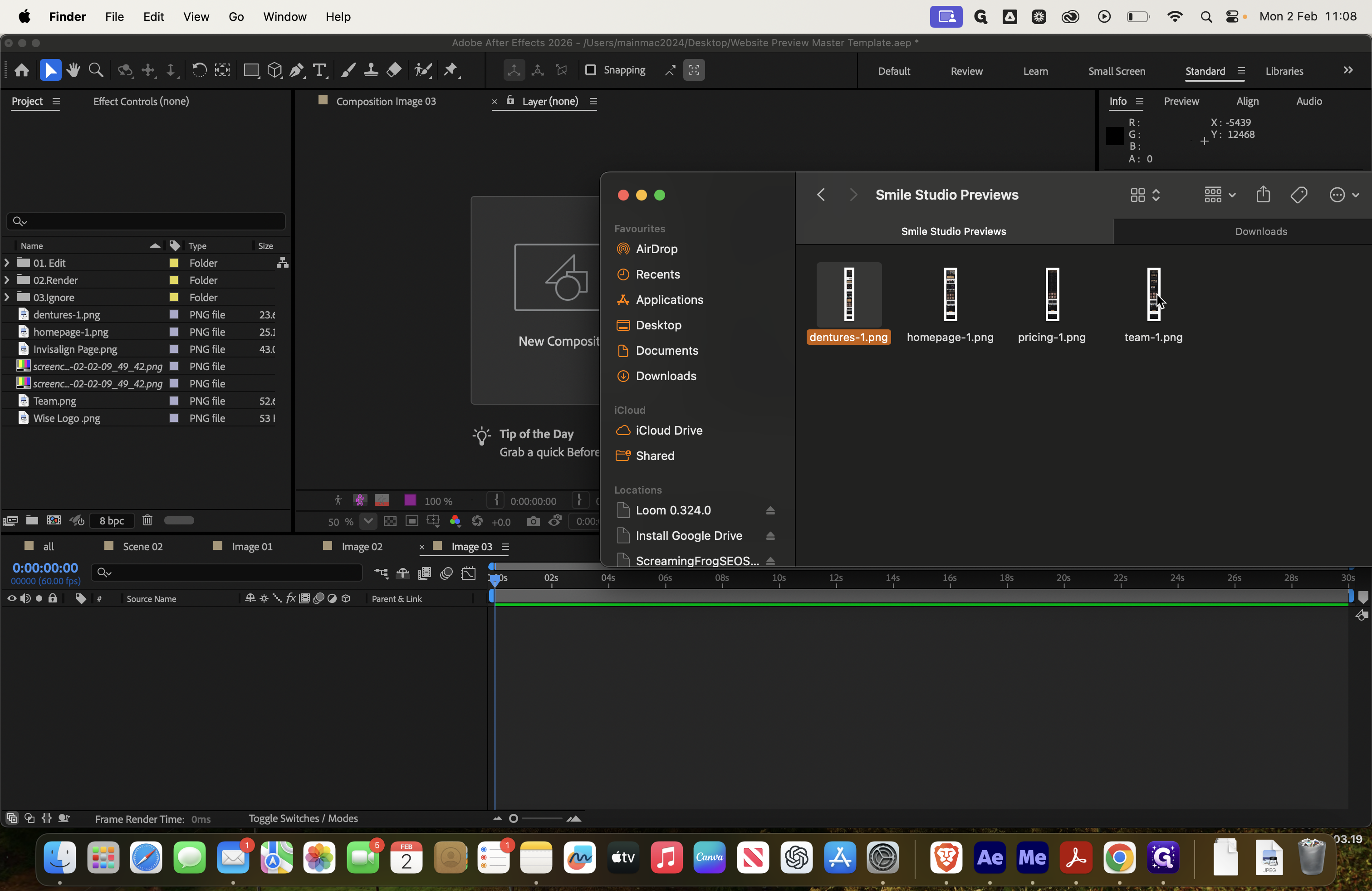
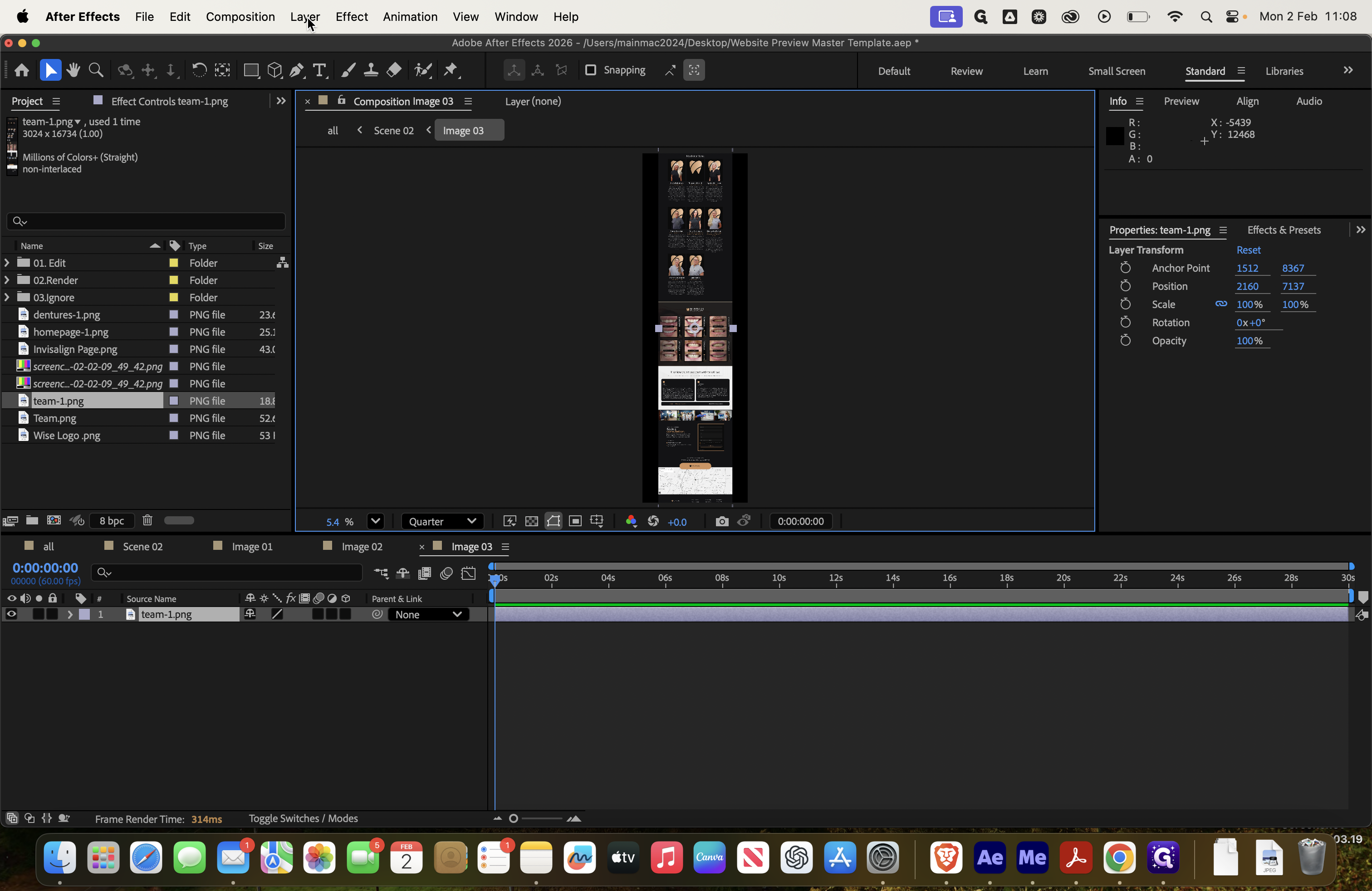
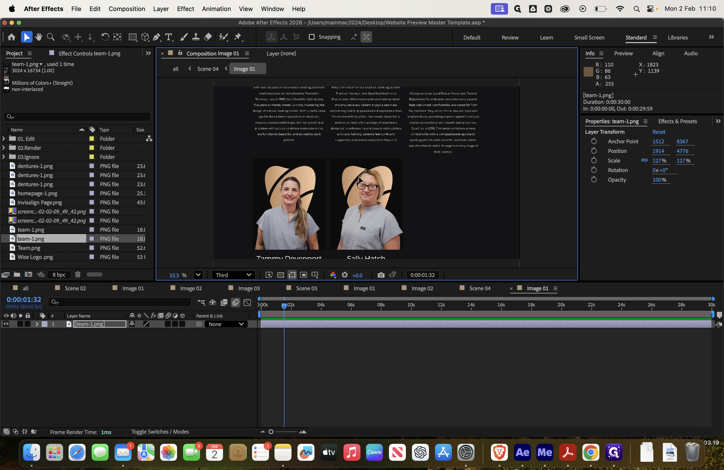
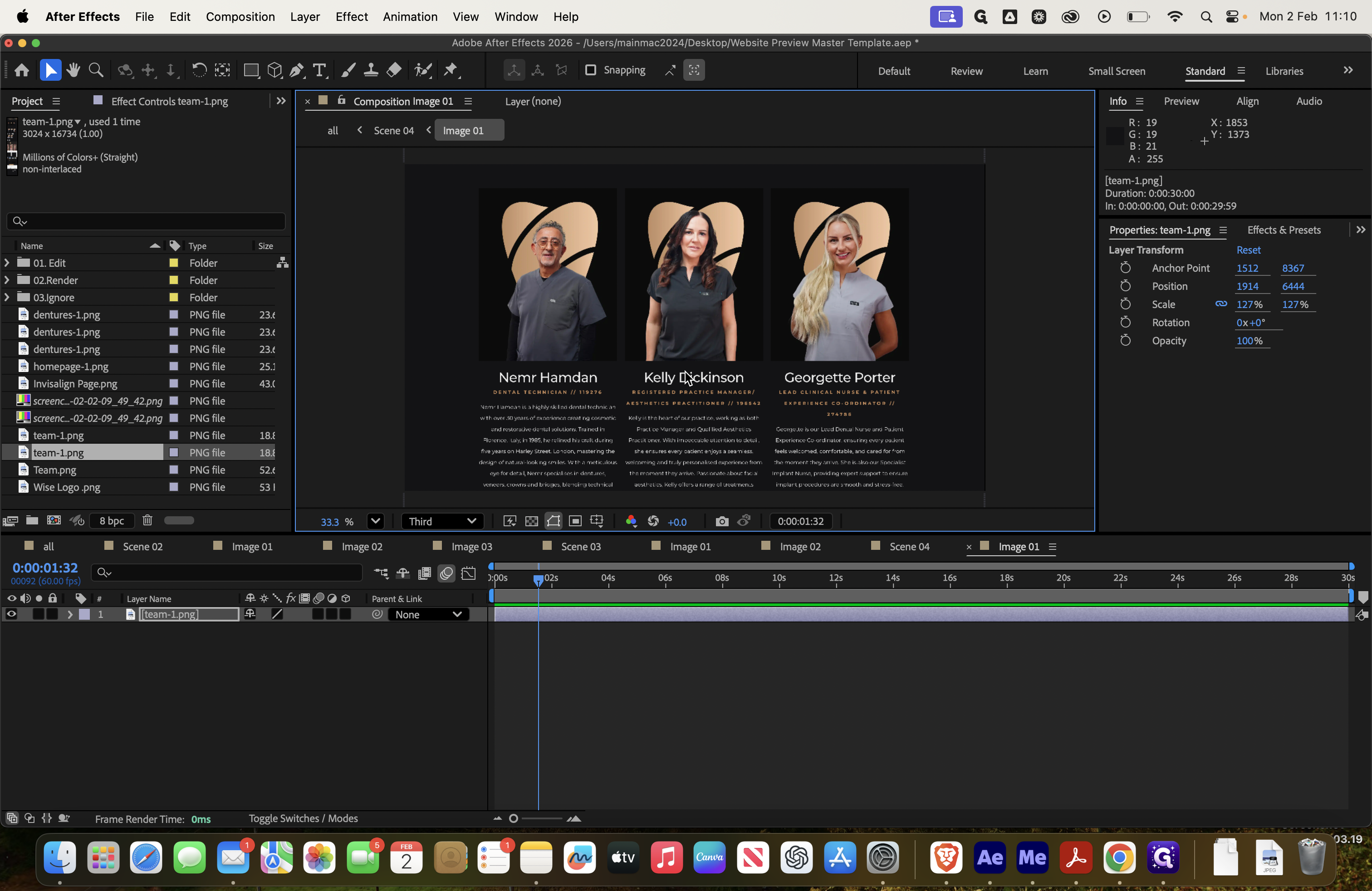
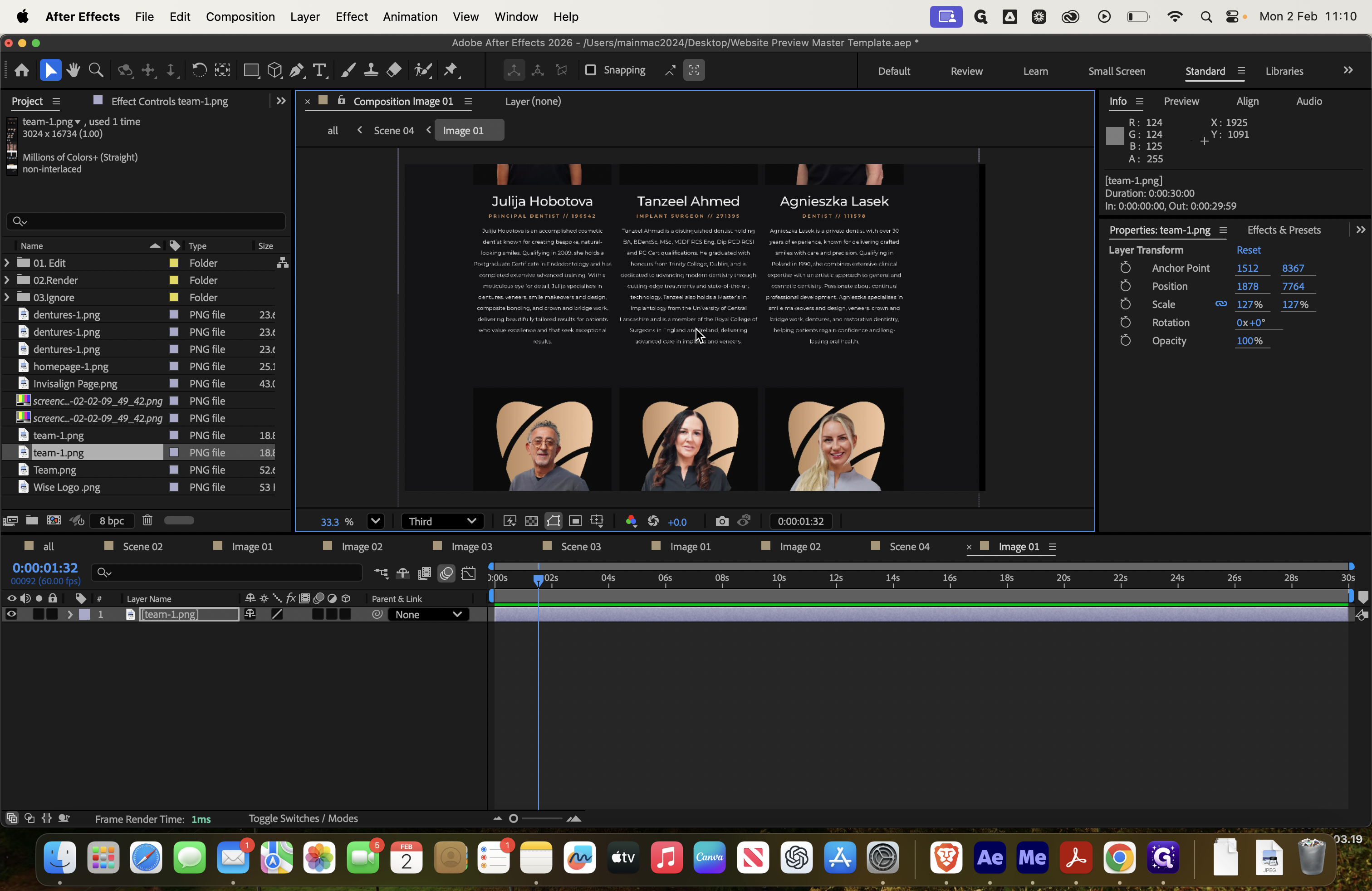
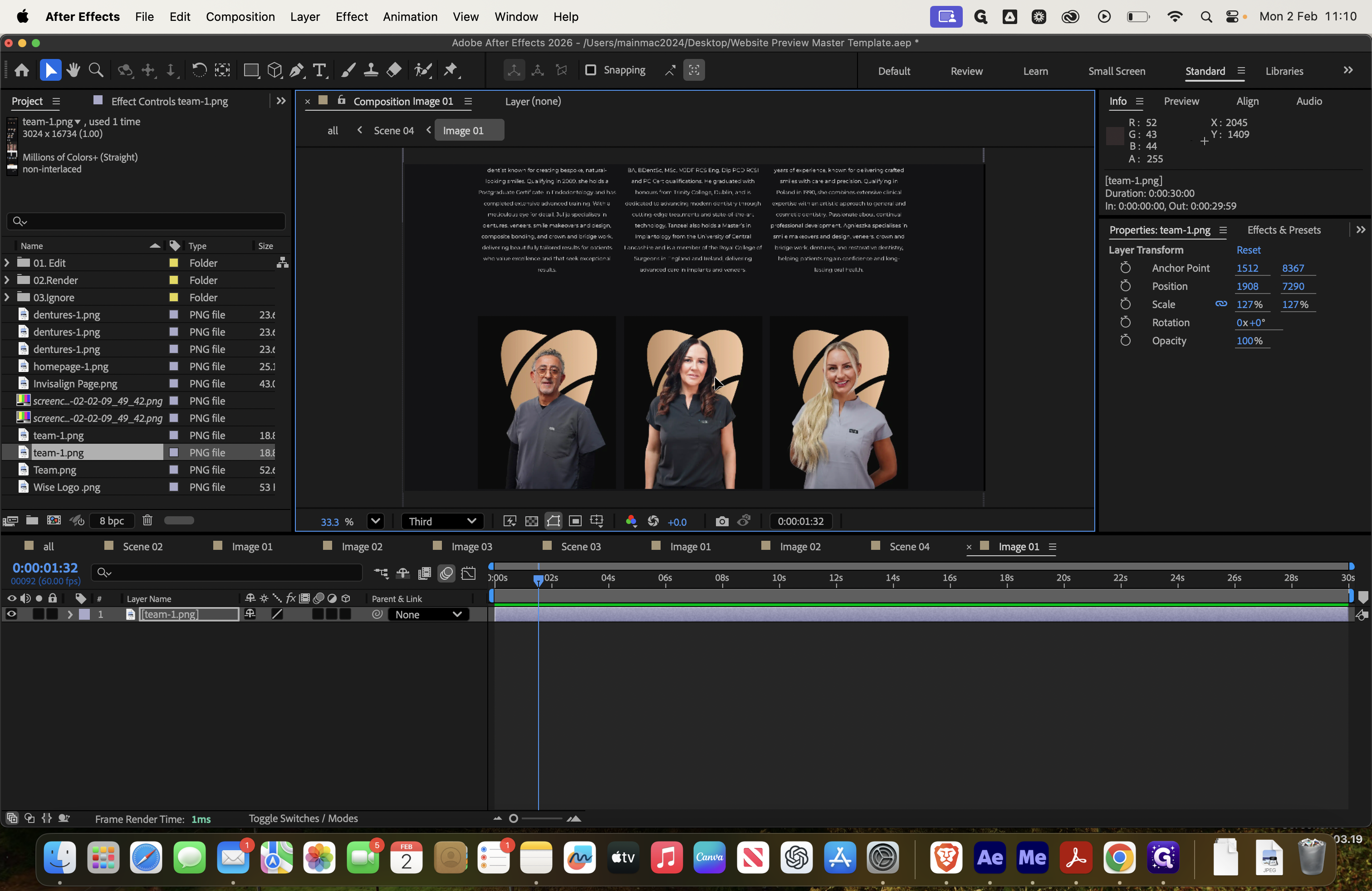
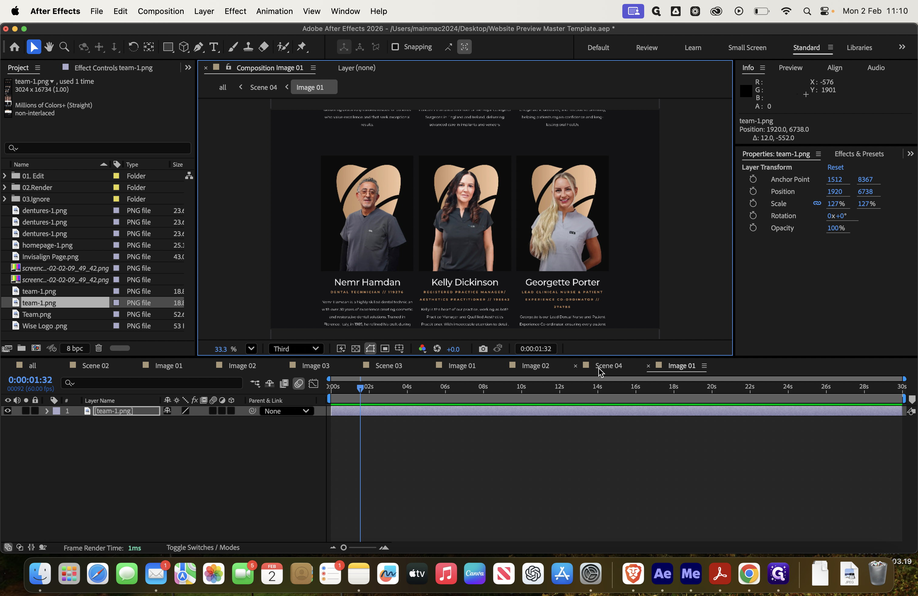
Click on image one and delete it. Then, select the team image this time.
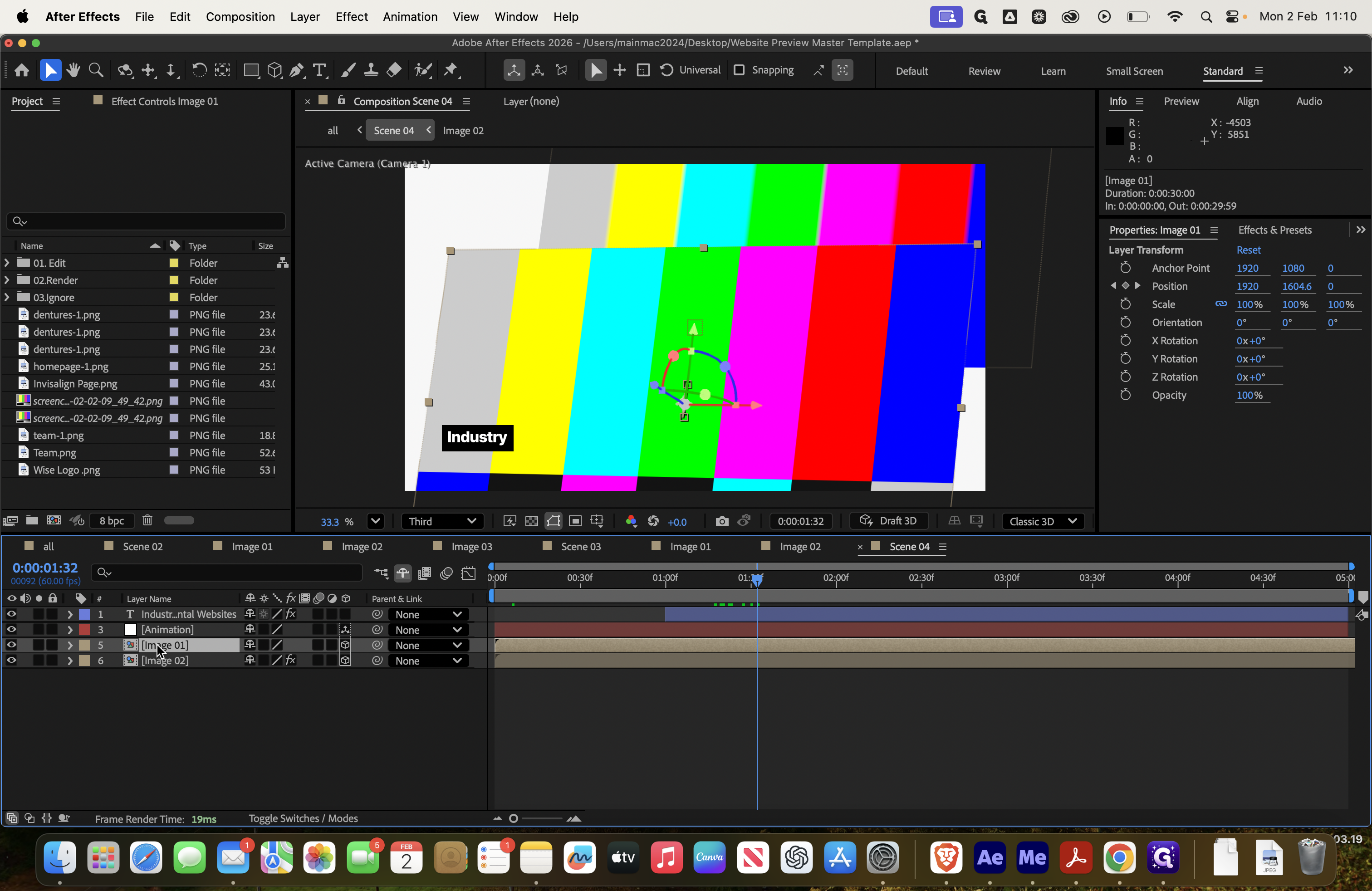
Again, select Transform, choose Fit to Comp Width, and move up to this point.
These three already have their images, so we'll do it here instead.
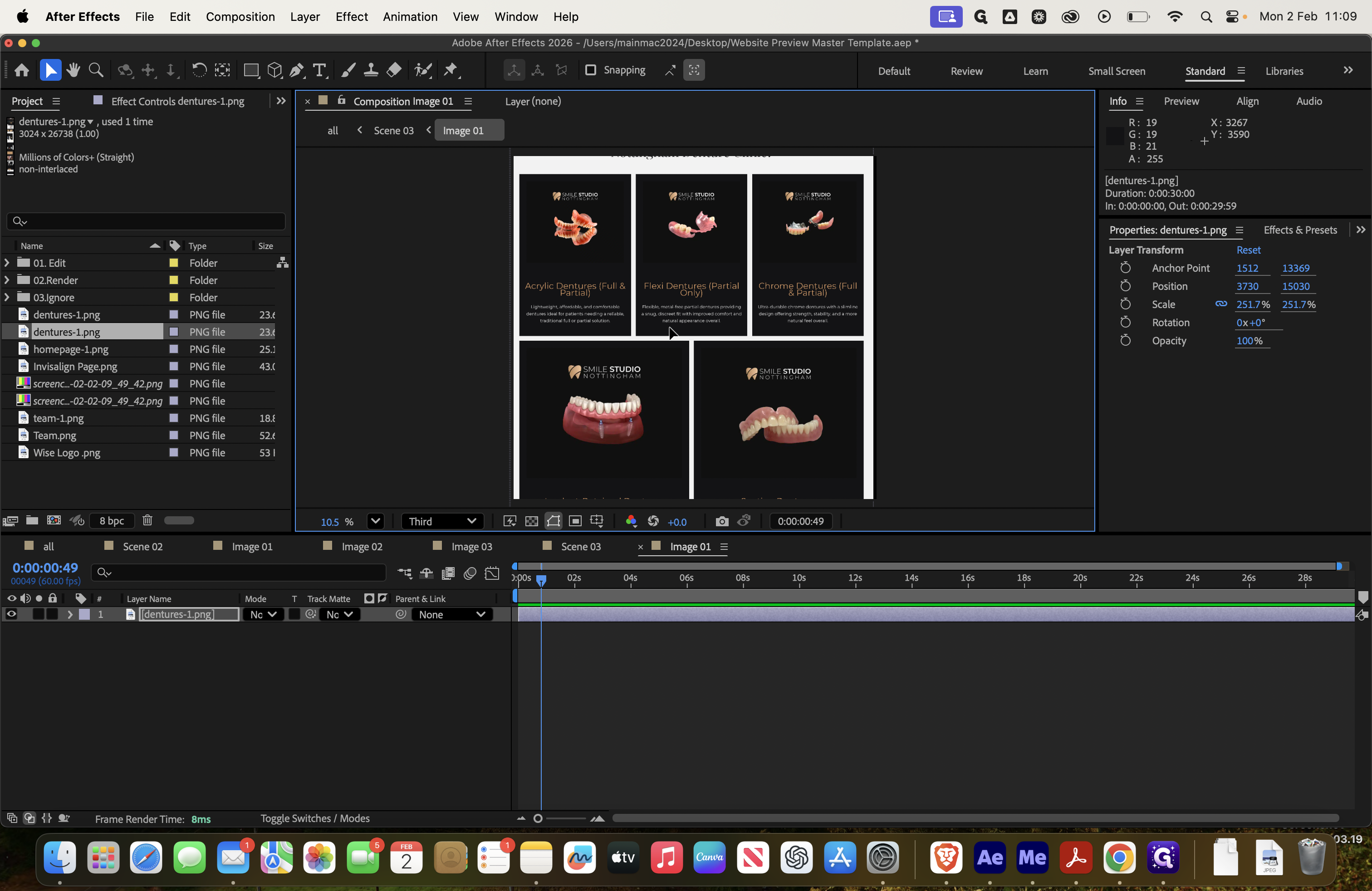
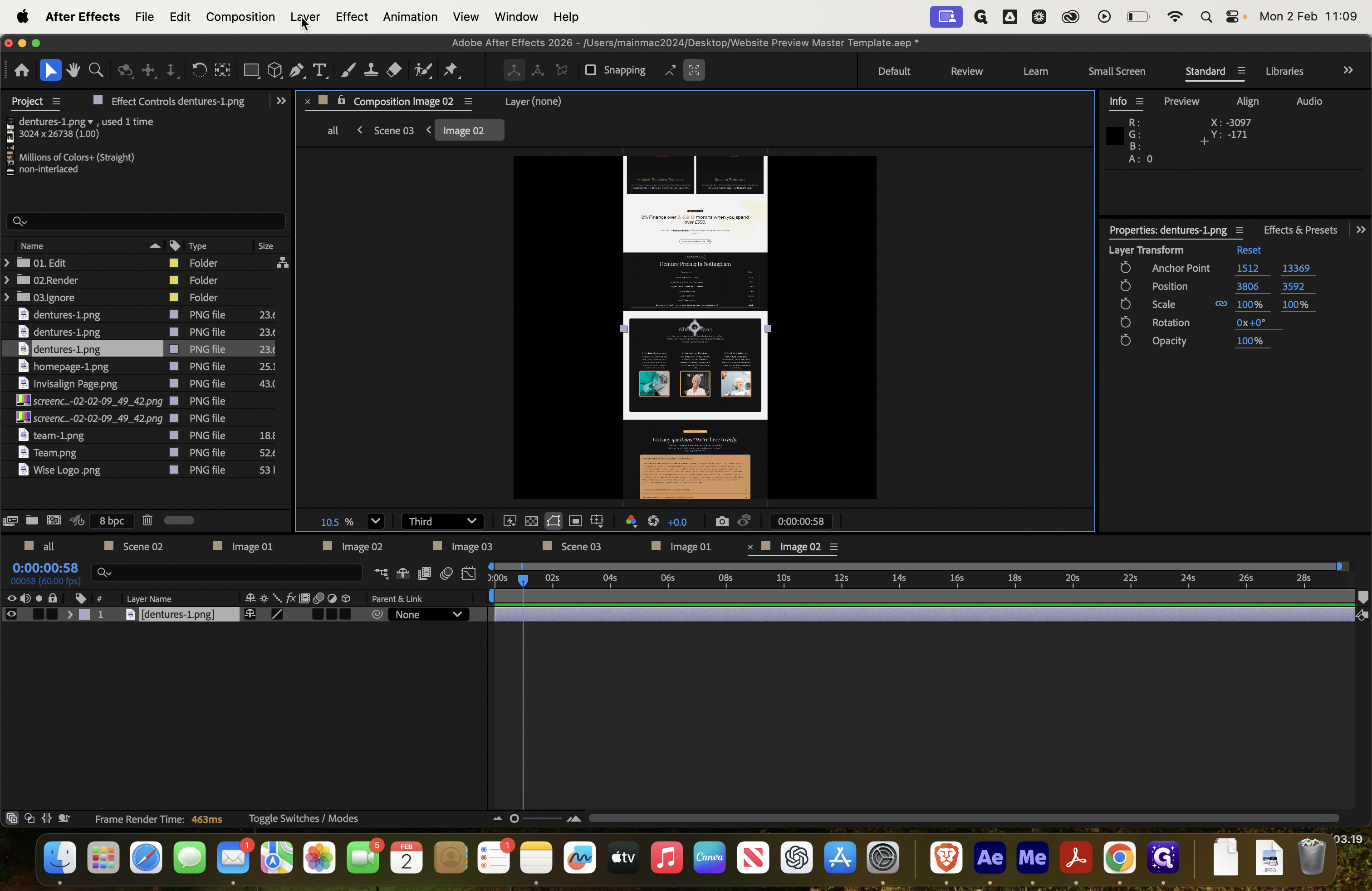
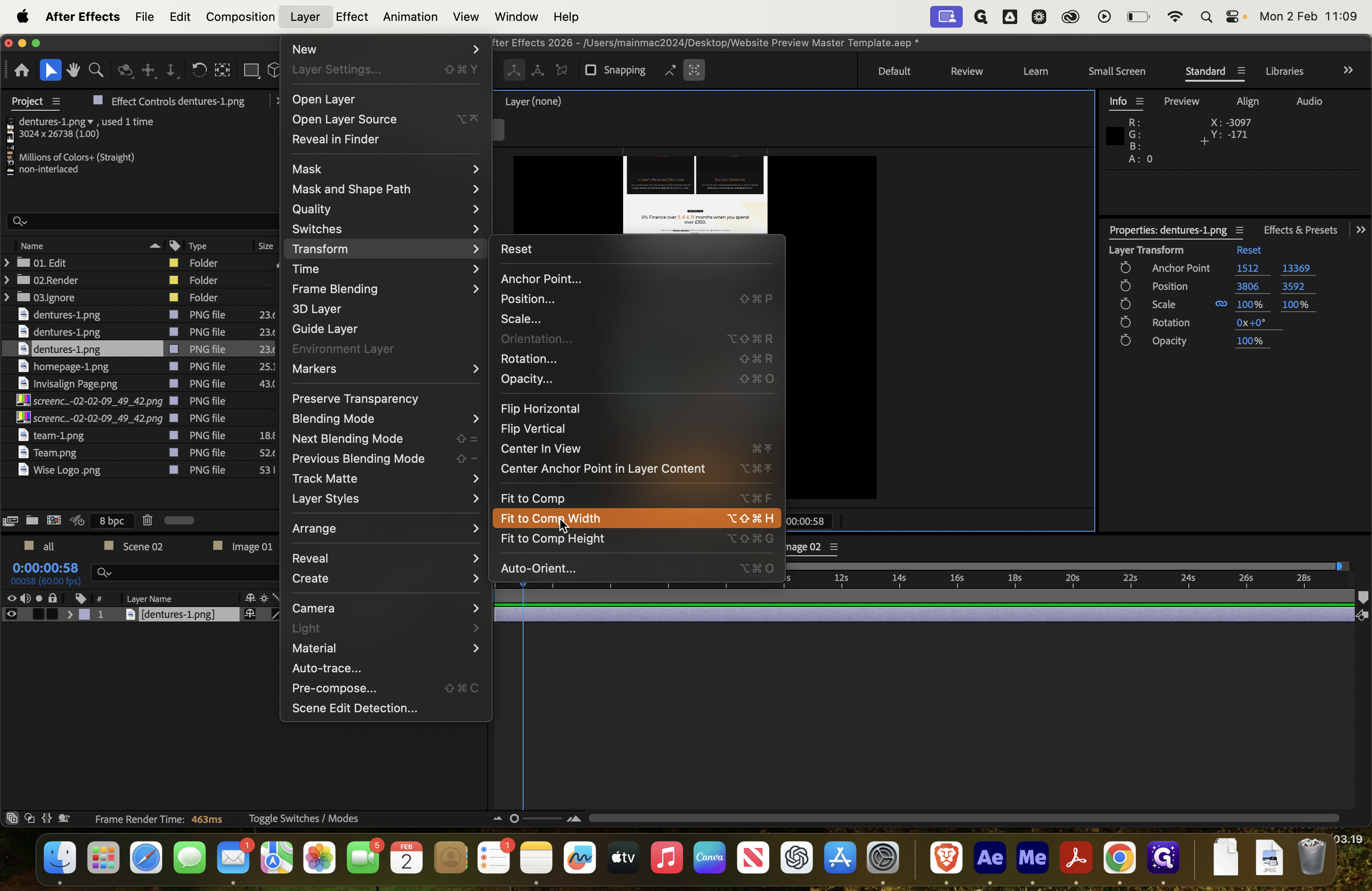
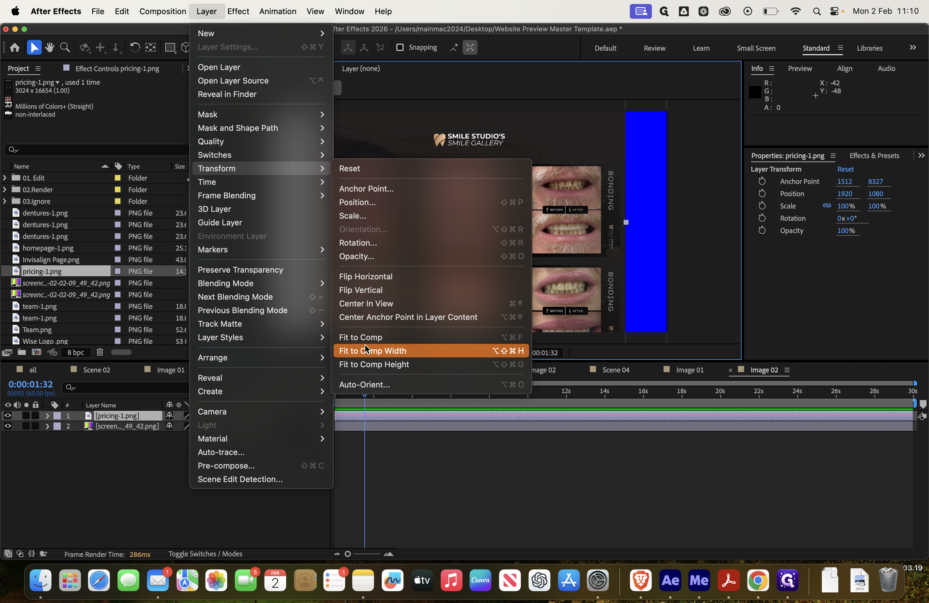
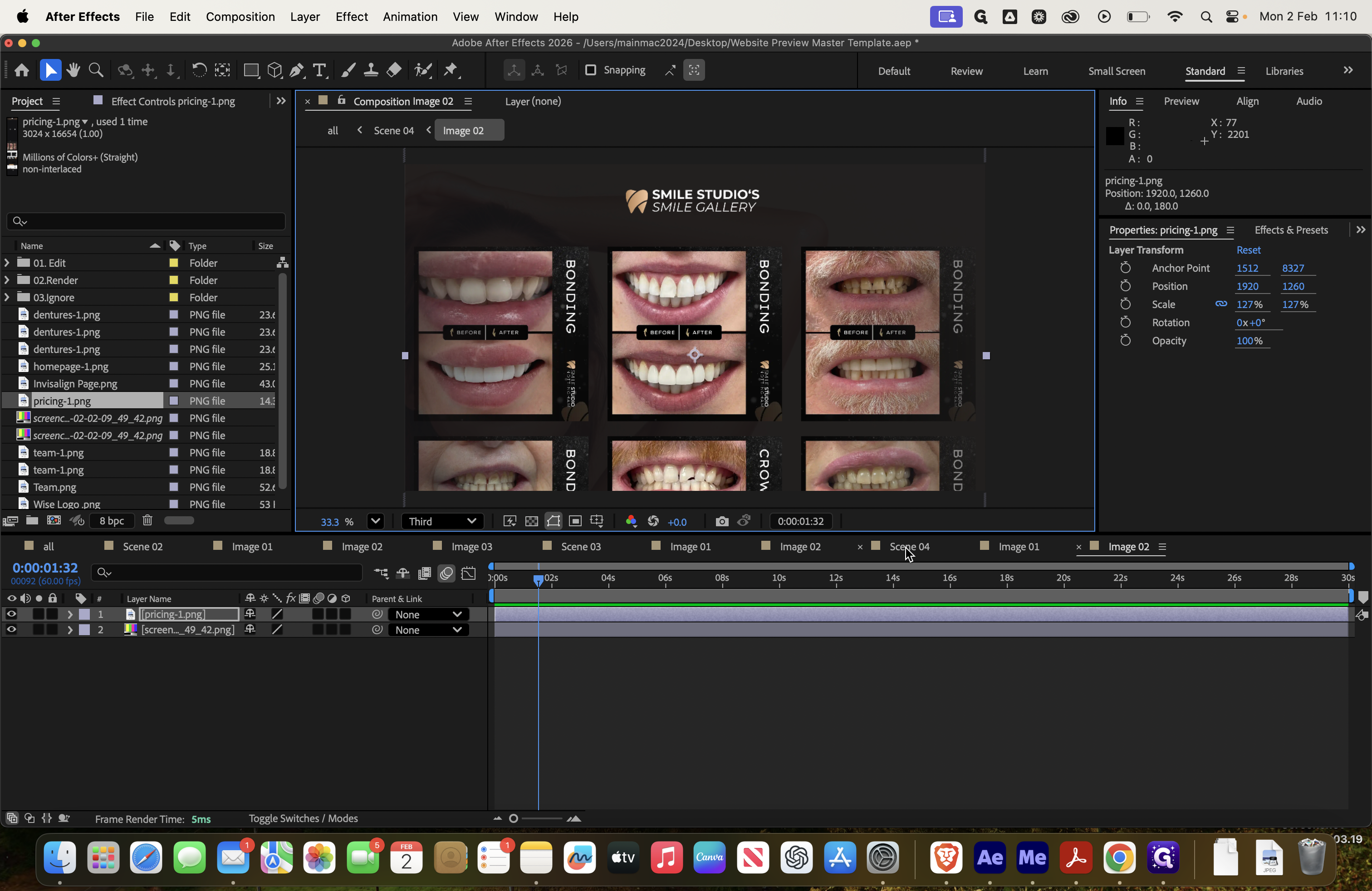
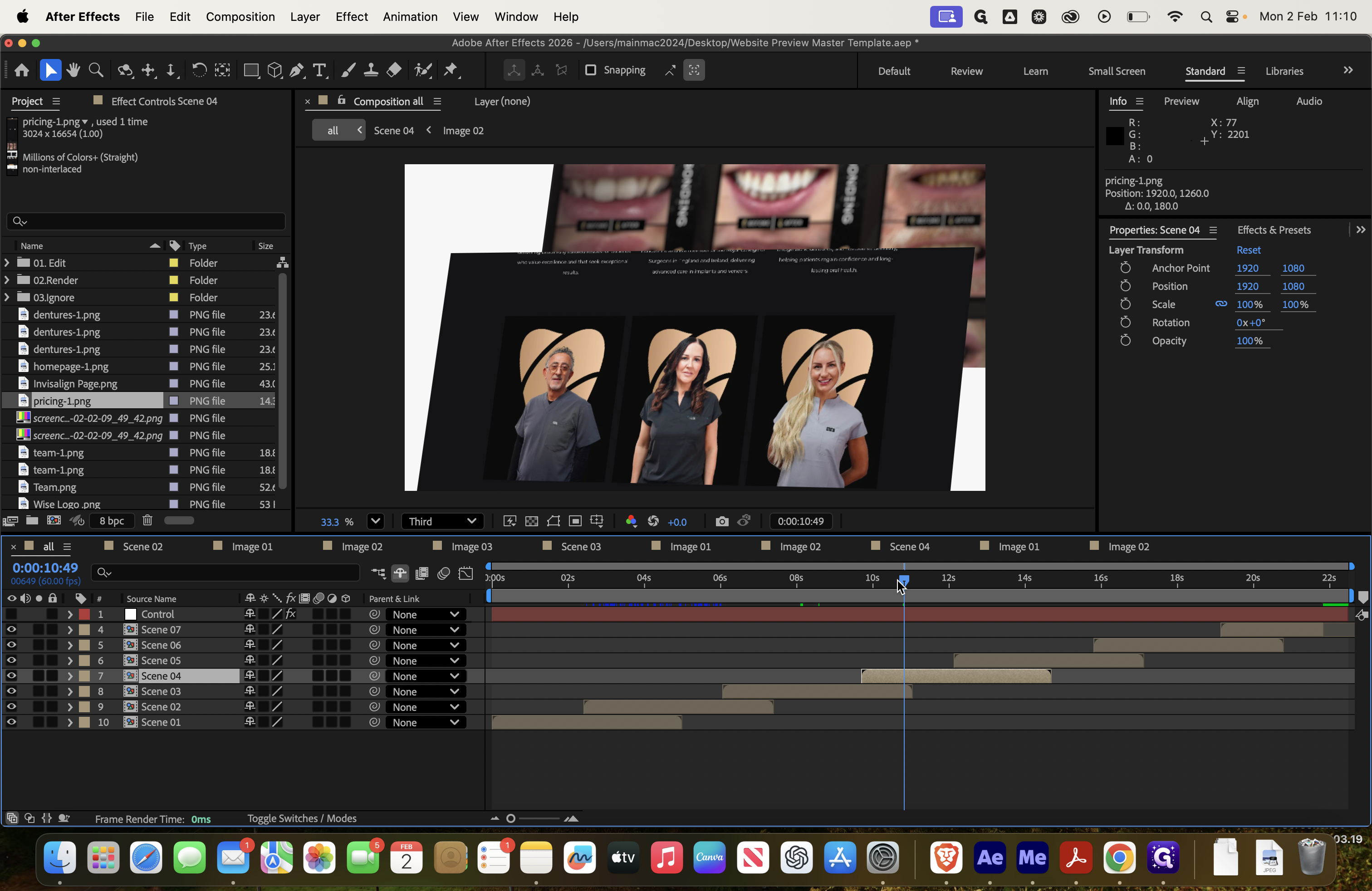
Next, return to scene four and select image two. Then, add the pricing page as an example.
![Step #67: Double-click on "Image 2 ]"](https://di8mn0rali2ic.cloudfront.net/uploads/1db3b62b-7f5e-4278-9553-53059233662a/c24be046-7369-4f01-8e7a-4850afc832a2.png)
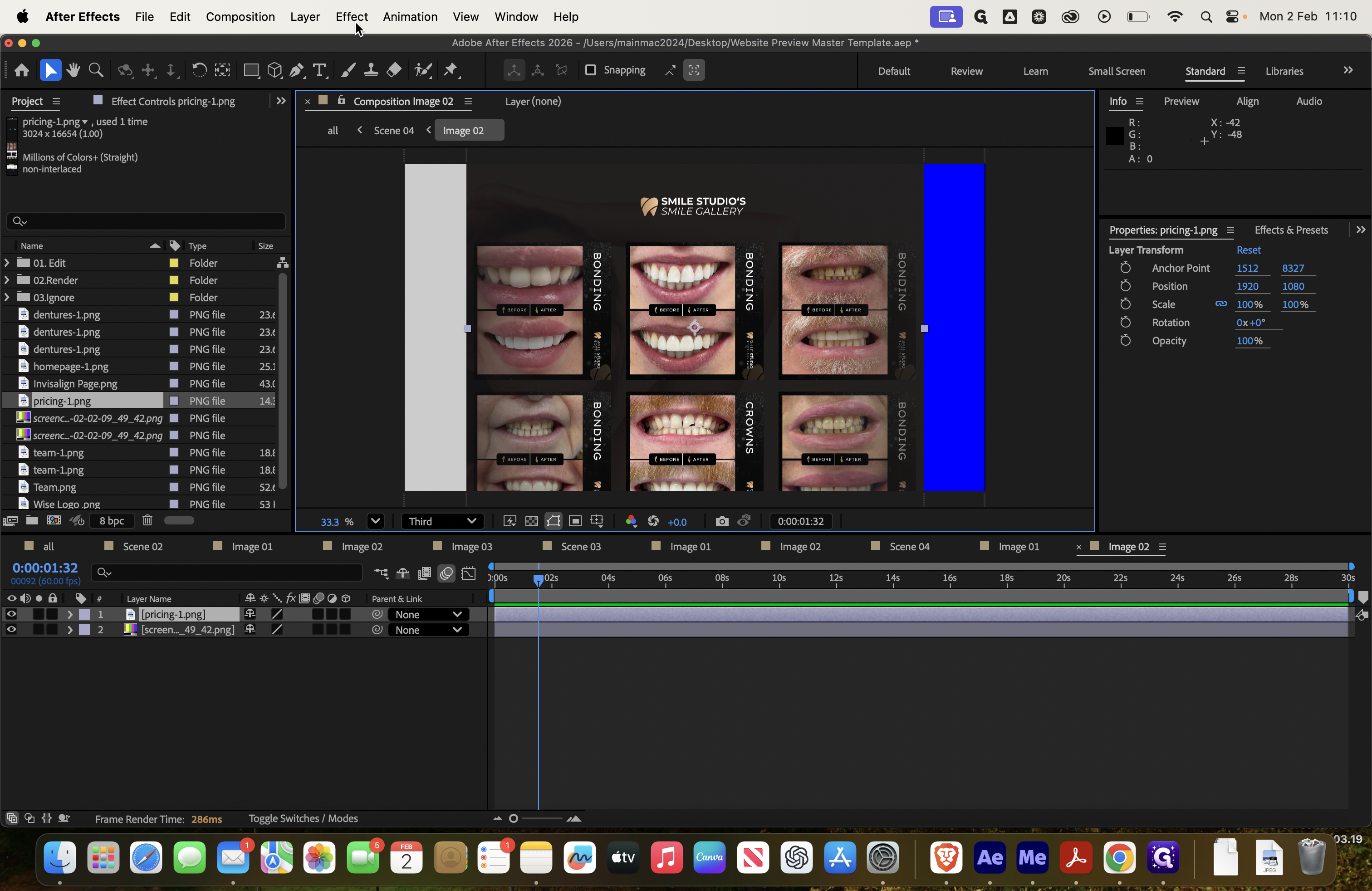
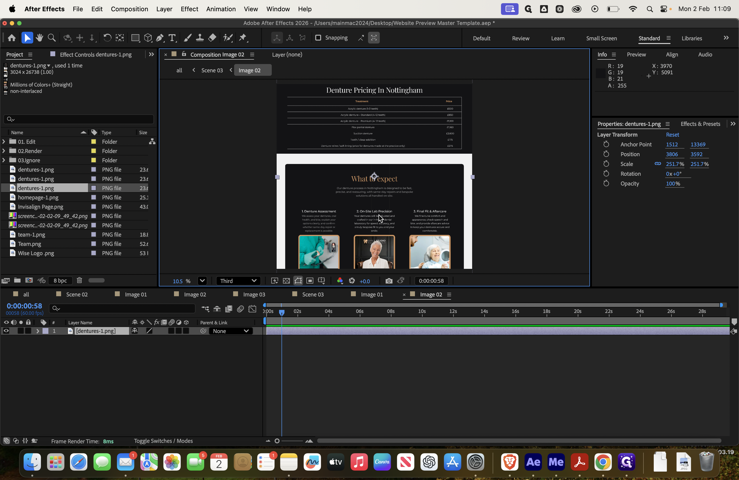
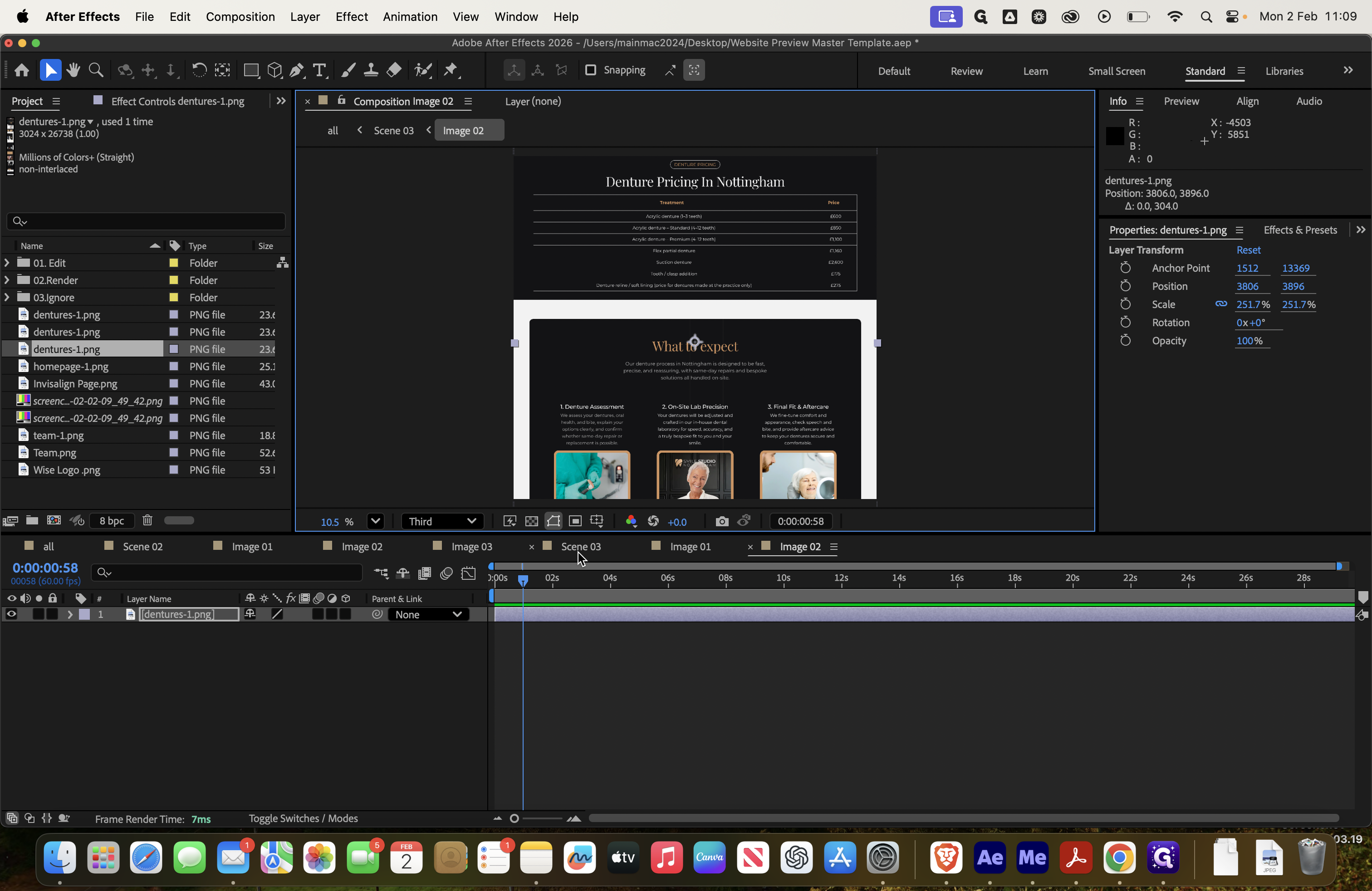
Again, go to Transform and select Fit to Comp Width. Now, let's display the smile gallery.
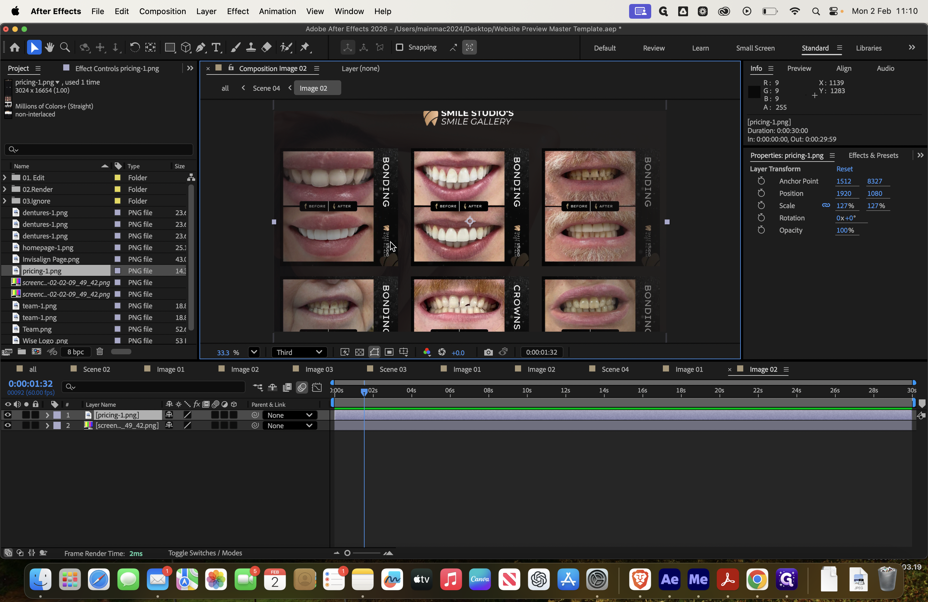
Next, preview it in scene four to see how it will look.

I think this might be the last...
There are two more.
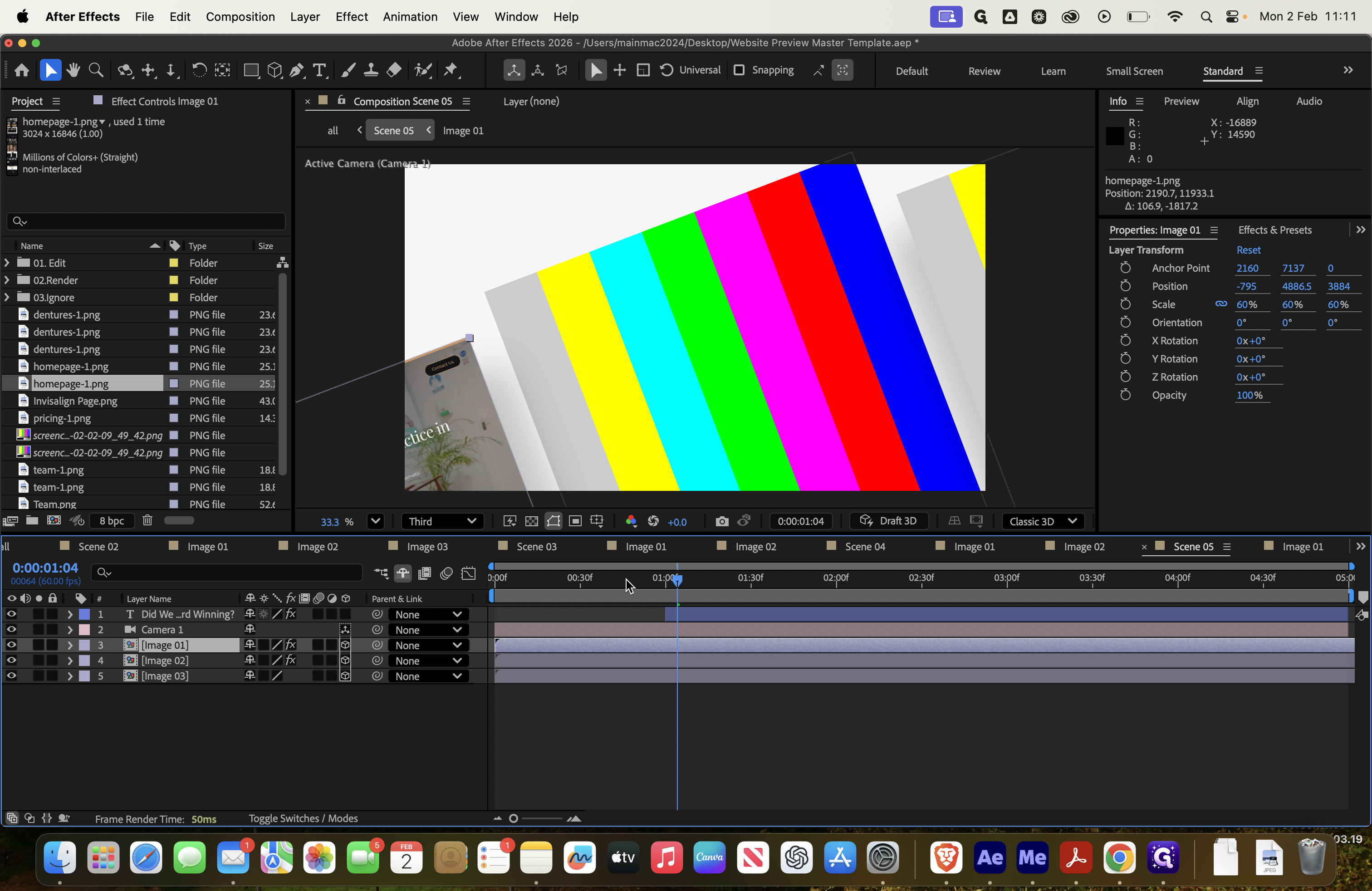
Scene five.
This uses three screens, so we will proceed...
We'll work on the homepage, dividing it into three sections.
Go to Transform, then select Fit to Comp Width. This won't display the entire content, so first, show the normal part of the page—the full-width version.
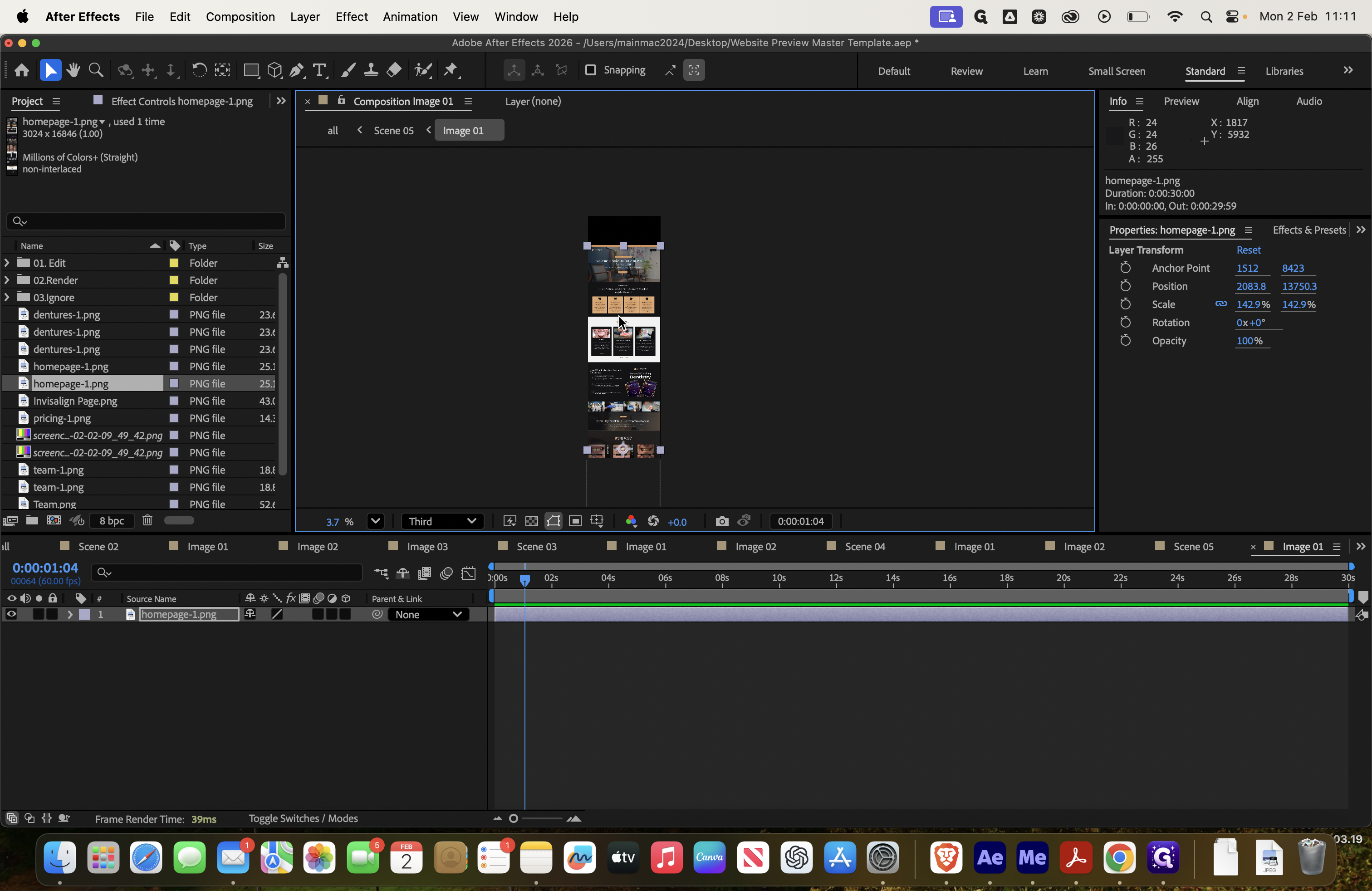
You can see it slightly on the edge here, but only a small part is visible.
![Step #91: Double-click on "[ Image 02 ]"](https://di8mn0rali2ic.cloudfront.net/uploads/1db3b62b-7f5e-4278-9553-53059233662a/ffb9ee8c-da57-4141-99eb-dbddca4e5716.png)
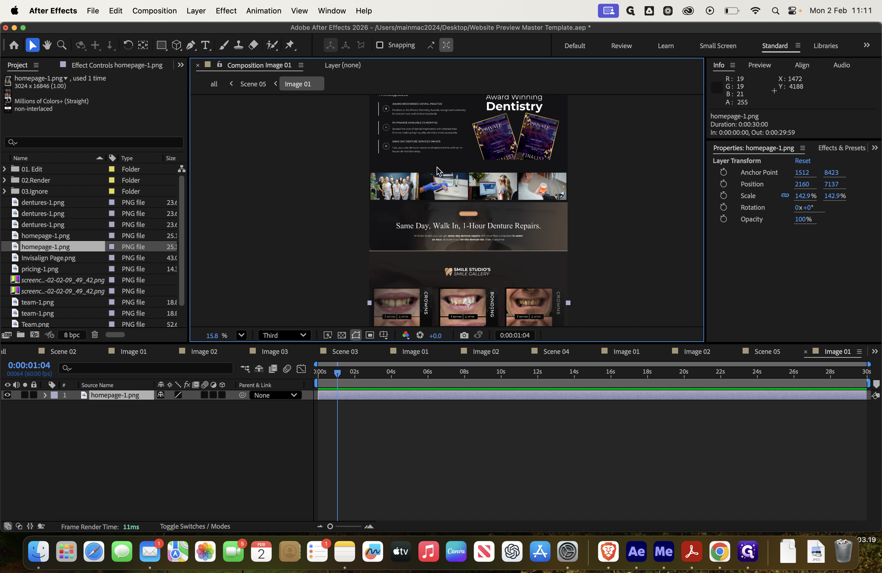
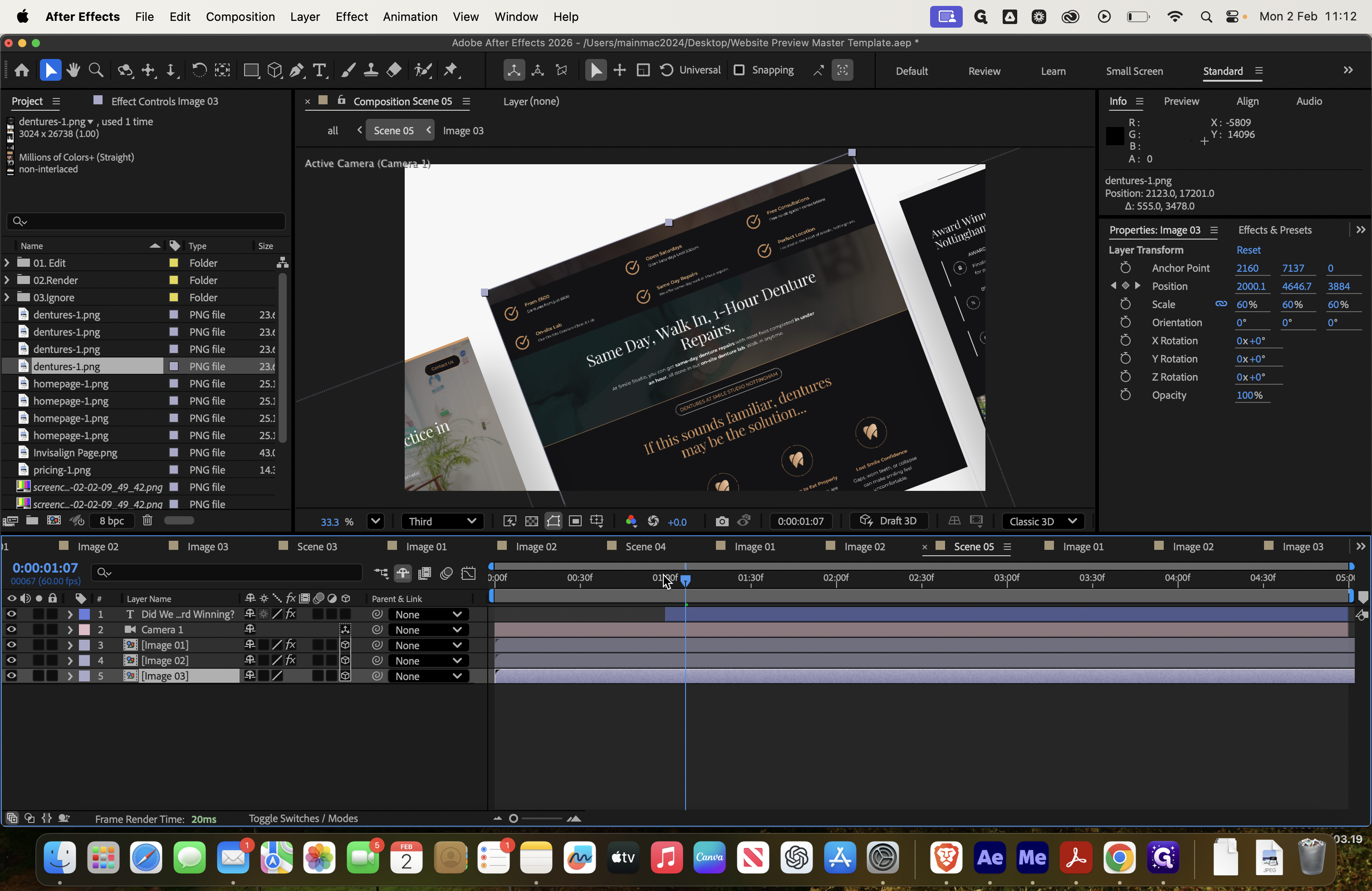
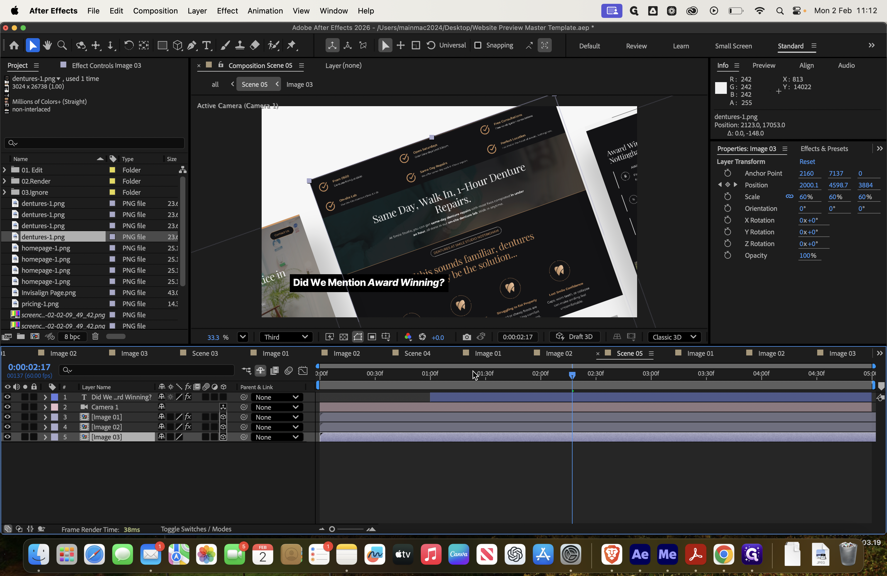
Next, add the homepage again. Set the layer to fit the comp width. Then, highlight the award-winning section from scene five, which appears on the right.


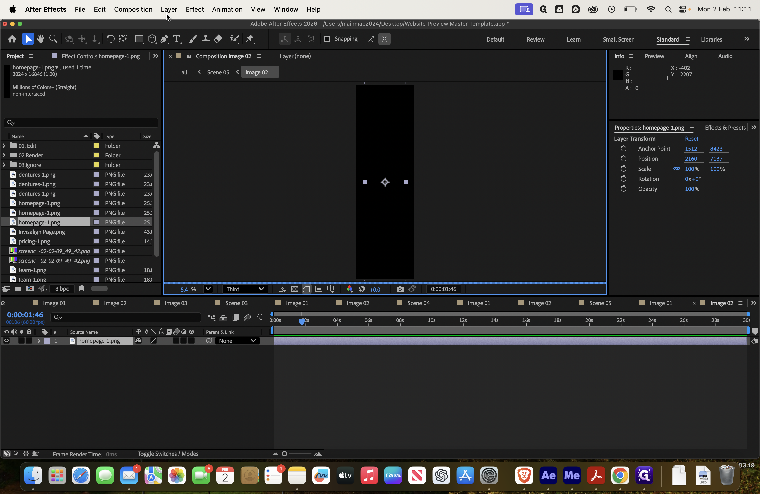
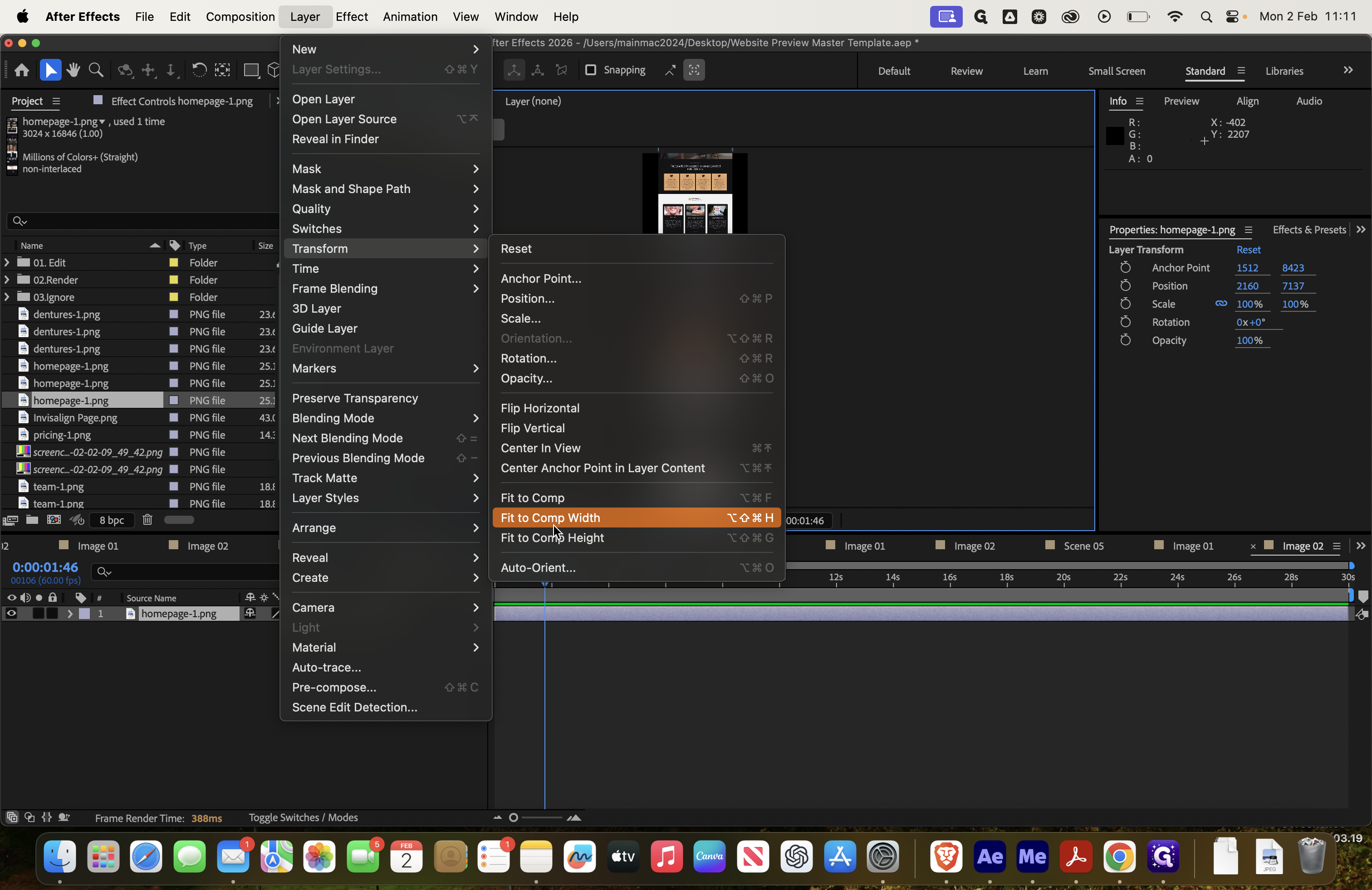
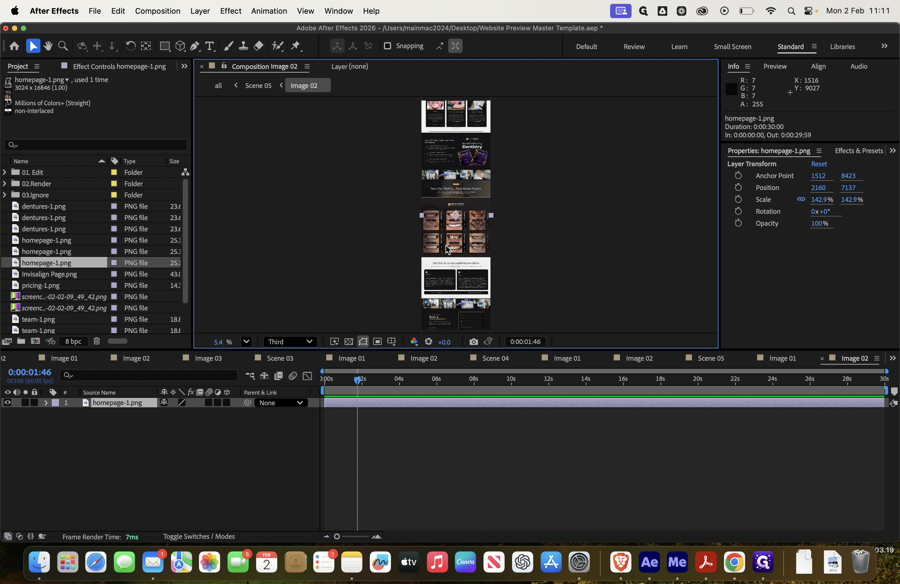
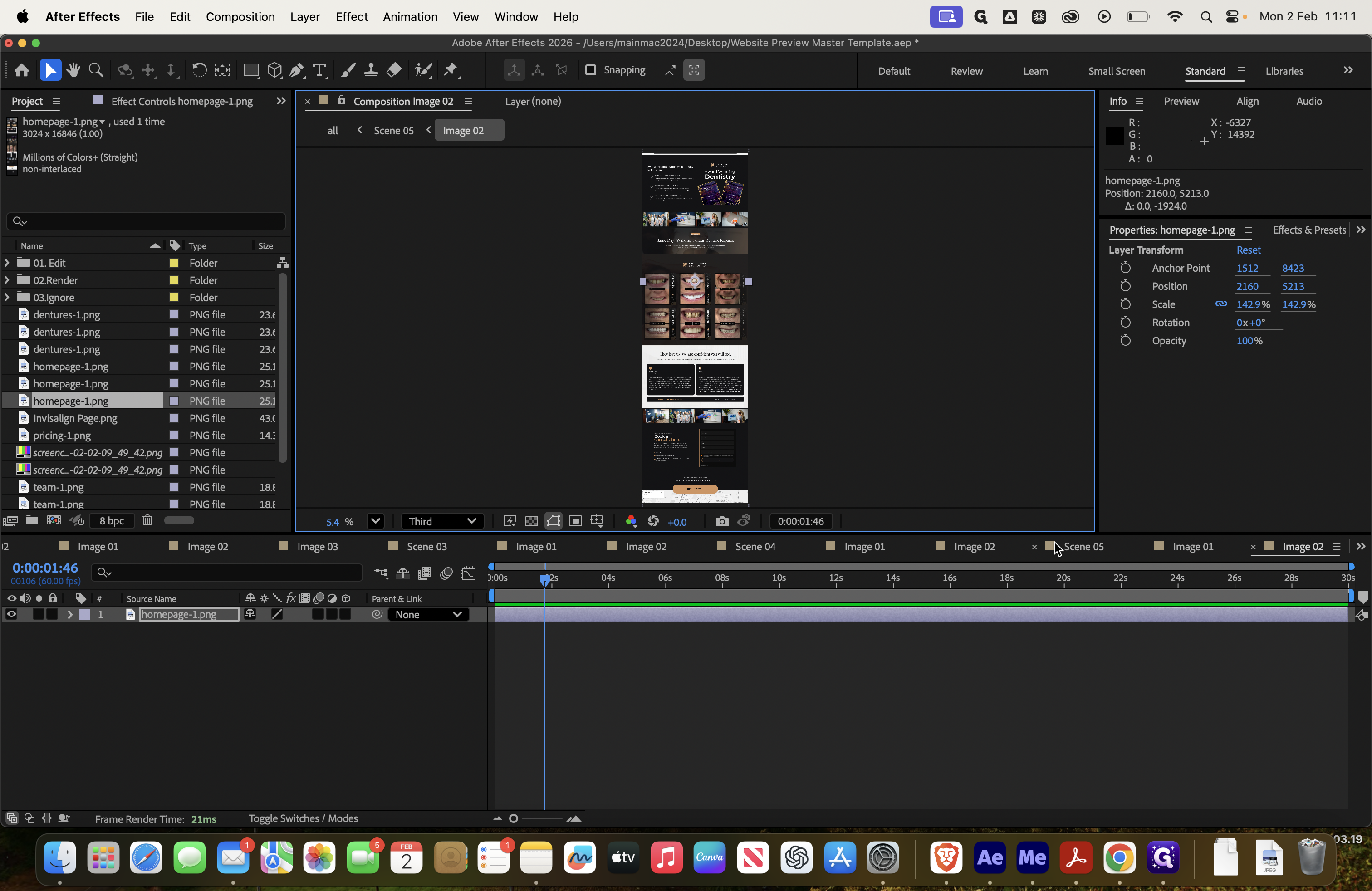
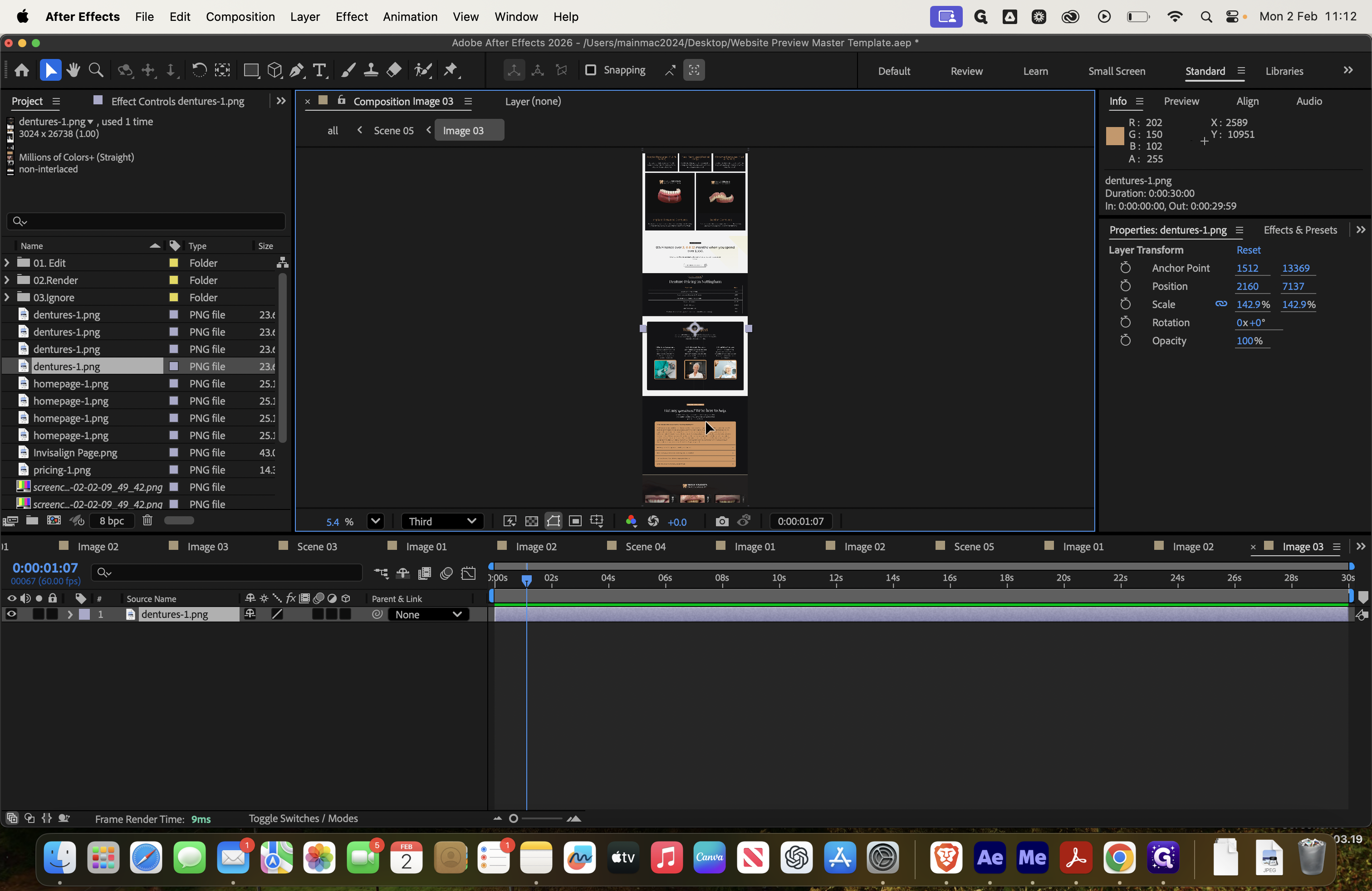
Image three should be your best, as it will be the most visible.
![Step #101: Double-click on "Image 03 ]"](https://di8mn0rali2ic.cloudfront.net/uploads/1db3b62b-7f5e-4278-9553-53059233662a/9e6d5ee3-c466-4fe4-8a14-83555d16b2e4.png)
Delete that.

Homepage again. Let's work on the dentures page, since I like that one.
Layer, Transform, Fit to comp width. Then, we'll demonstrate it somewhere like that.
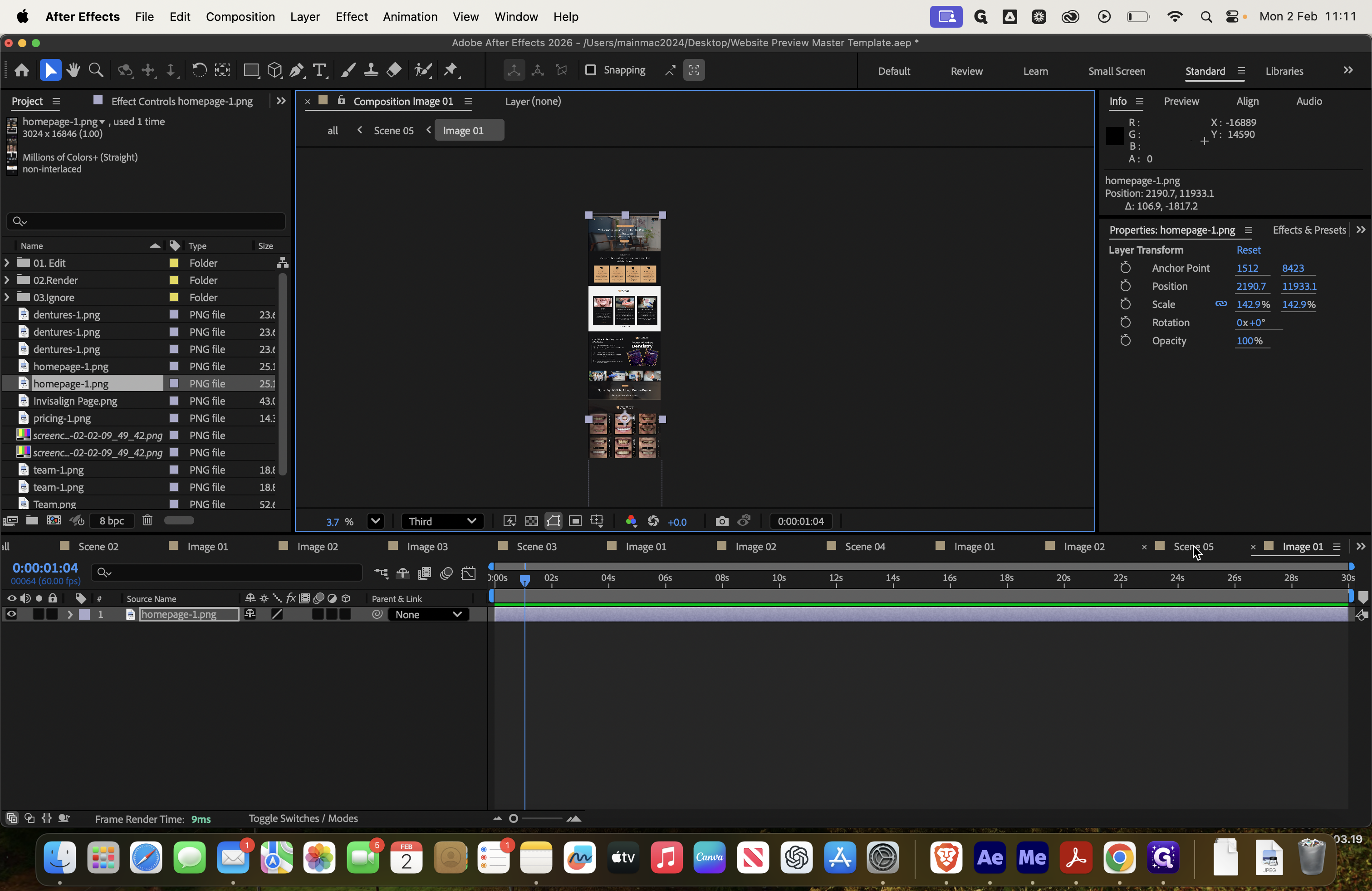
Scene five. We can see it here. I don't like how this part is showing, so we'll go back and drag it up a bit to hide it.

And then it should ...

There we go.
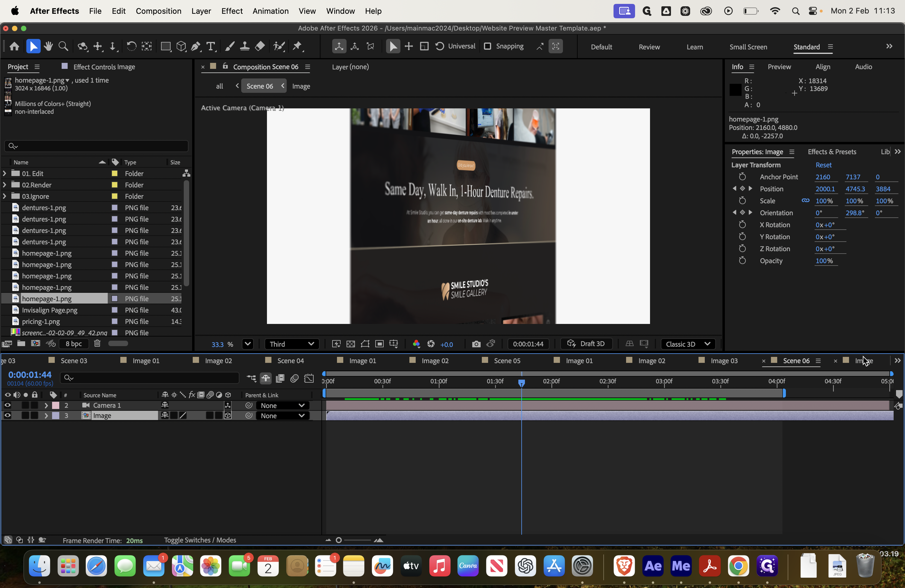
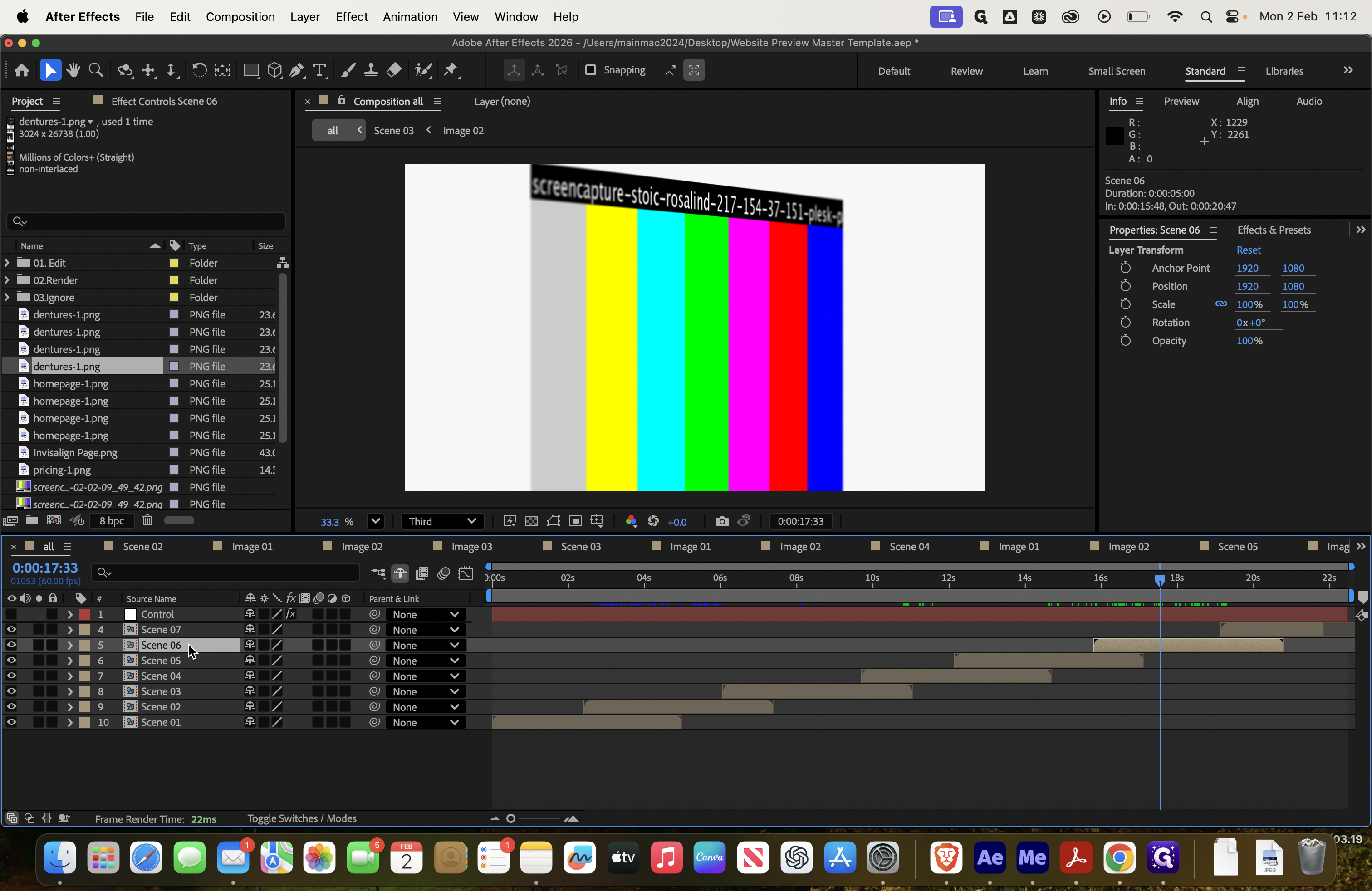
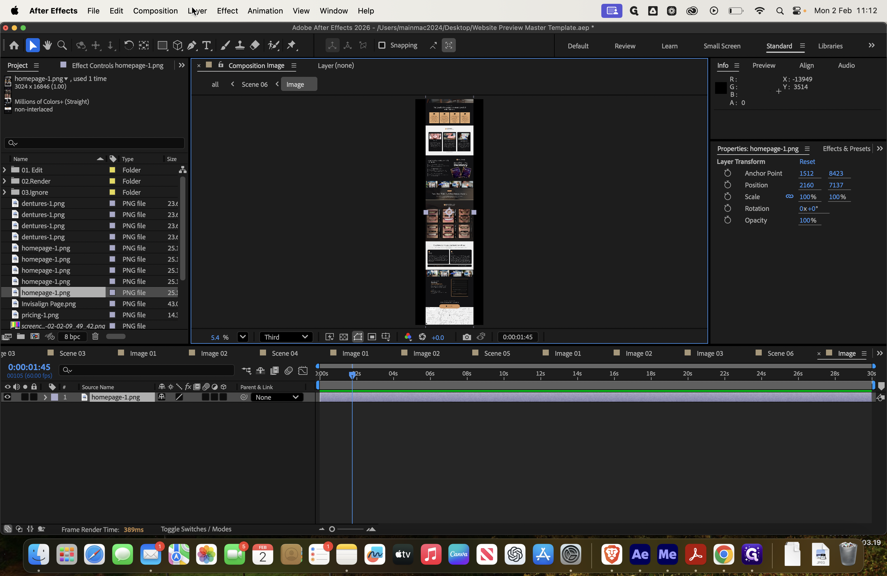
That looks better now. Next, scroll across to "All," then select scene six, which is this one.

As you can see, it is highlighted. This will be the final version, so we want it to be at least decent.

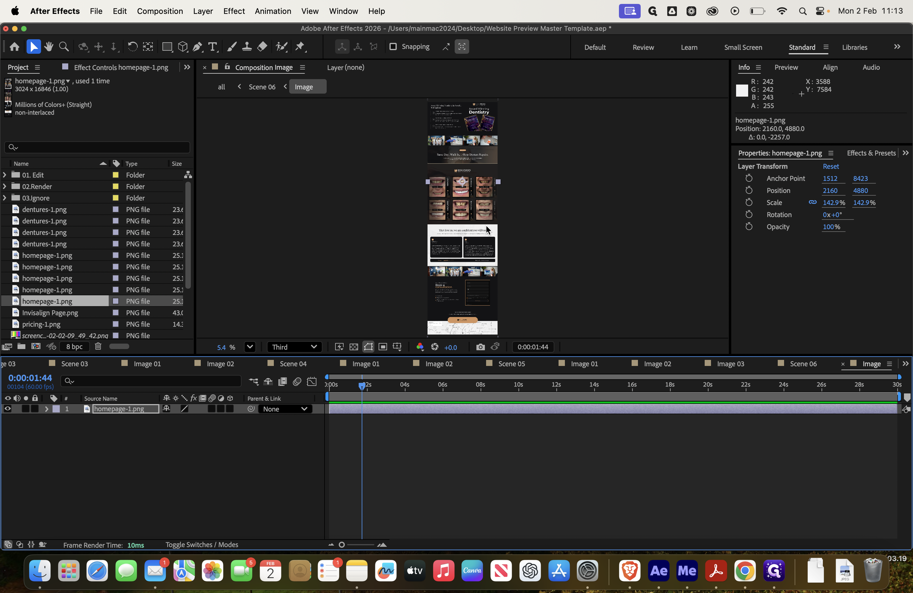
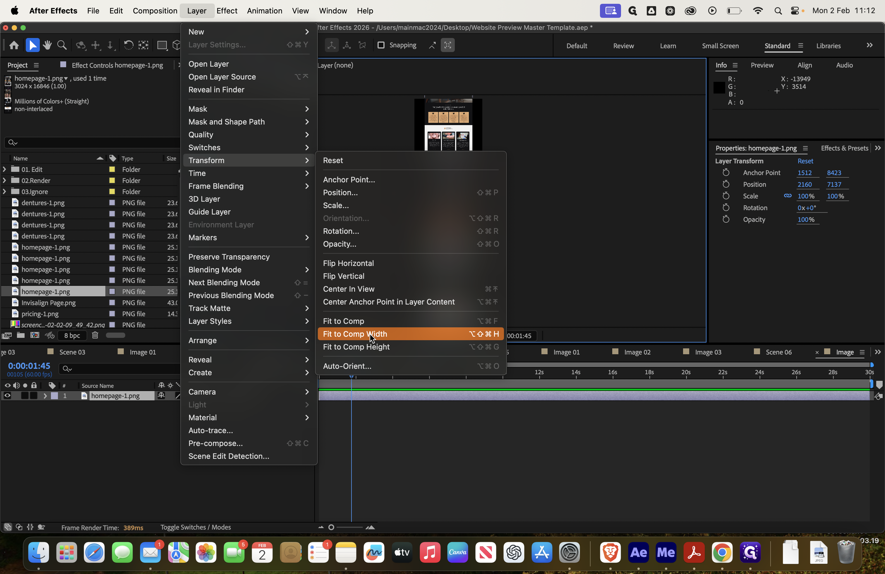
In scene six, click on it, select the image, and delete it. Then, we will redo the homepage.
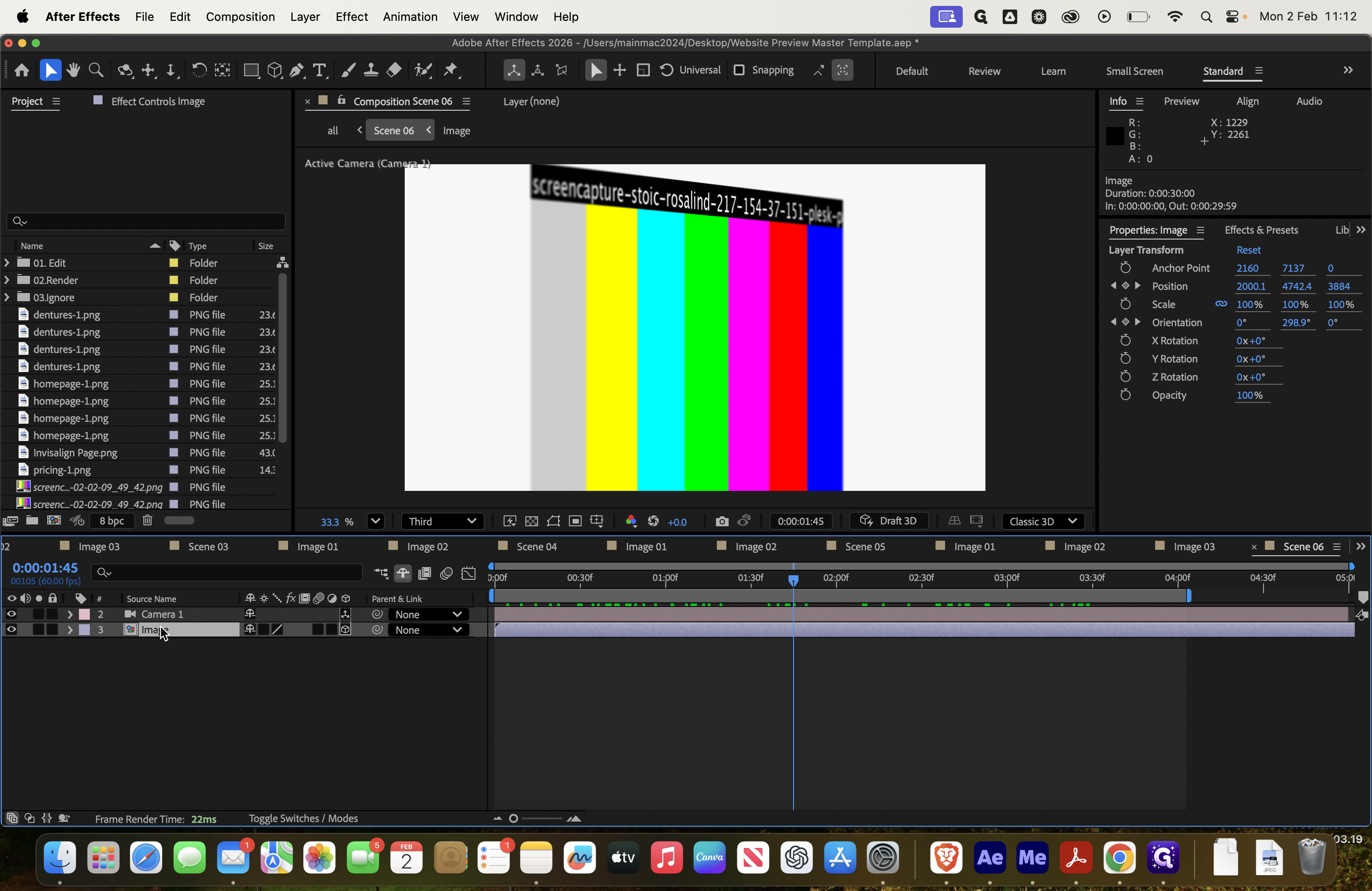

As always, go to Transform and select Fit to Comp Width.
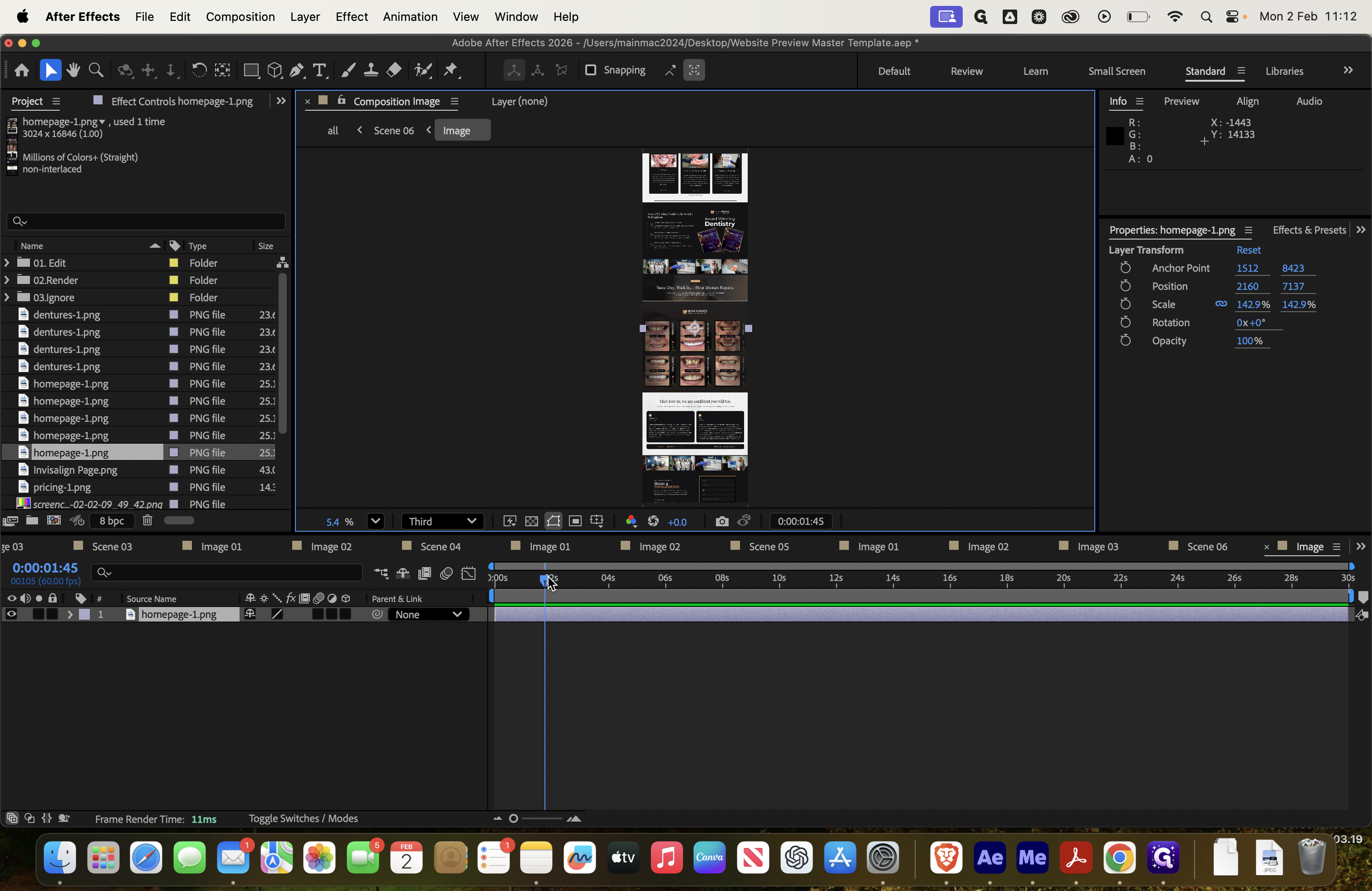
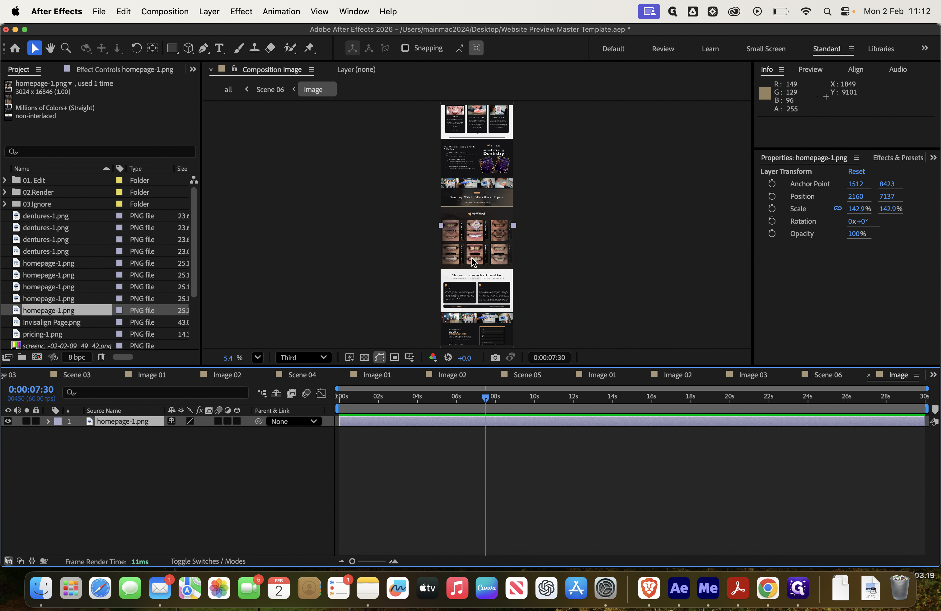
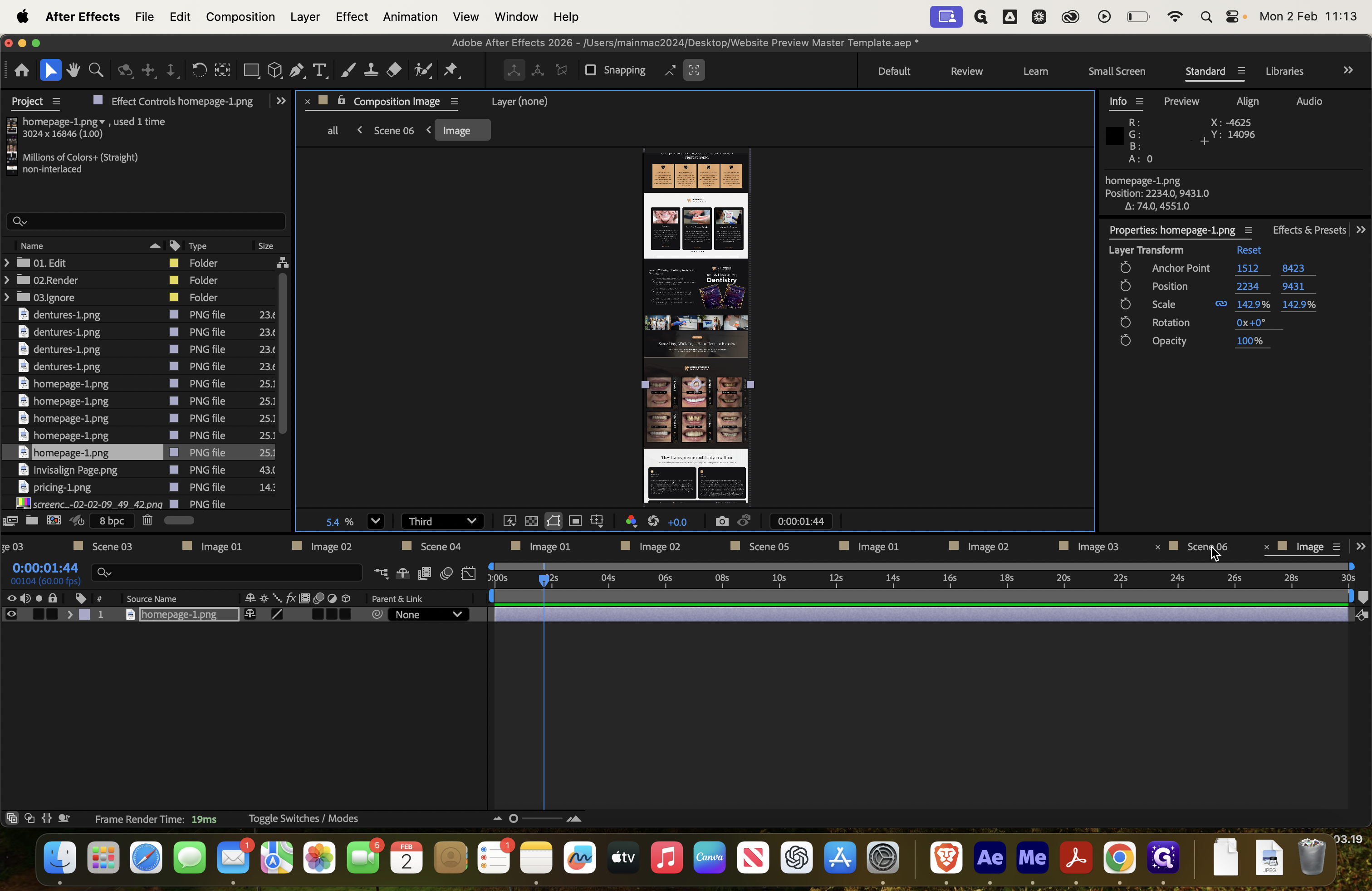
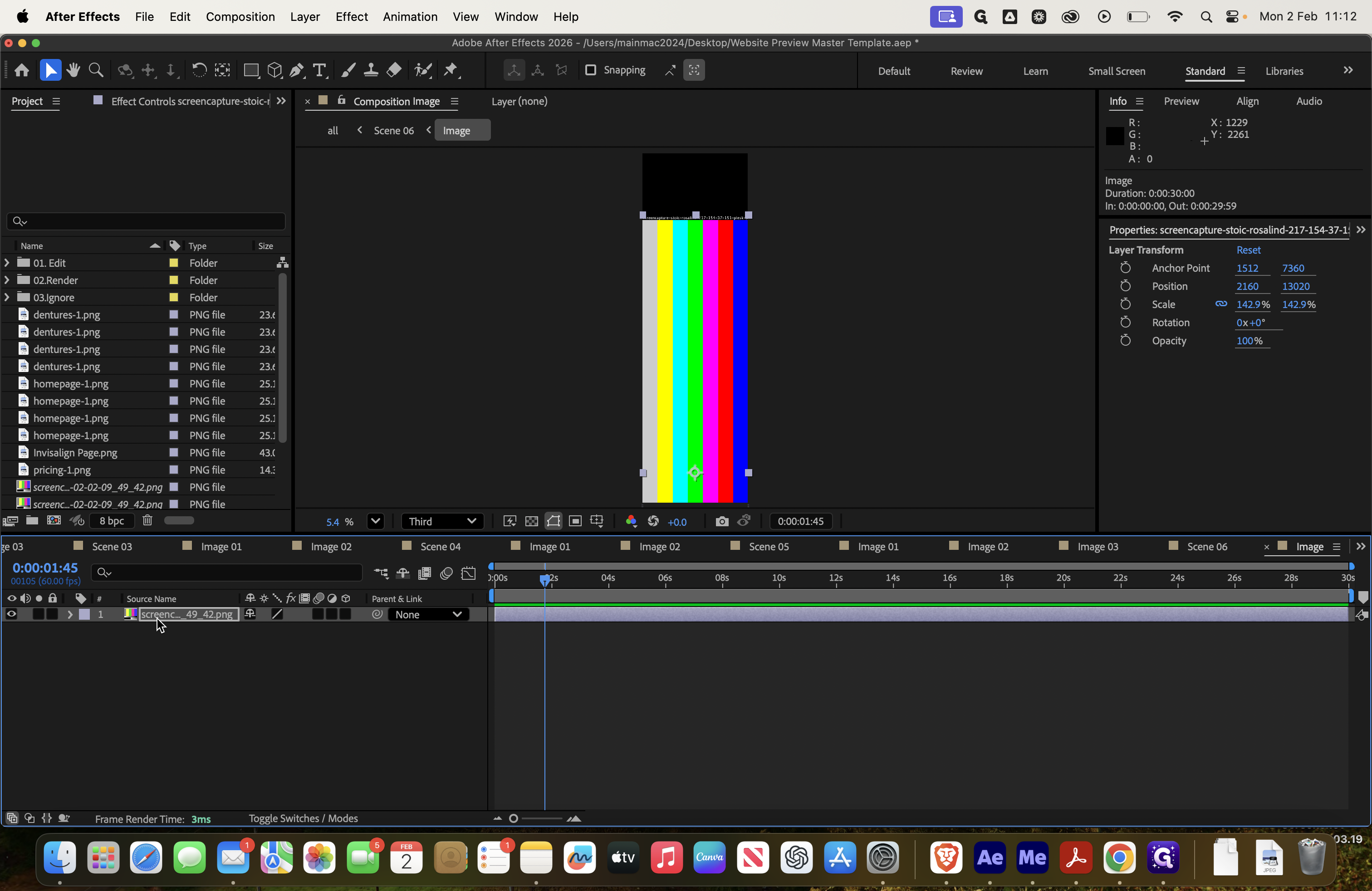
We’ll highlight the awards section again and preview it here.
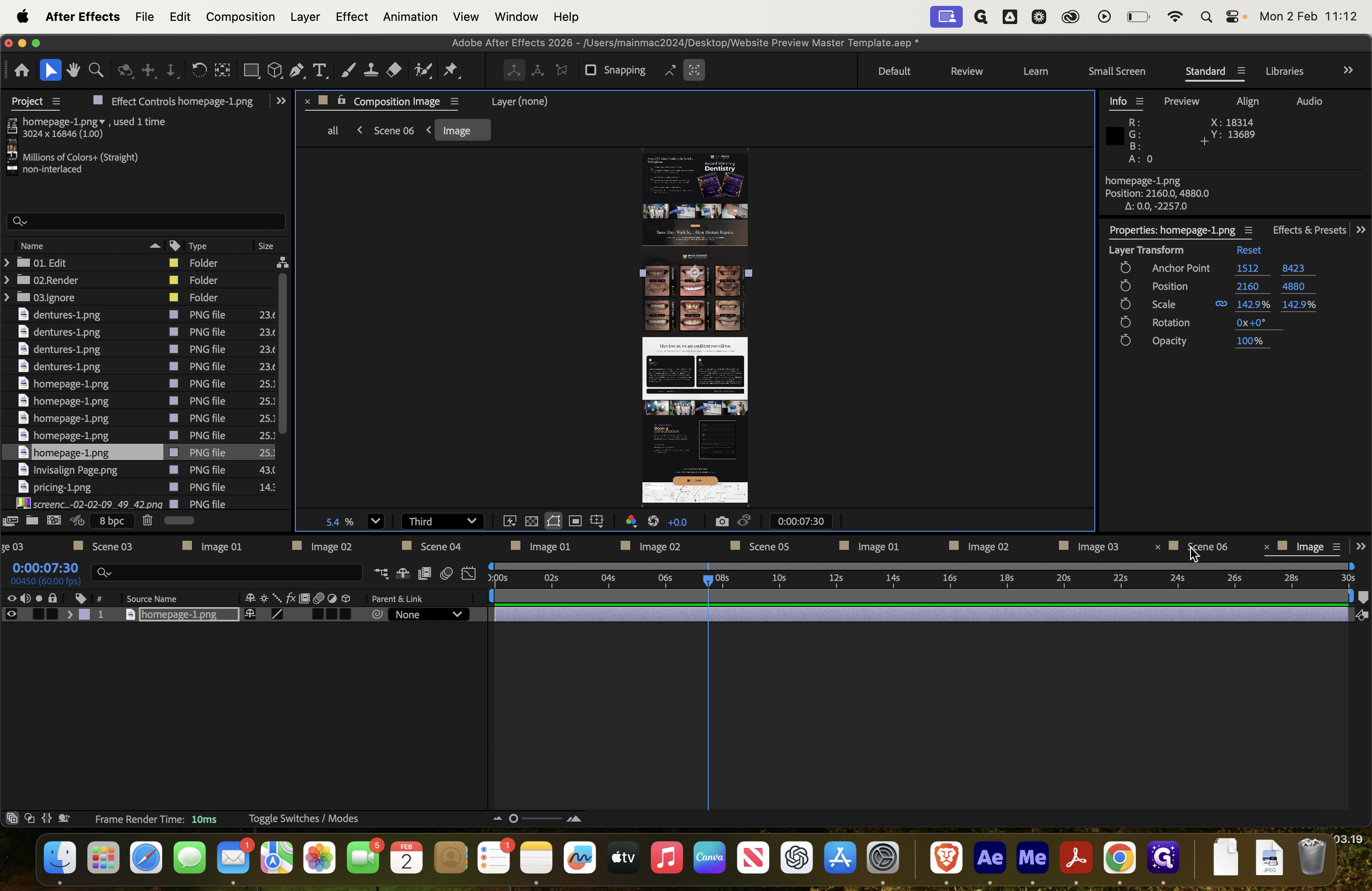
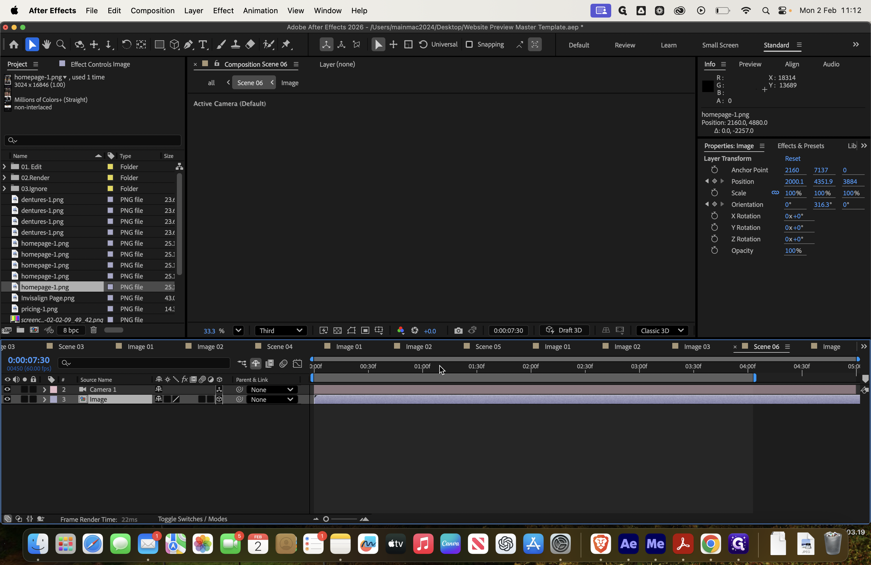
It's not showing the awards section because the image is zoomed in on the middle of the page. We need to go back to the image and keep adjusting it, moving it down until we find the right position.