
Bugs/fixes for Sponsor Enrollment part 2
I want to highlight that I love the green notification bar - it effectively indicates successful completion of an action.

When the sponsor fills out their forms and clicks save and close, a popup confirms the changes are saved successfully. This seems like an extra step because the green bar I like so much briefly showed success before returning you here.

Unnecessary click?

I believe the behavior of dropping back to the task screen is correct. However, the green bar should be displayed right above the form area to indicate that the task was completed successfully, mirroring the green change of the button.
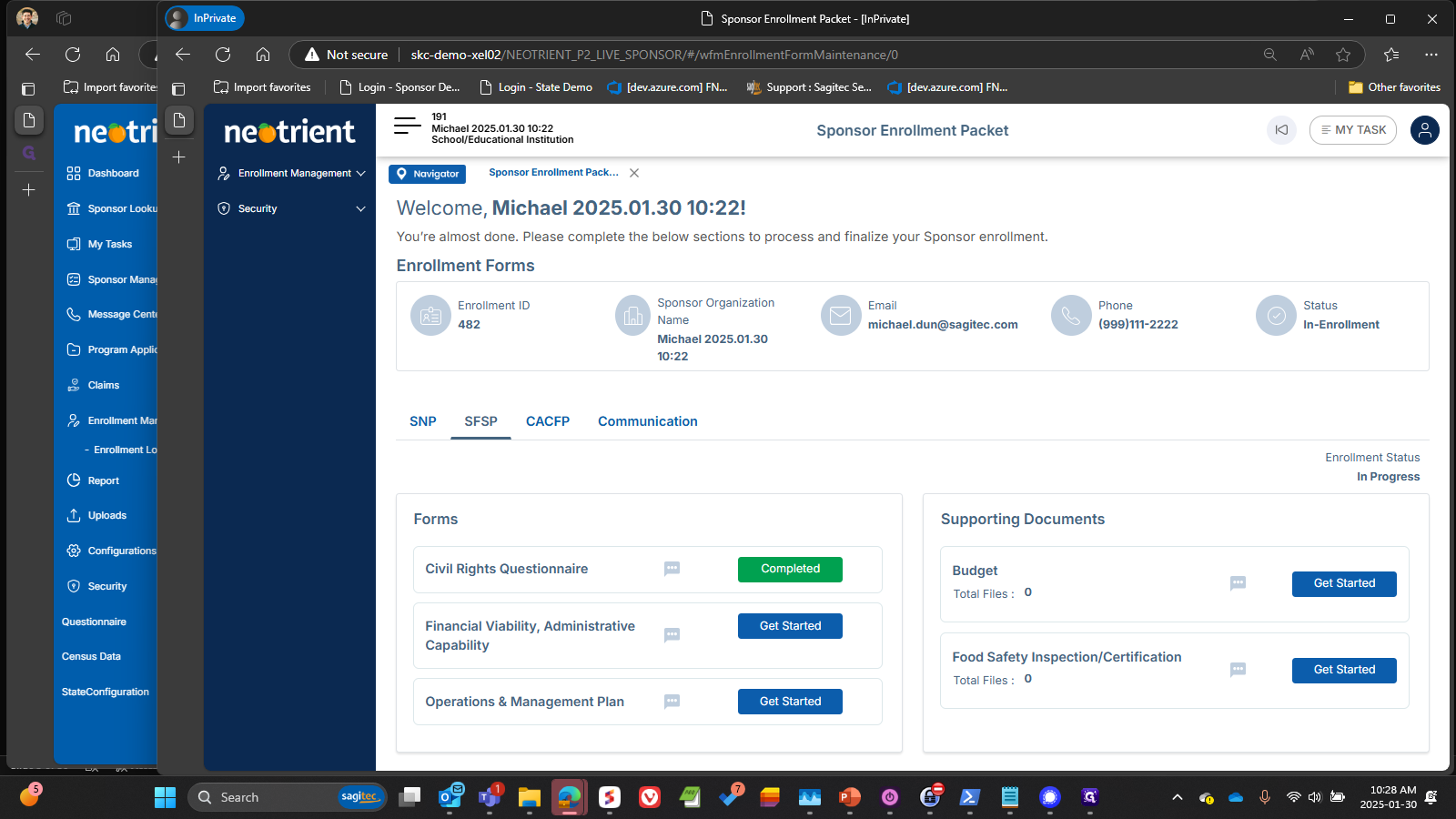
Below is where I think we could use that green bar again - right between the tabs and the forms.
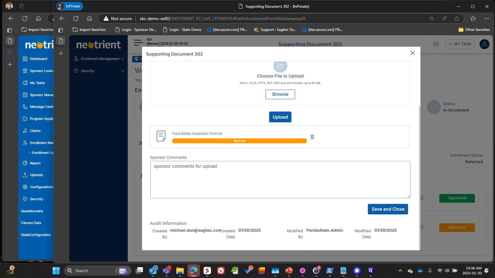
I do wish we could drag and drop, instead of have to use the file browse window.
Did I understand this is a framework issue? Are there plans to update?

You can enter comments from the sponsor under an upload here. But you can't really find them again unless you go in exactly here again. None of the communication areas are updated, nor do their badges change.


When Approving an item, the green bar shows an incorrect message.


When Returning a portion, you are required to put a "Return Reason", but that reason never appears anywhere else in the system, again no badges are updated, and no Communication shows the text.


Likewise, when you Return the whole application, the messages again go nowhere and are seen nowhere. All the same efforts were taken to find it, I'm not going to repeat all those screen shots.
instead of "returning"


When a Sponsor has received a Returned form, there is no information telling them why it was returned, what question(s) were involved, or what needs to happen. At the moment, we're requiring them to figure it all out since no communication text is shared.
Even if the text were shared, it's currently related to the whole form and we'd have to type out which questions needed fixing and how - is it possible to have communication or notes tied to each question rather than only at the form level?


but if there were multiple fields needing attention, it would be very difficult to know
just what to do.

Is the Modify button required? I find myself always trying to change it, not being able to, then going back up to click Modify, then going back down to change. We are not providing very visible hints that the form is not editable - the field backgrounds are not grayed out, there are no "lock" icons or similar - any of these would help guide me as a user that I need to Modify.
But I'd prefer not even having to flip to that mode since I am explicitly required to click the Save Button and then get a notification that it was Saved.
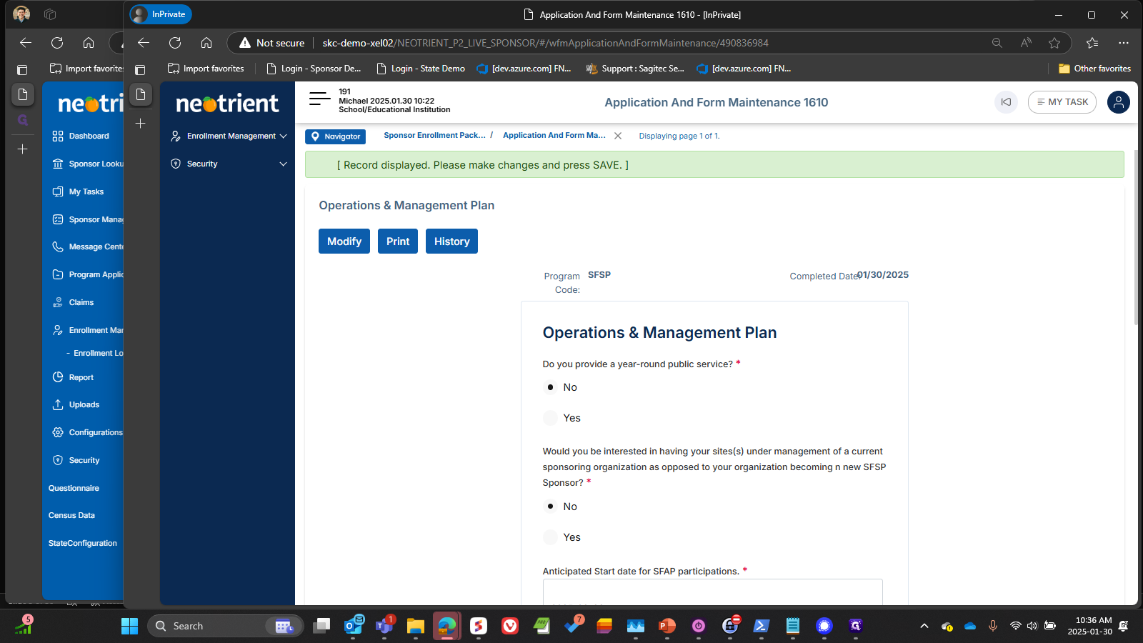


better way to show the success.

In the same vein, the comments on the uploaded documents, or why they might be returned do not show anywhere - except sometimes in the same upload screen, but only the ones that you put there yourself - it doesn't appear to be any part of the two-way communication.

And, when Approving the overall packet, all the same communication problems - they don't show anywhere. All the same example screenshots, I'll not repeat.


The Enrollment Status is not a very visible feature - I think it would benefit by using the same color scheme as our form buttons - red/orange if returned or some other denial-type status, green for approved/complete/etc., and either the blue - or I think a color that better implies "pending/in process/incomplete" for while it is not yet done.
