Portal Data and Database Design Review for User Path on Homepage
Comprehensive review of portal data and database design for optimizing the user path on the homepage. Includes feedback on decision maker contact verification, form design, font sizes, email notifications, and lead tracking systems.
In this guide, we'll learn how to review and improve the design of a user path on a homepage, focusing on data and database elements. We will address issues such as font size, form layout, email notifications, and flagging systems for tracking leads. The goal is to create a user experience that is clear, efficient, and easy to navigate.
Let's get started
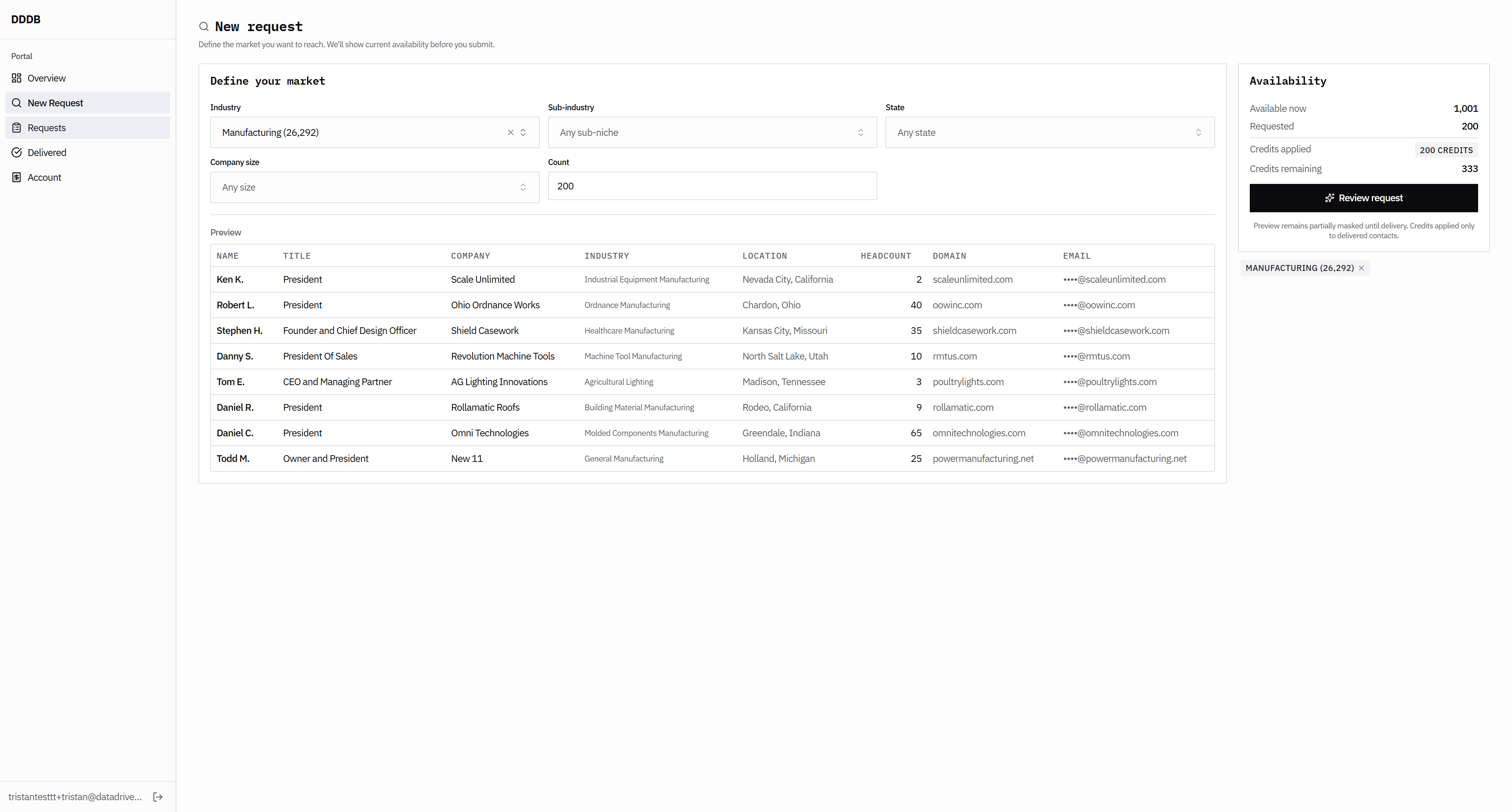
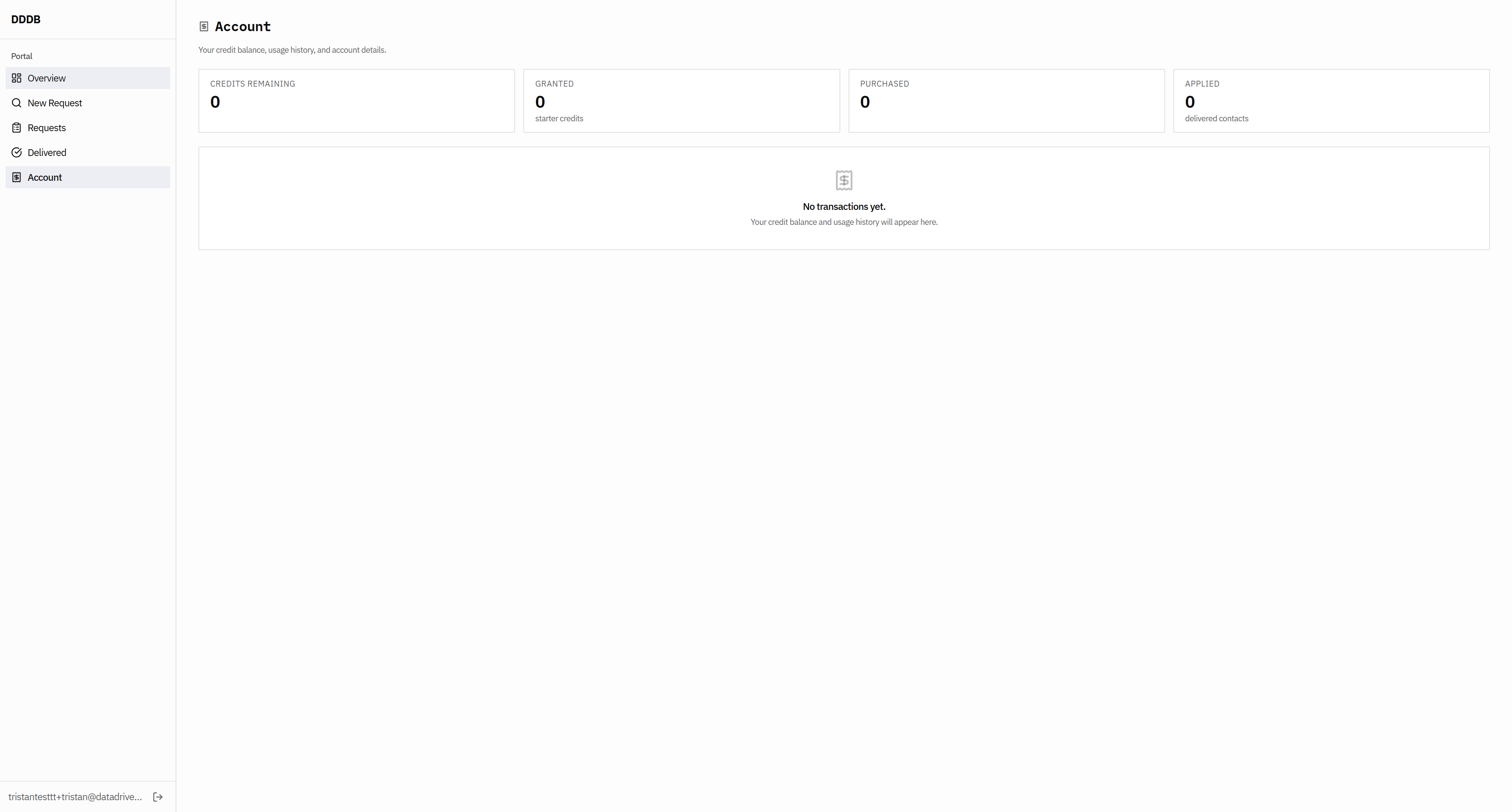
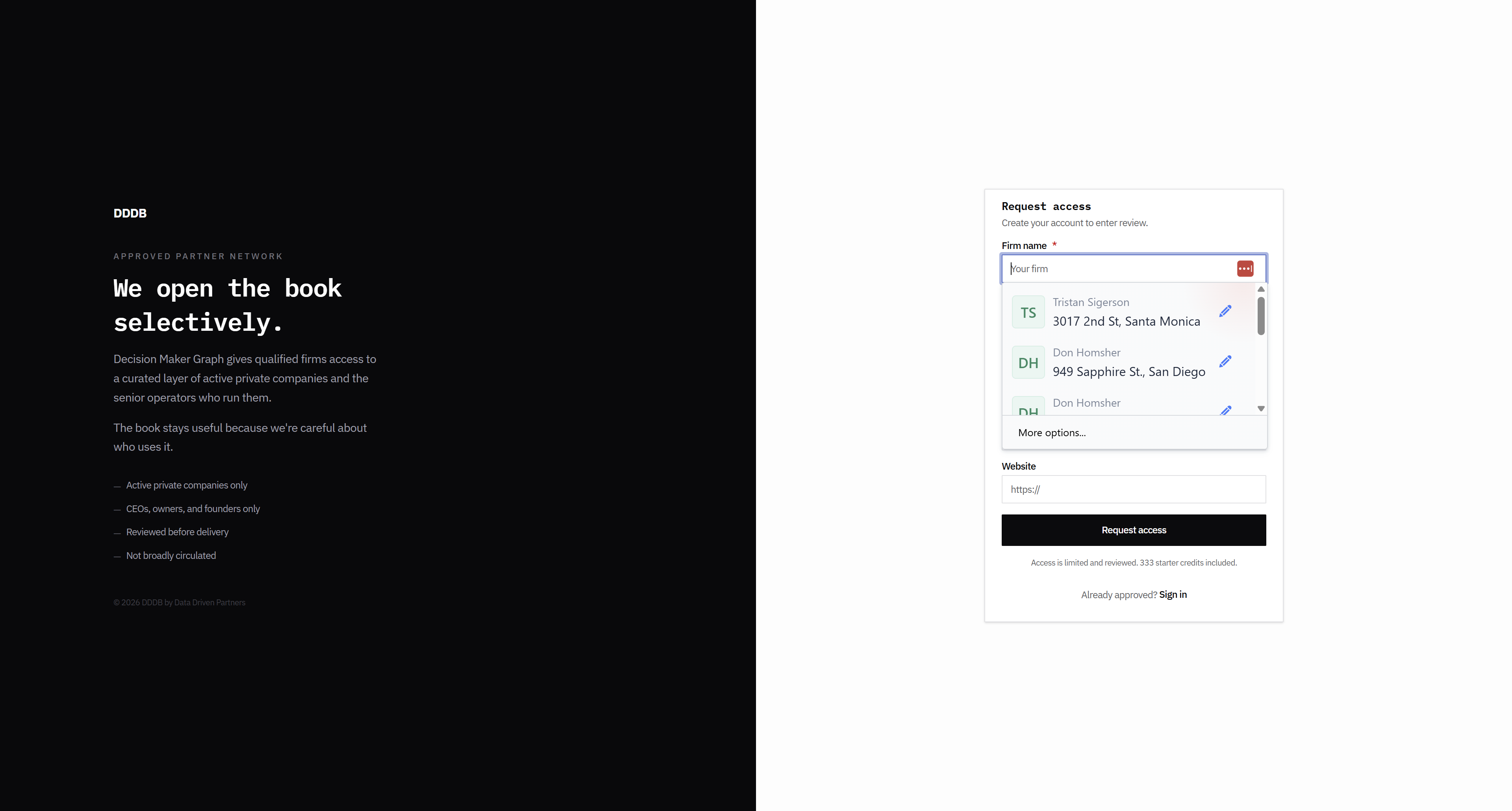
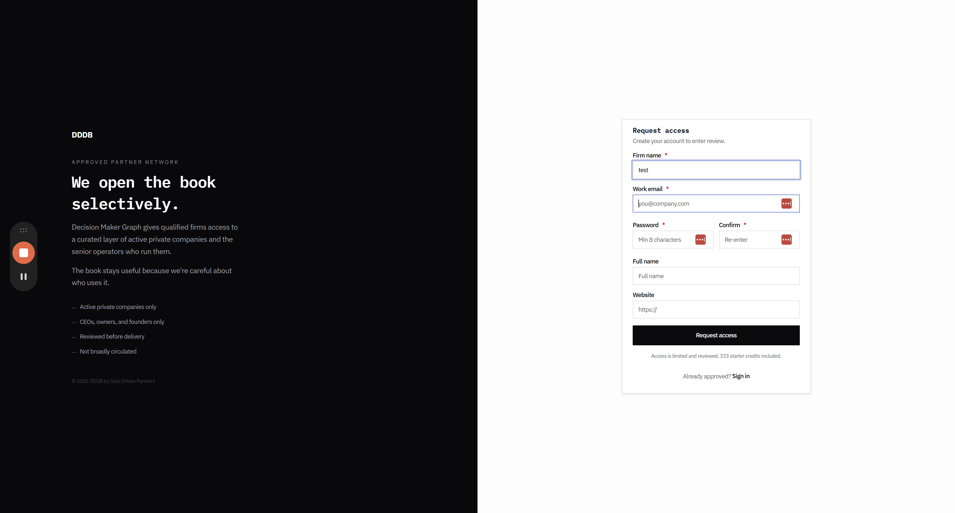
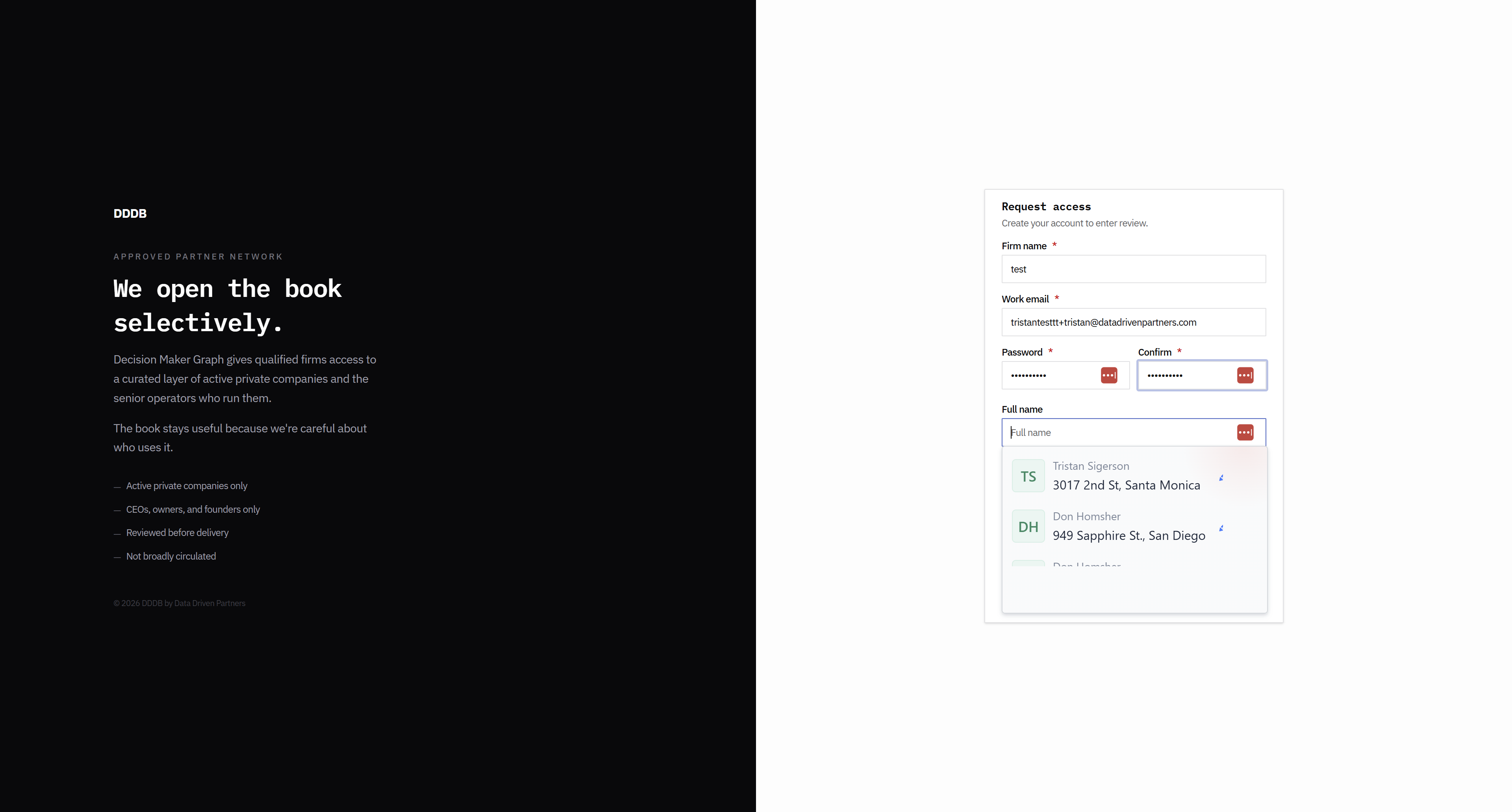
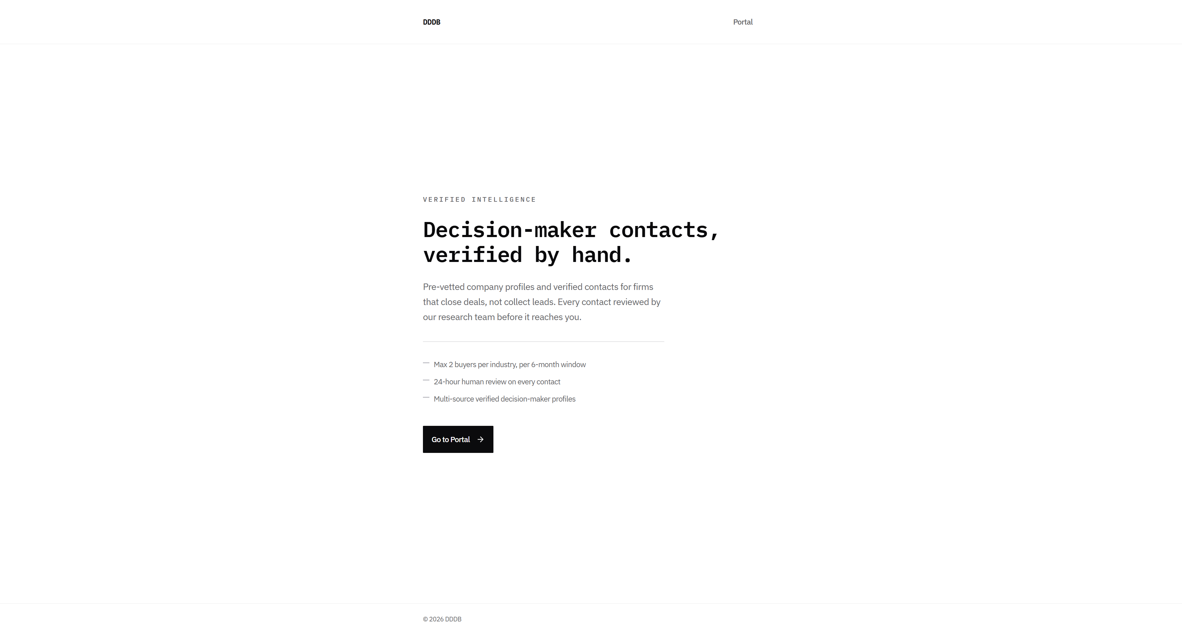
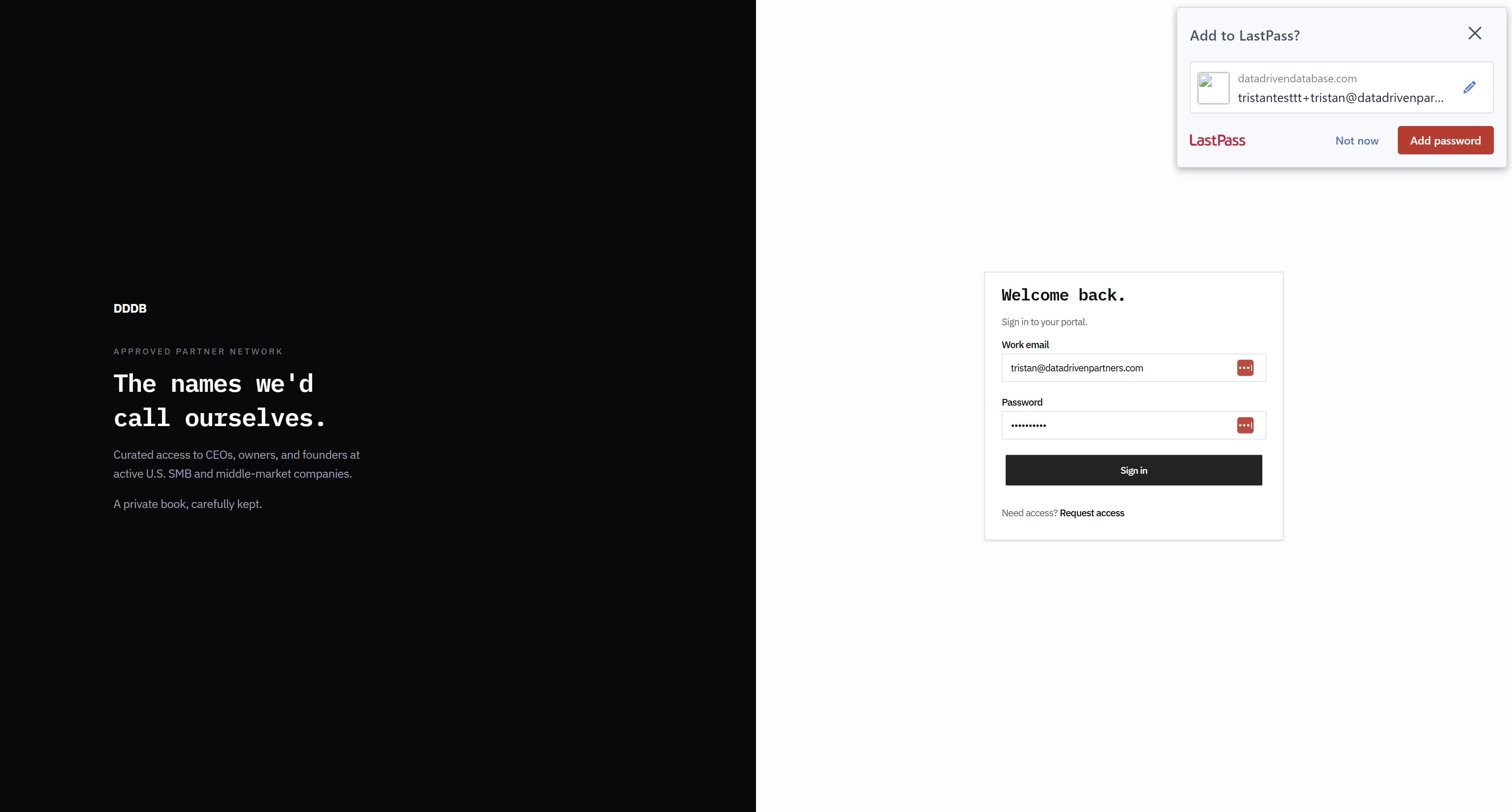
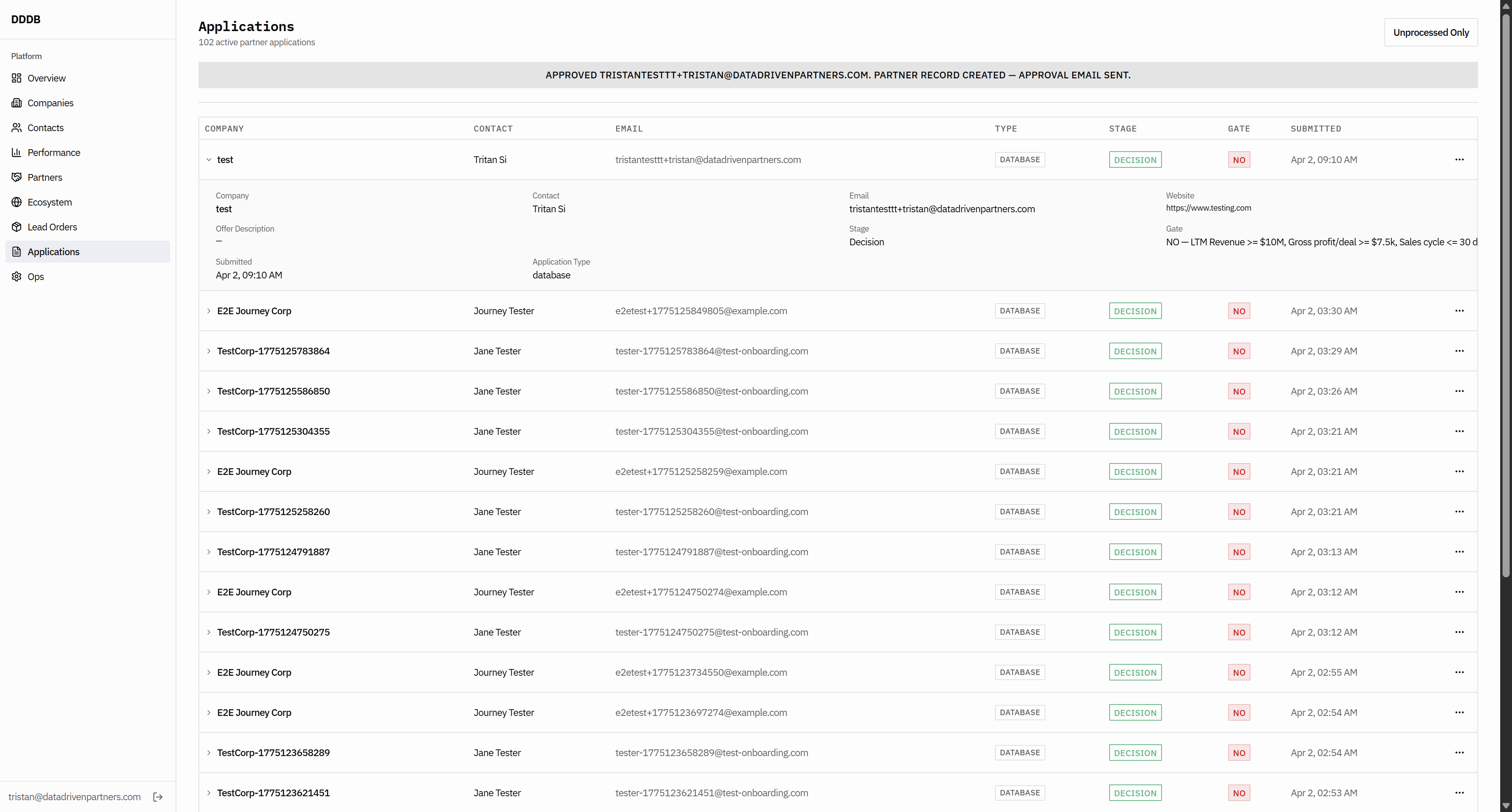
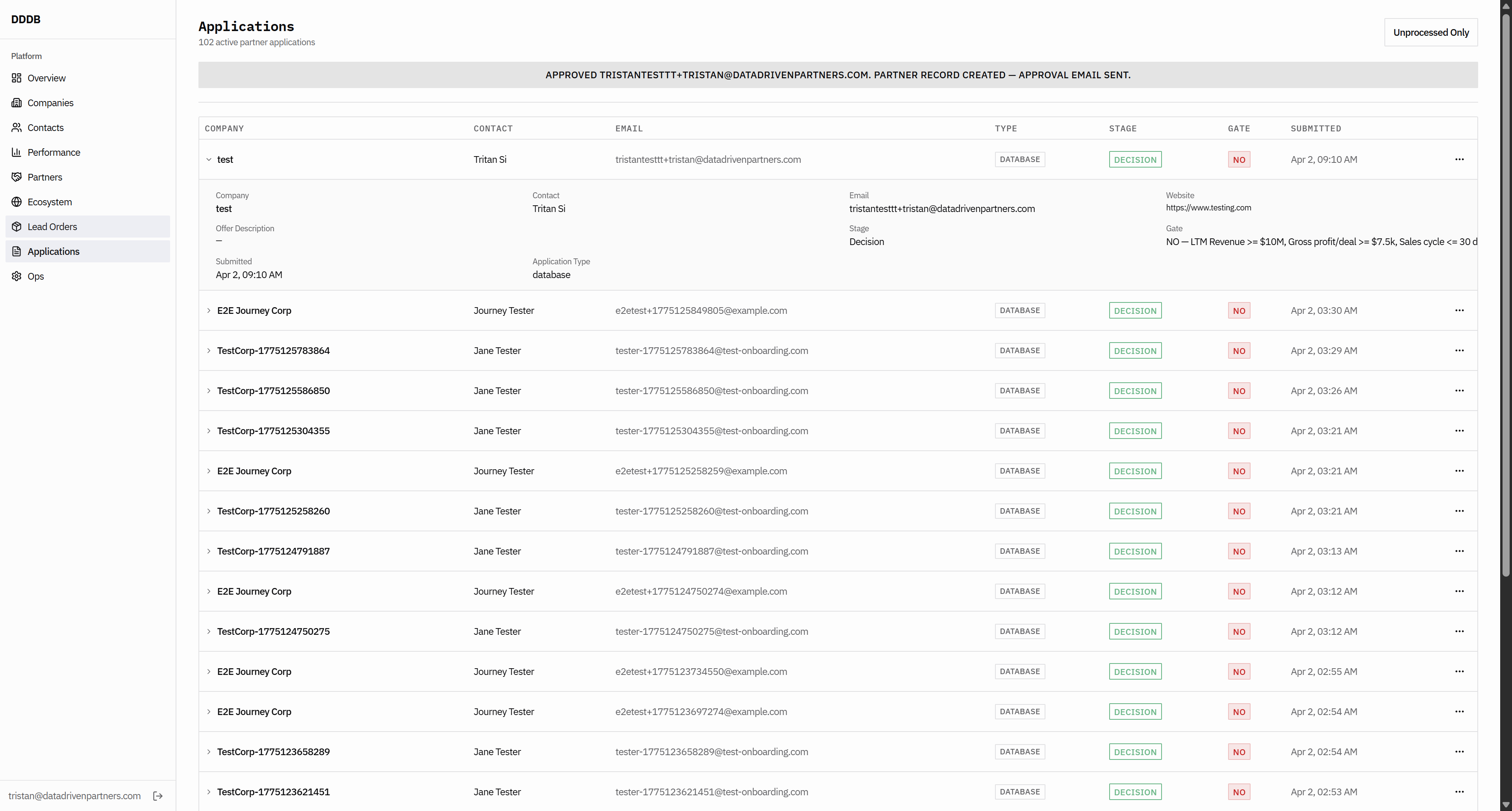
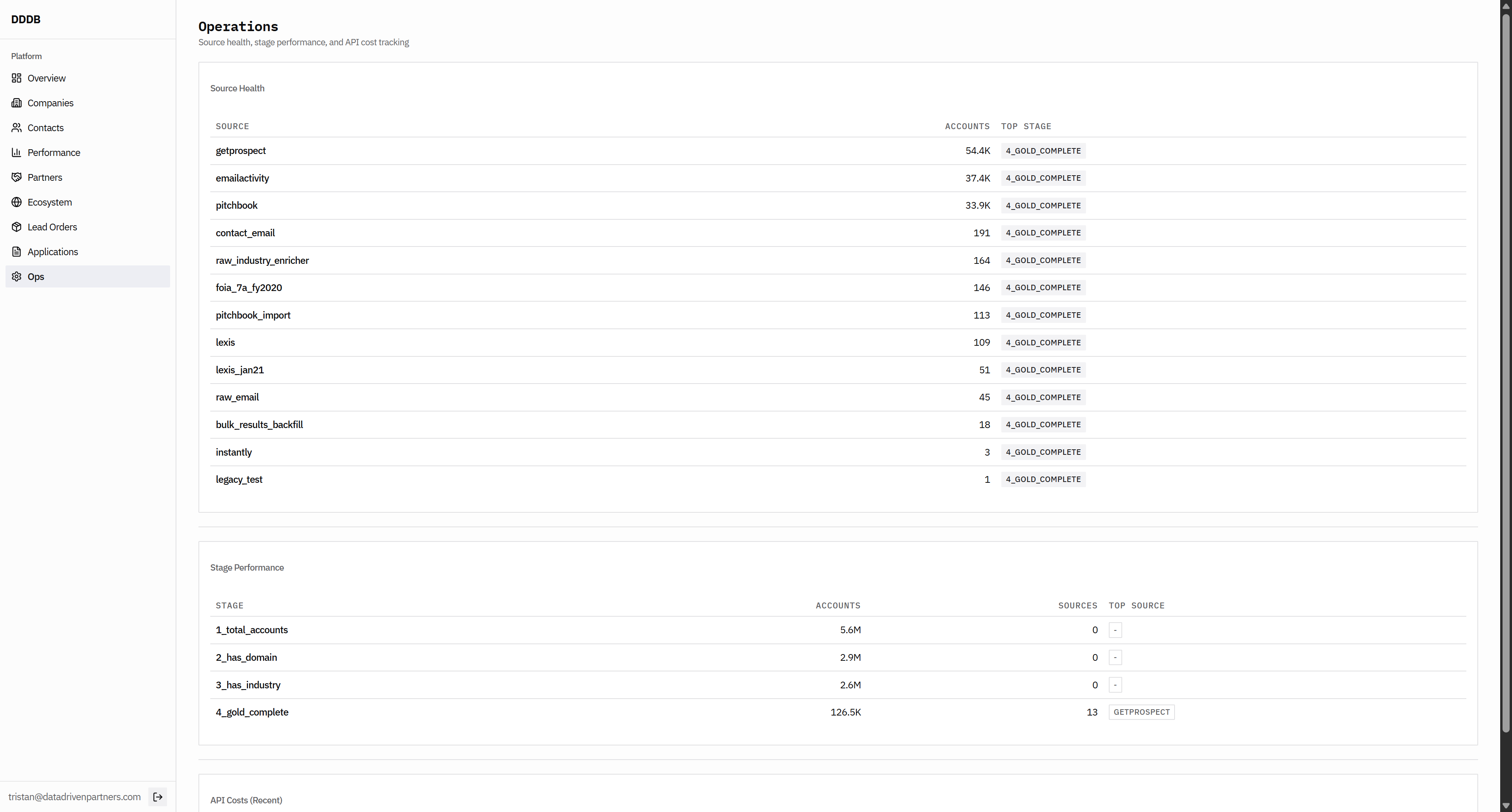
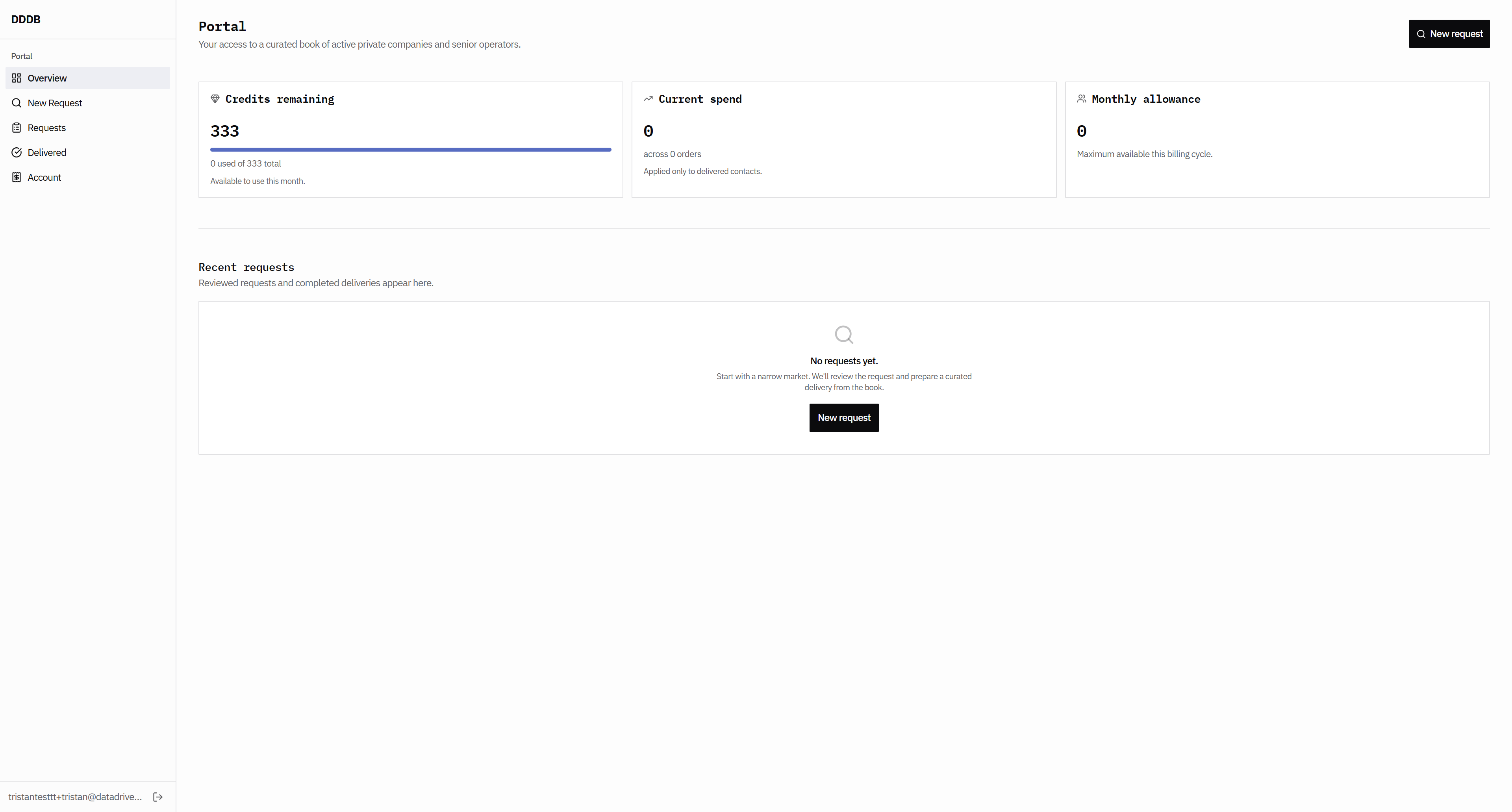
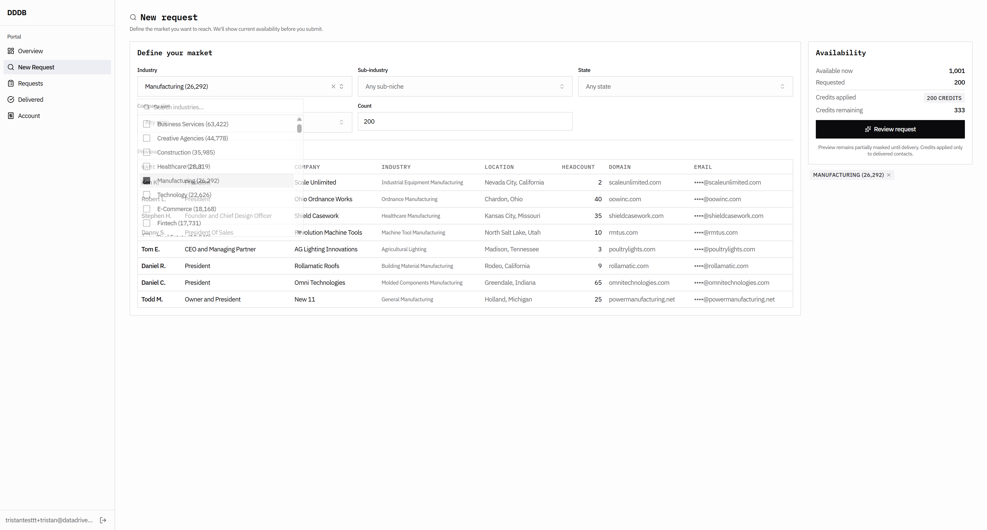
Okay, portal data and database design review for user path on the homepage. I don't really like this: decision maker contacts verified by hand or verified intelligence.

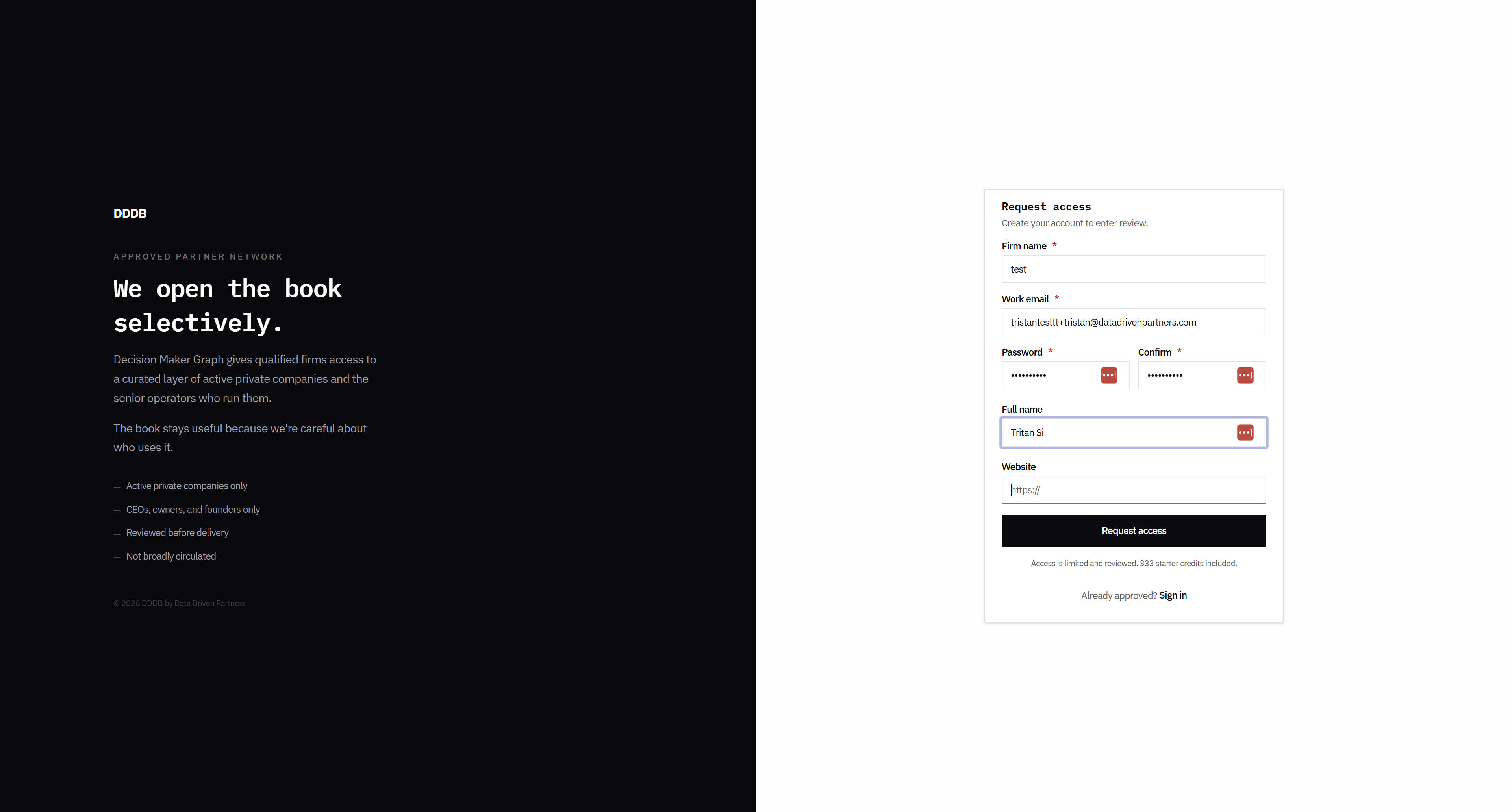
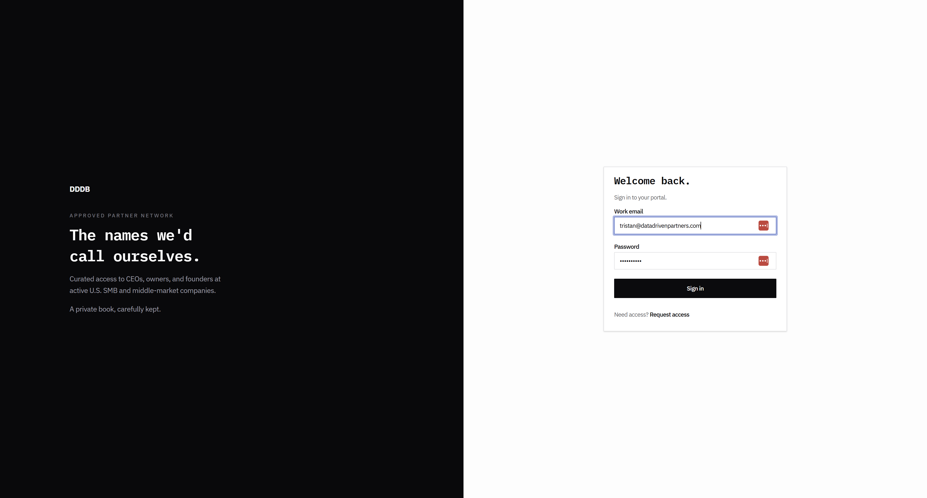
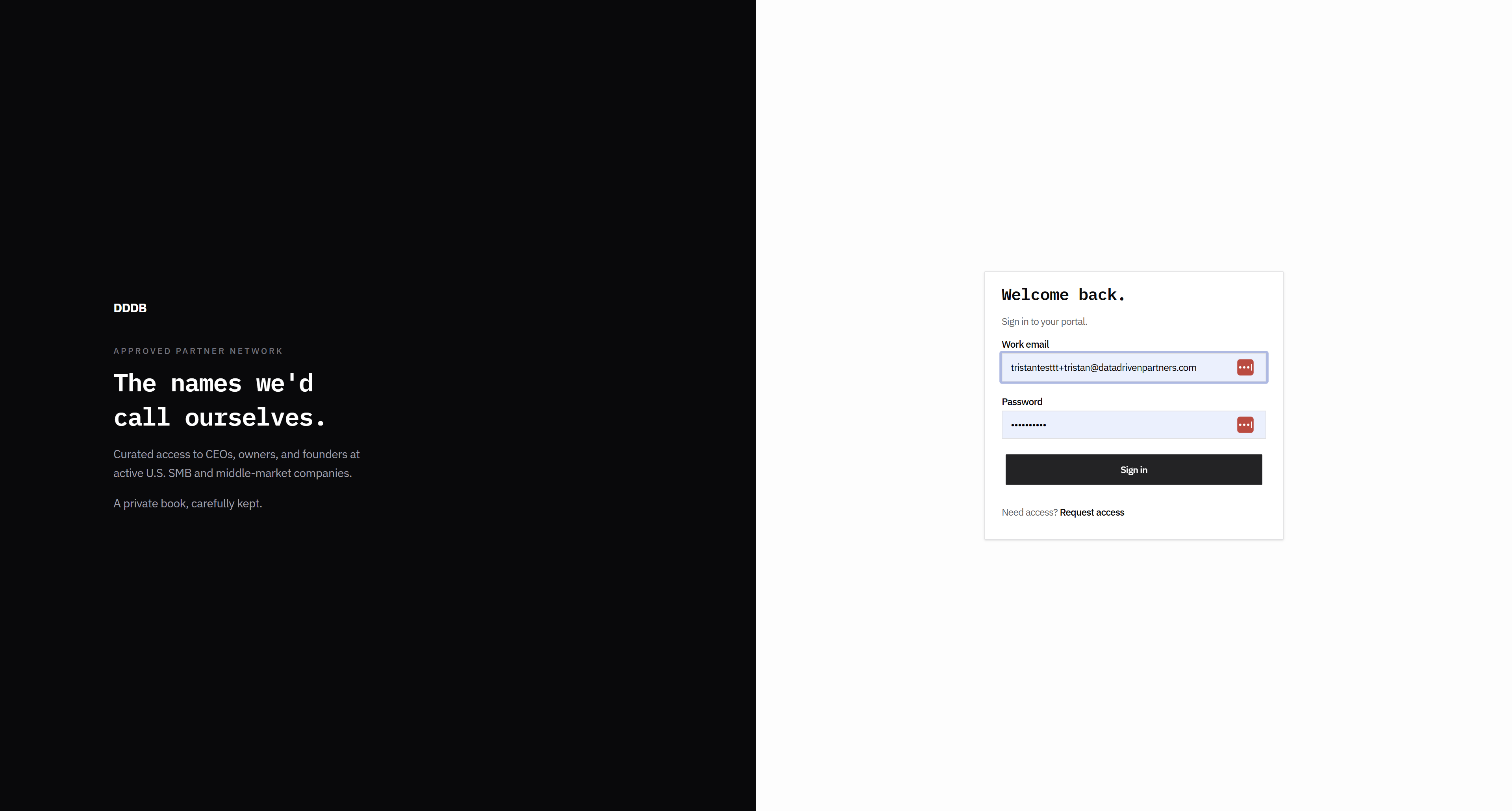
I have a couple of other solutions. And then, do not include these three bullet points here. It should be simple text. Request access. This is correct. These fonts should be large.
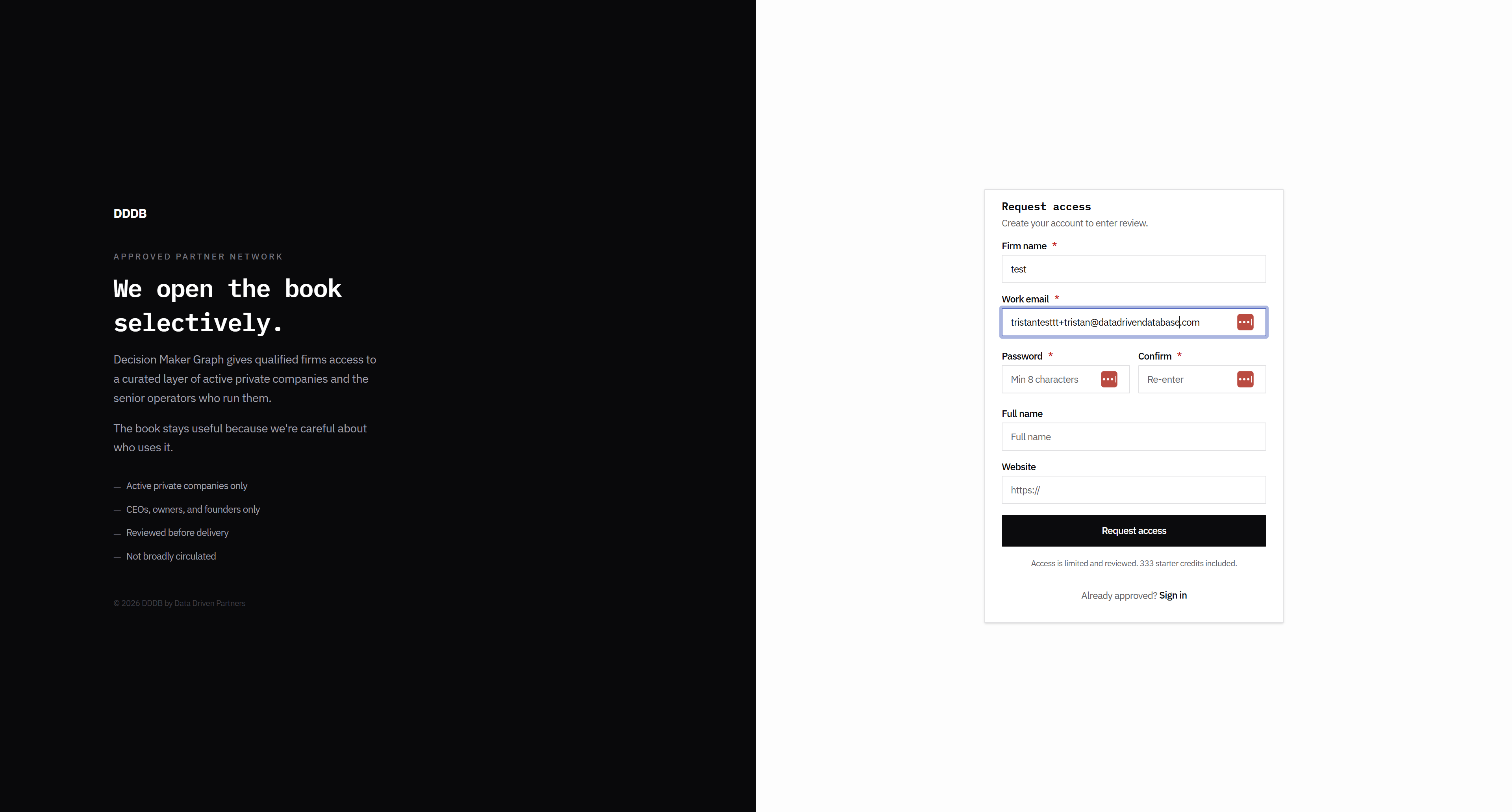
These are too small, and this is too small. The language here feels like we're trying too hard.

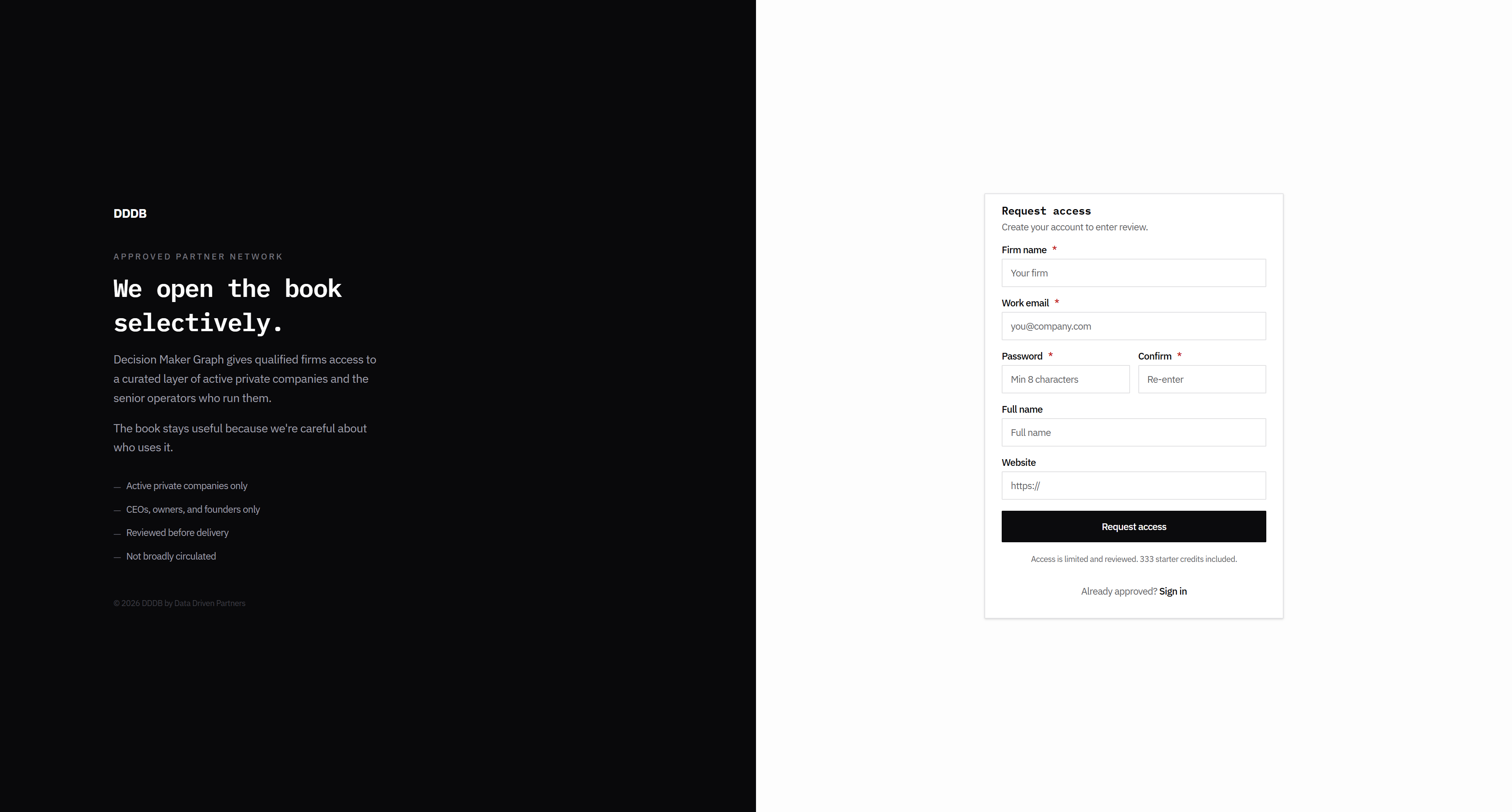
The font size is too small.

This must be in six or eight-point font.
This could be the company name or firm name.
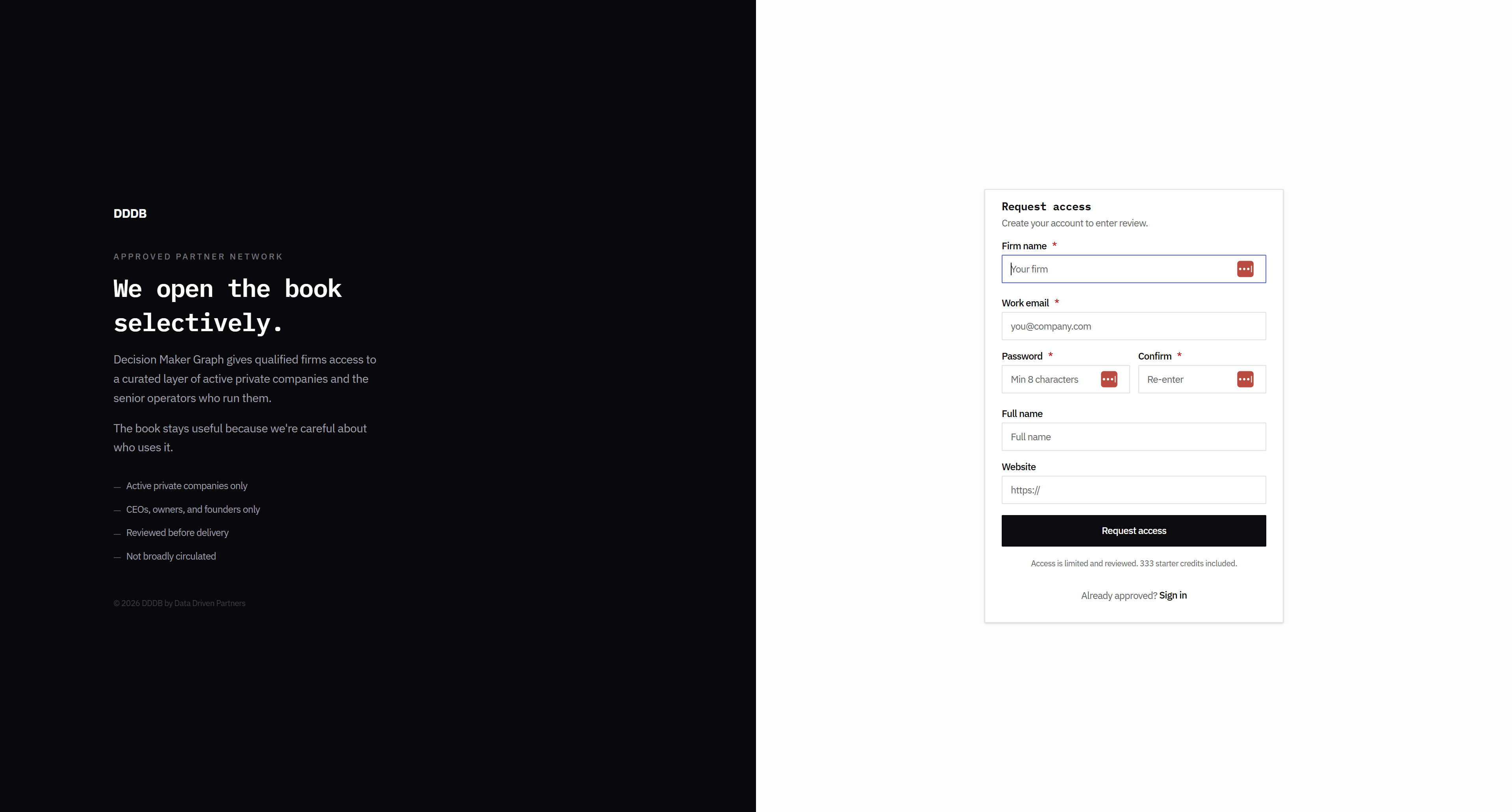
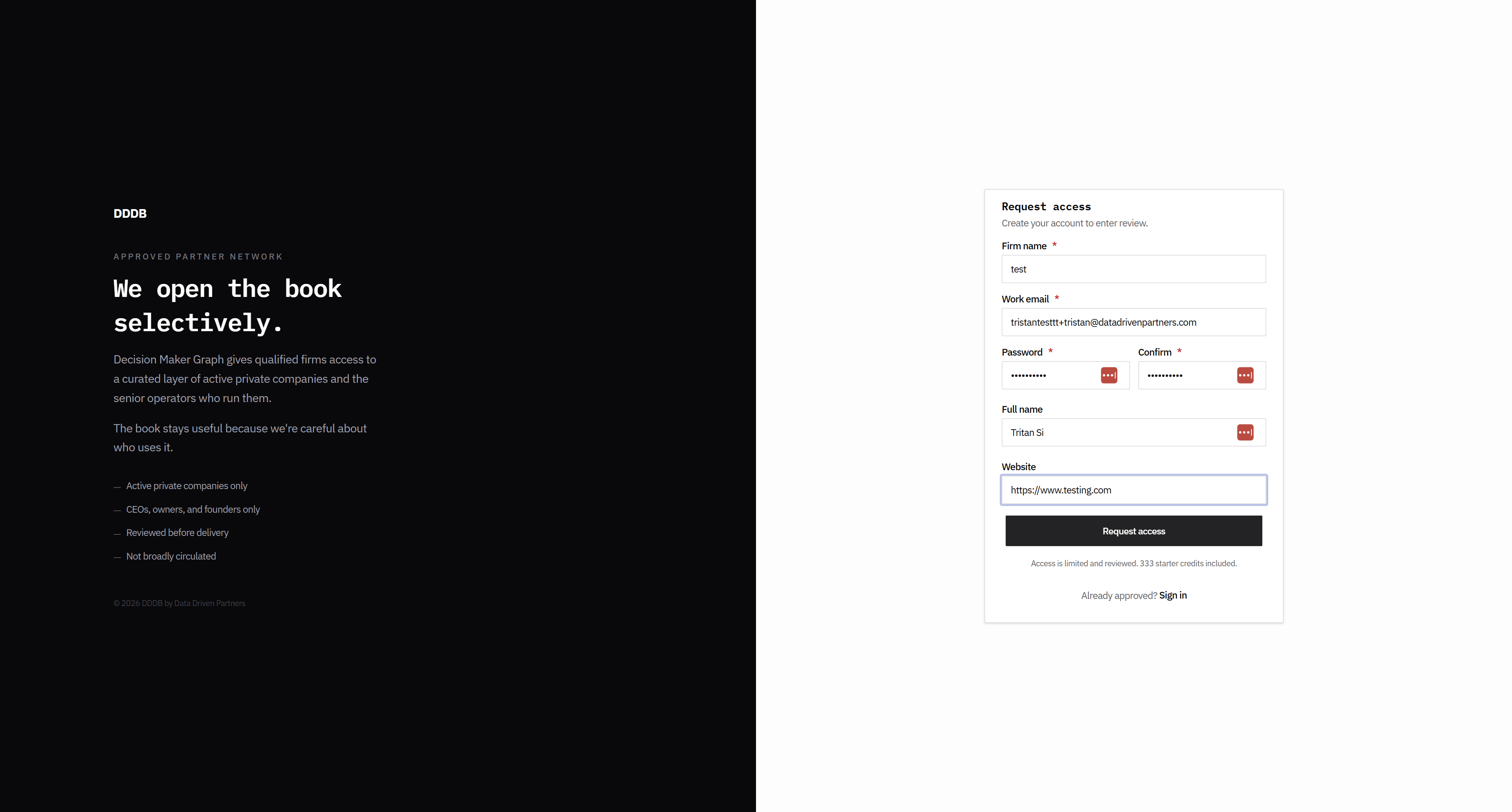
I think this form could be a little wider.

Like this.
This. Let's see how that looked.
Okay, that worked. That all makes sense.
Let's see. Okay, so I'm not sure if I've gotten the...
All right, so...
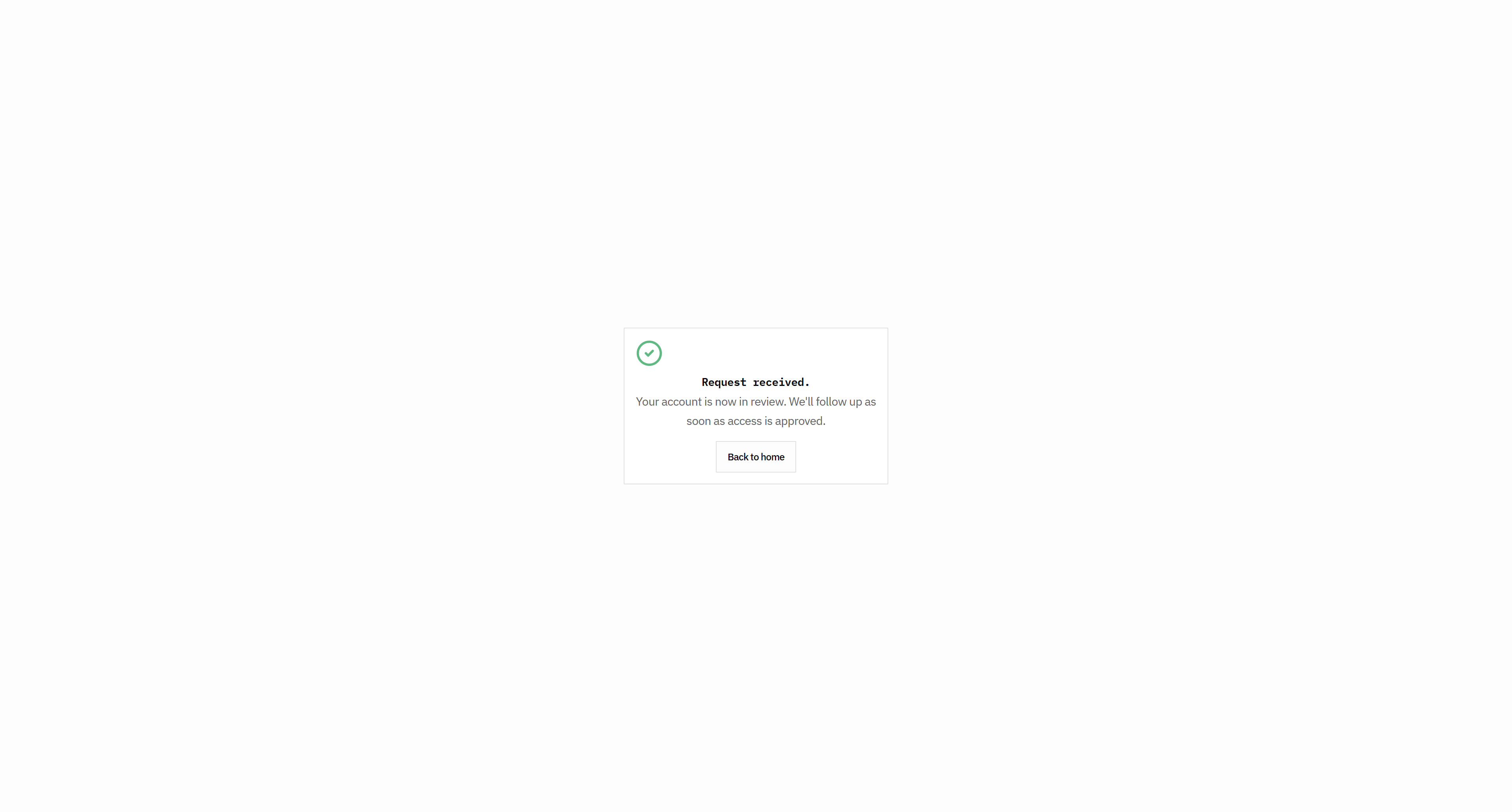
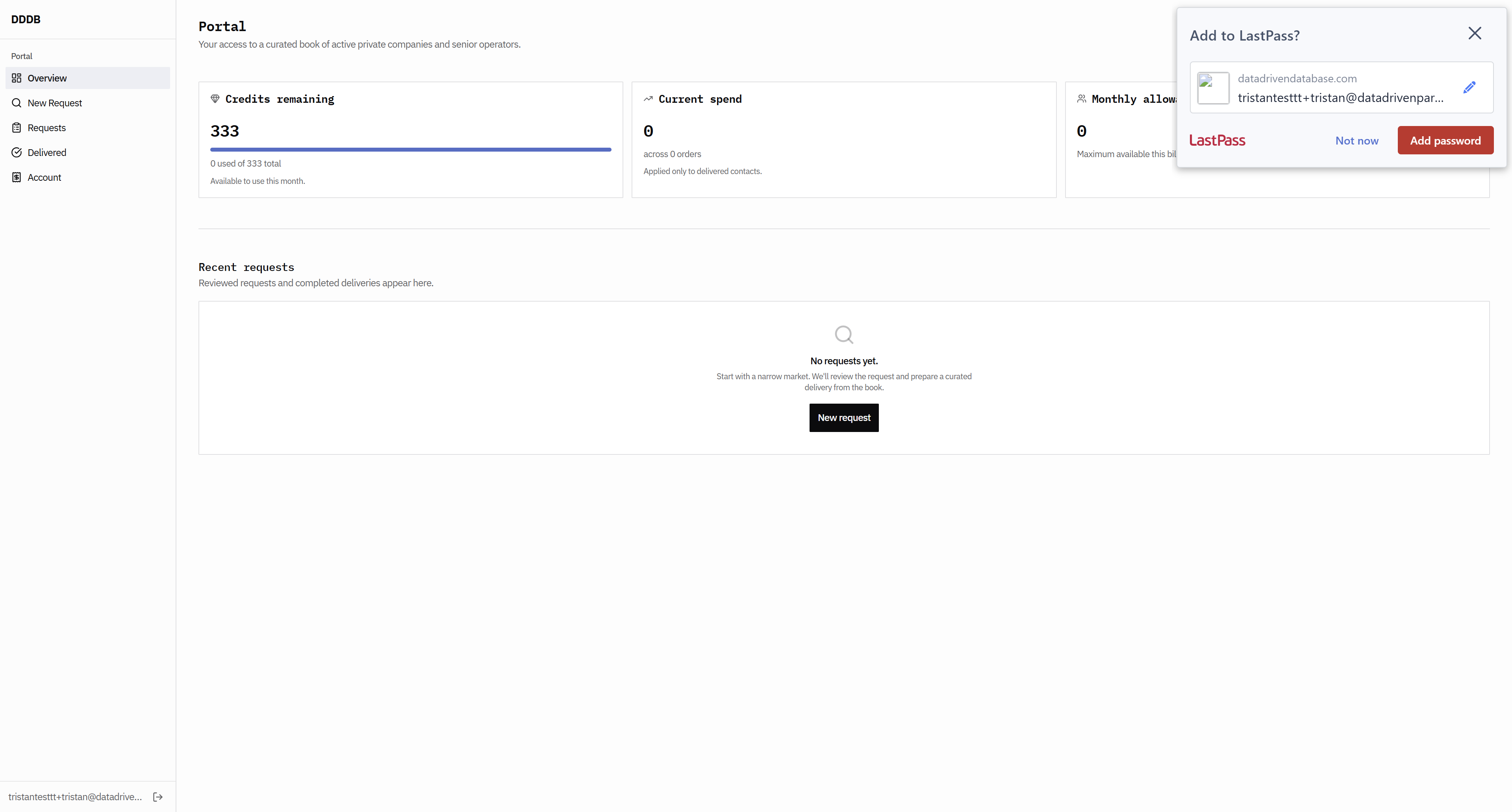
I'm not sure if the email is working. I think I should receive an email immediately that says, "Hey, we got your submission."
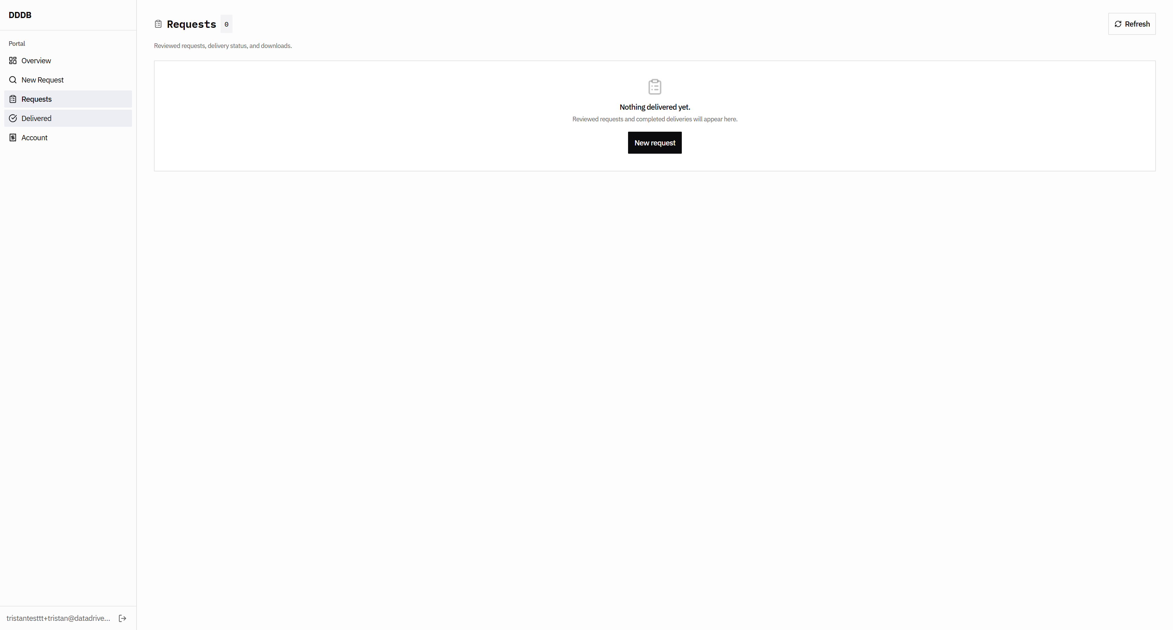
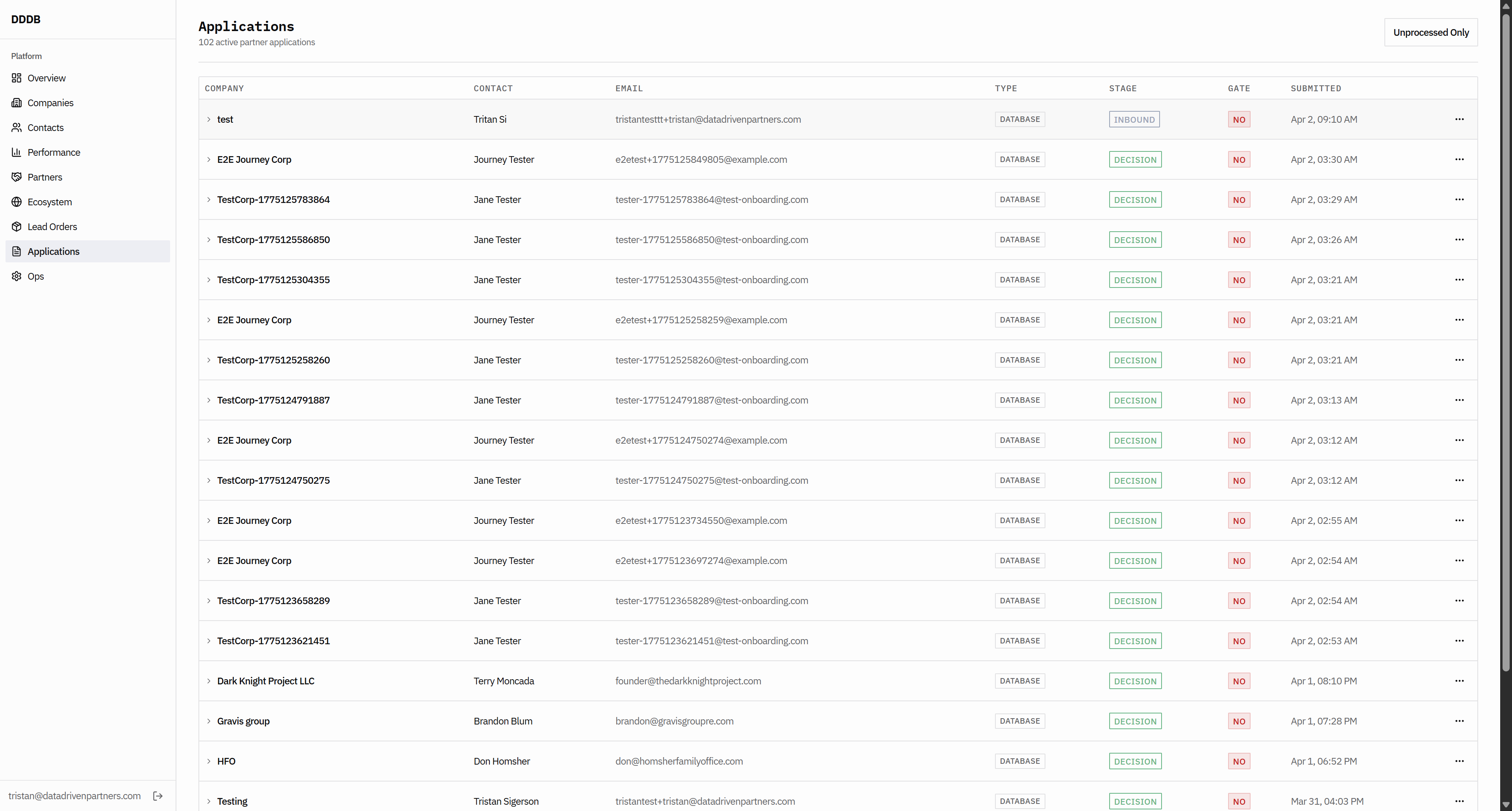
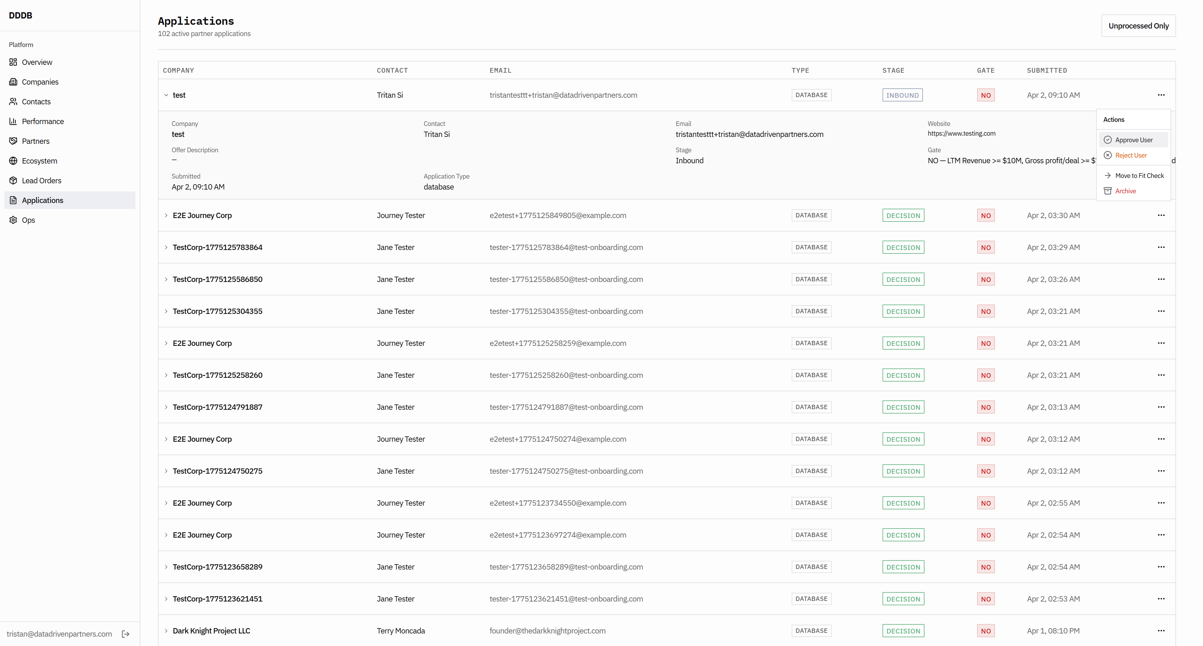
Keep going. The names for your carousels don't really make sense.
It sounds silly.
It sounds silly. We need to get to these pages.
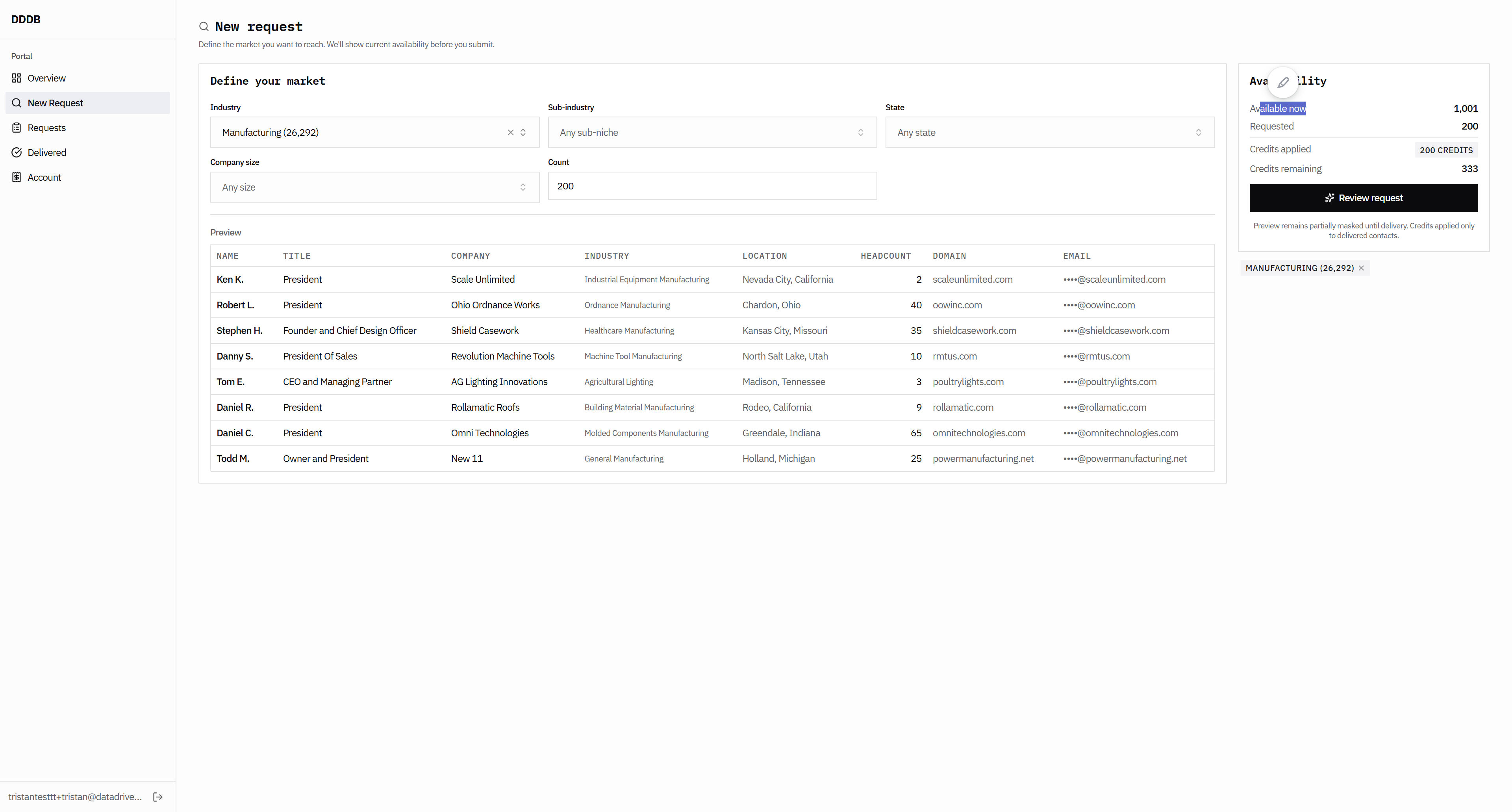
The rest of these pages, such as the pipeline overview, do not work as they should. But we're going to continue to veto, viewers. Has this font changed?
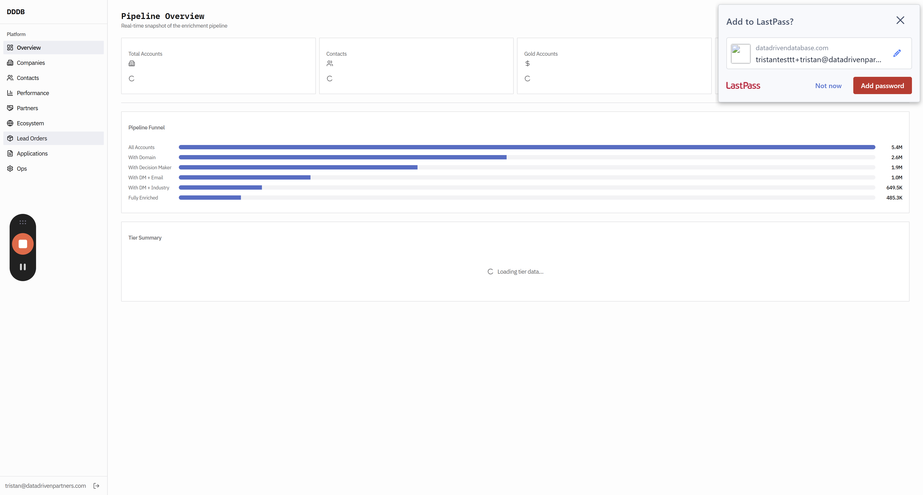
Did we... The font seems too small here. Okay, that's...
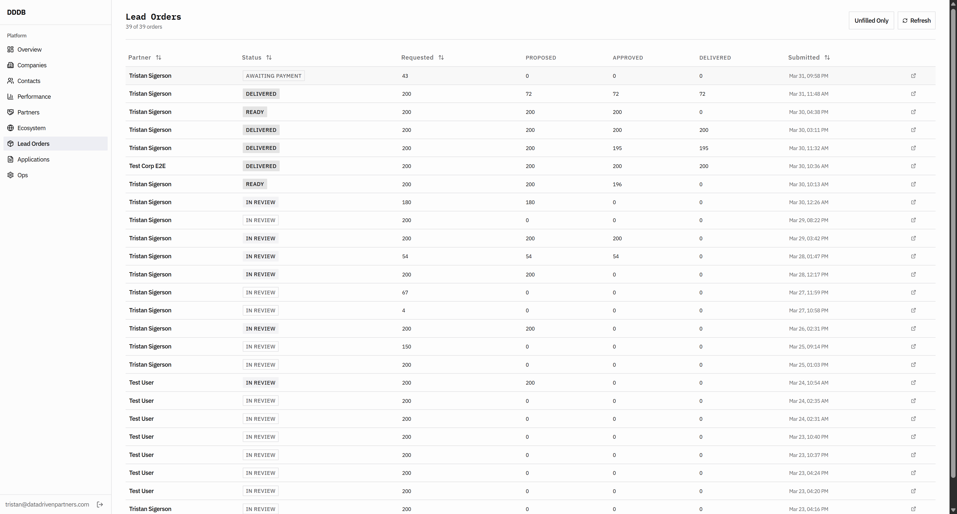
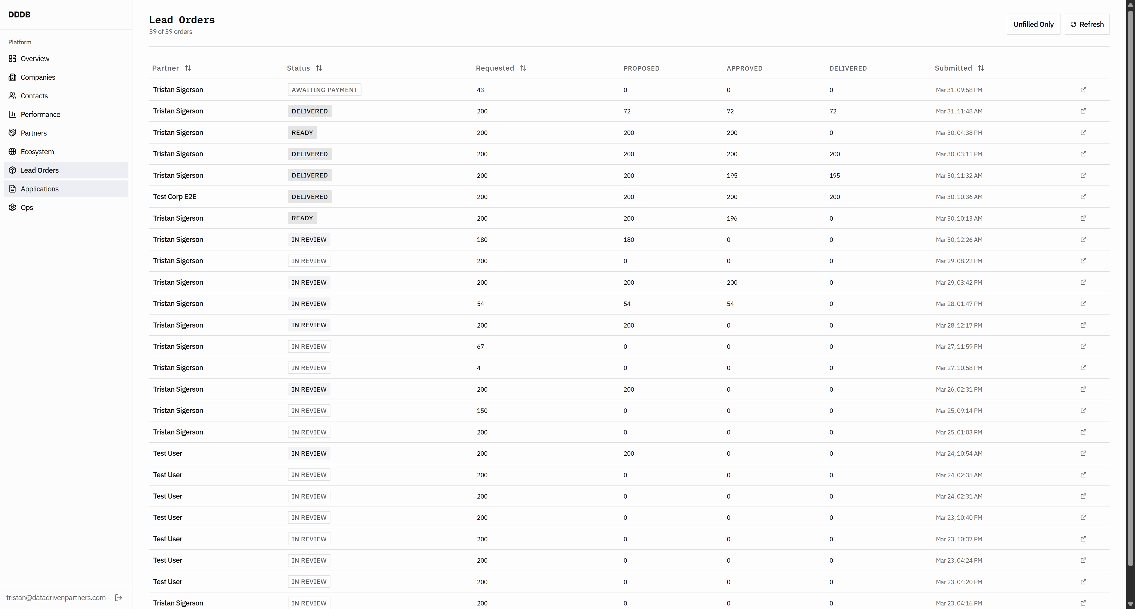
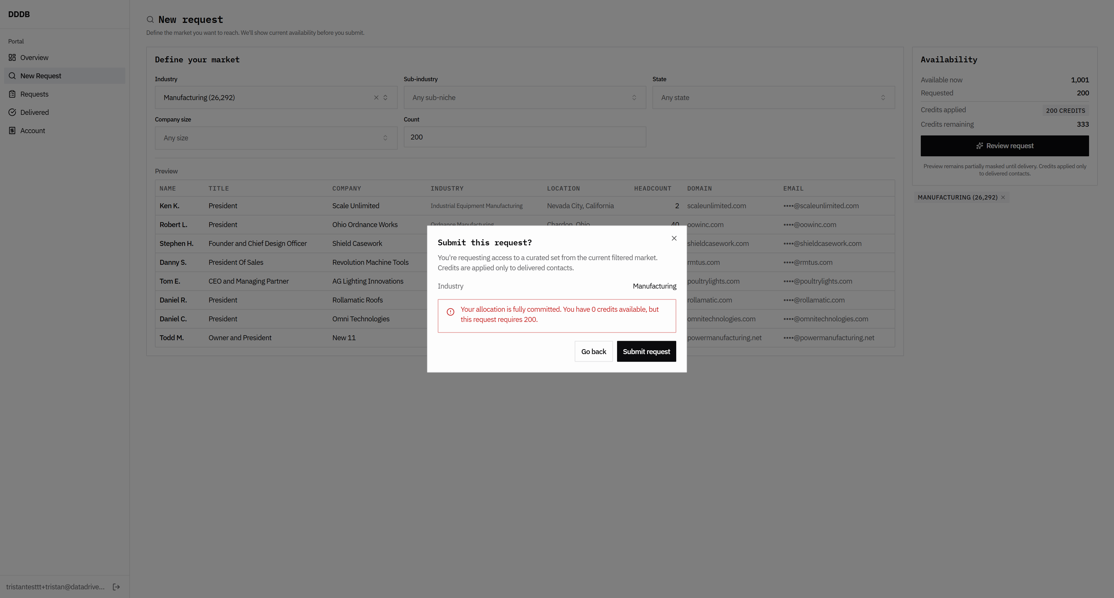
If they request 200 and we don't have to fill out a form, we should probably create something that is not like...

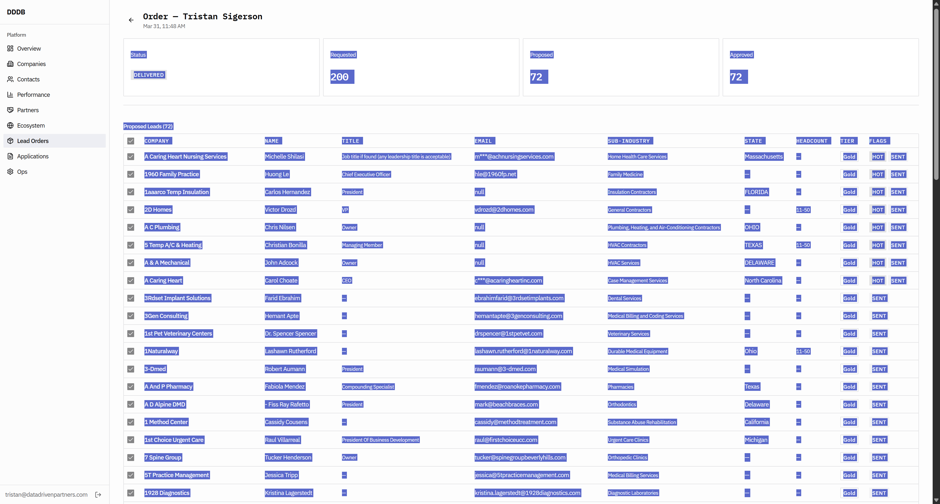
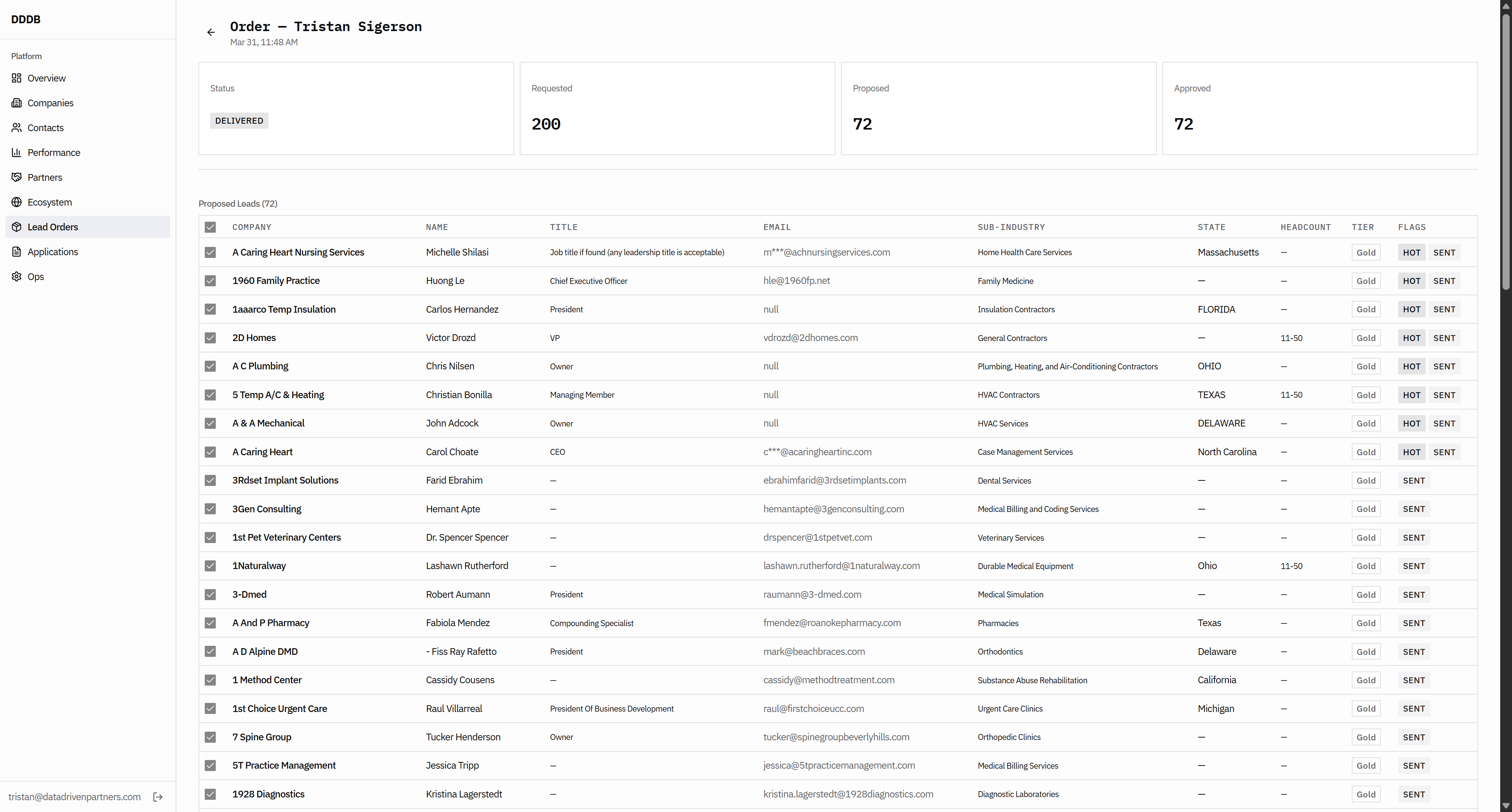
I need the ability to continue working on this, to fill more of this order, or to fill a separate order. We also need to make sure this email is here with M three stars. I'm not sure why it is included.

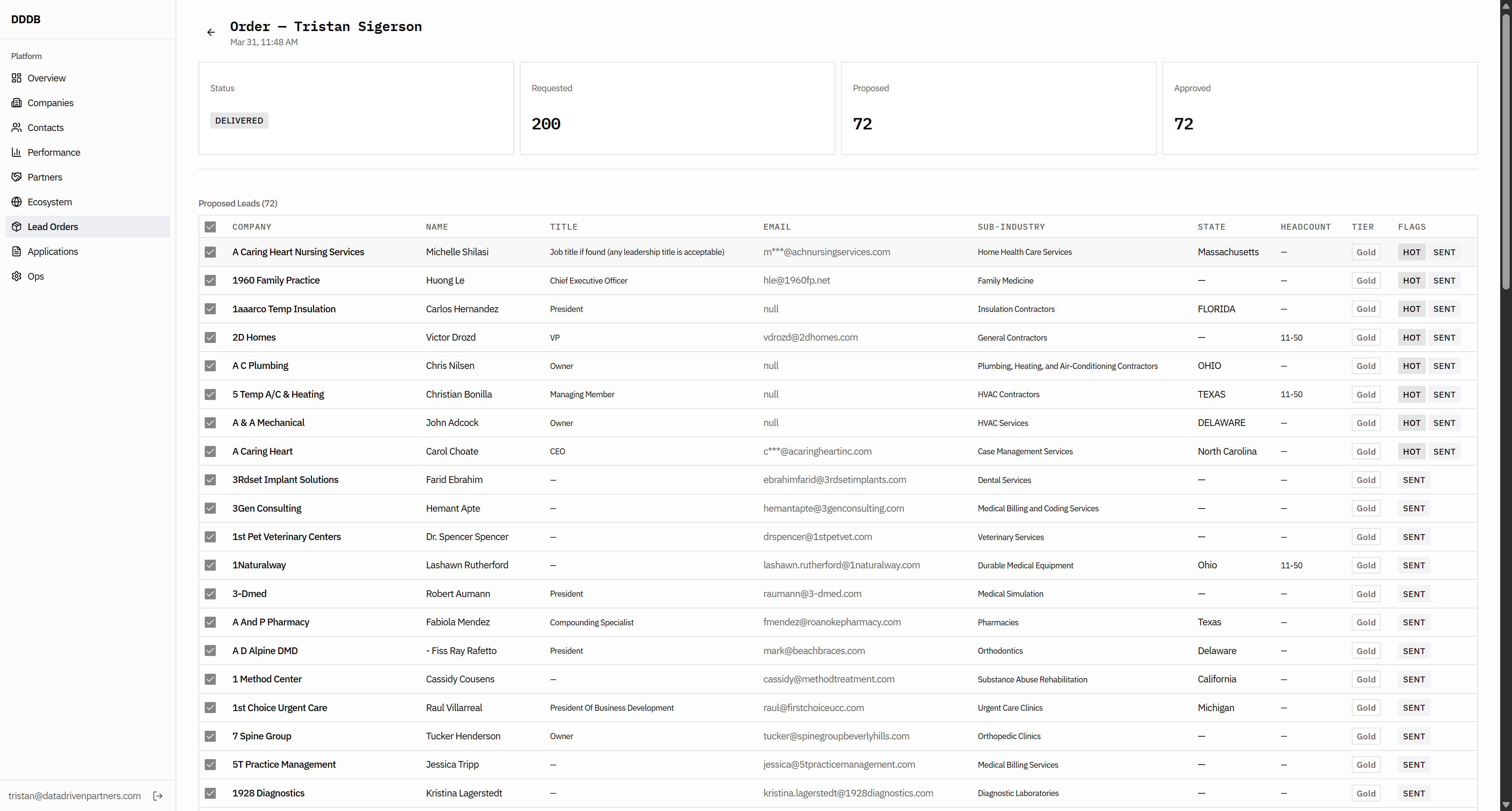
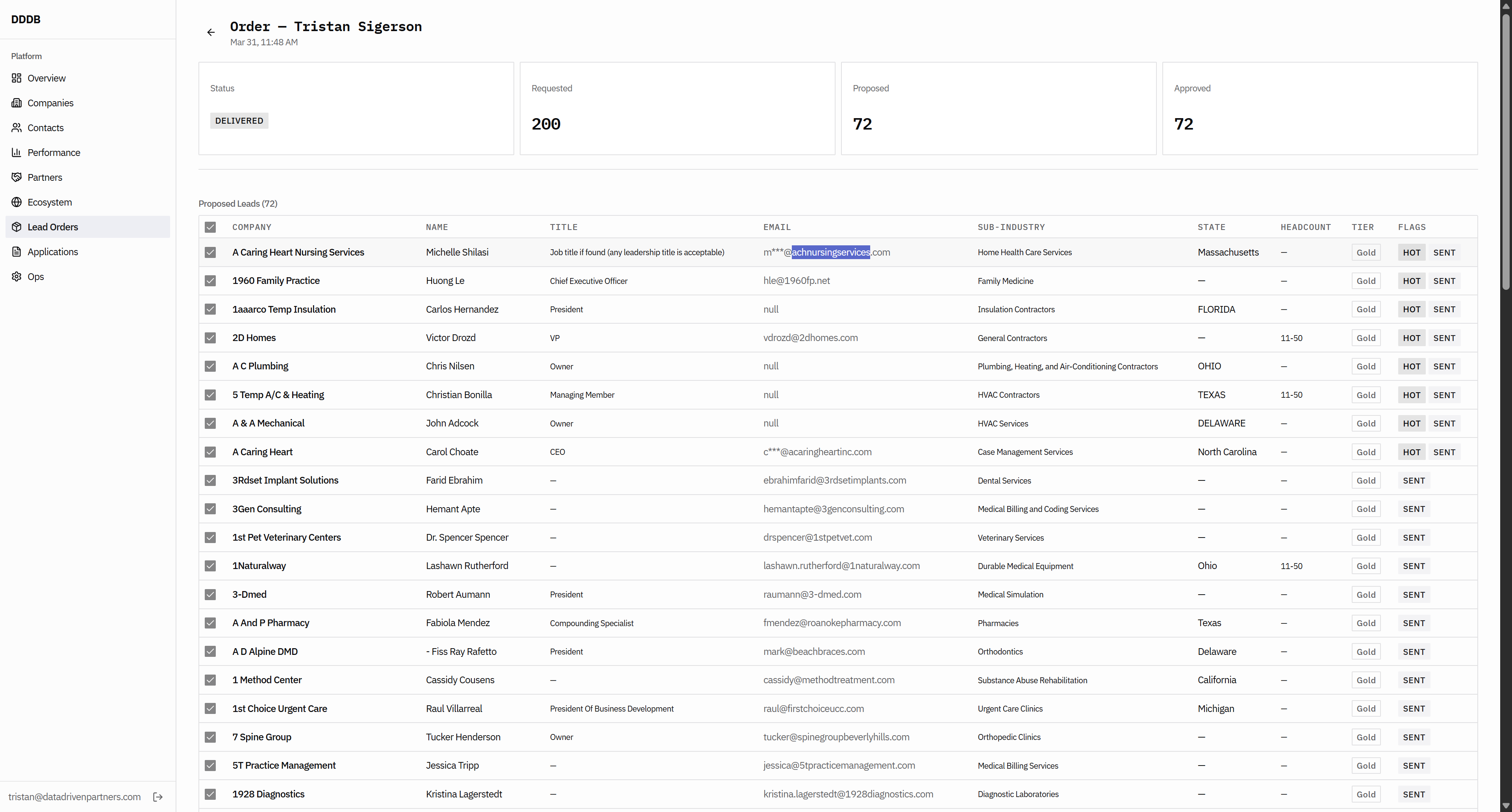

That means we don't have their email address, so it should be filtered out. And then, on the flags, if we can confirm they have already sent the sent flag when this happened... So it should be like a...


We need a system for keeping track of which leads we've given to whom.

Then you probably have a flag for industry.

For which industry we have sent this flag or lead. Insurance brokerage or something similar should be the flag. Let's see this.

Okay.
We haven't found a better flag to use here than this one.

This just seems funky. Okay.

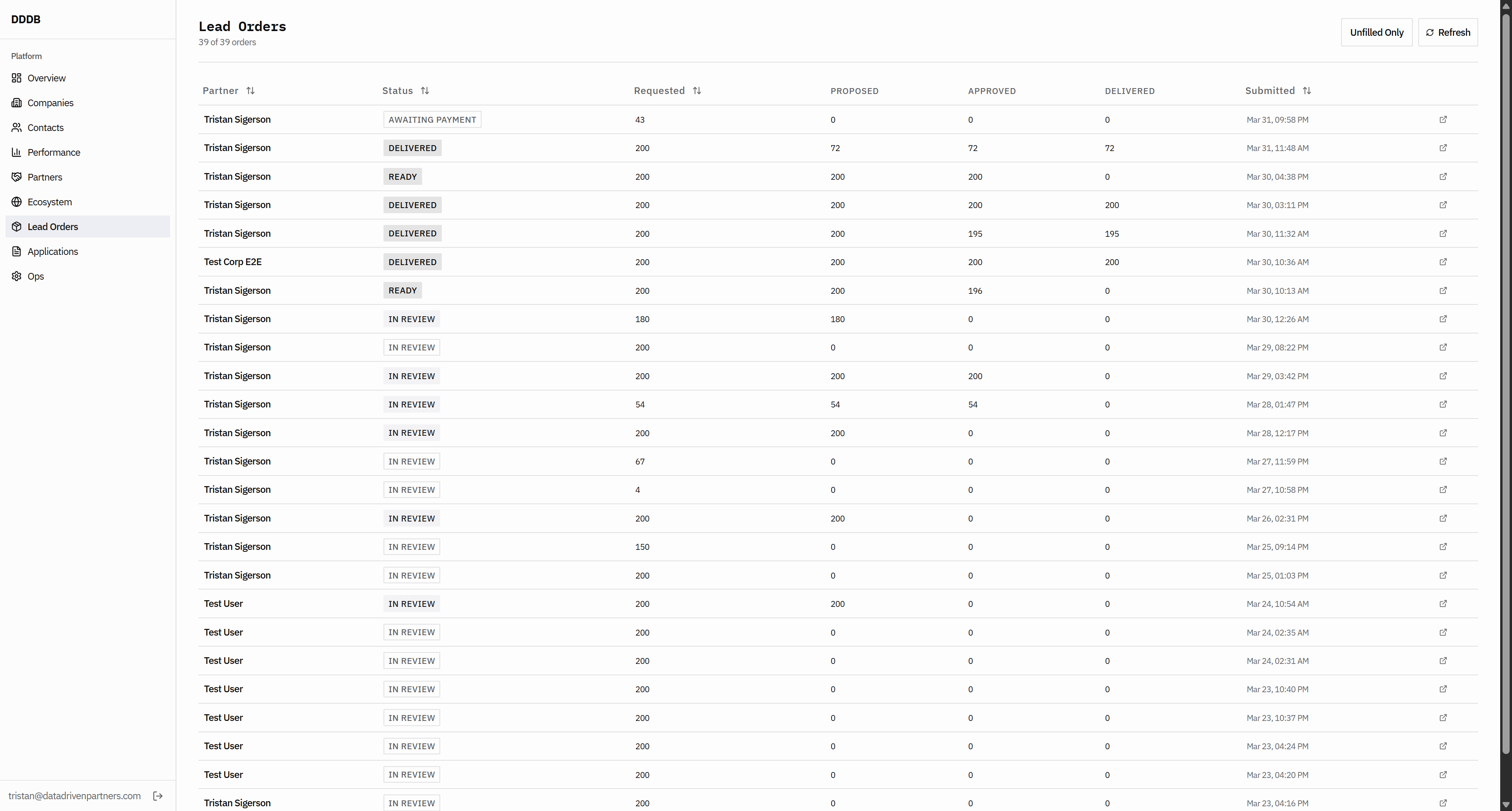
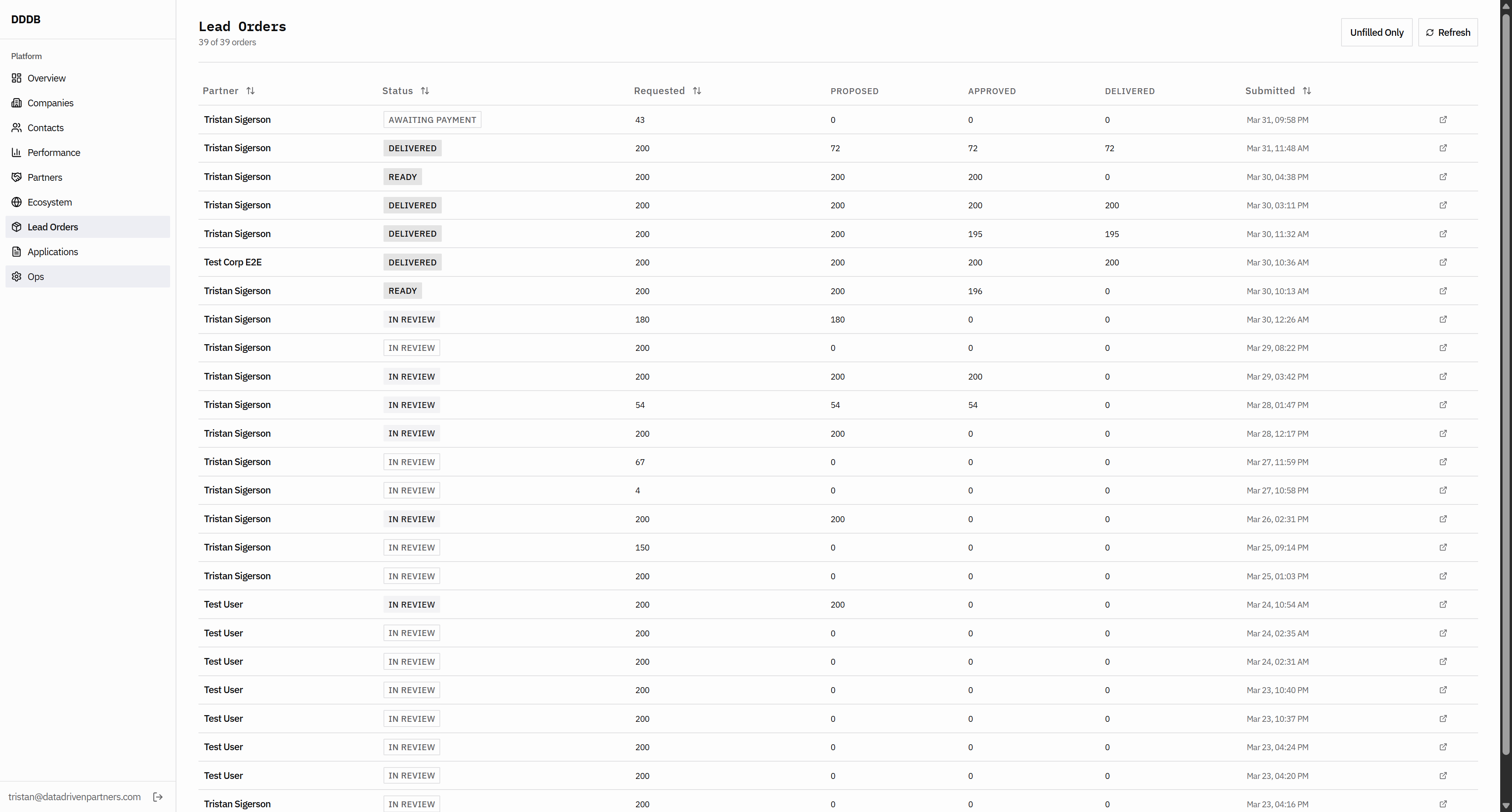
That means user.
They should have allowed us to set it to 1000 instead of zero. Okay. That means user. They should have allowed us to set it to 1000 instead of zero. Yes.

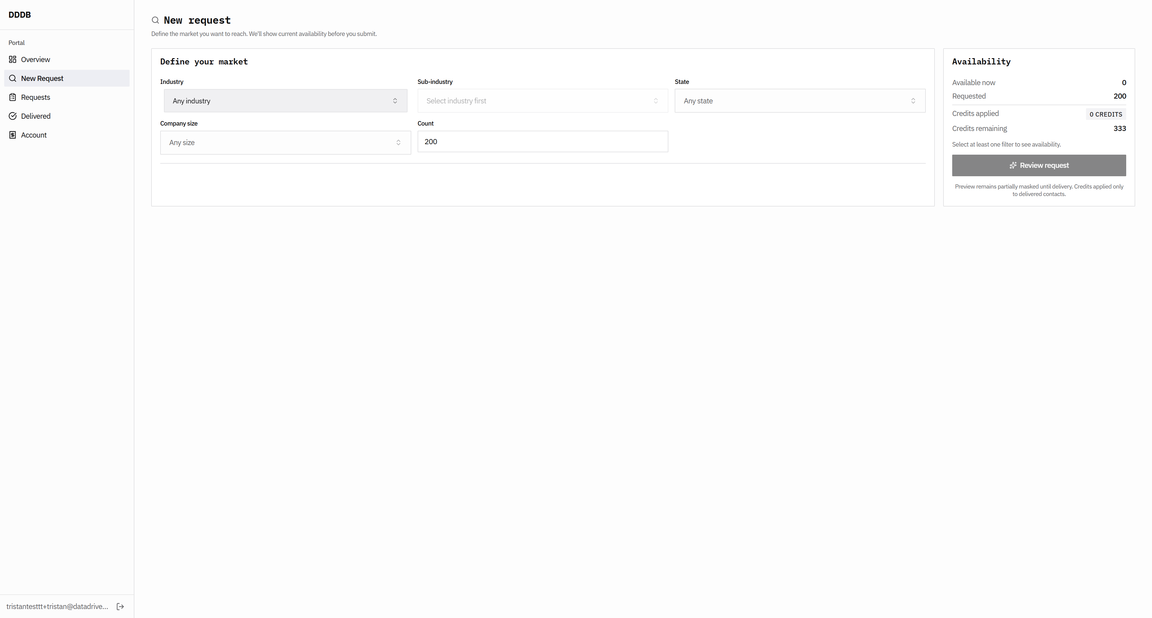
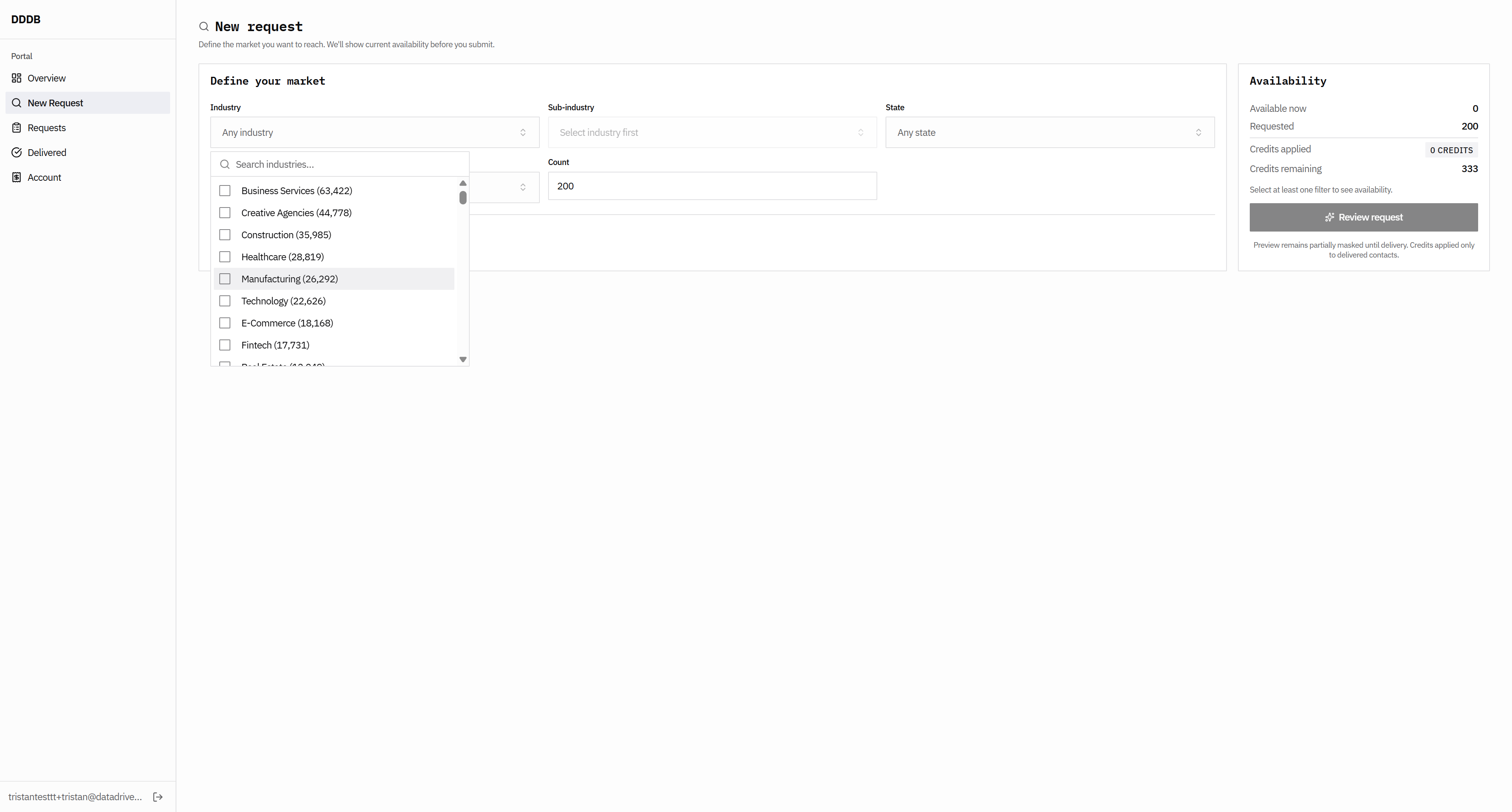
I think what may be available to you has changed. This doesn't make sense; these numbers are incorrect.


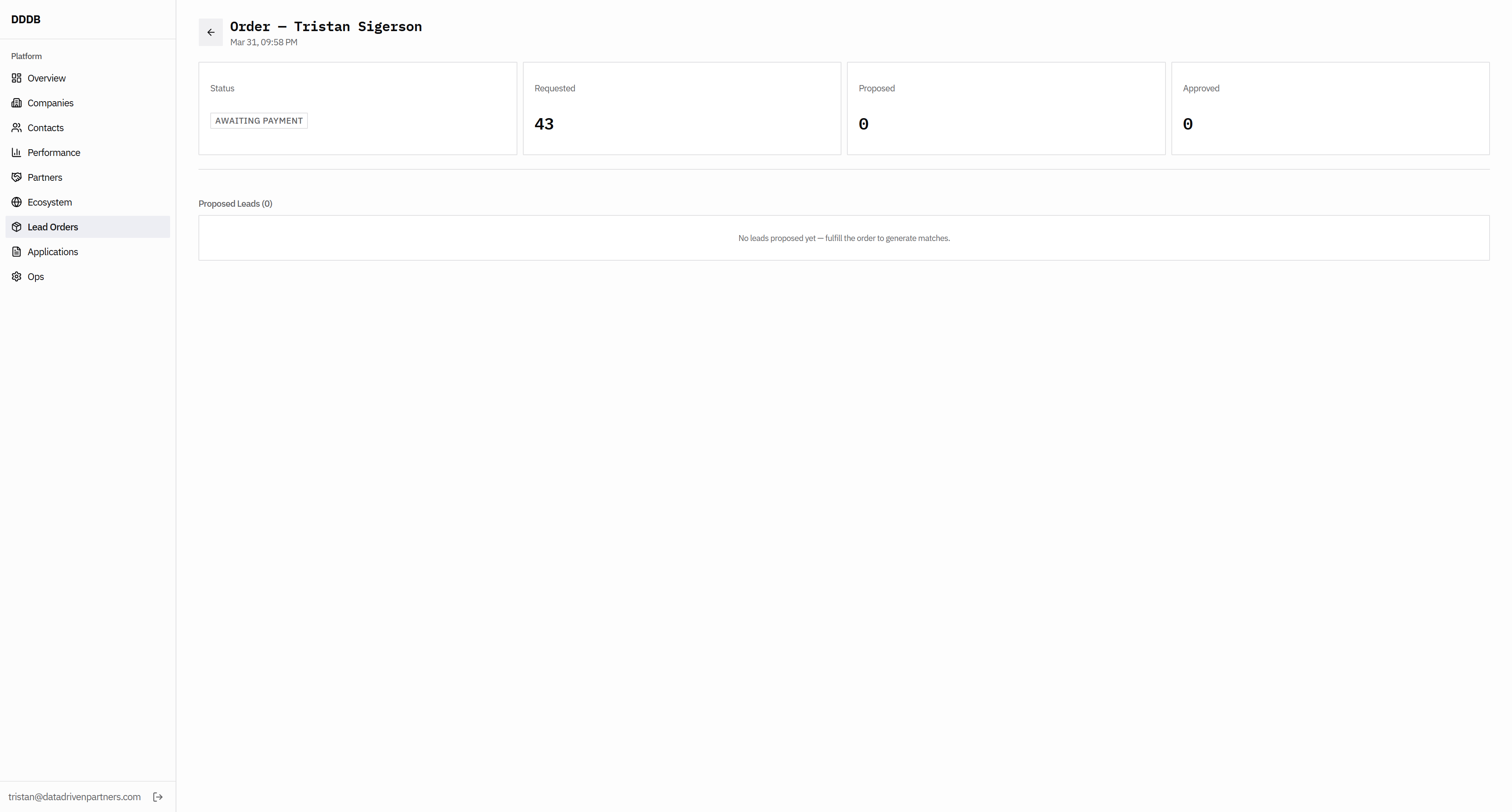
Uh, requested... Oh, yeah. That's return. This should be 143 credits. Do we have a subtotal here on the submit request?
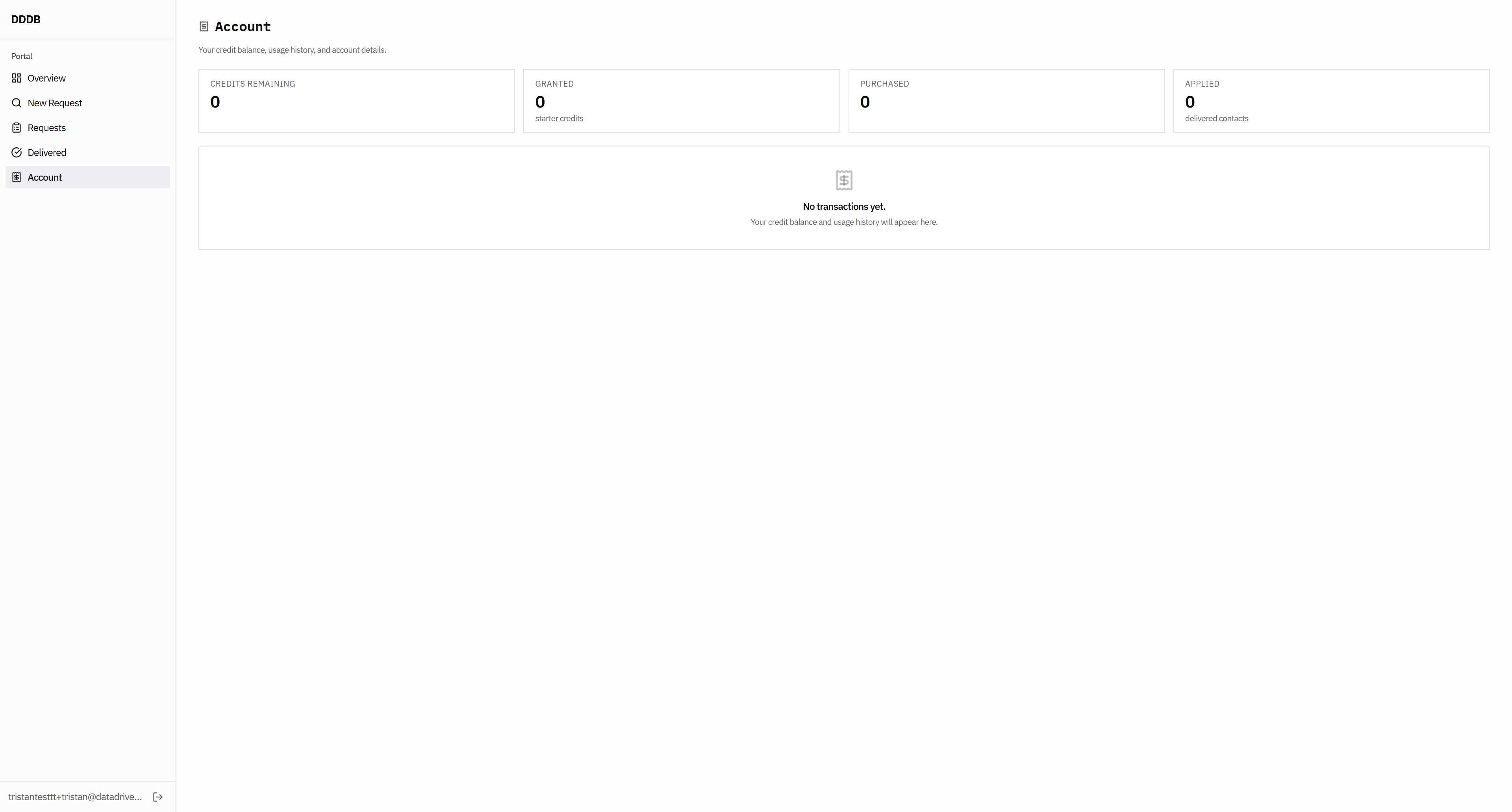
Then we get the error message, so they shouldn't click OK.
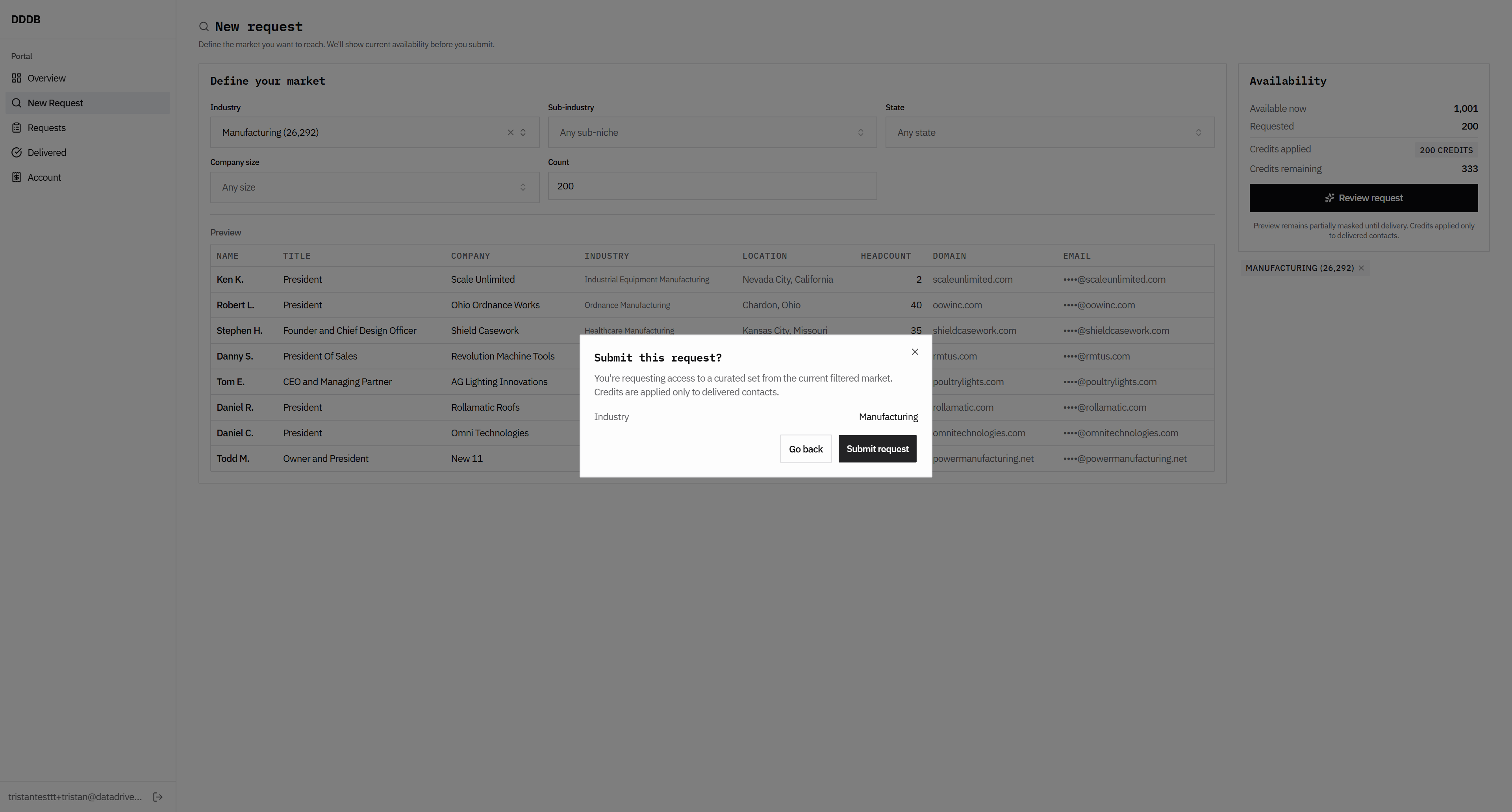
There isn't an opportunity to generate an invoice. I'm not sure where our invoice is, because we should allow them to request as many as needed to generate an invoice.


That's incorrect.

To review the previous version.