Icon

Step-by-Step Guide: Creating a Visual Chart to Display Data Summaries

Learn how to create a visual chart to display data summaries, including filtering, grouping, color coding, and customizing your chart for educational buildings by gross floor area and year built.

By Robin Neri

In this guide, we'll learn how to create a visual chart to summarize and compare data, such as the total gross floor area of different types of educational buildings over time. We will cover how to select and filter data, choose the right chart type, customize the appearance, and save your chart for future use or sharing.

Let's get started

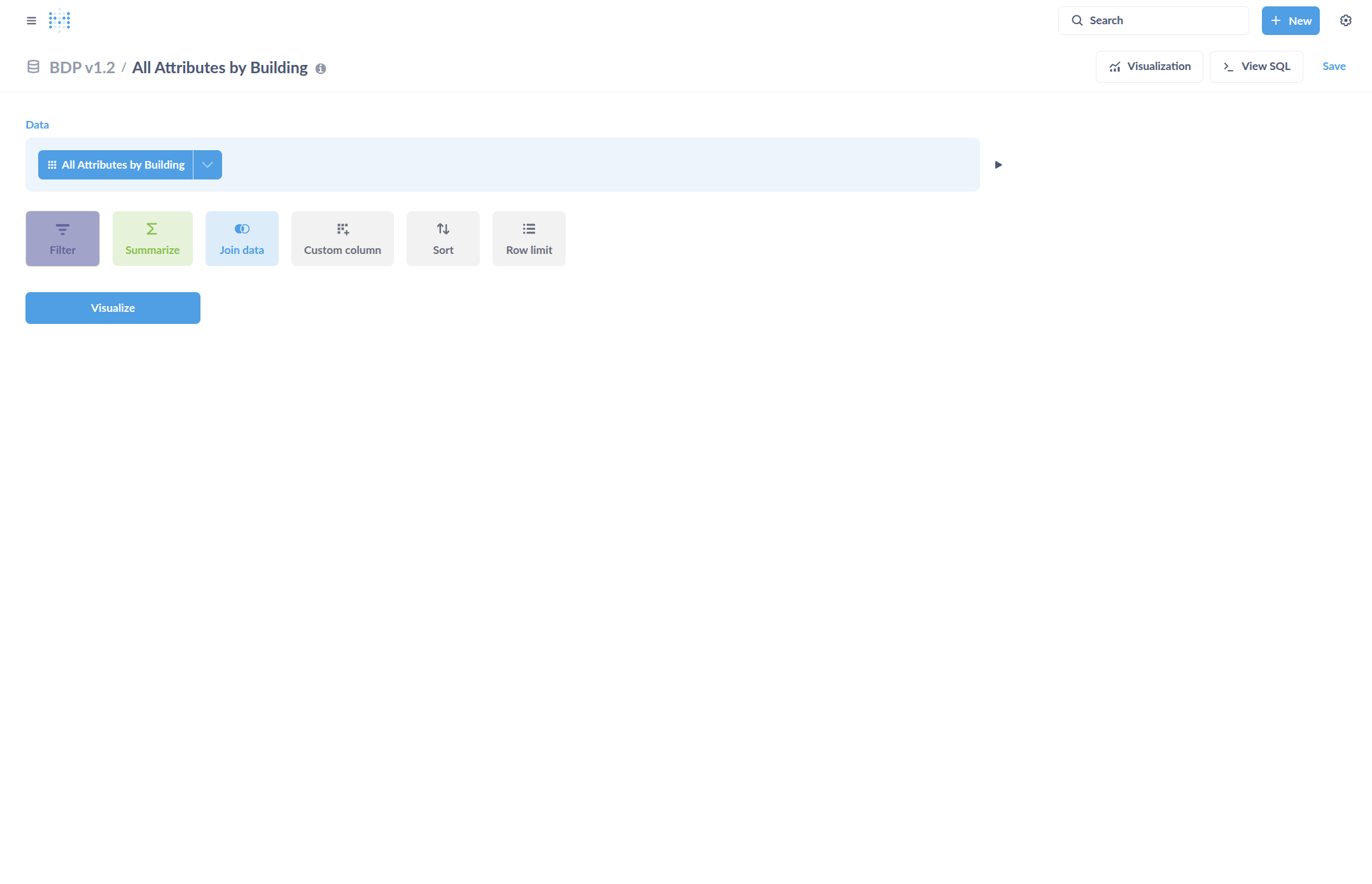
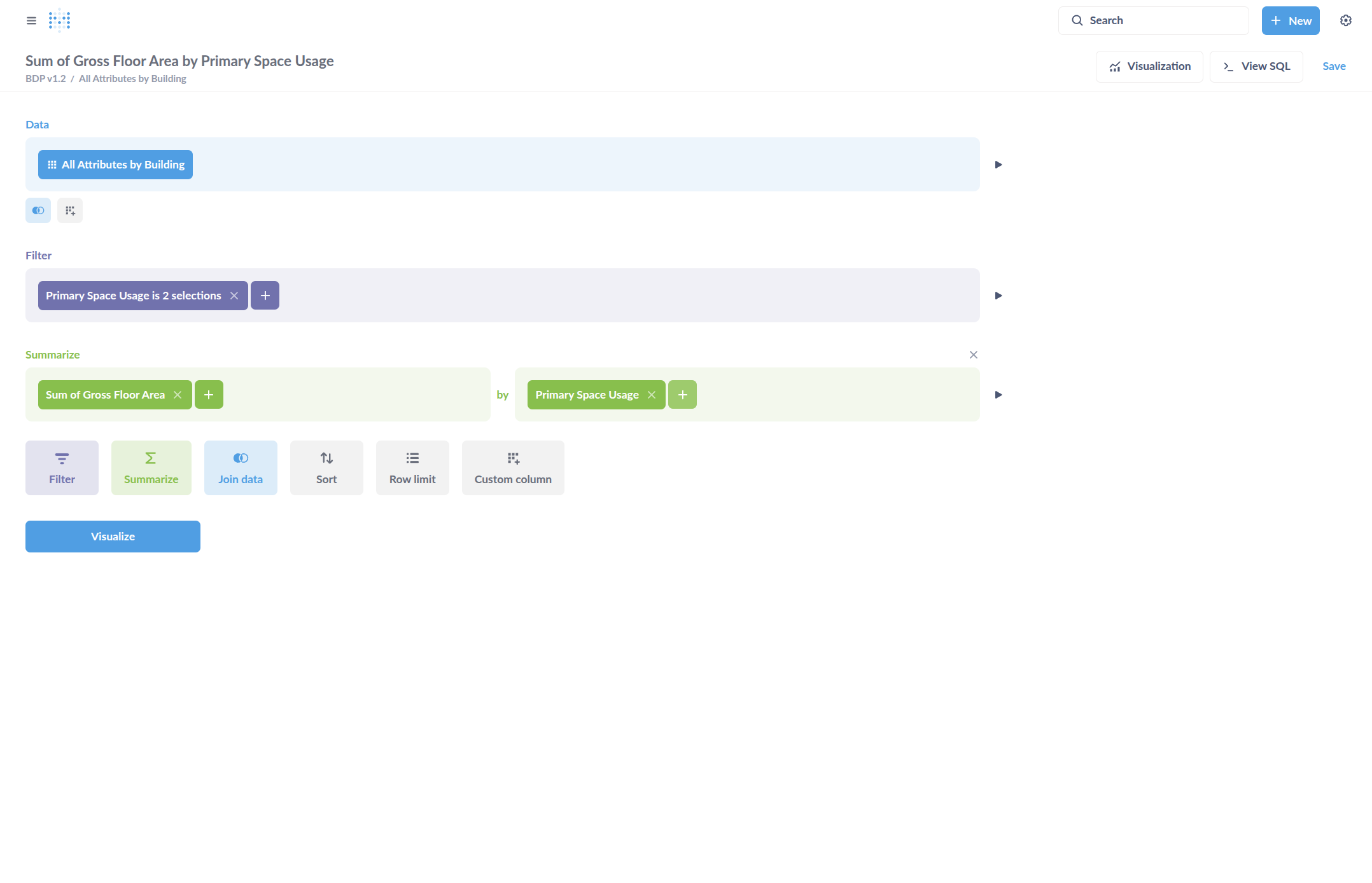
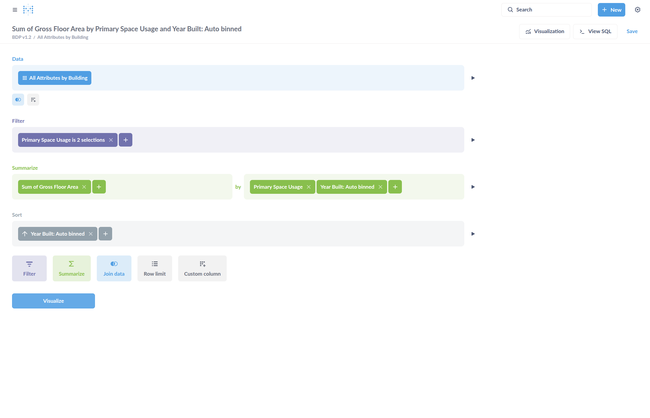
... Guide for creating a visual chart to display a data summary. We can start by creating a summary. Click Editor.

1
Go to any table view
2
Click "Editor"
Step #2: Click "Editor"
3
Create the summary data you want to show in a visualization. For example, add a filter...
Step #3: Create the summary data you want to show in a visualization. For example, add a filter...

4
...for "Primary Space Usage".
Step #4: ...for "Primary Space Usage".
5
Select some options, such as colleges...
Step #5: Select some options, such as colleges...
6
... and K-12 Schools...
Step #6: ... and K-12 Schools...
7
Update the filter.
Step #7: Update the filter.

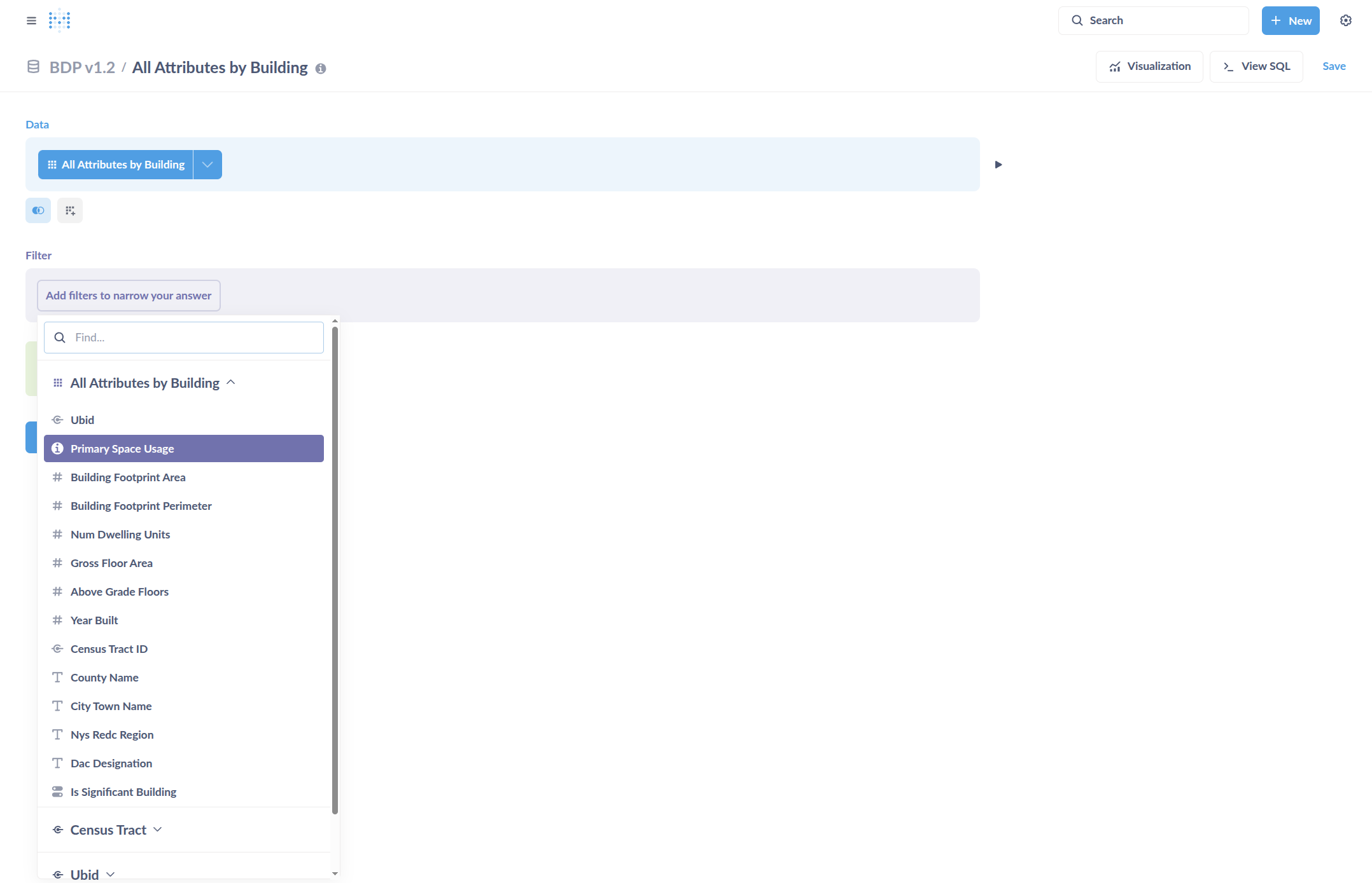
Then, click on what you want the chart to display.

8
Click on "Summarize"
Step #8: Click on "Summarize"
9
Slect "Sum of ..."
Step #9: Slect "Sum of ..."

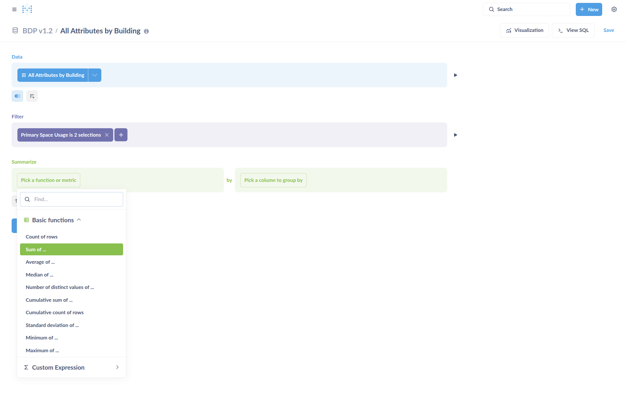
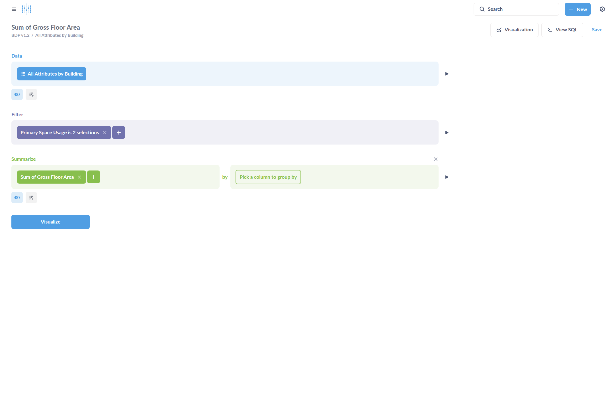
For example, the sum of the gross floor area.

10
Step #10:
11
Select attributes to group by
Step #11: Select attributes to group by

12
We will want to color code our chart by primary space usage, so we select that first.
Step #12: We will want to color code our chart by primary space usage, so we select that first.

13
Add another grouping column with the Plus symbol.
Step #13: Add another grouping column with the Plus symbol.
14
Select Year Built. Since this is a numerical column, it will default to binning the values into groups for better summaries. This can be changed by clicking "Auto bin".
Step #14: Select Year Built. Since this is a numerical column, it will default to binning the values into groups for better summaries. This can be changed by clicking "Auto bin".

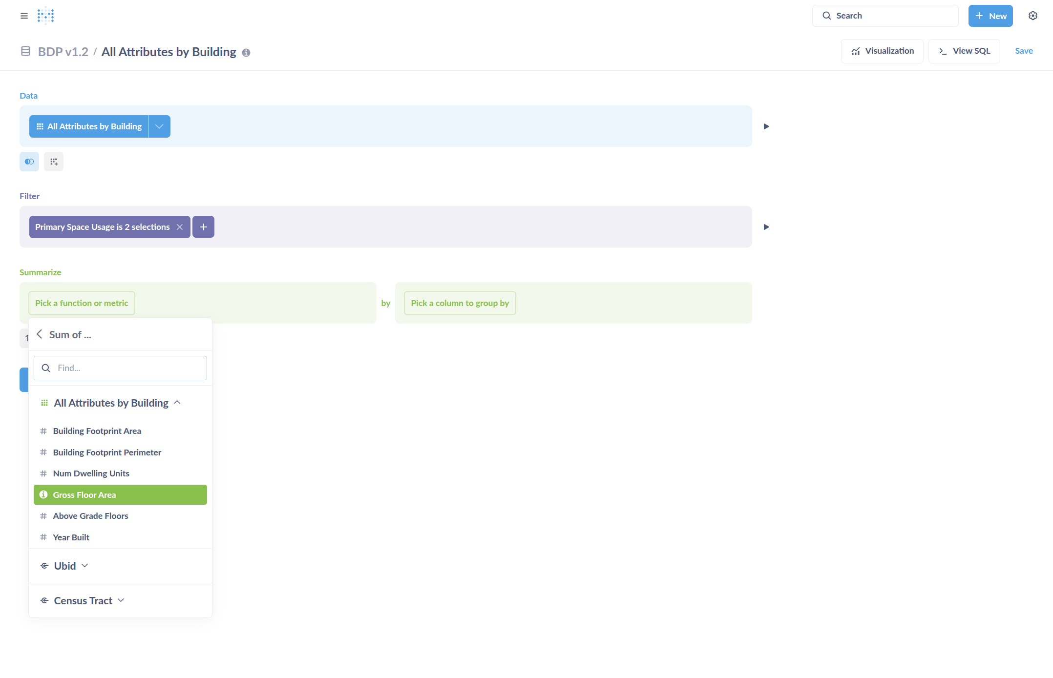
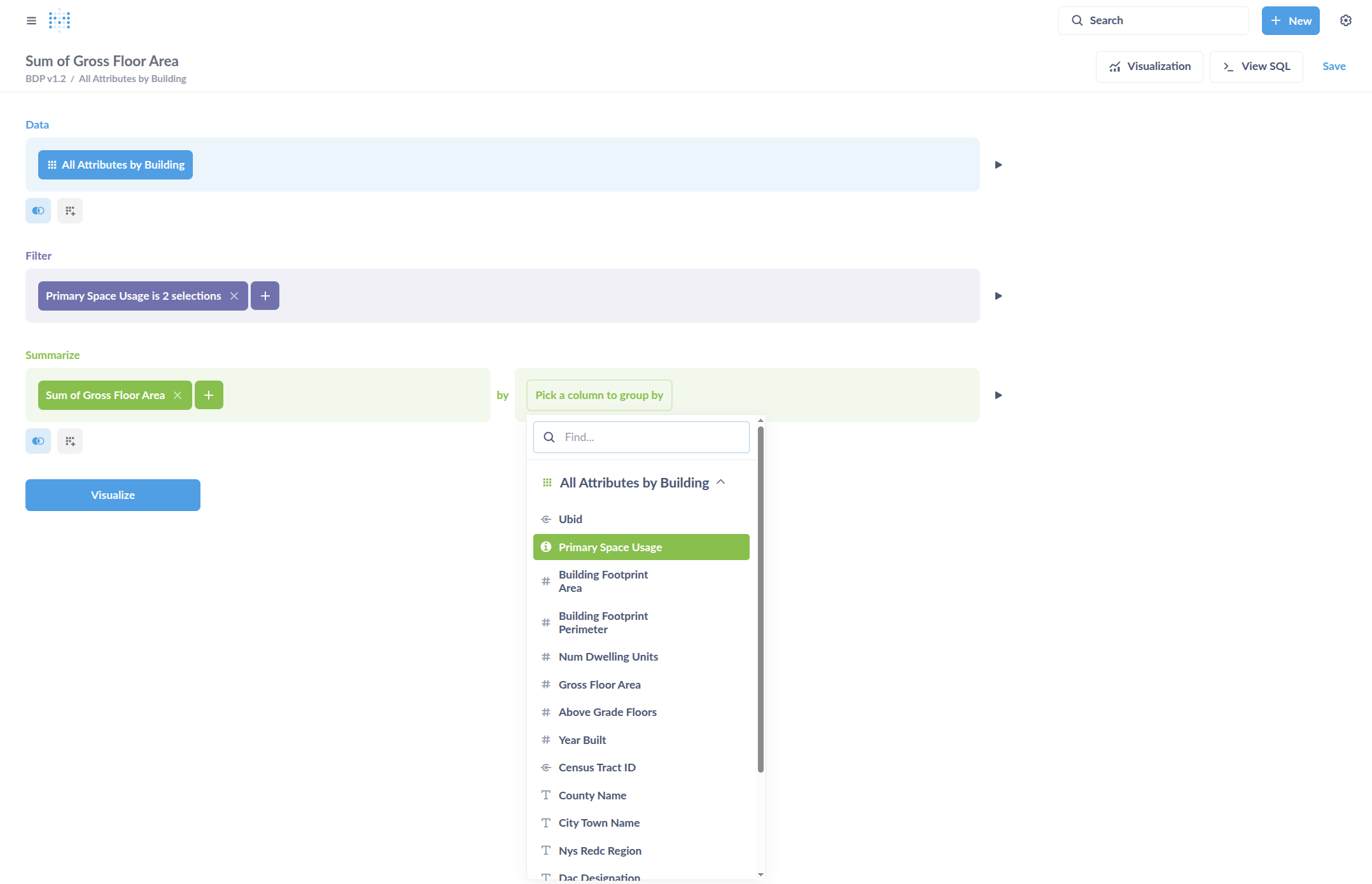
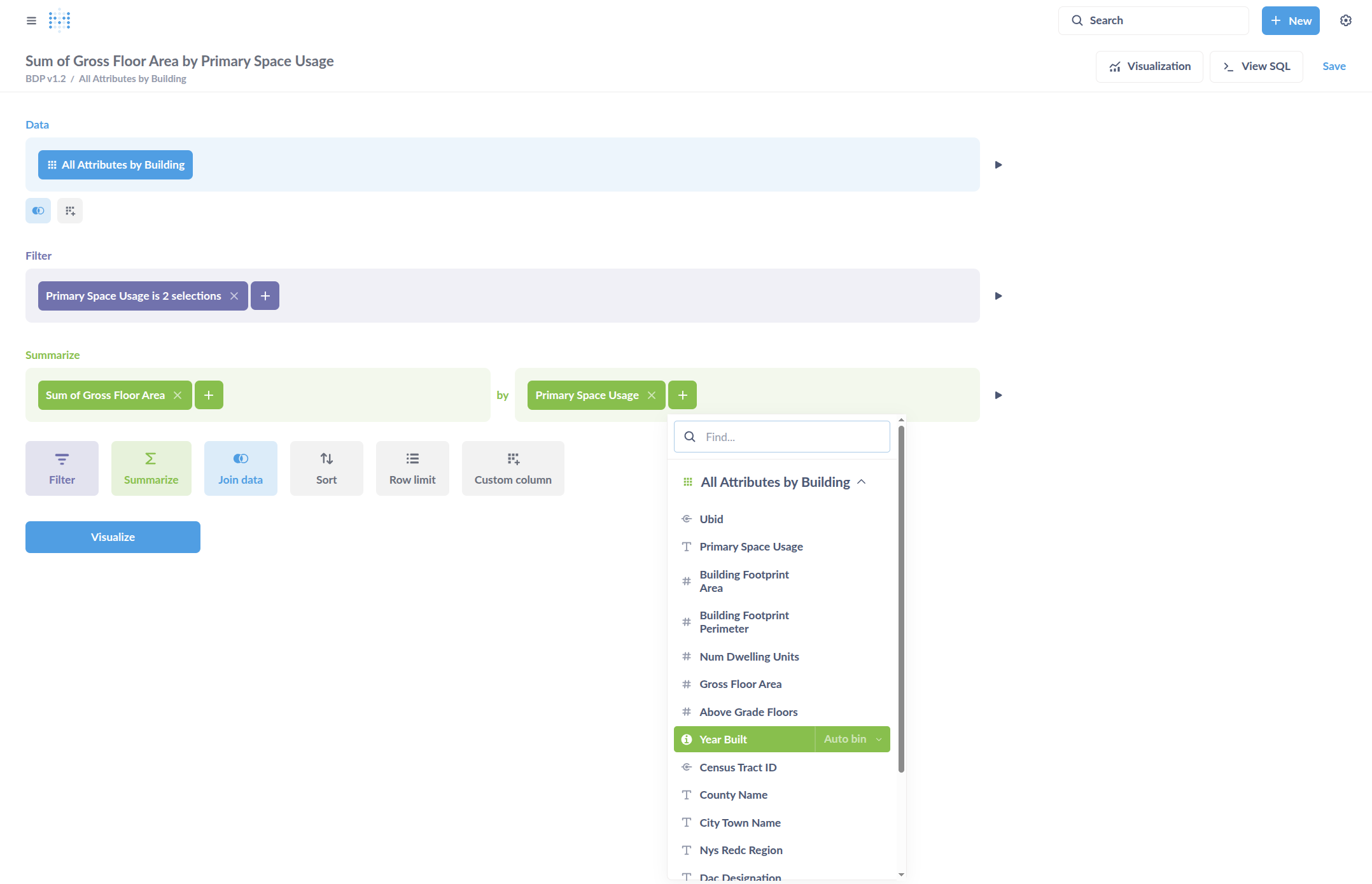
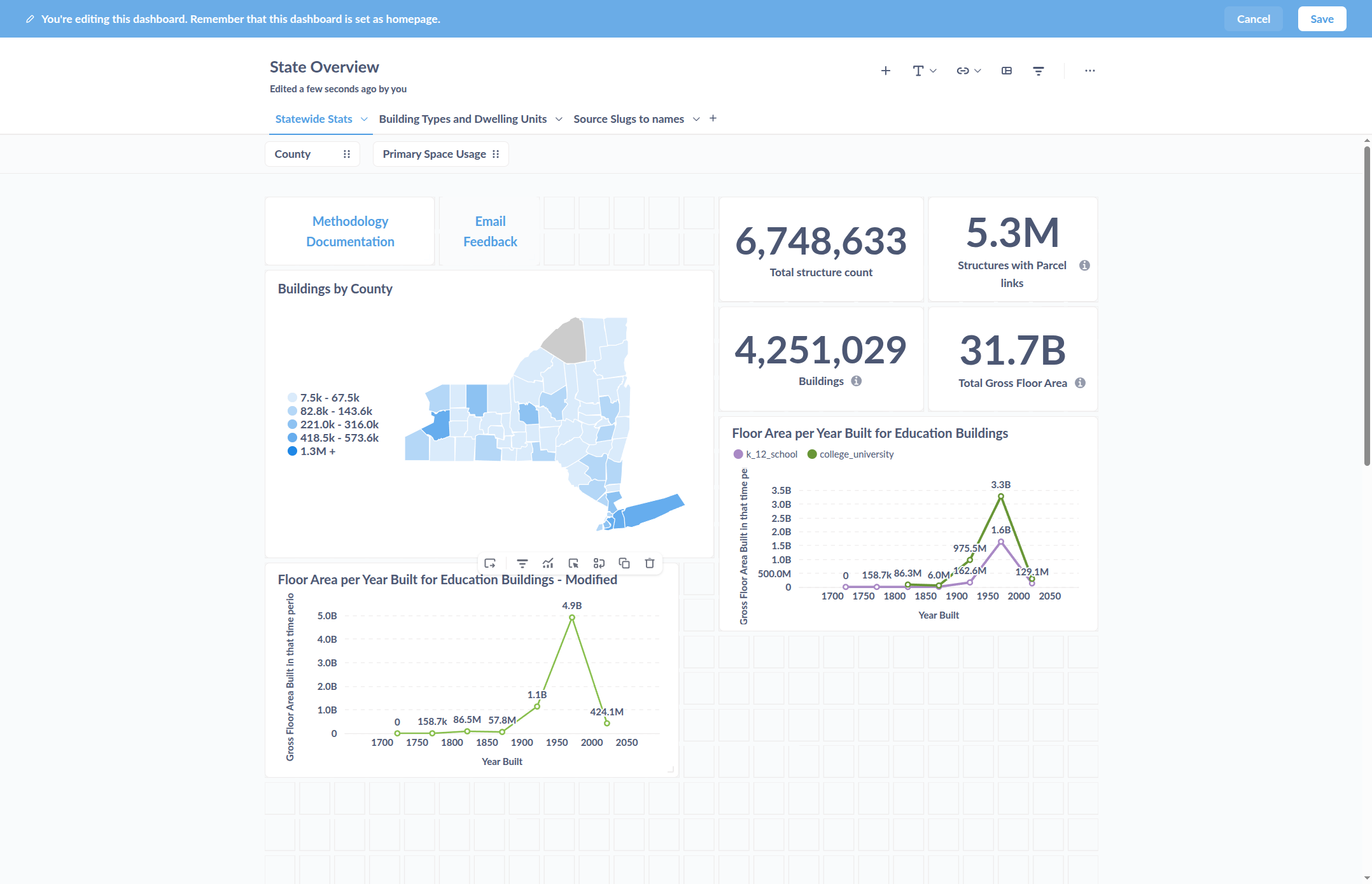
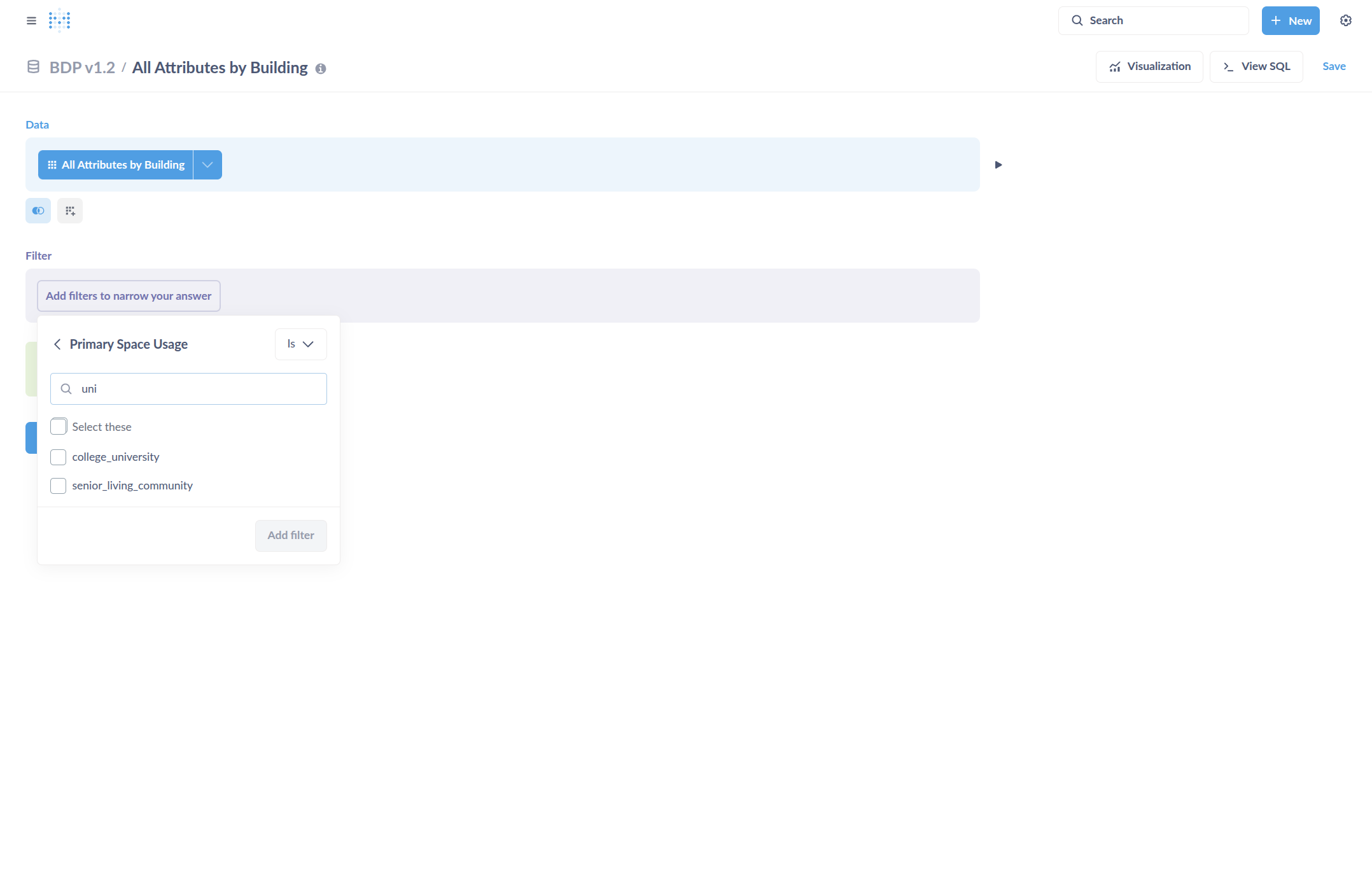
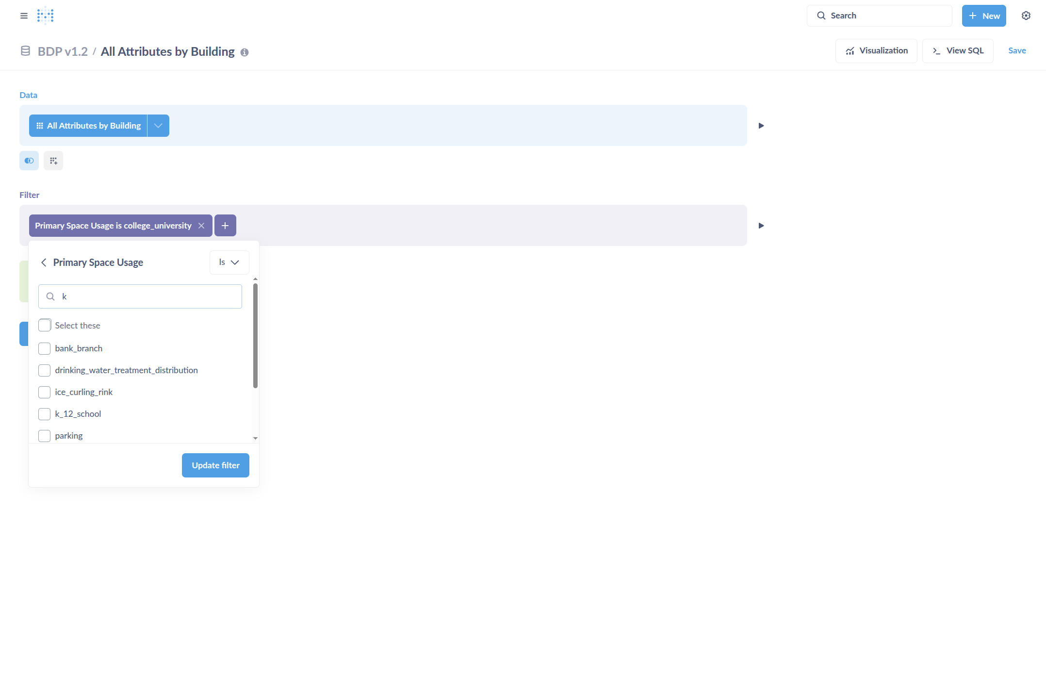
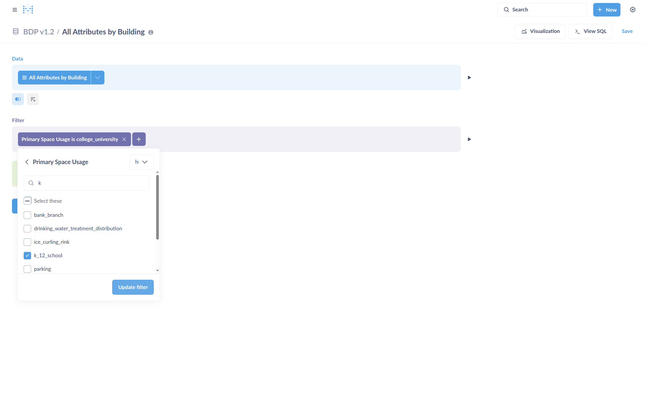
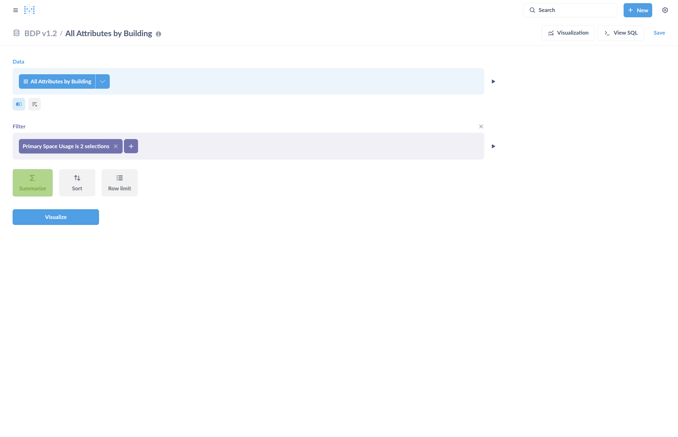
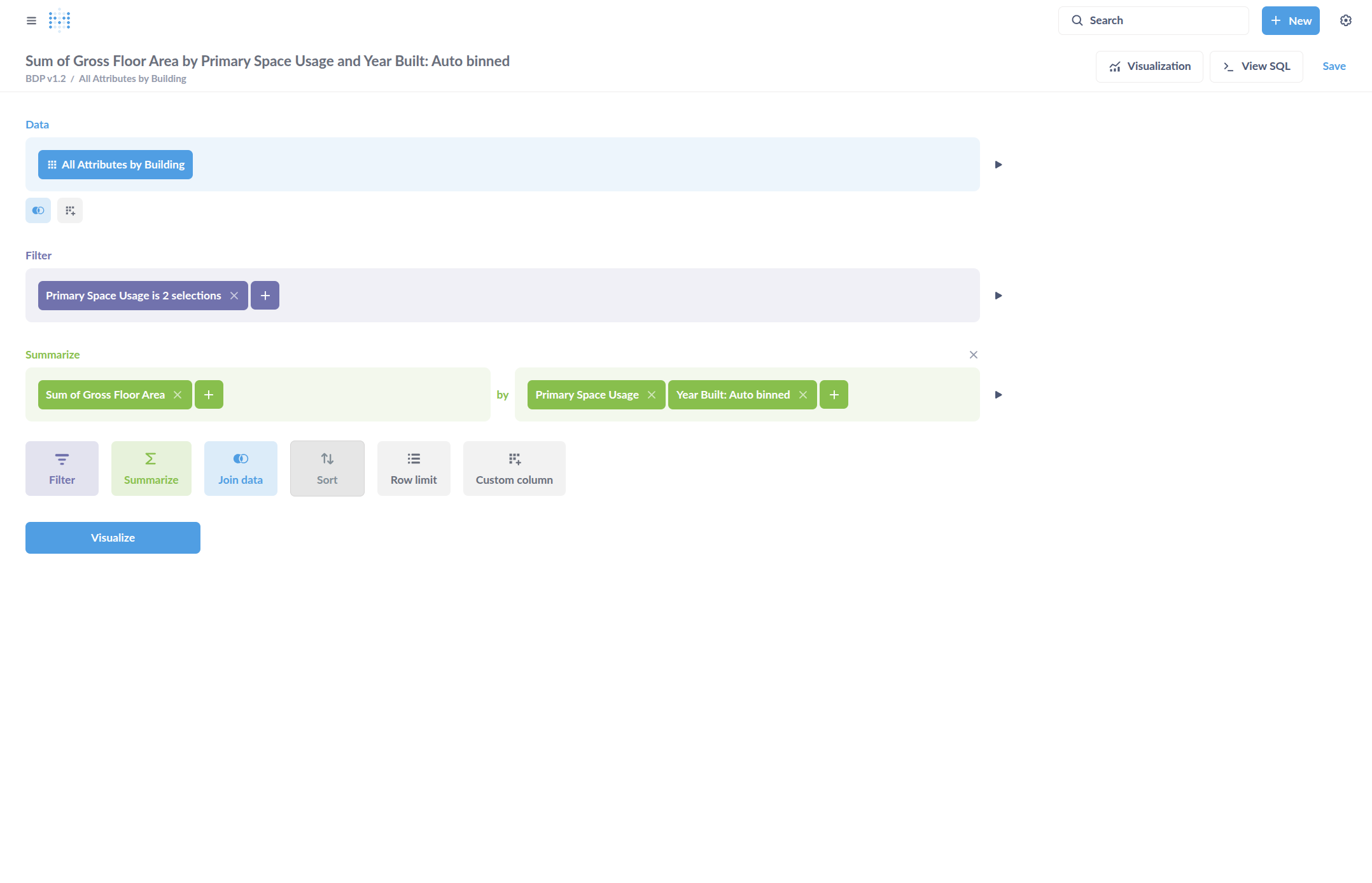
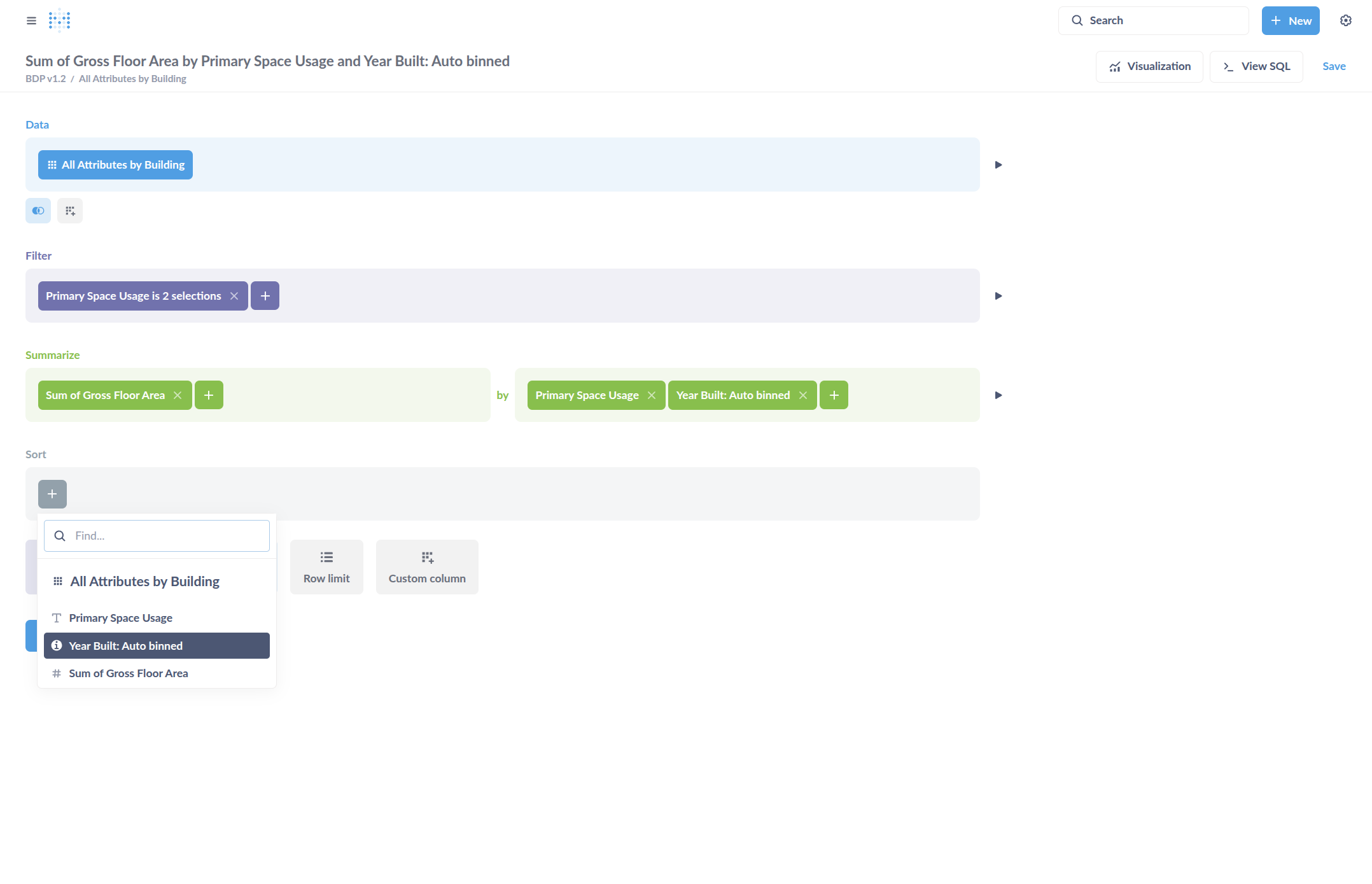
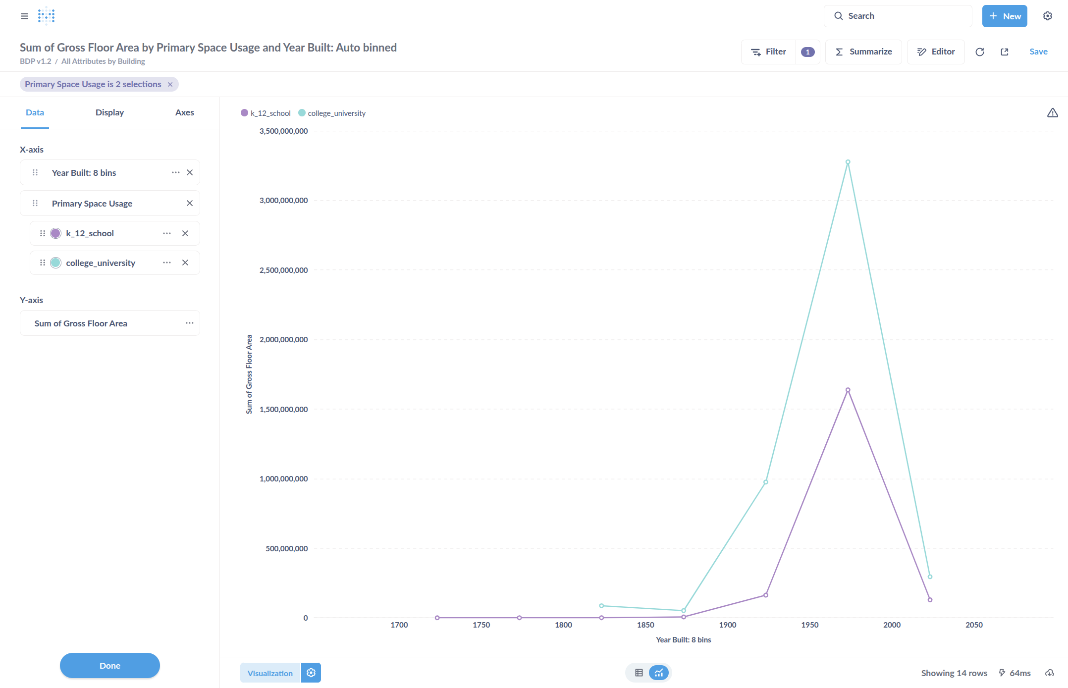
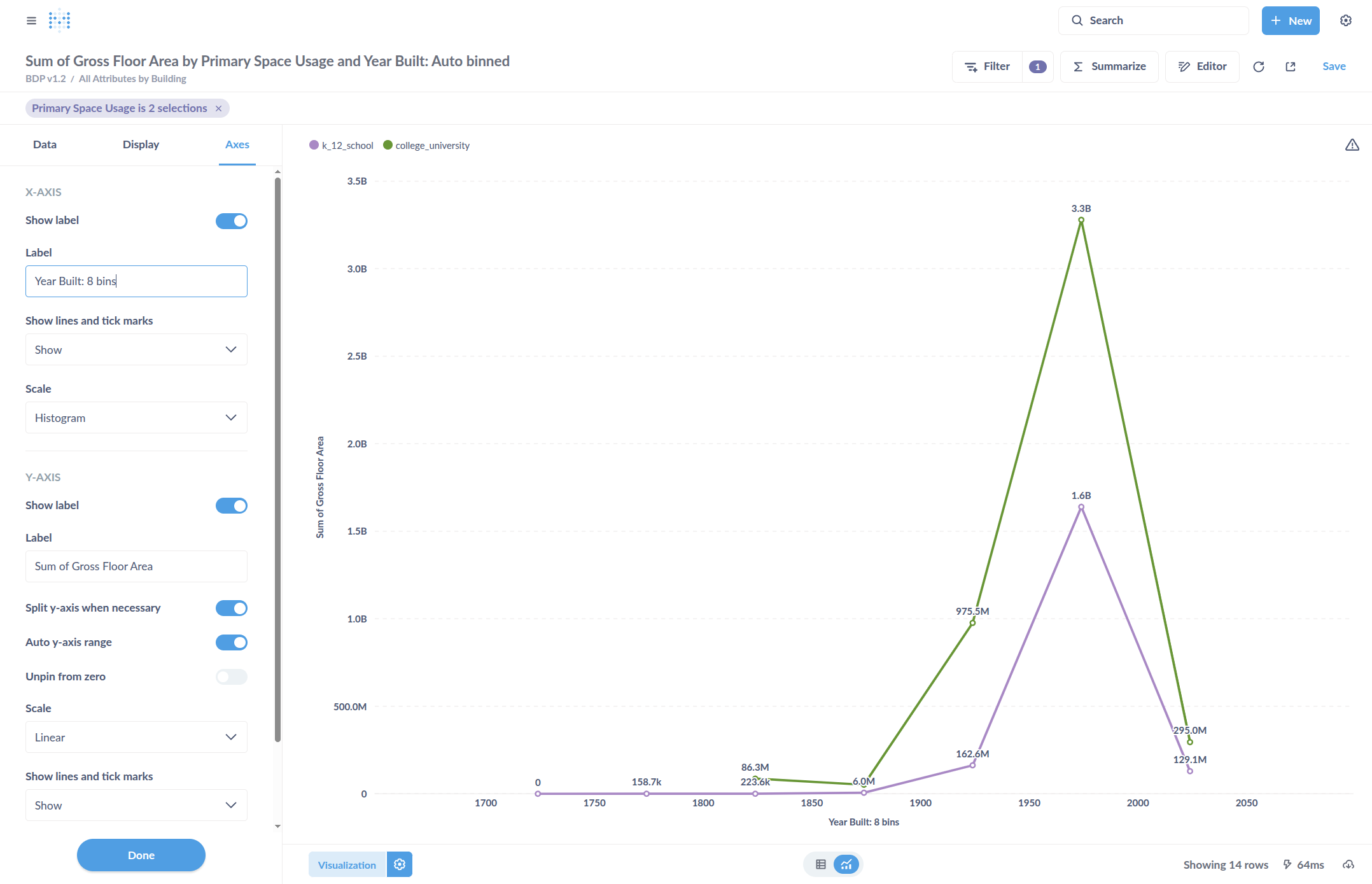
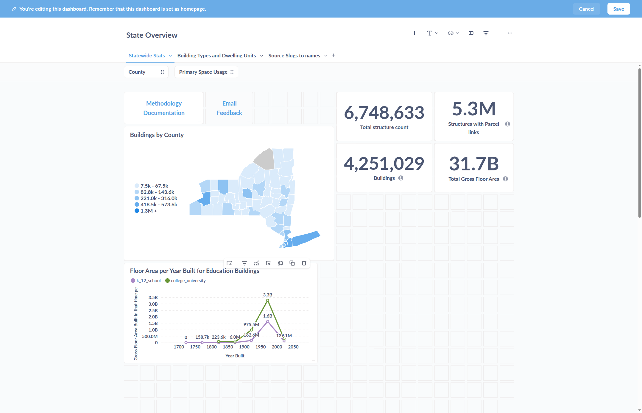
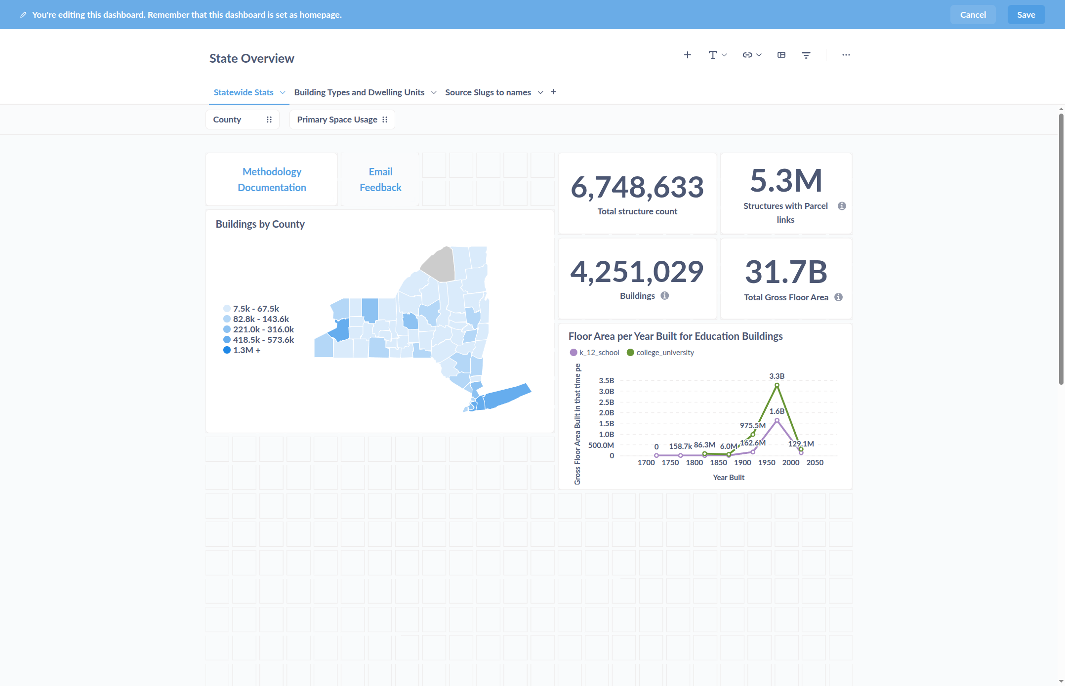
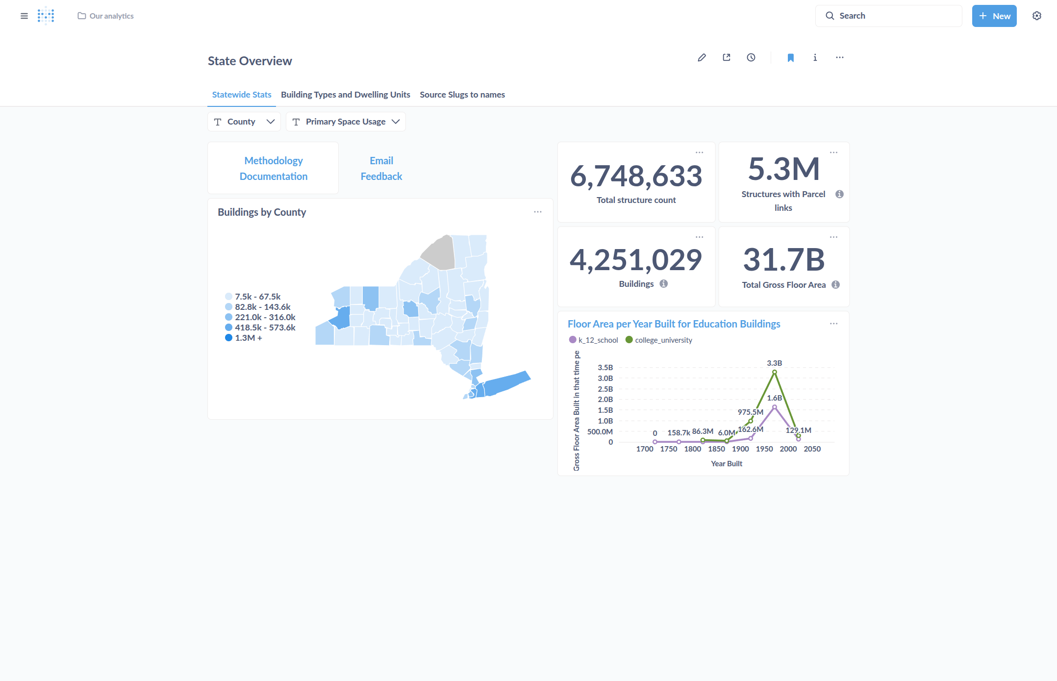
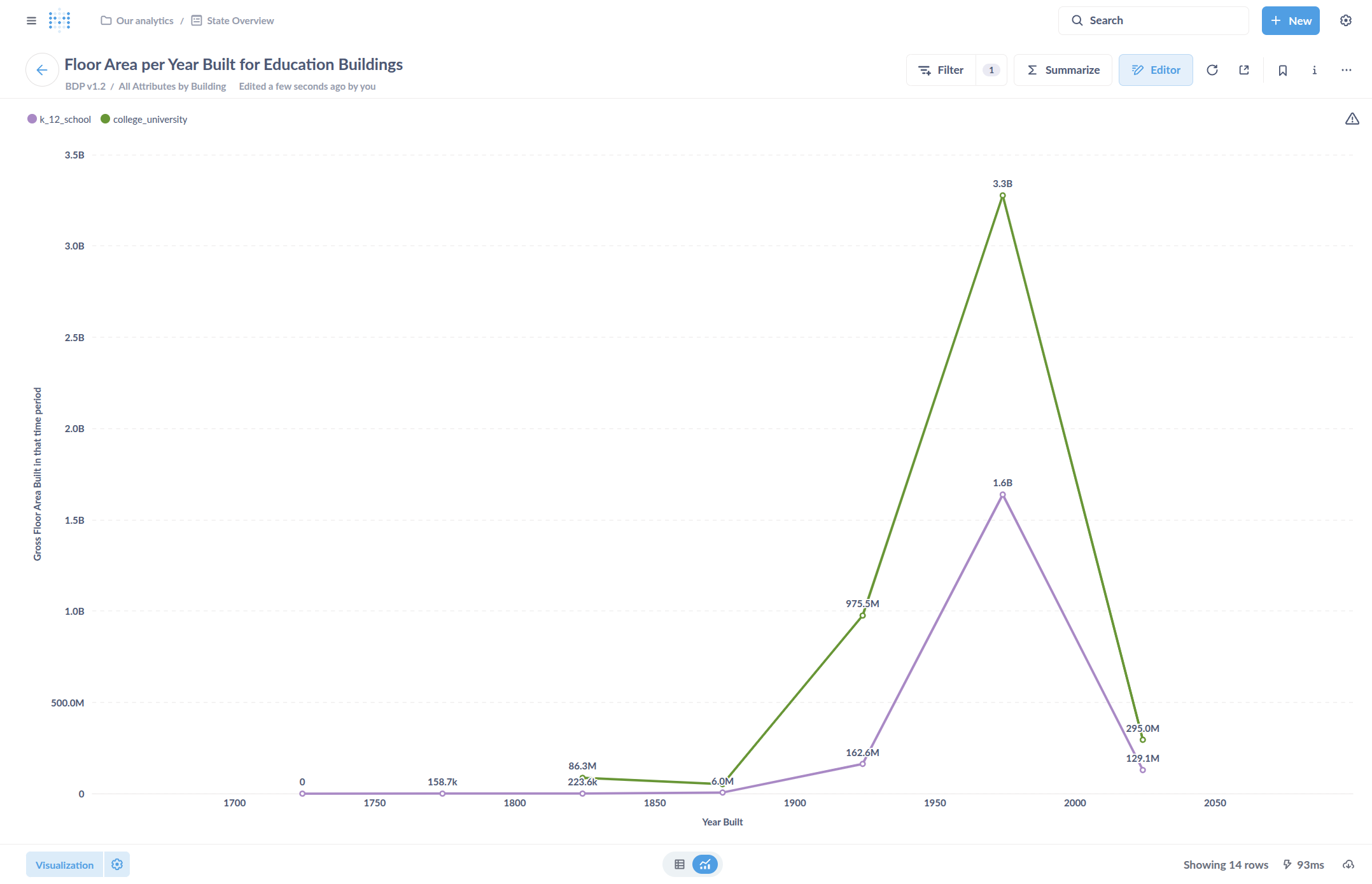
Here, we are designing a chart to compare two types of buildings by their gross floor area, based on the year they were built. The idea is to set the X axis as Year Built and the Y axis as total Gross Floor Area. We will use color coding to represent the type of Primary Space Usage. It helps to sort this by Year Built to help with charting the X axis in order from earliest to most recent.

15
Click Sort
Step #15: Click Sort
16
Select our Year Built grouping. This menu will show all column selected in the summary.
Step #16: Select our Year Built grouping. This menu will show all column selected in the summary.

Now select "Visualize."

17
Click here
Step #17: Click here

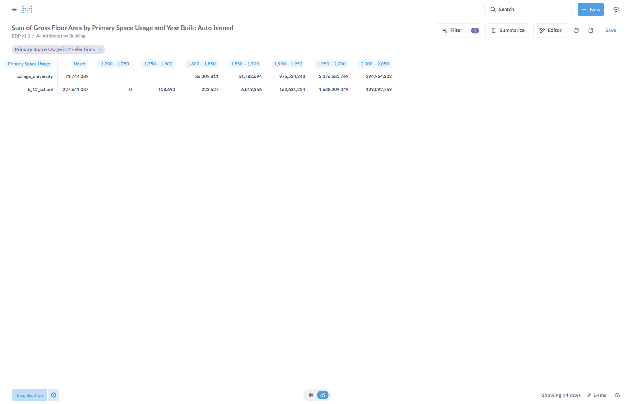
By default, it displays a table. I can go to Visualization and click on it.

18
Click here
Step #18: Click here

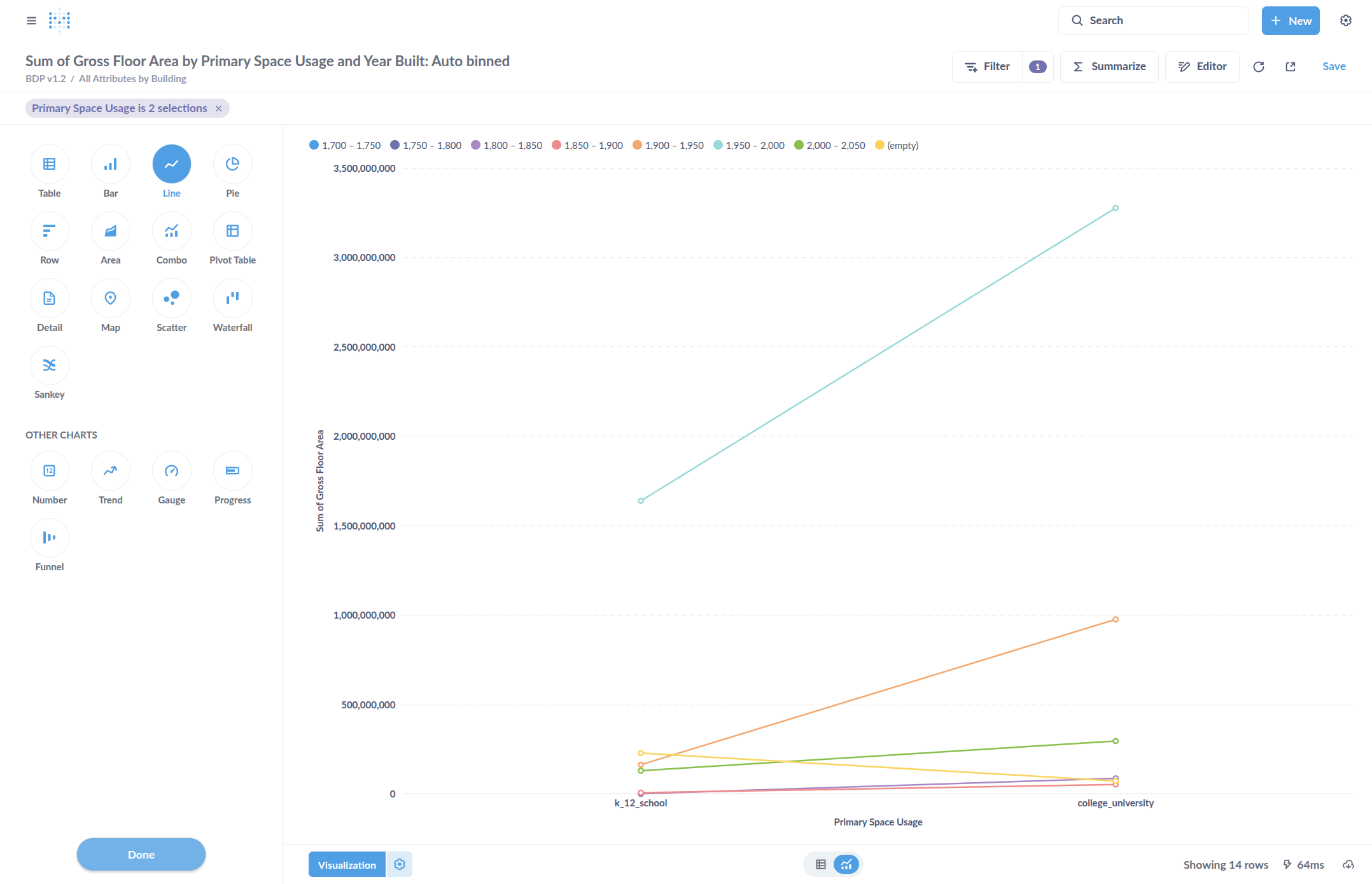
Now I can change it to the type of chart I want to see. I can select a line chart by clicking Line Chart.

19
Click here
Step #19: Click here

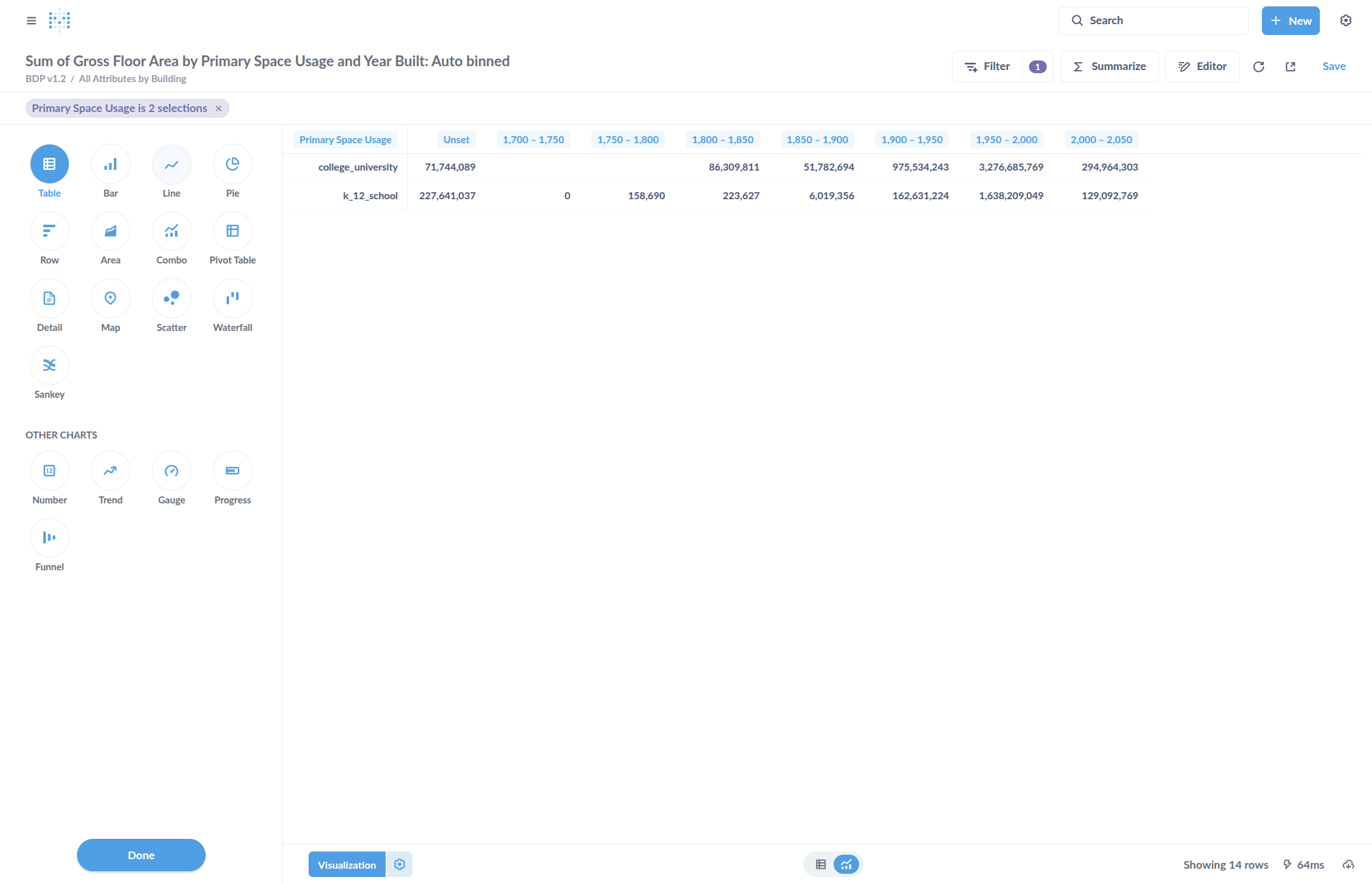
Select Done, which just means done with selecting the type of chart

20
Click here
Step #20: Click here

I can go to the visualization settings by clicking on the Settings icon next to the Visualization button.

21
Click here to color code by Space Usage. So, I'll remove Space Usage from the X axis.
Step #21: Click here to color code by Space Usage. So, I'll remove Space Usage from the X axis.
22
For the example chart, the Primary Space Usage is going to be a color, not a part of the X axis where it defaulted to. So remove it from the X axis.
Step #22: For the example chart, the Primary Space Usage is going to be a color, not a part of the X axis where it defaulted to. So remove it from the X axis.

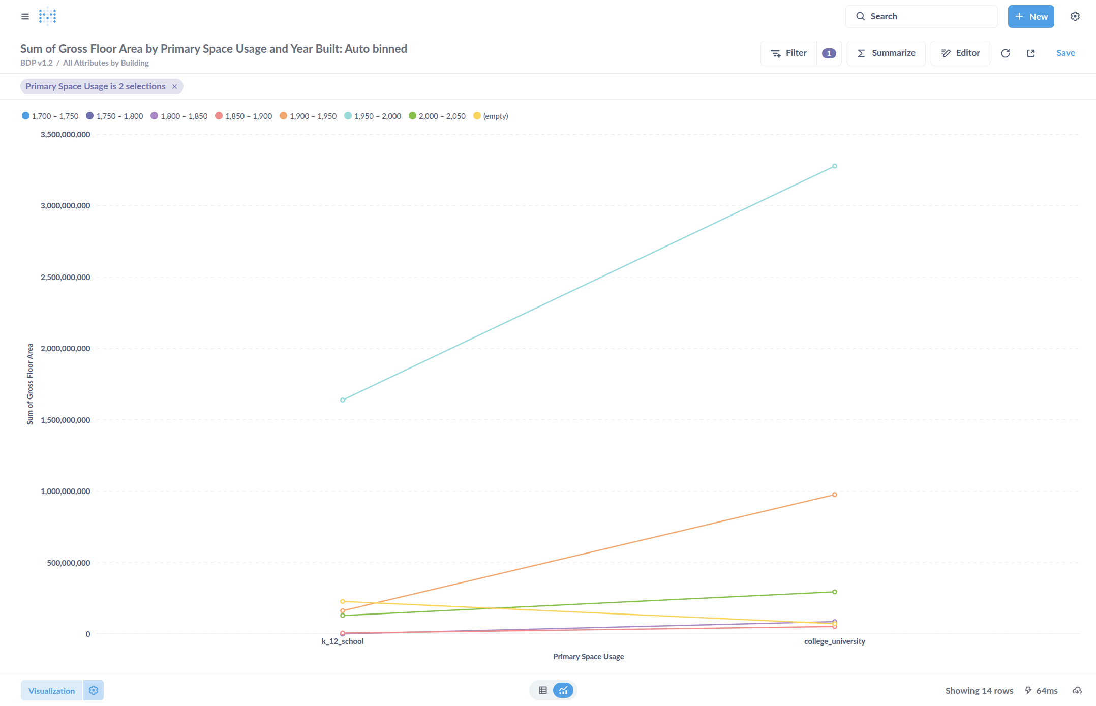
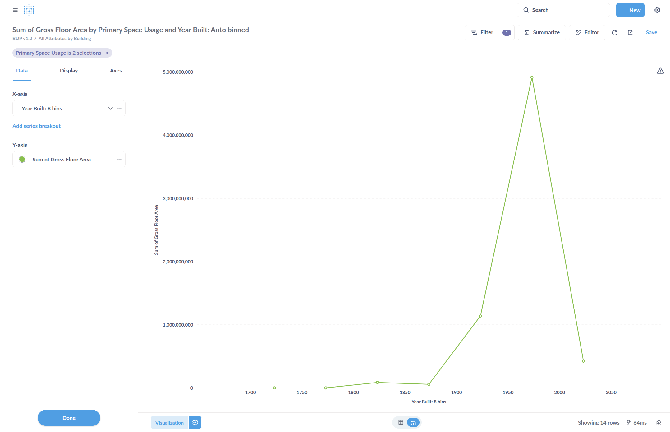
Now only Year Built is on that axis.

23
Click here
Step #23: Click here

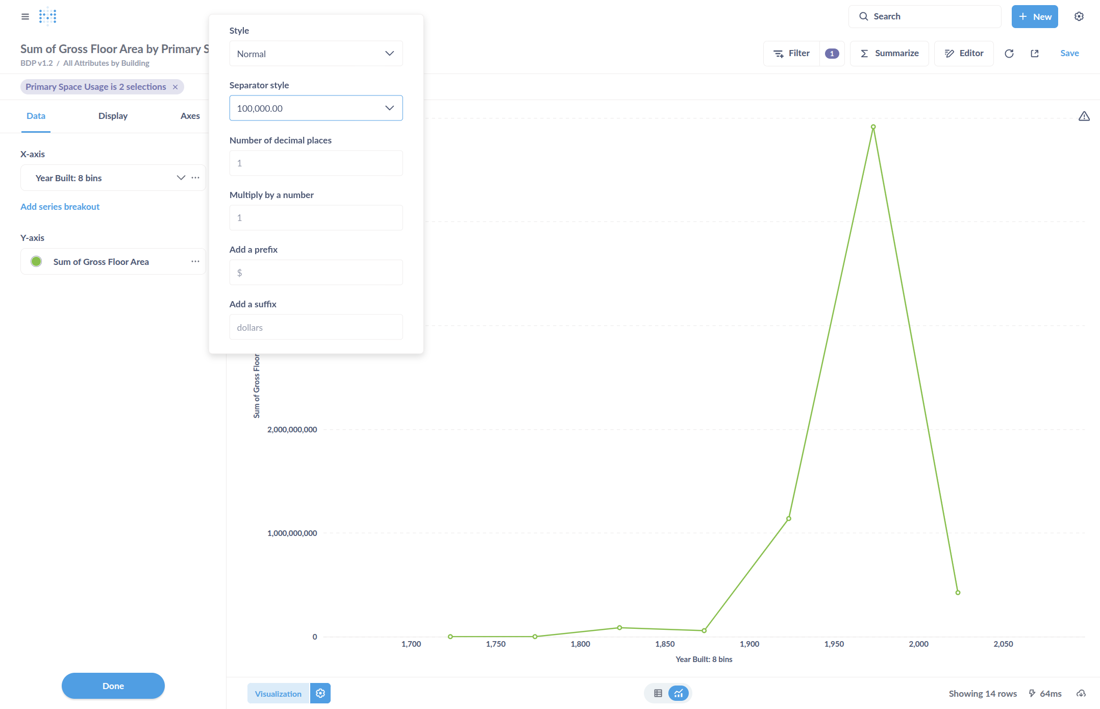
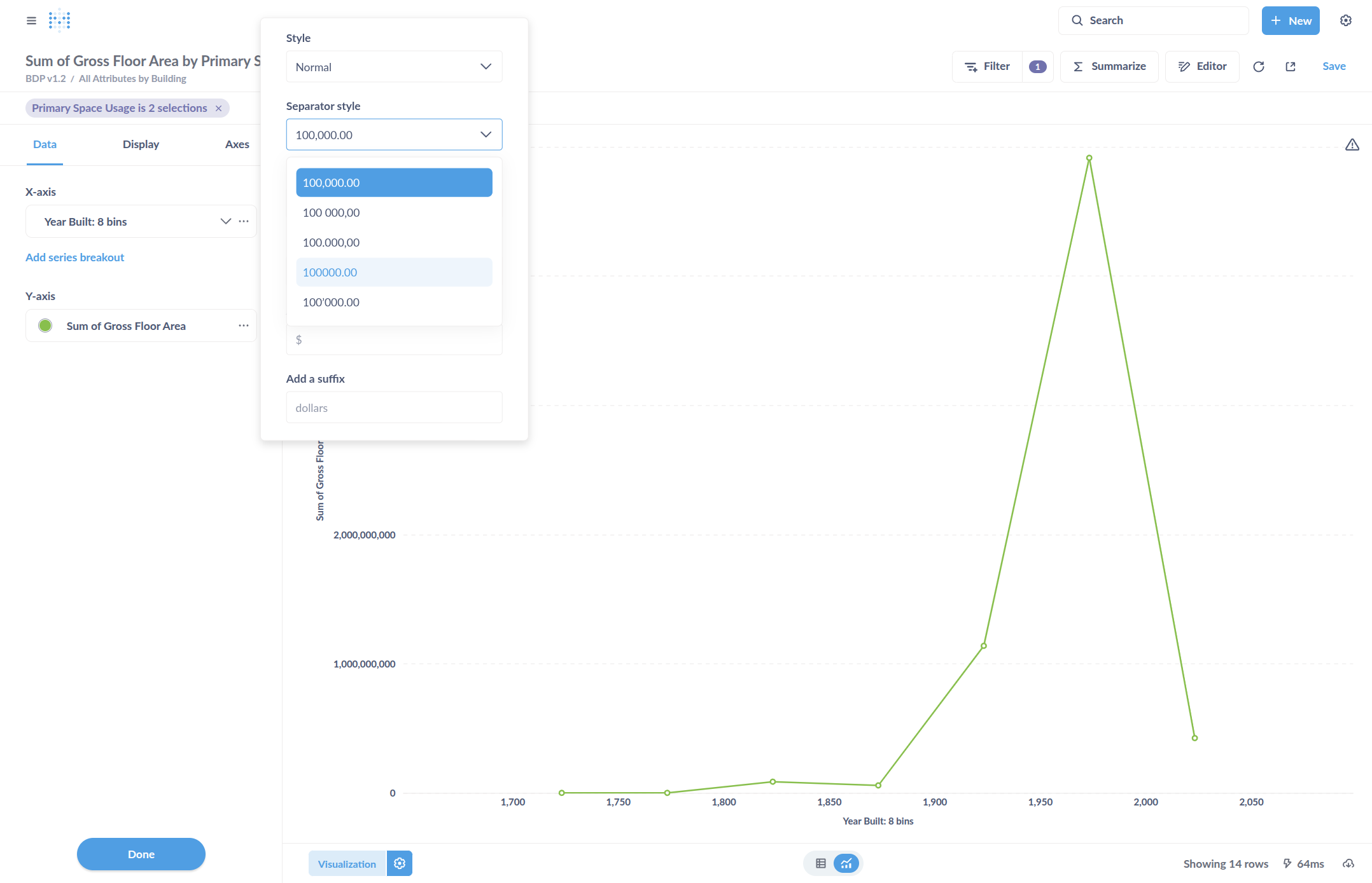
Change the number formatting style so that the Year Built does not include a comma. To do this, click Separator Style and select the option without commas.

24
Click on "Separator style"
Step #24: Click on "Separator style"
25
Click on "100000.00"
Step #25: Click on "100000.00"

Color code the chart by selecting "Add Series Breakout."

26
Click here
Step #26: Click here

By default, it added Primary Space Usage, which is correct in this case. It is now color-coded for the two different types of space usage.

27
To edit how the lines look...
Step #27: To edit how the lines look...

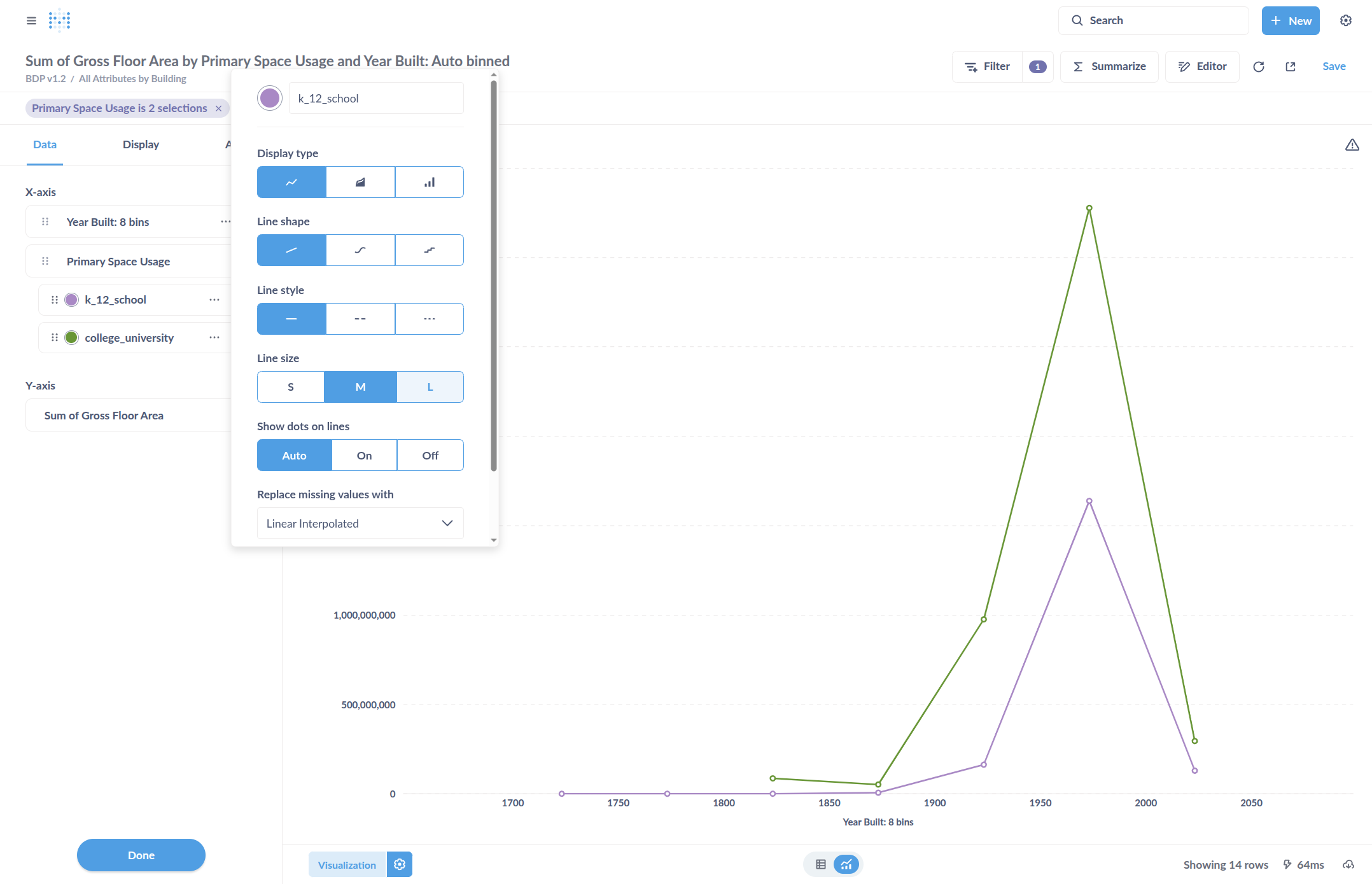
Edit the type of shape or line to include hashes, or to interpolate if there are missing points.

28
Click here
Step #28: Click here

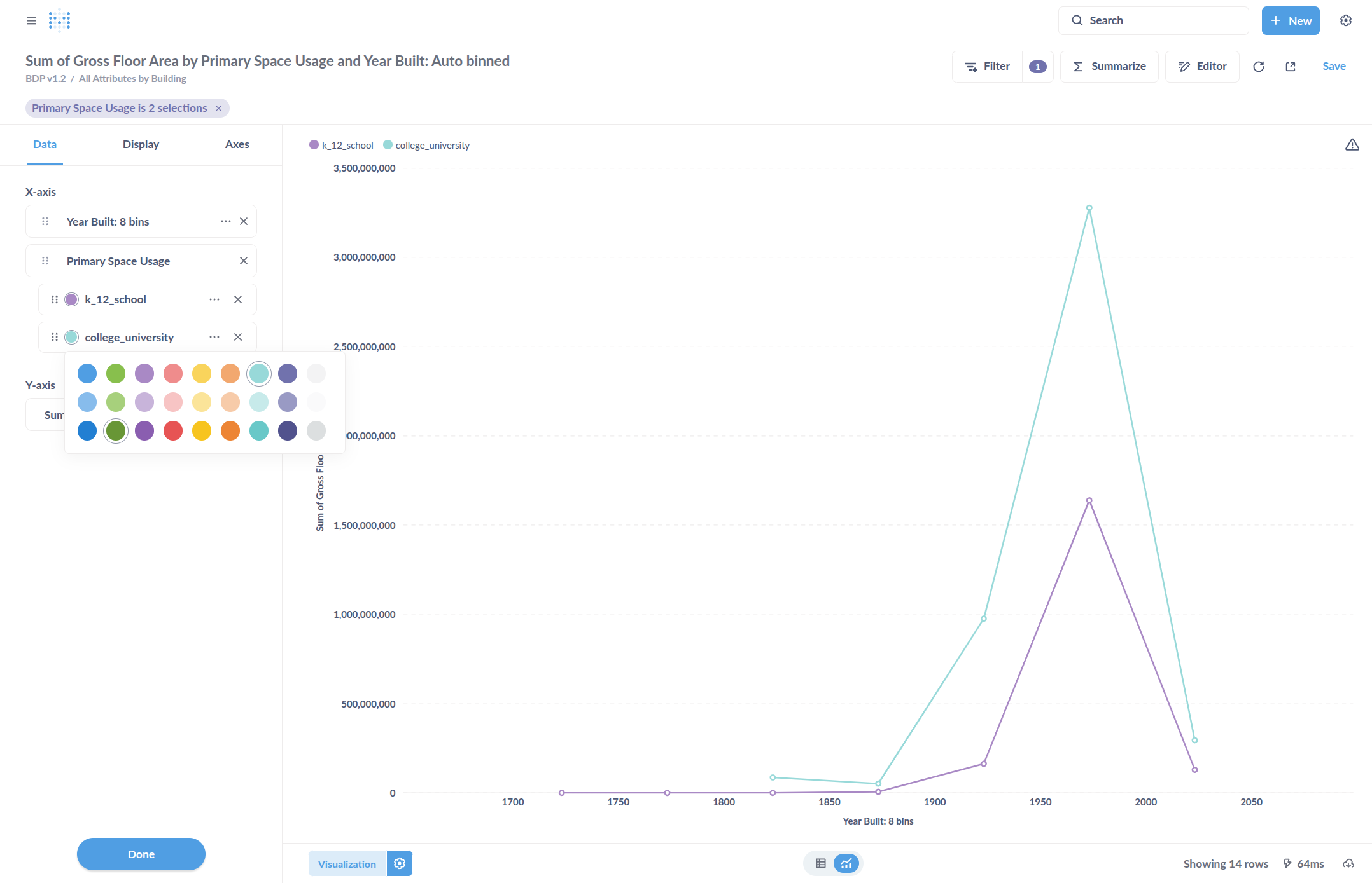
Change the color by clicking on the colored circle next to the label. In this example, we will change the color of College/University to one with more contrast compared to K through 12 schools. This will make them easier to distinguish on the chart.

29
Click on "Primary Space Usage"
Step #29: Click on "Primary Space Usage"
30
Click on "college_university"
Step #30: Click on "college_university"

Change the "Line size" to change the thickness of the line, which may improve visibility.

31
Click here
Step #31: Click here

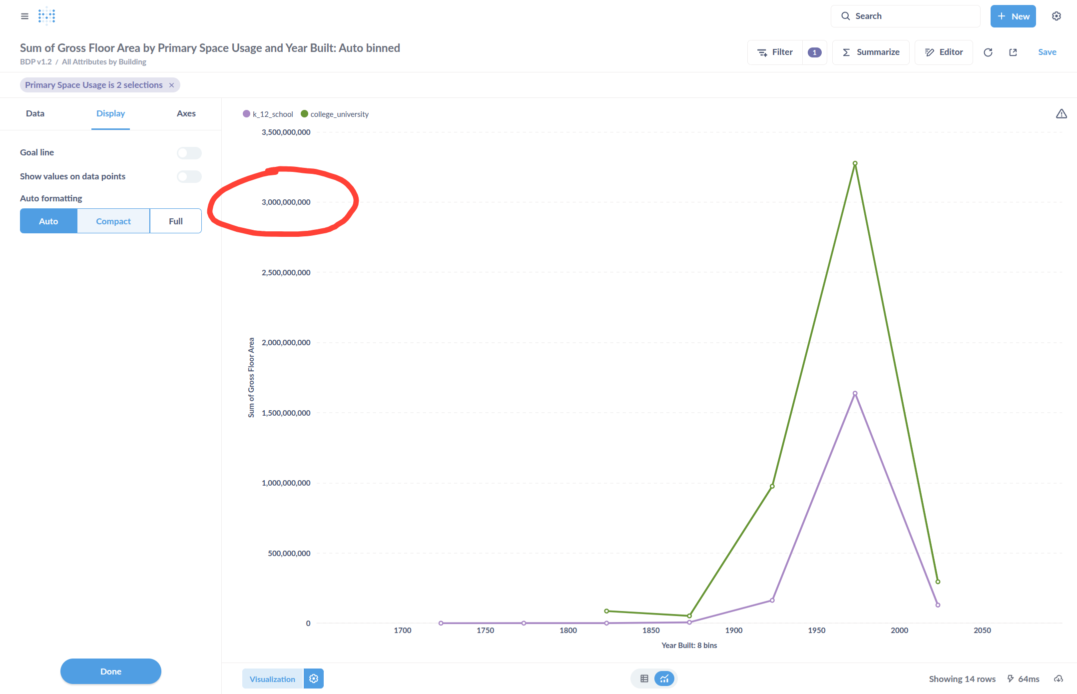
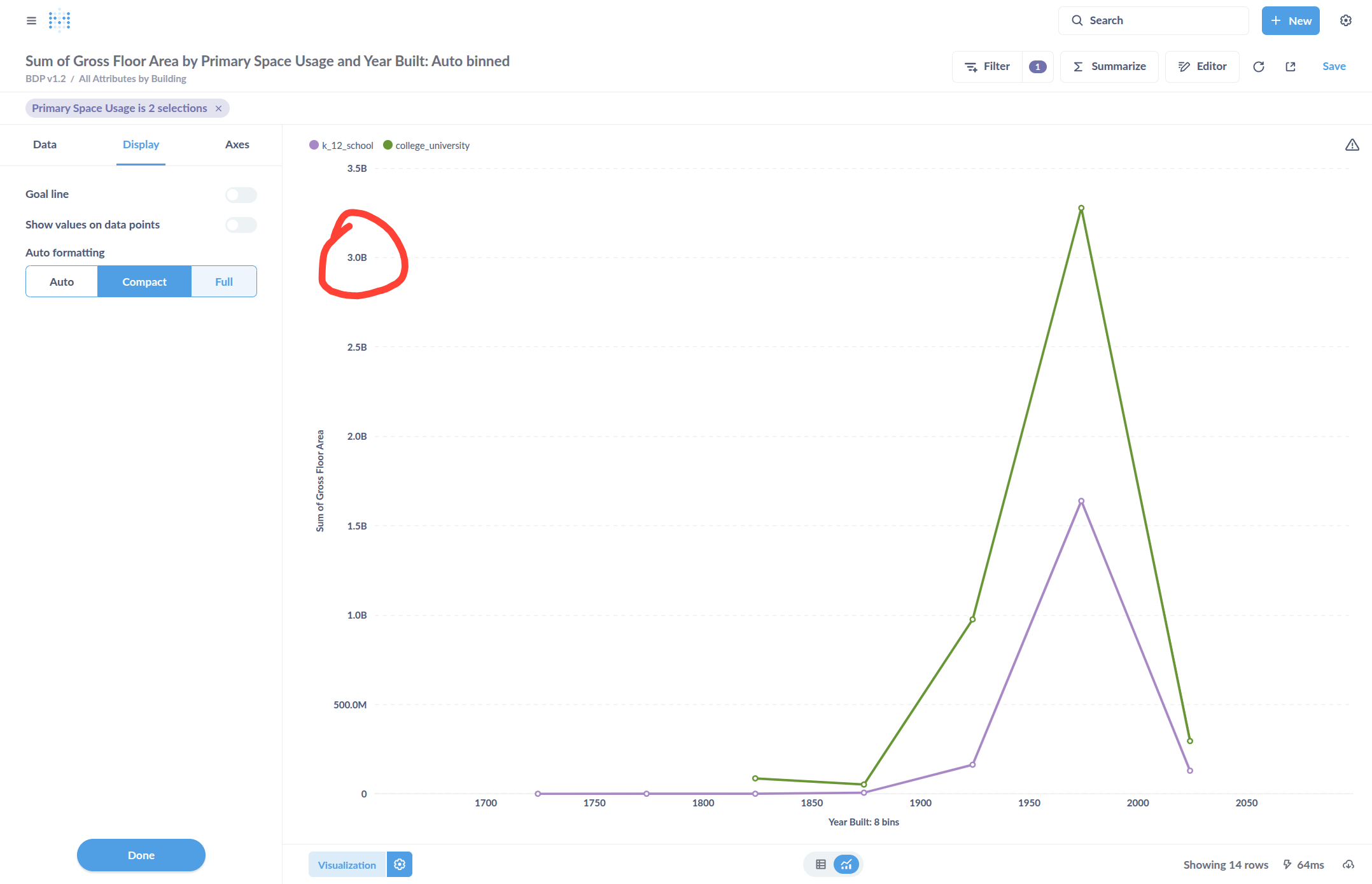
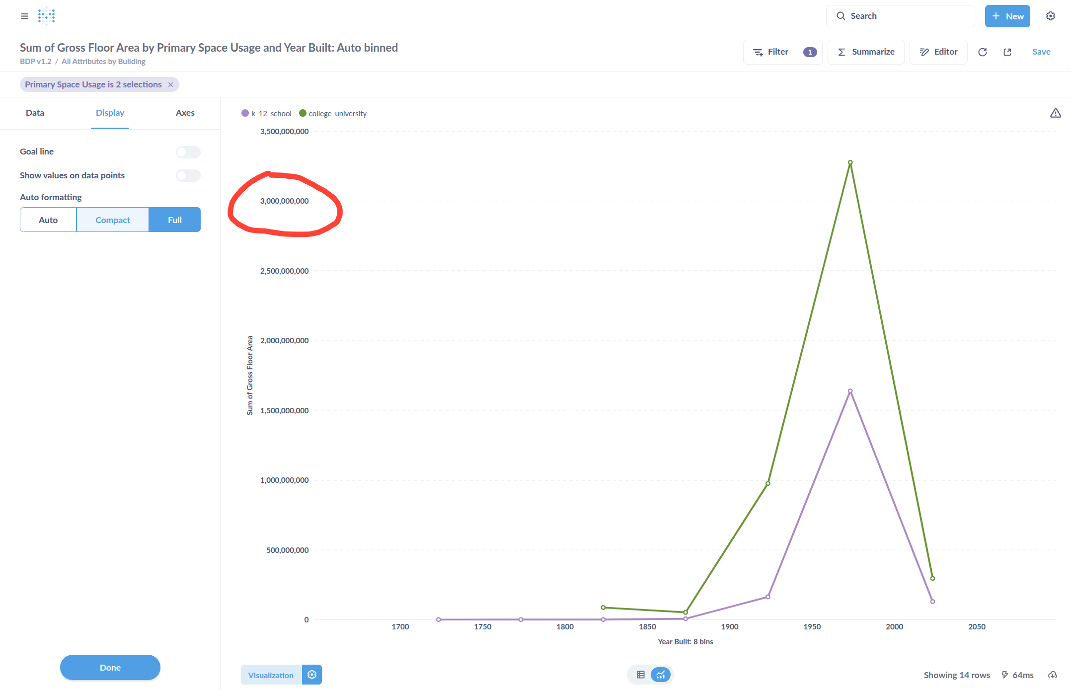
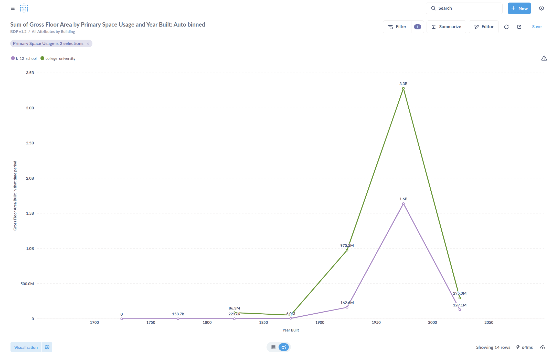
Click "Display" and change the formatting of the labels to show the full number or have it automatically abbreviated.

32
"Auto" will select a default number display format, in this case with all the zeroes
Step #32: "Auto" will select a default number display format, in this case with all the zeroes
33
Select "Compact" to abbreviate to thousands, millions, billions, etc.
Step #33: Select "Compact" to abbreviate to thousands, millions, billions, etc.
34
Or "Full" to show the whole number.
Step #34: Or "Full" to show the whole number.

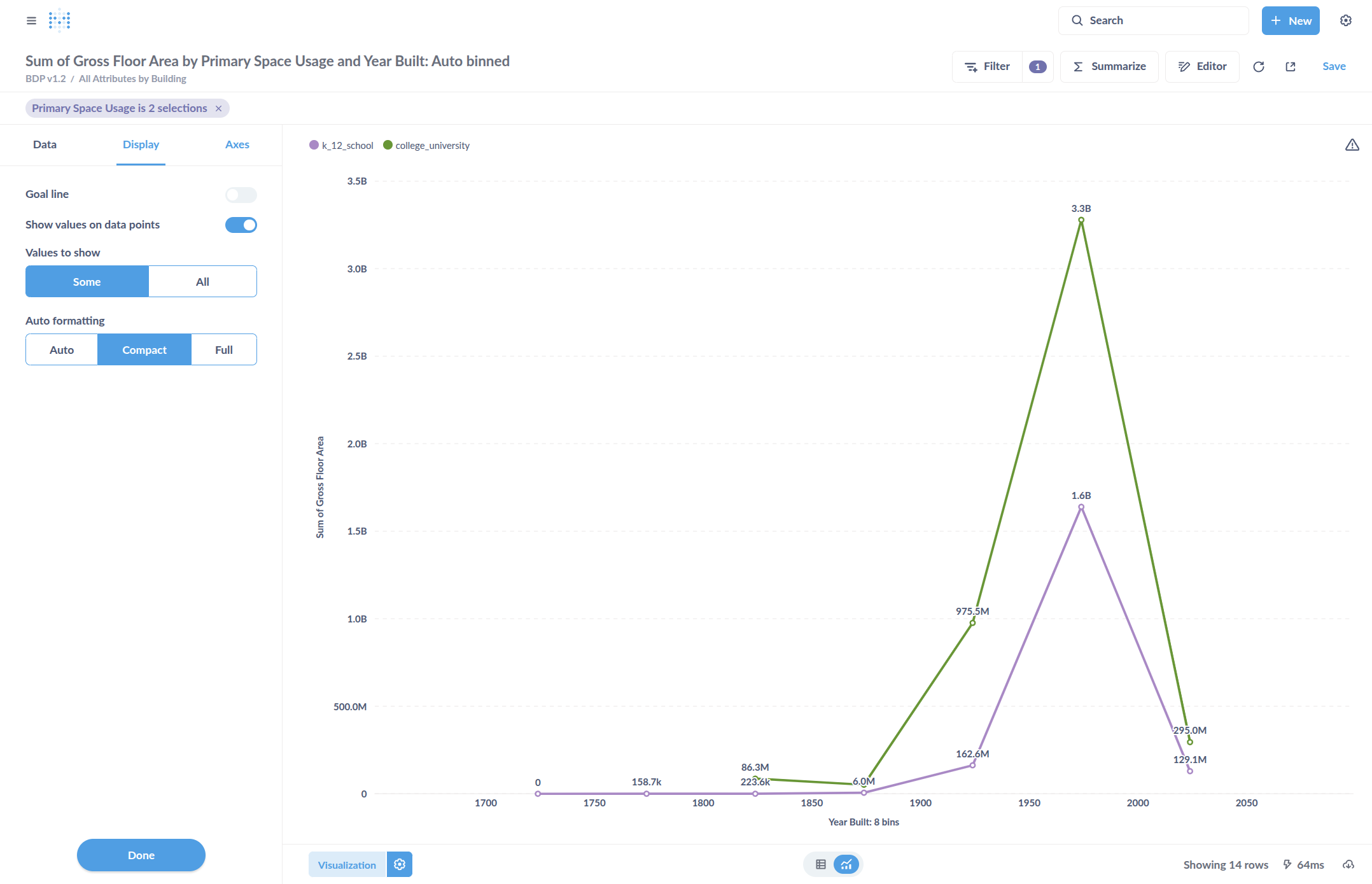
Add the values labels to the data points by clicking Show Values on Data Points. This will label the chart with the numbers for each point.

35
Click here
Step #35: Click here

Change the labels on our axes. Click in this box to edit the text.
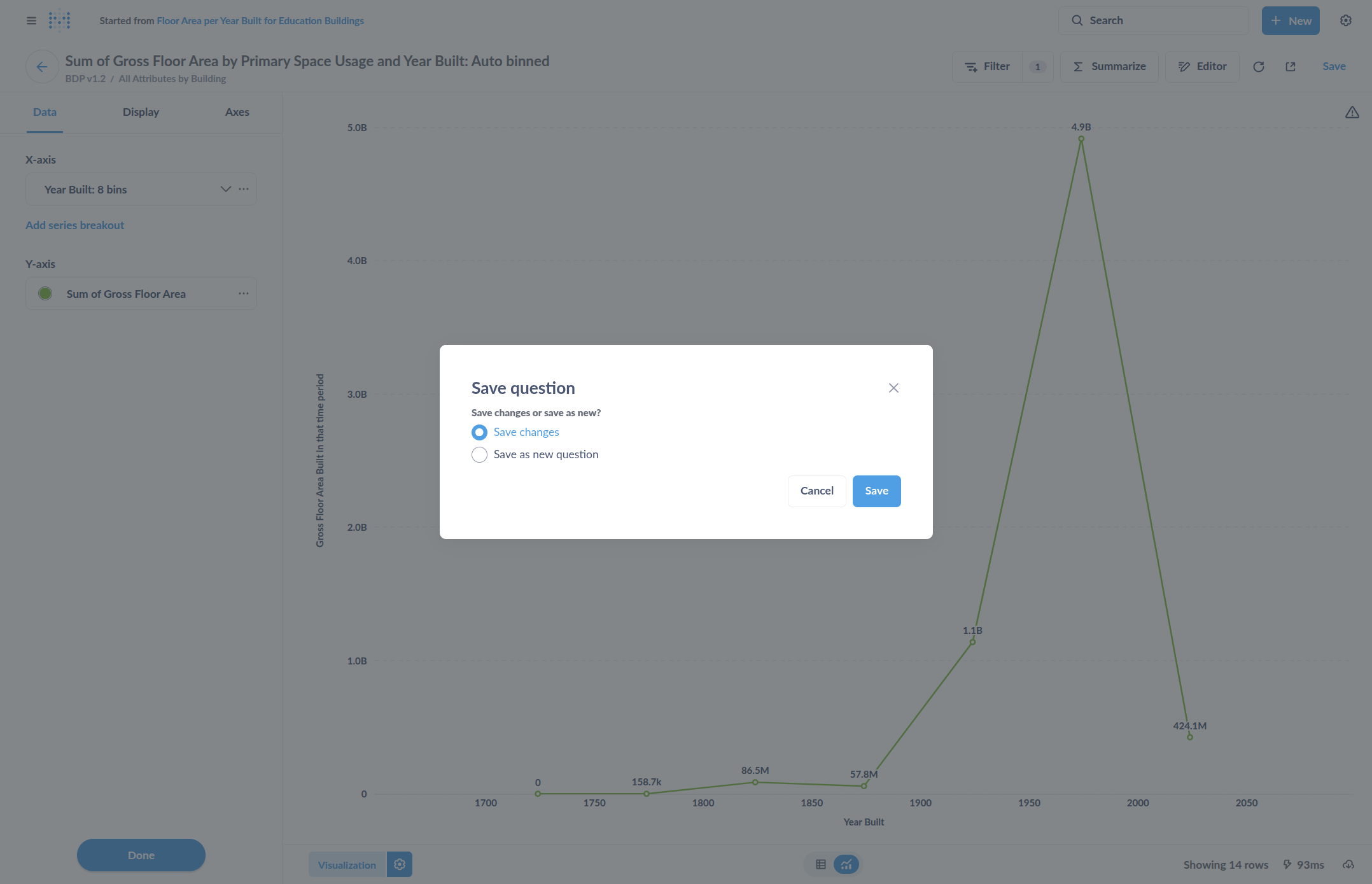
36
Select "Axes" to edit how the axes are formatted.
Step #36: Select "Axes" to edit how the axes are formatted.
37
Edit the axis names
Step #37: Edit the axis names

Save the chart.

38
Select "Save"
Step #38: Select "Save"

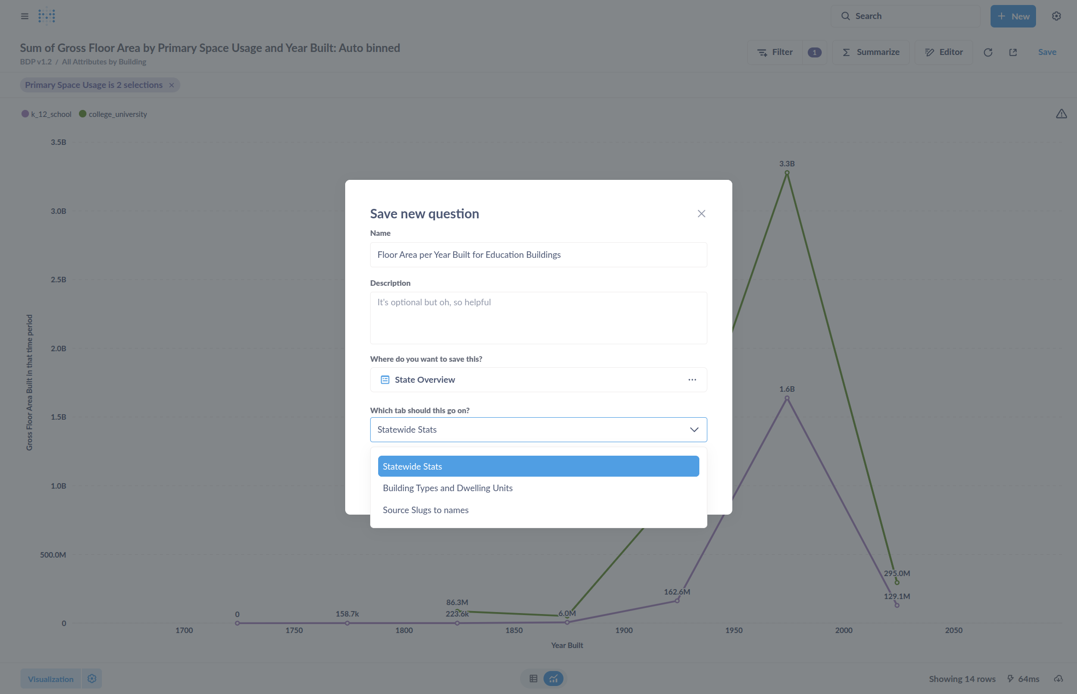
Give it a title, such as "Floor area built for education buildings over time."

39
Click here
Step #39: Click here

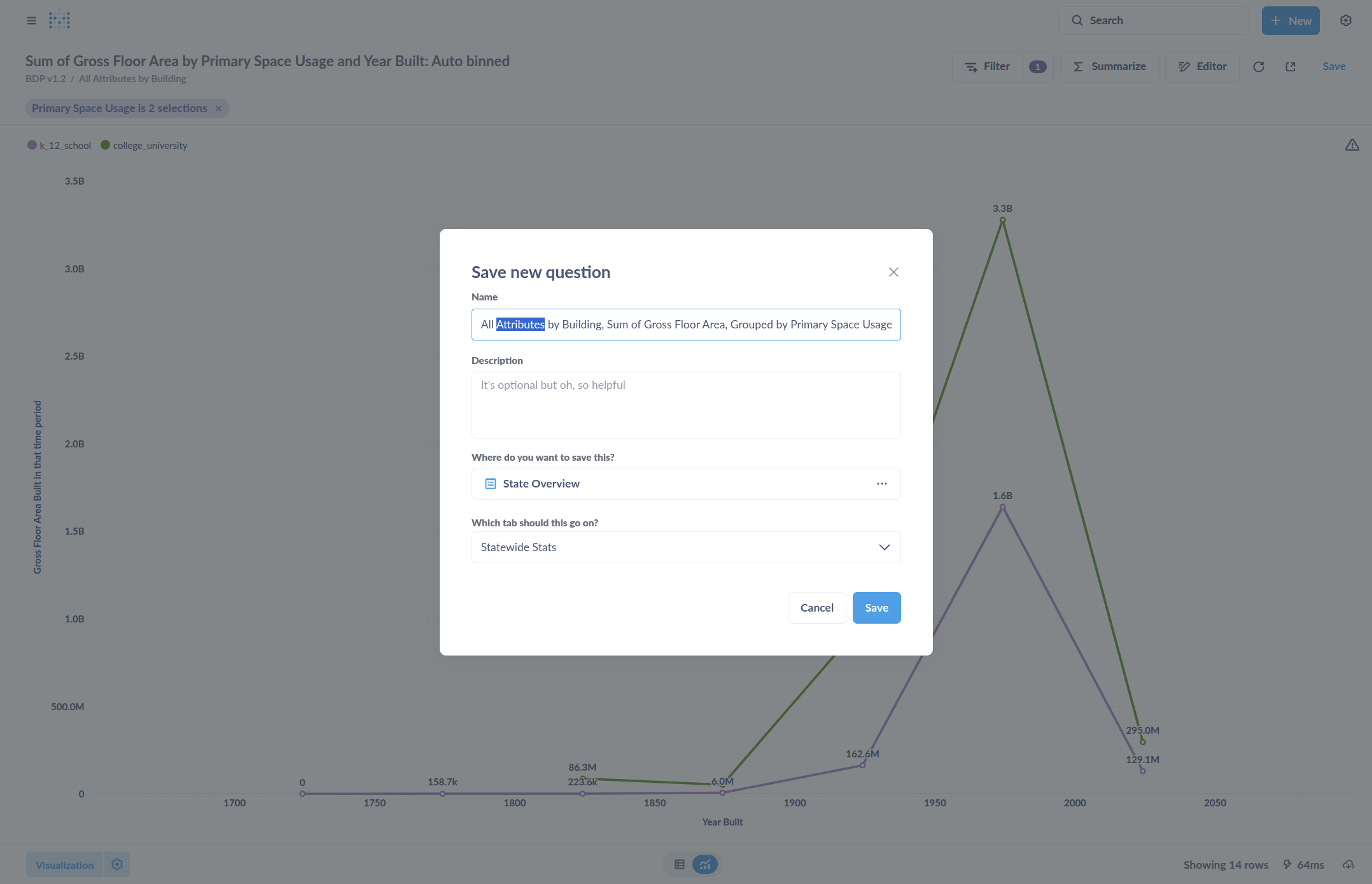
It can be added to an existing dashboard, or just saved as a chart, referred to as "Questions" elsewhere in the user interface.

40
Select location
Step #40: Select location

You can now see it added at the bottom with our title, labels, and the formatting we wanted.

41
Click here
Step #41: Click here

Once saved and on a dashboard, you can go back and edit the chart.

First, I'll click Save because that's where I want it on the dashboard.

42
Click here to save the dashboard if it was in Edit mode.
Step #42: Click here to save the dashboard if it was in Edit mode.

In the normal view, click the name to return to the chart. To edit it, click Editor.

43
Click on the name of the chart to view it for editing.
Step #43: Click on the name of the chart to view it for editing.
44
Click here
Step #44: Click here

Change the visualization by returning to Visualization and adjusting the Settings.

Everything is still editable. Once done editing, you can choose to overwrite the existing chart, including its dashboard location, or create a new chart.

This is essentially "Save to Overwrite" and "Save As New Question." "Save As New Question" creates a new chart that can be placed elsewhere. To save it as a new question, click "Save As New Question."

45
To save as a new version and preserve the original, select "Save as new question"
Step #45: To save as a new version and preserve the original, select "Save as new question"

You can place it in a different location or the same one, then click Save.

Now you will see two charts.

46
Click here
Step #46: Click here

Step-by-Step Guide: Creating a Visual Chart to Display Data Summaries