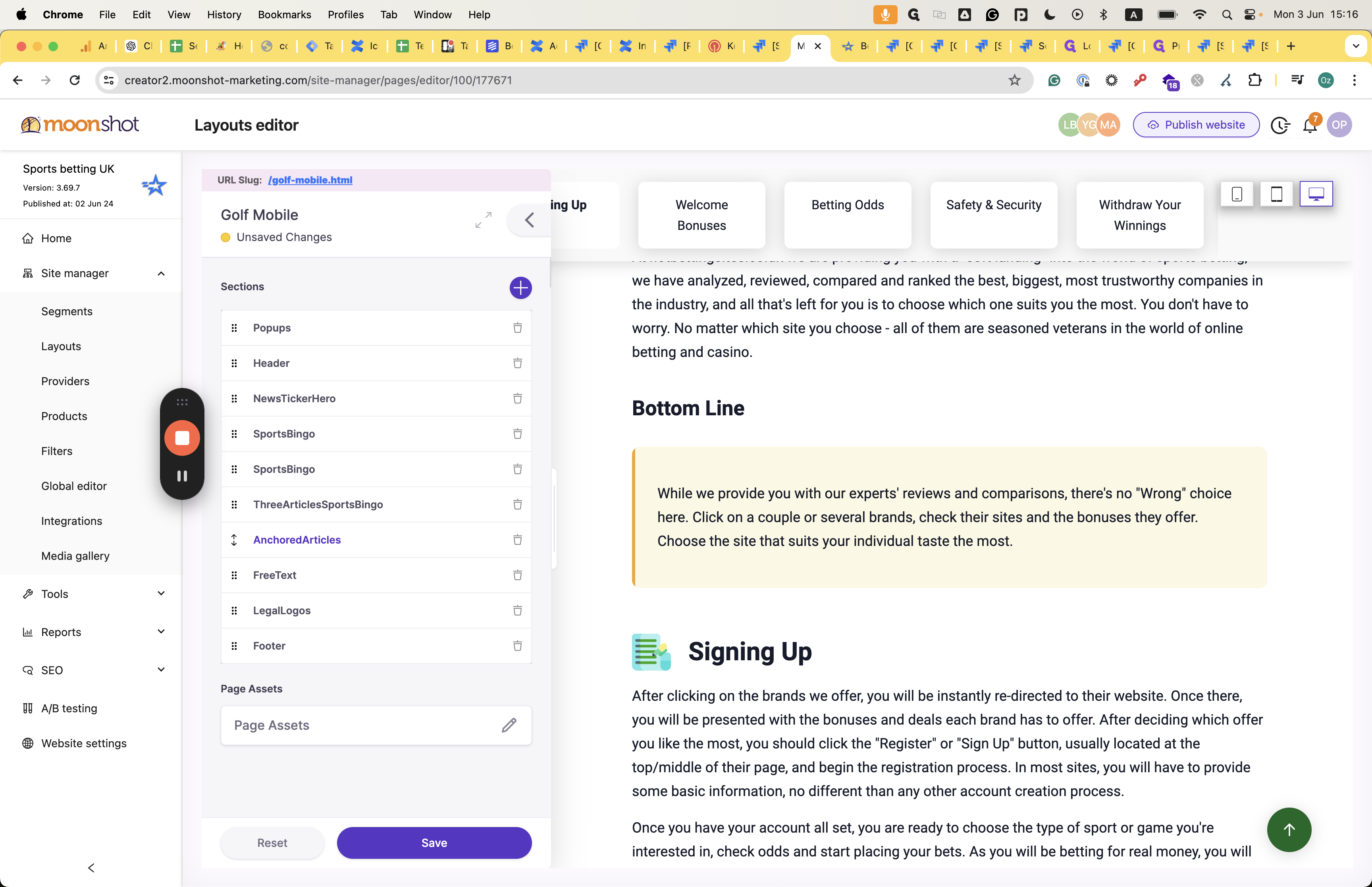
AnchoredArticles section
A detailed guide on how to navigate and utilize the AnchoredArticles section. Learn how to add and edit articles, change design aspects, and connect with providers.
In this guide, we'll learn how to navigate and customize the AnchoredArticles section within your layout.
Overview
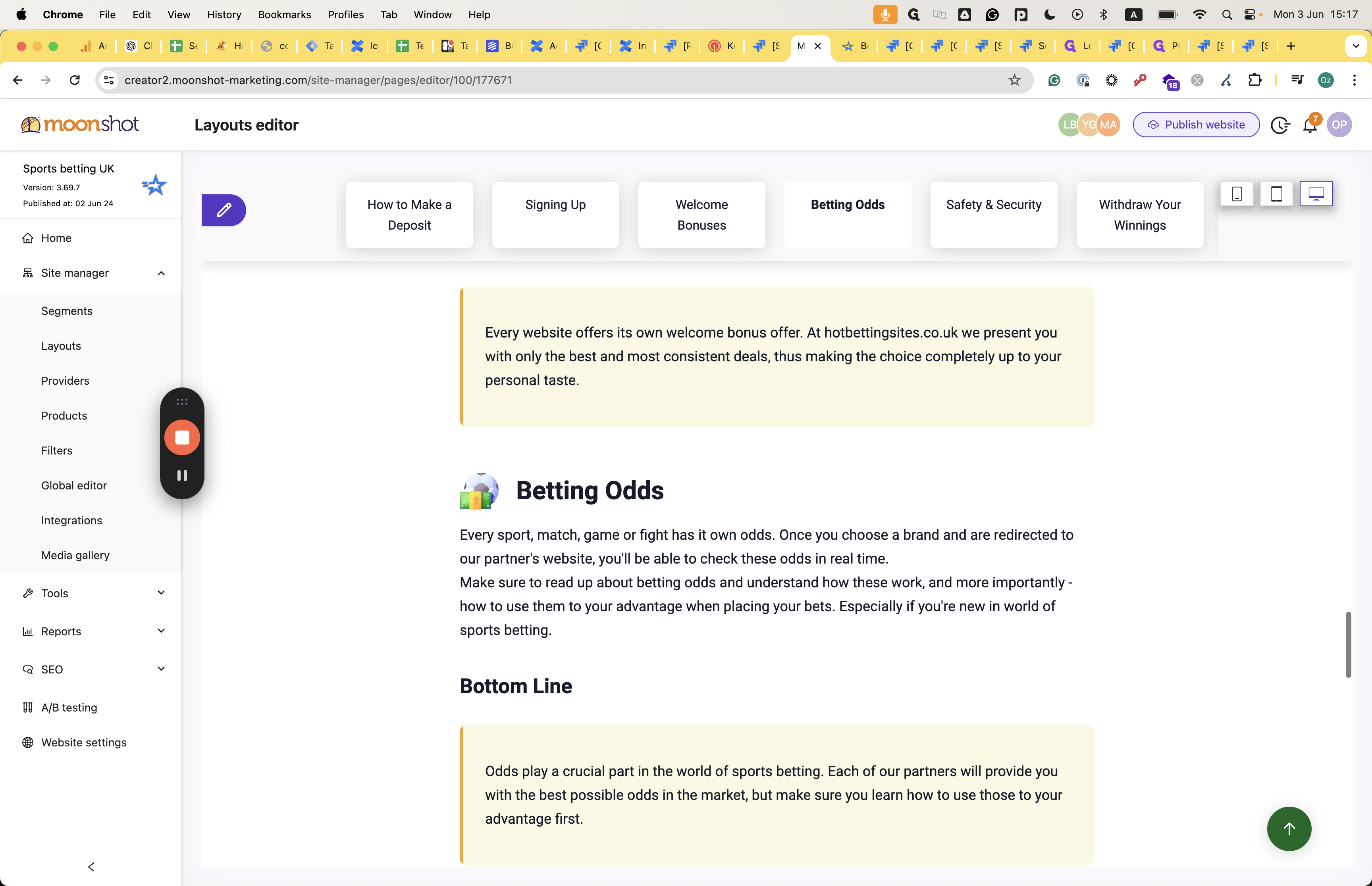
This section serves as a platform to showcase articles, each represented by a title in distinct boxes. By delving into the structure and features of AnchoredArticles, you can enhance the presentation of your content.
Let's explore how to add provider lists, adjust the number of providers displayed, and modify the theme to suit your preferences. Additionally, we'll delve into editing articles, including titles, icons, text formatting, and the inclusion of headers.
Furthermore, we'll cover the incorporation of mini-provider cards, enabling you to enrich your articles with additional information. Let's get started.
Let's get started.
How it looks like in the layout:
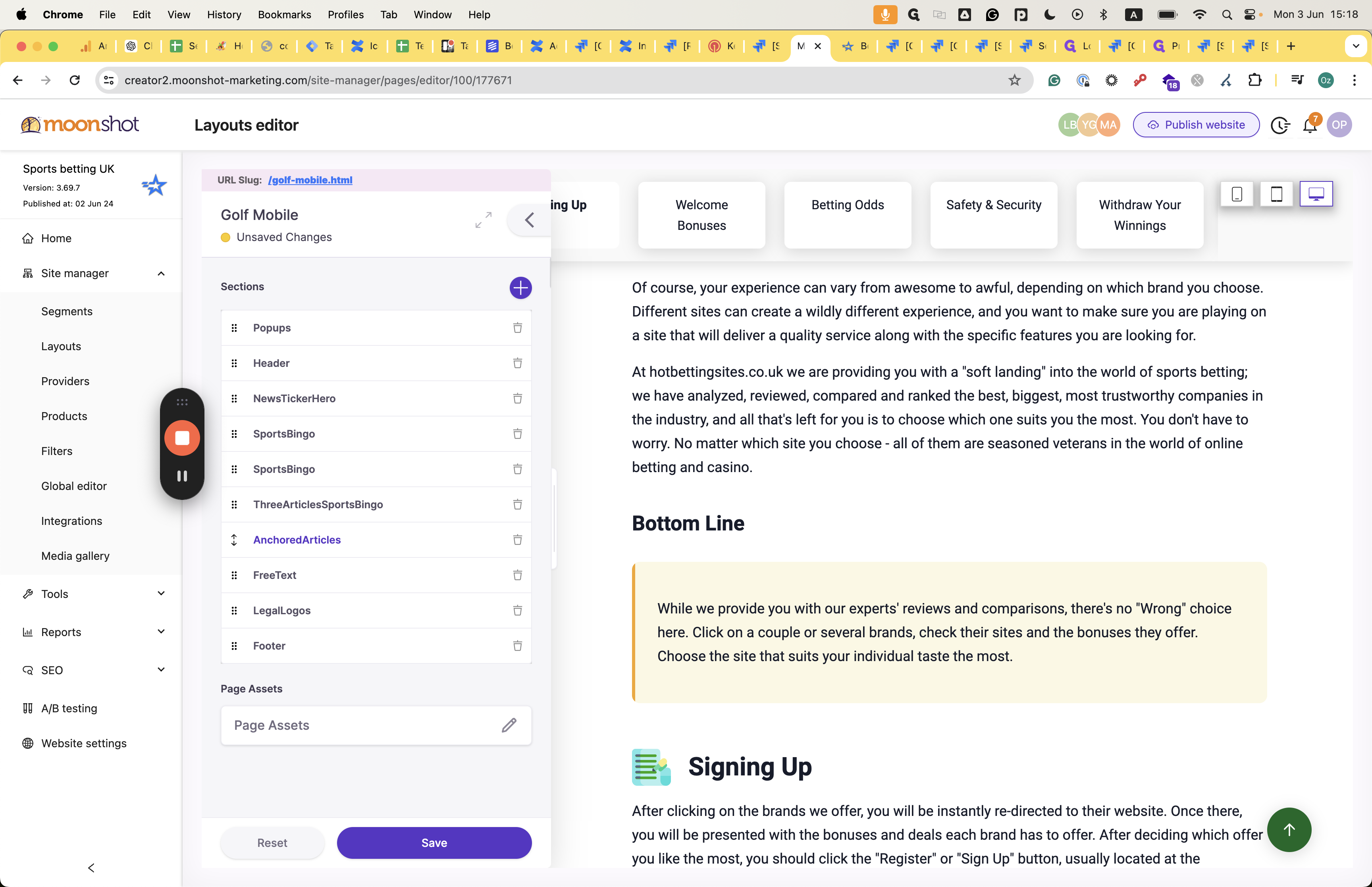
Within the layout itself, his structure is as follows:
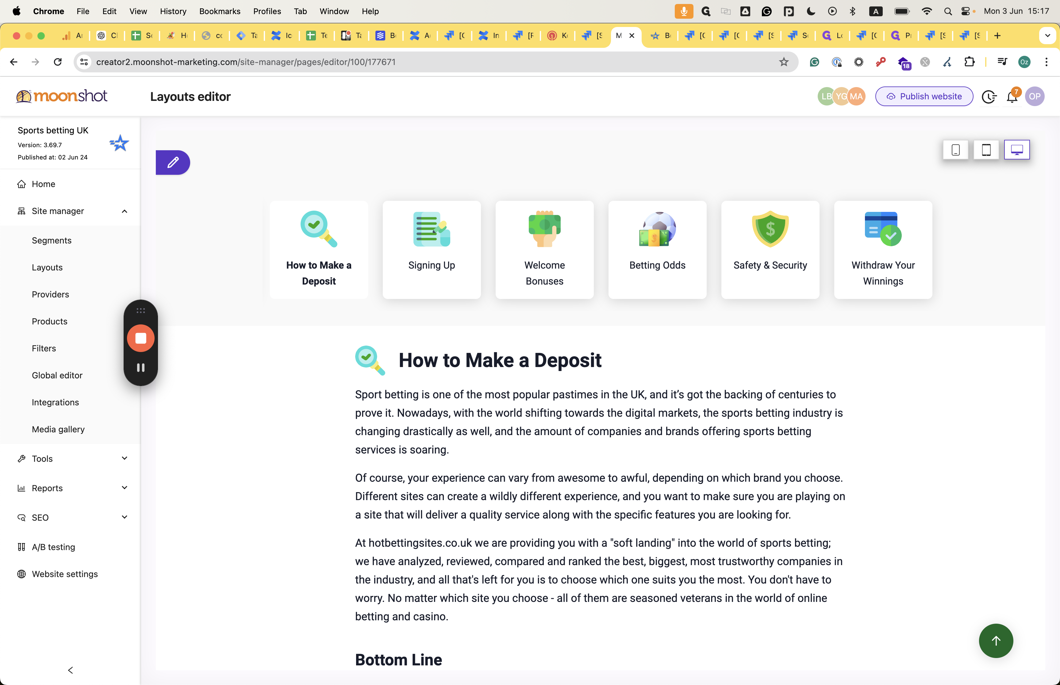
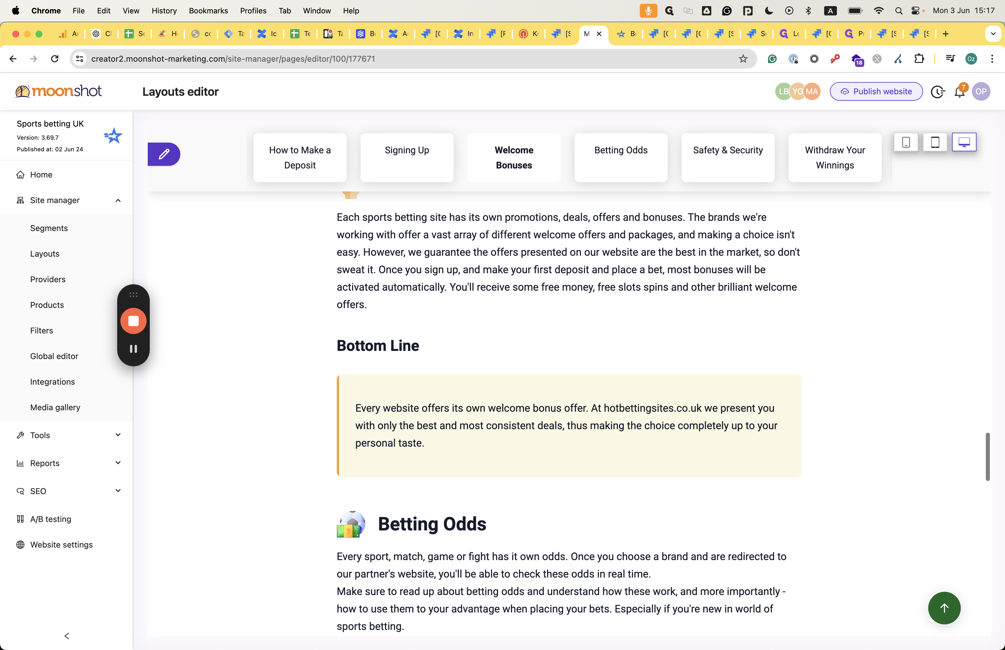
You can see the title of each article represented in boxes. After that, you can view the articles in the layout, one after the other.
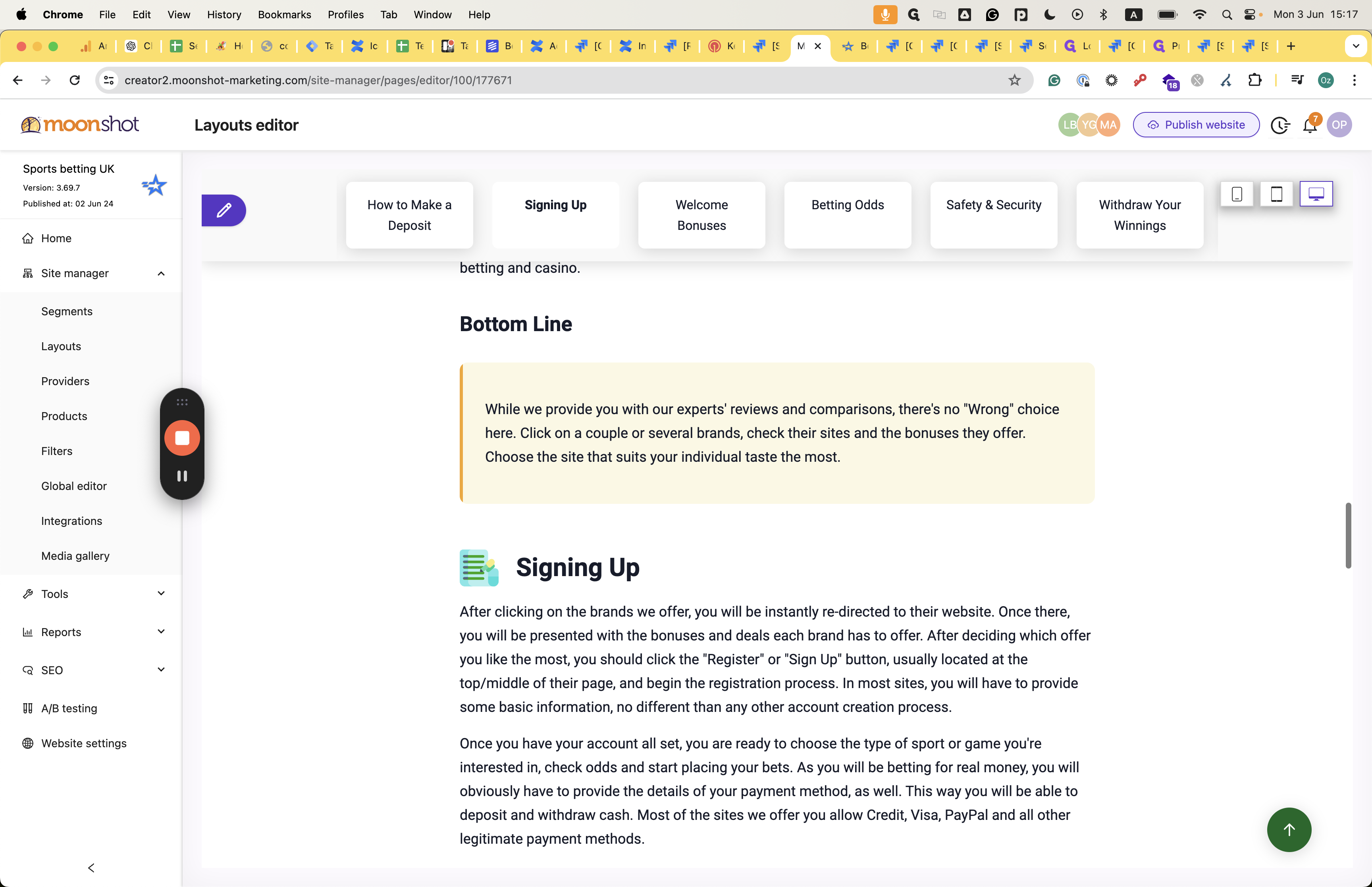
Those articles can also contain CTA. You can also add a mini card related to the provider list that you can connect with in this section. Let's see how we can implement this.
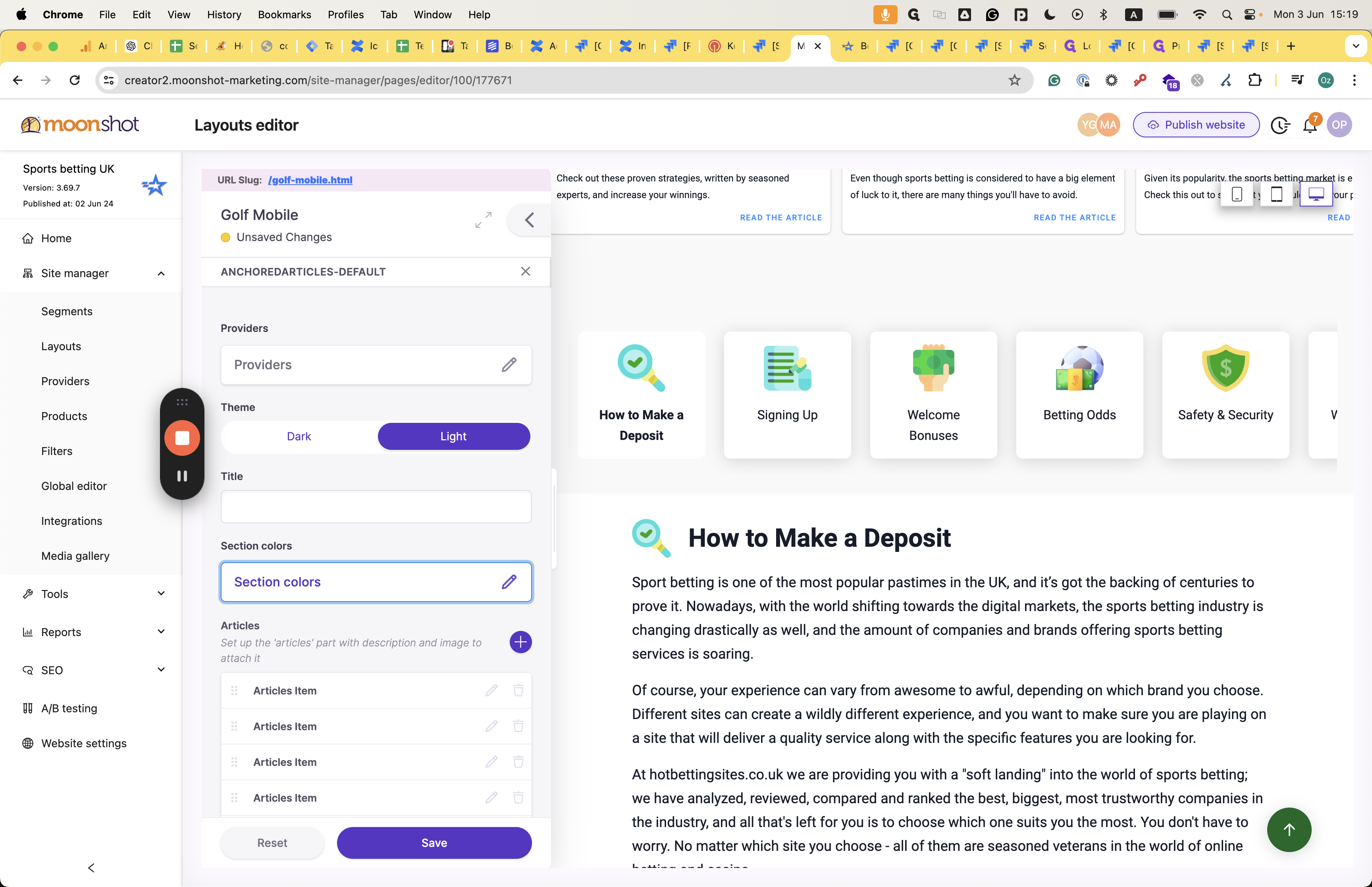
Once inside "AnchoredArticles," as presented in the layout, navigate to the providers' asset. Select a provider list from the dropdown menu to add it.
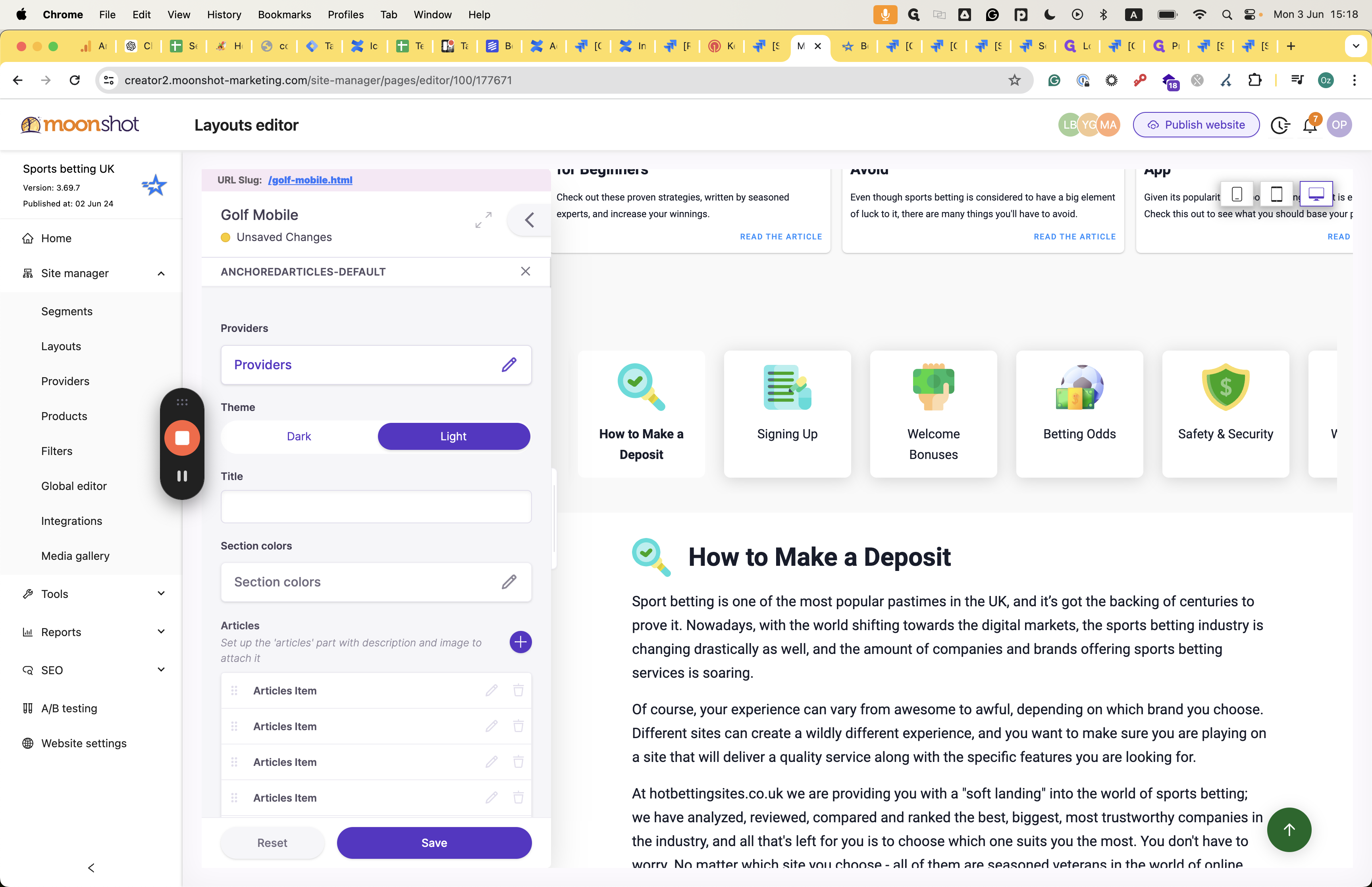
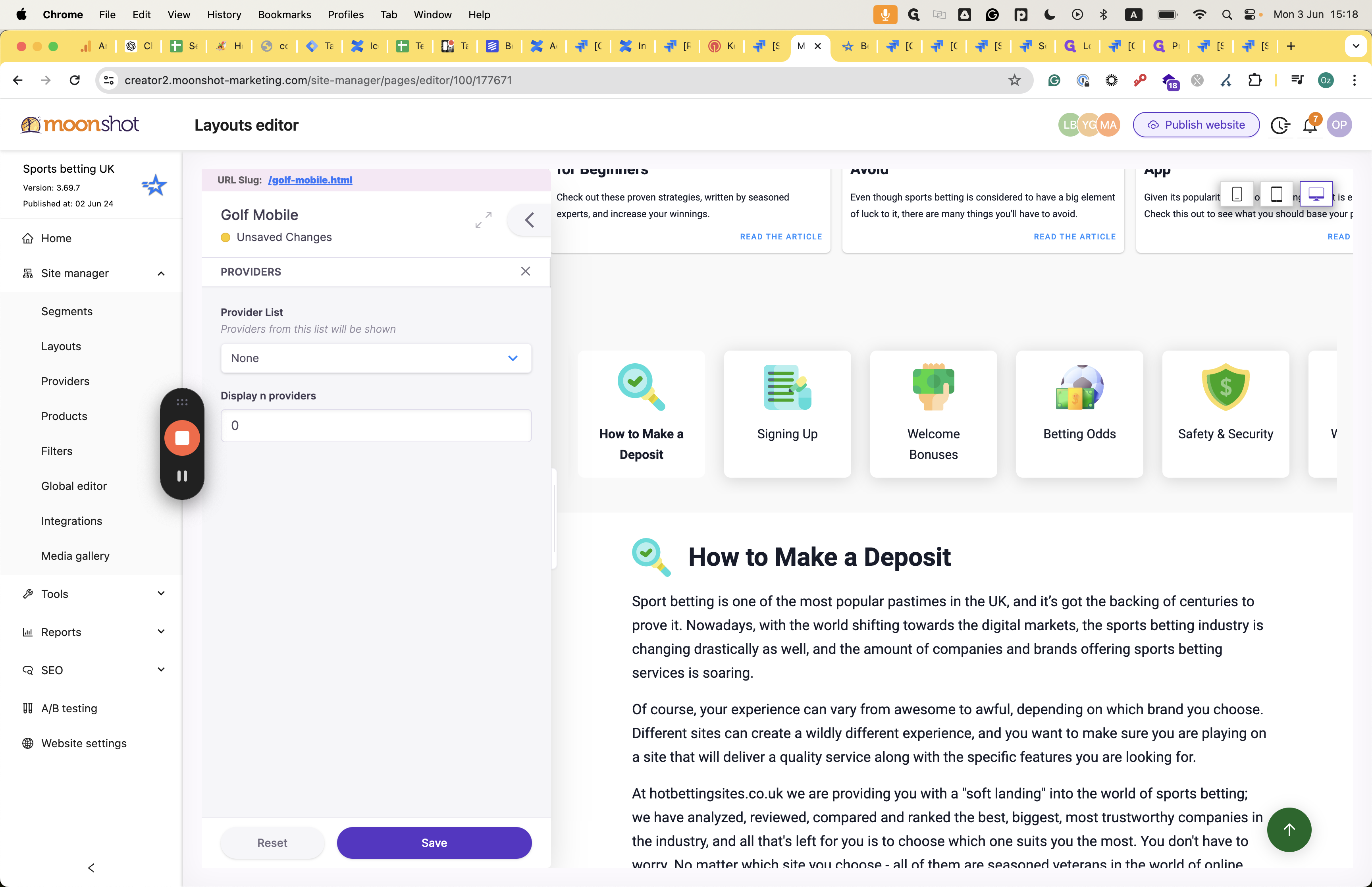
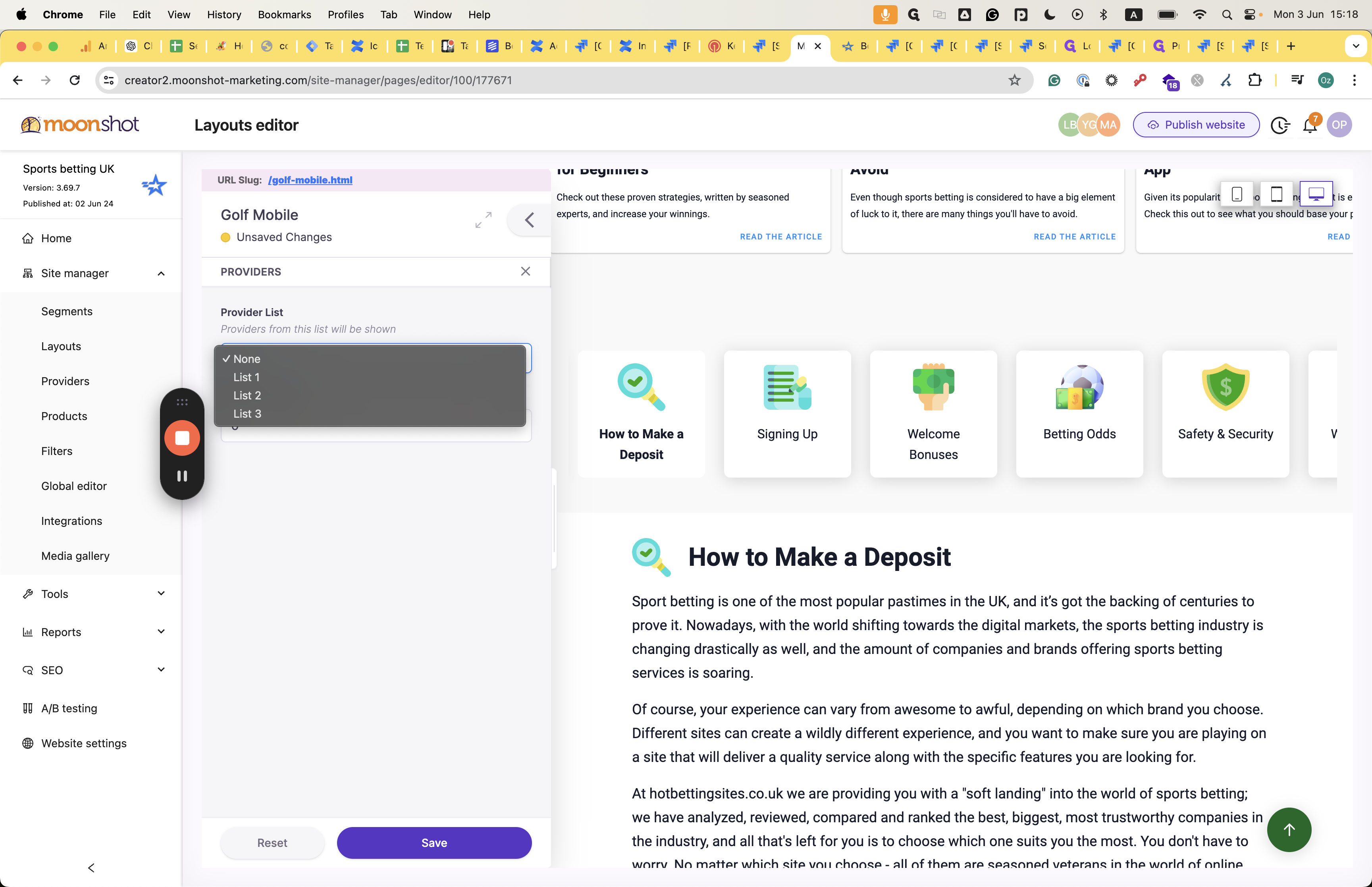
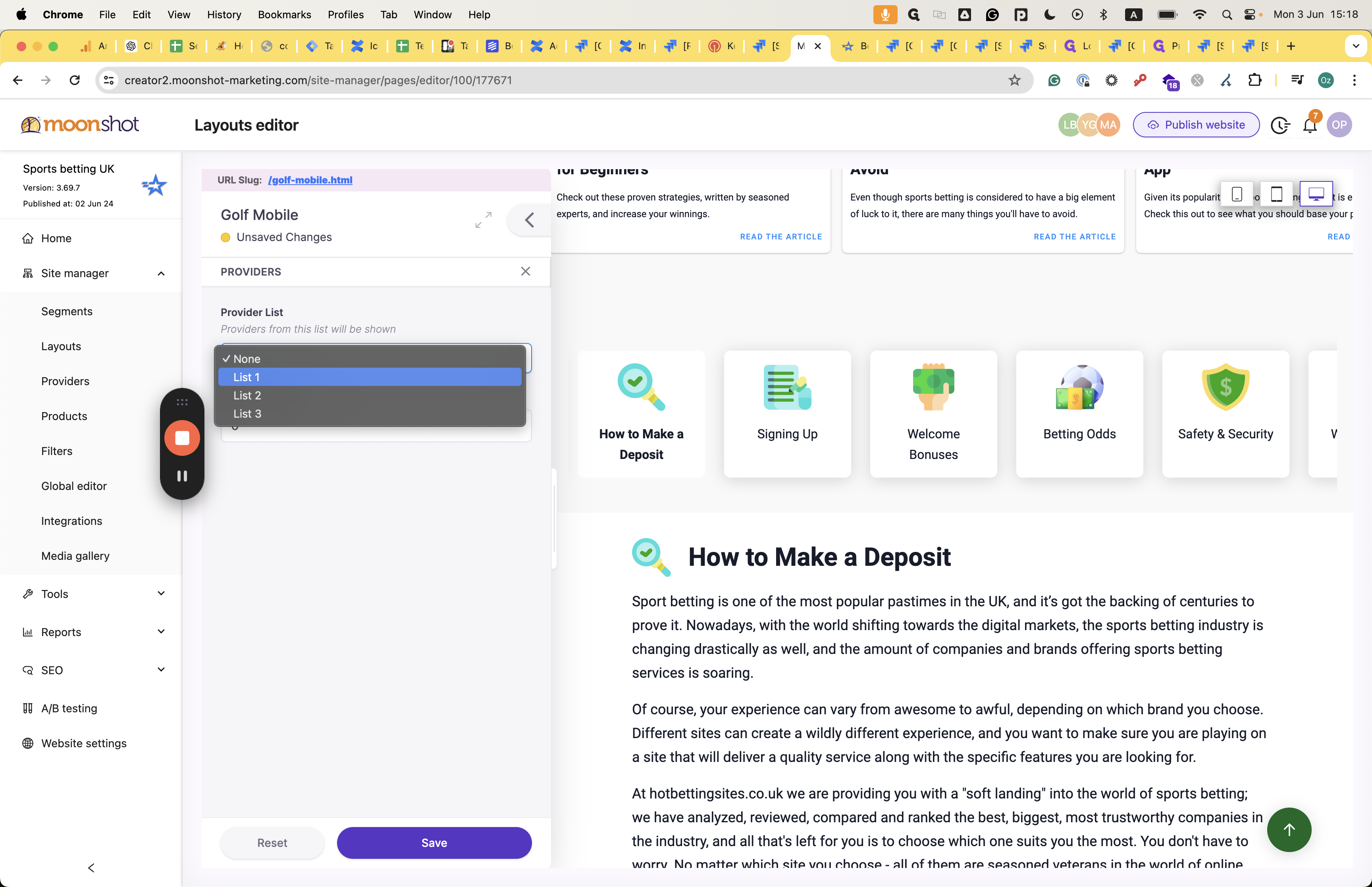
Let's choose one. You can also decide how many providers will appear in this section.

We'll see in about a minute how it affects the articles themselves.
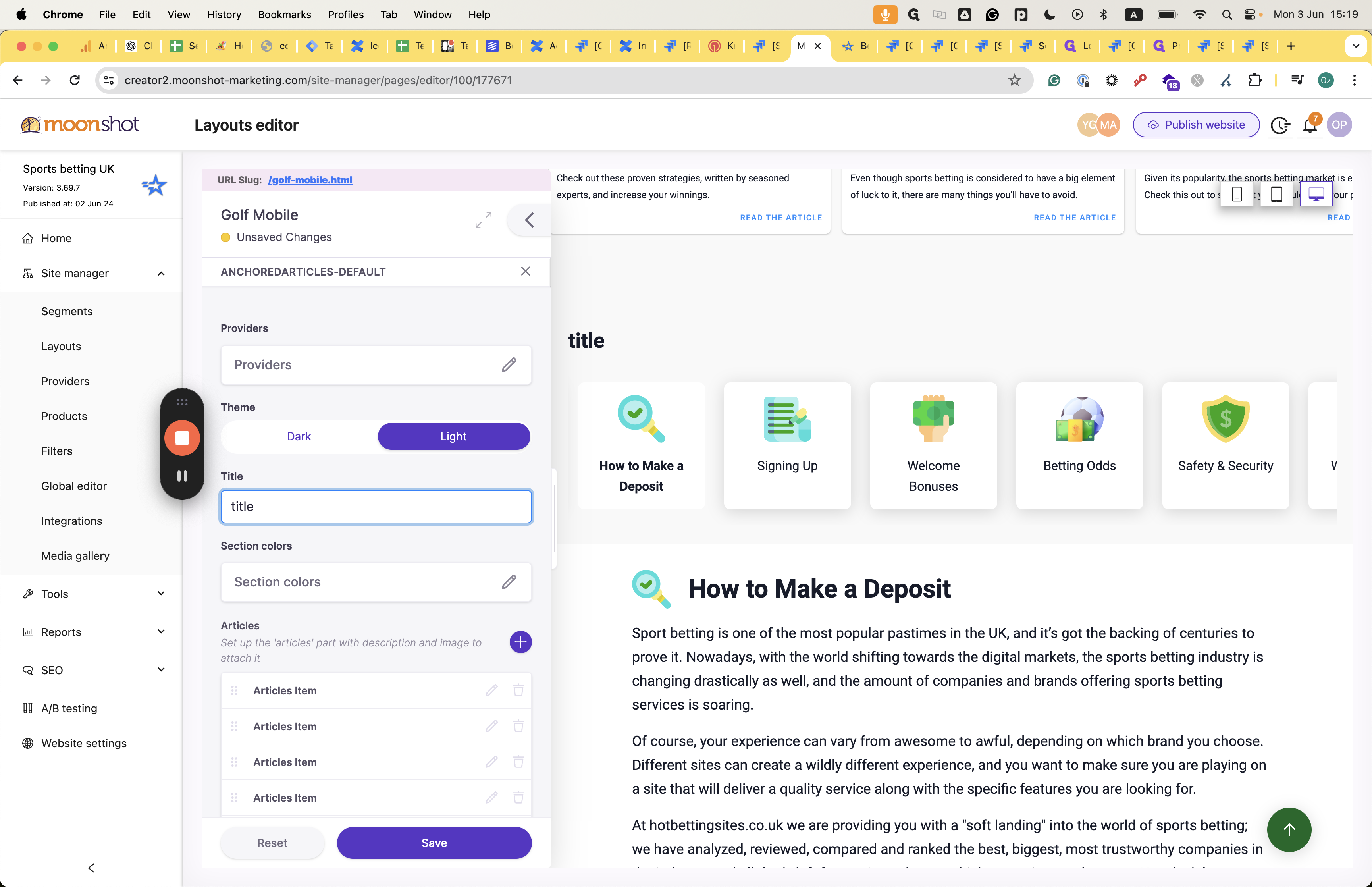
We can choose whether it will be dark or light by changing the asset theme. We can also add a title here, which will appear here.
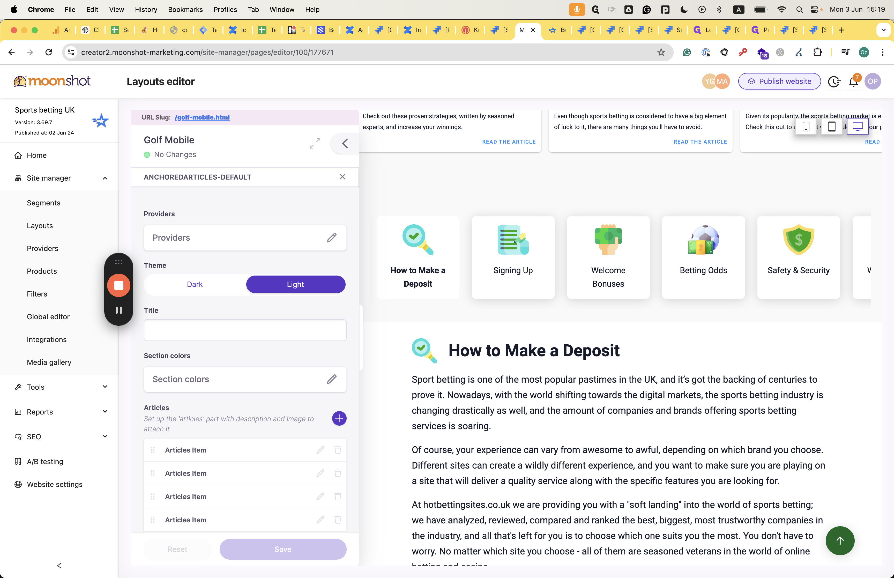
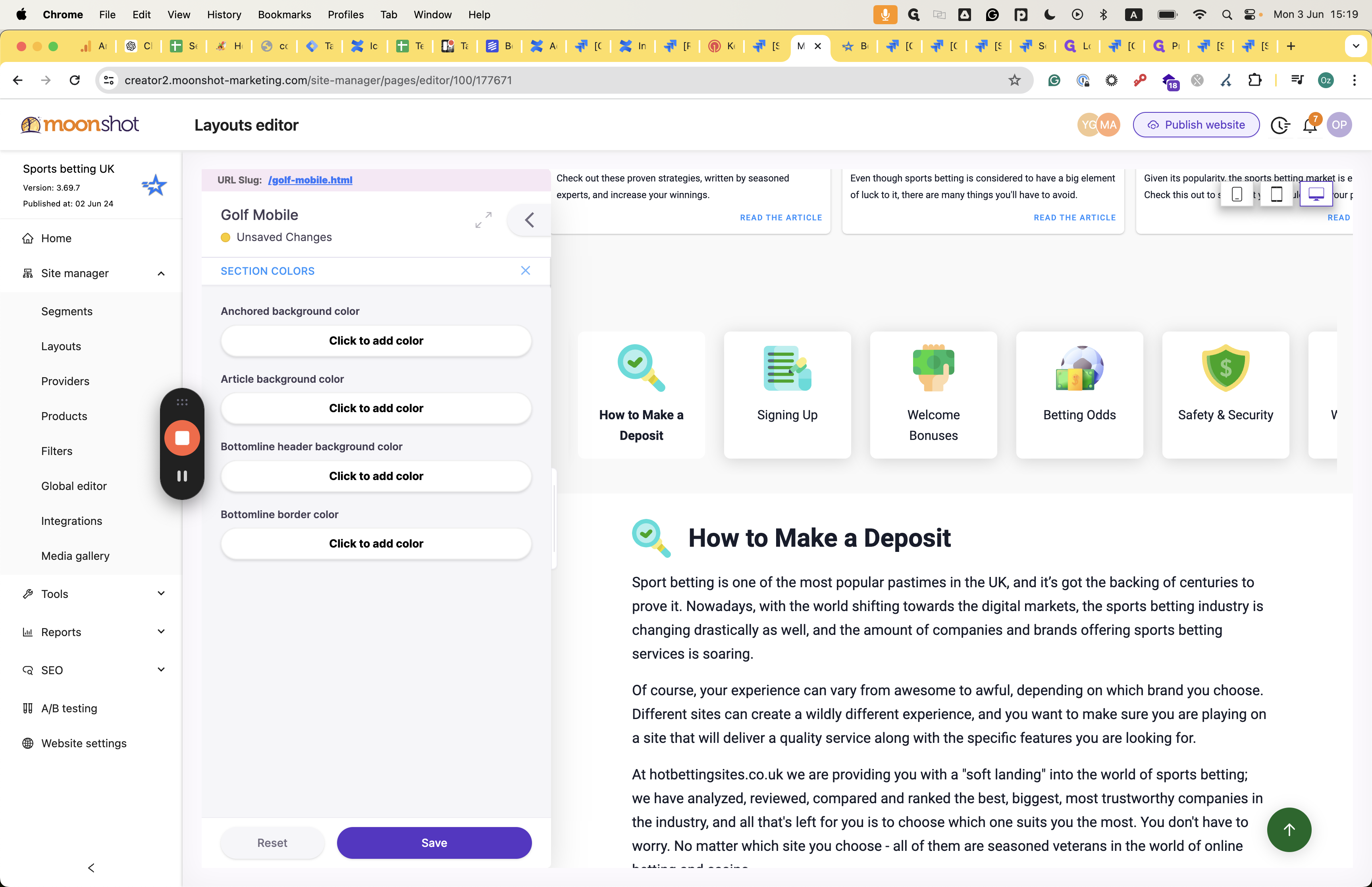
Also, in the asset section, we can edit colors related to the section, including background color, border color, and other design issues.
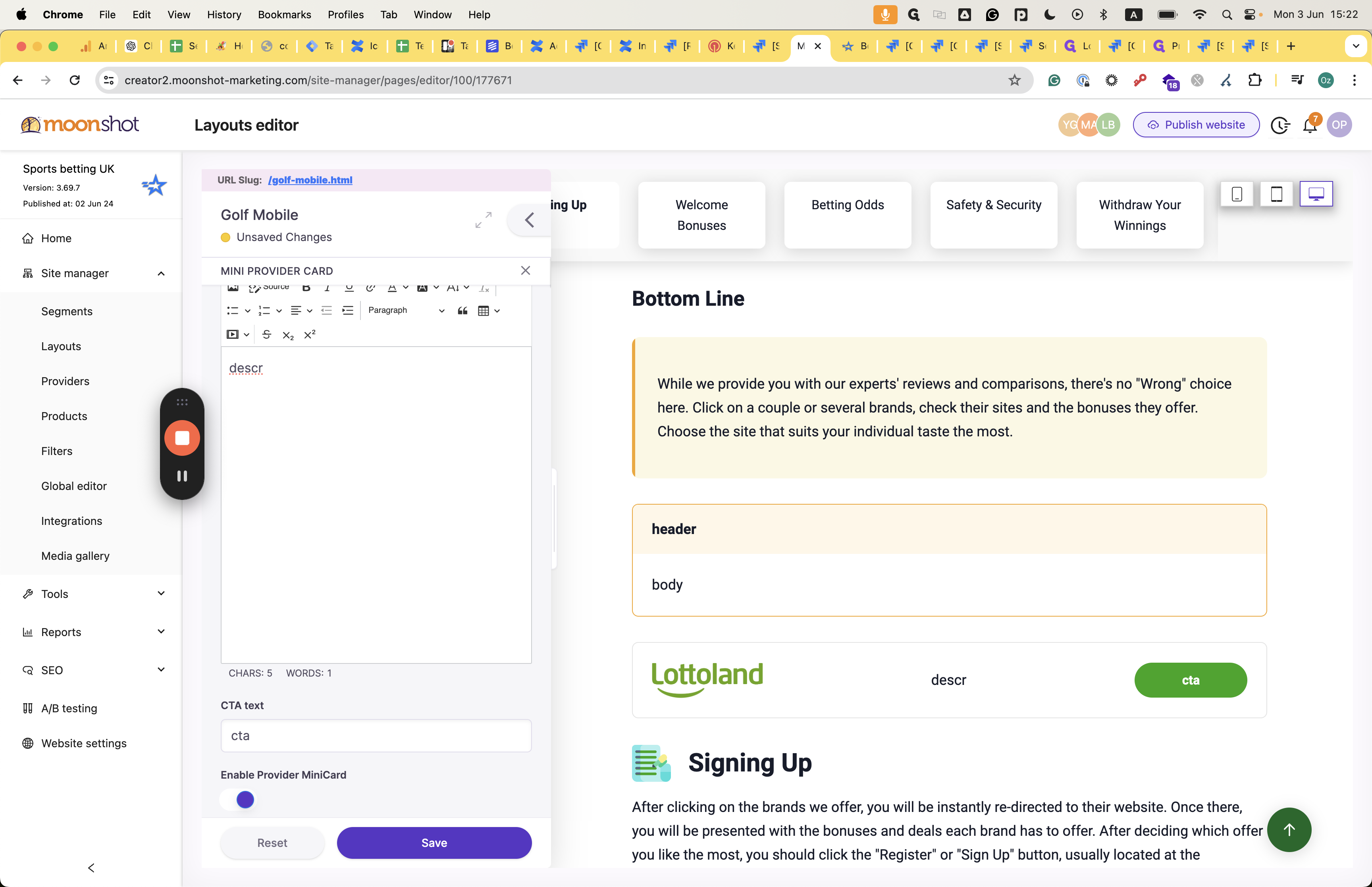
Create and edit the article :
Press the plus icon to add a new article to the asset.
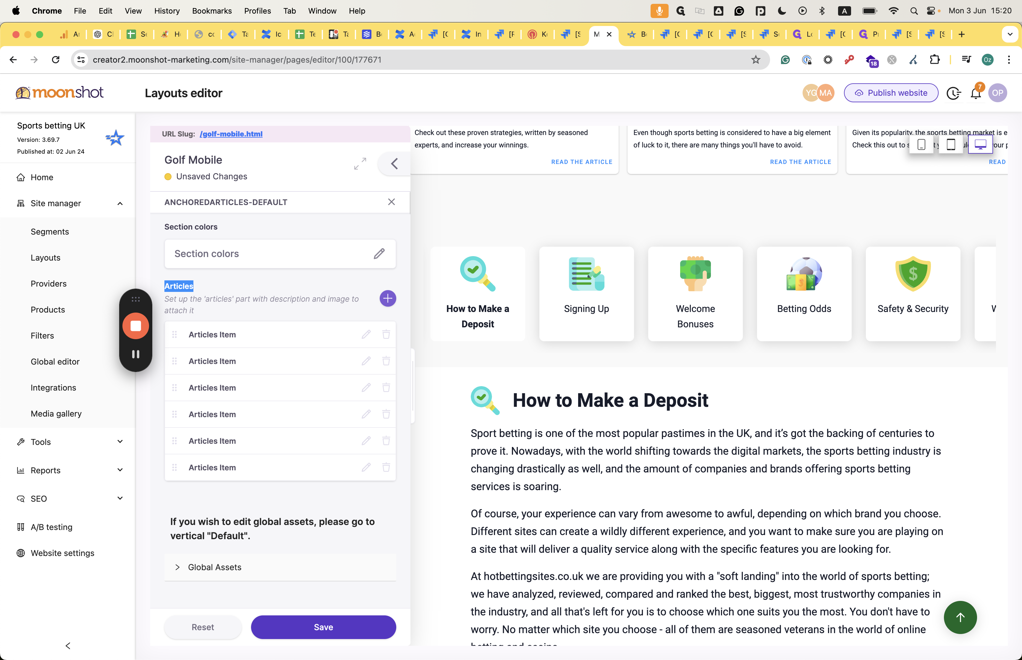
After completing the previous step, you can edit the article by clicking on it.
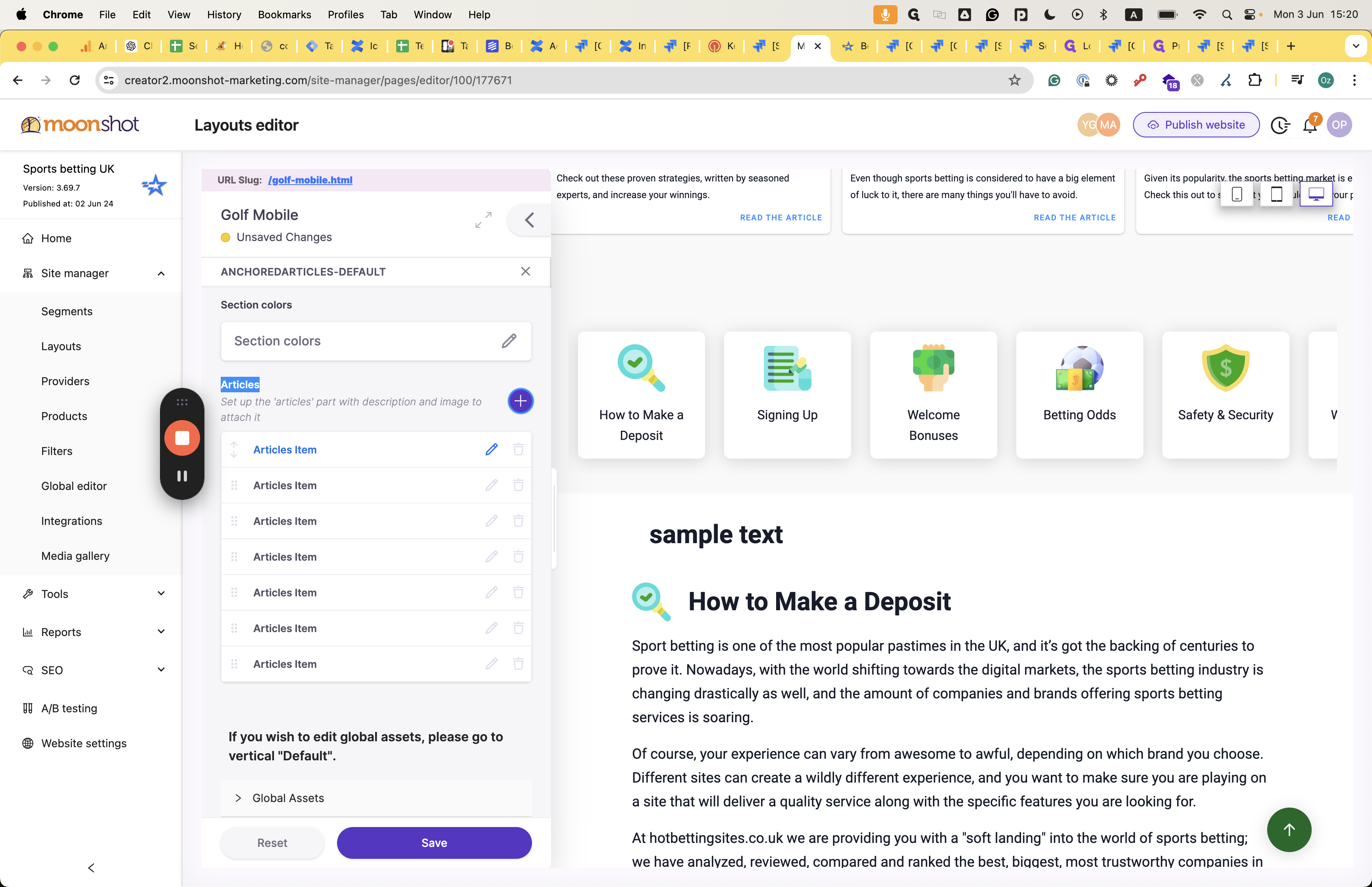
Title and icon: You can also add an icon, located here, to accompany the title displayed here.
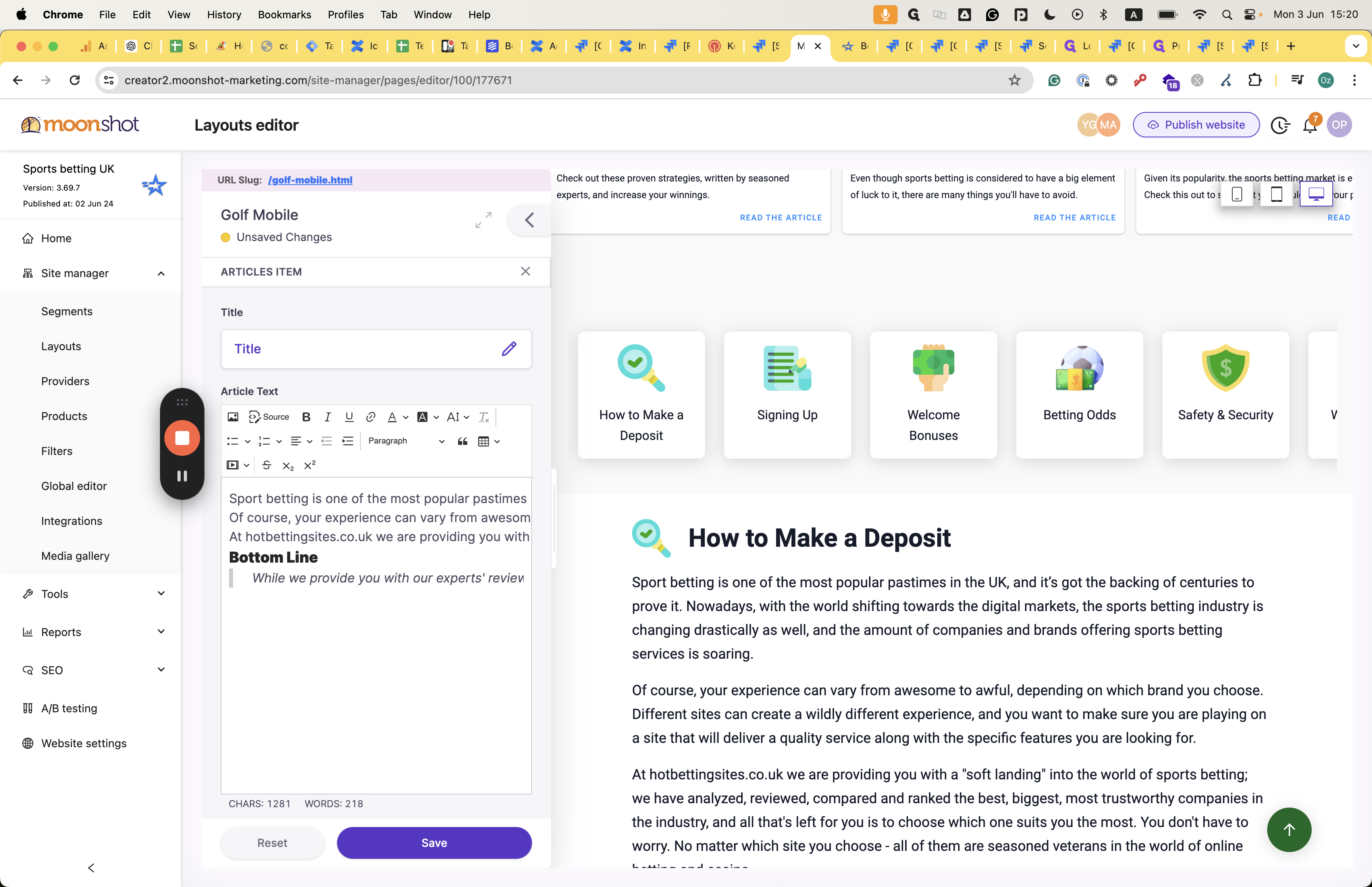

The title you see here and the article text itself have various fonting and design capabilities for the text.

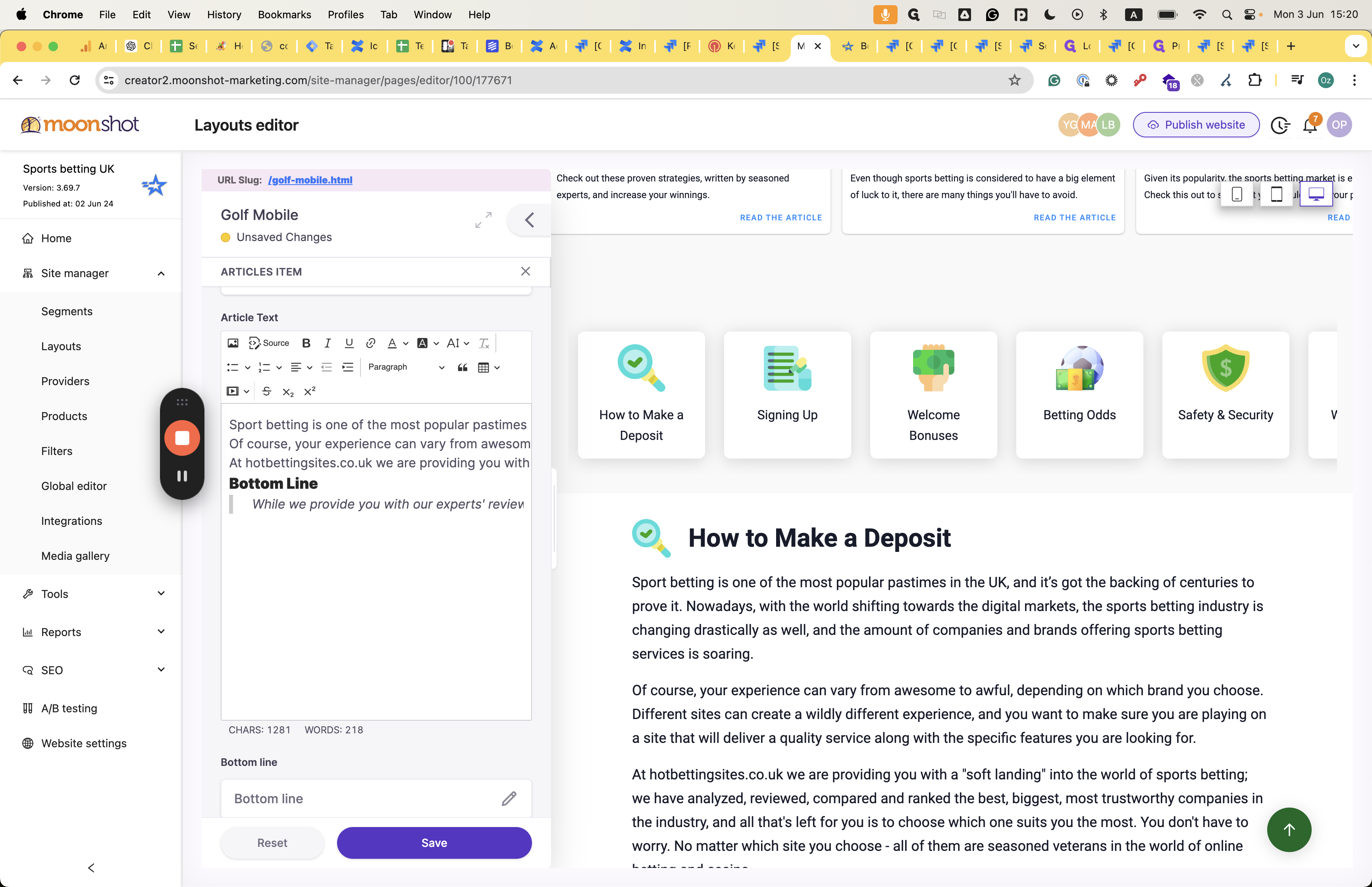

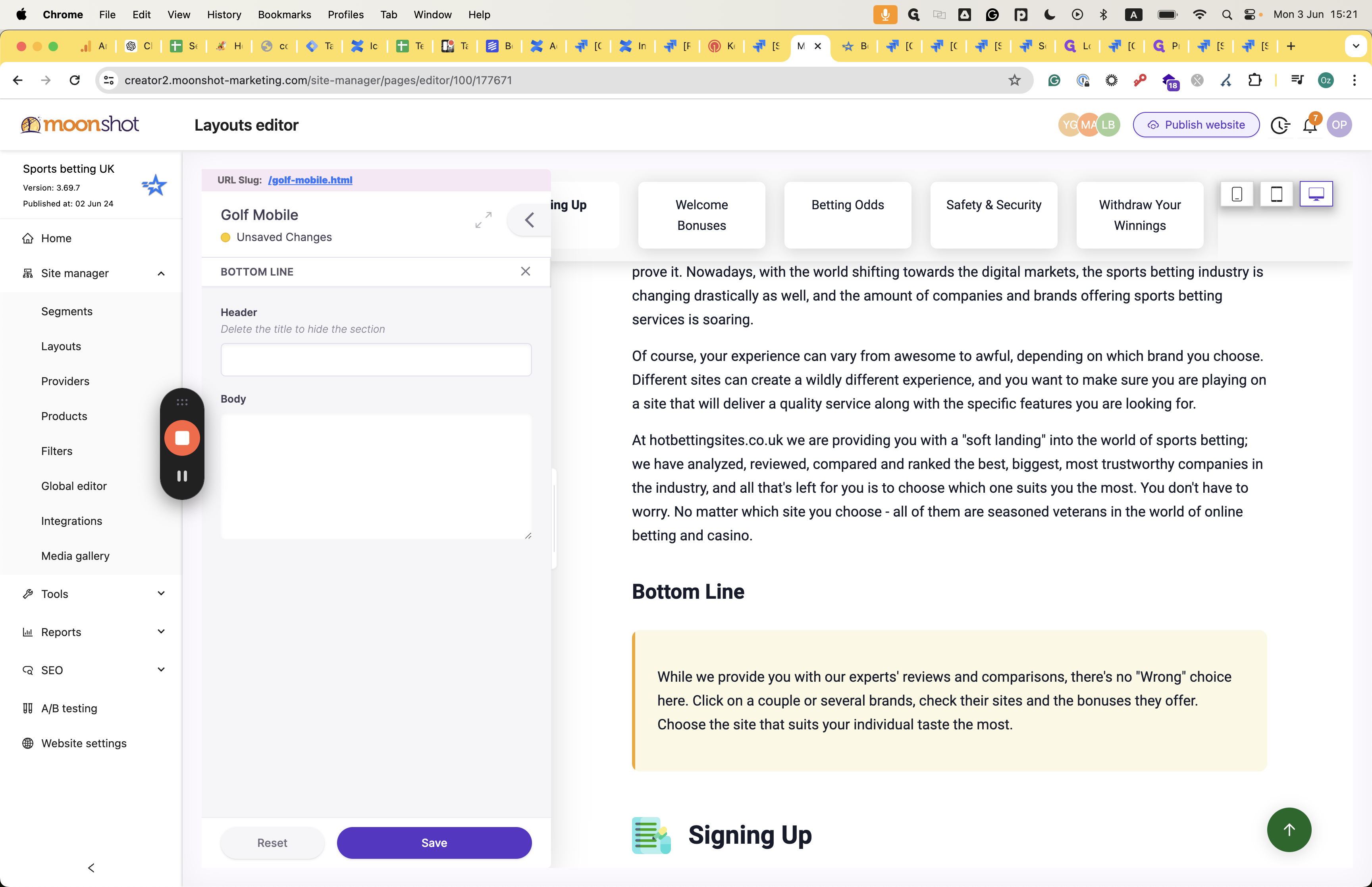
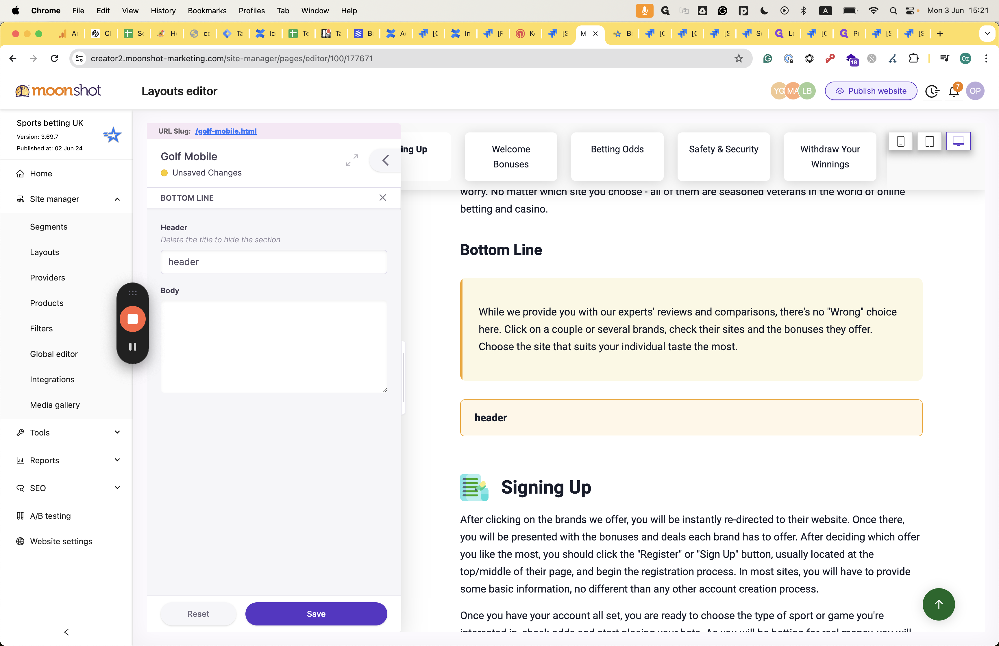
And you can decide at the bottom line whether you want to include a header.
This is the bottom line.
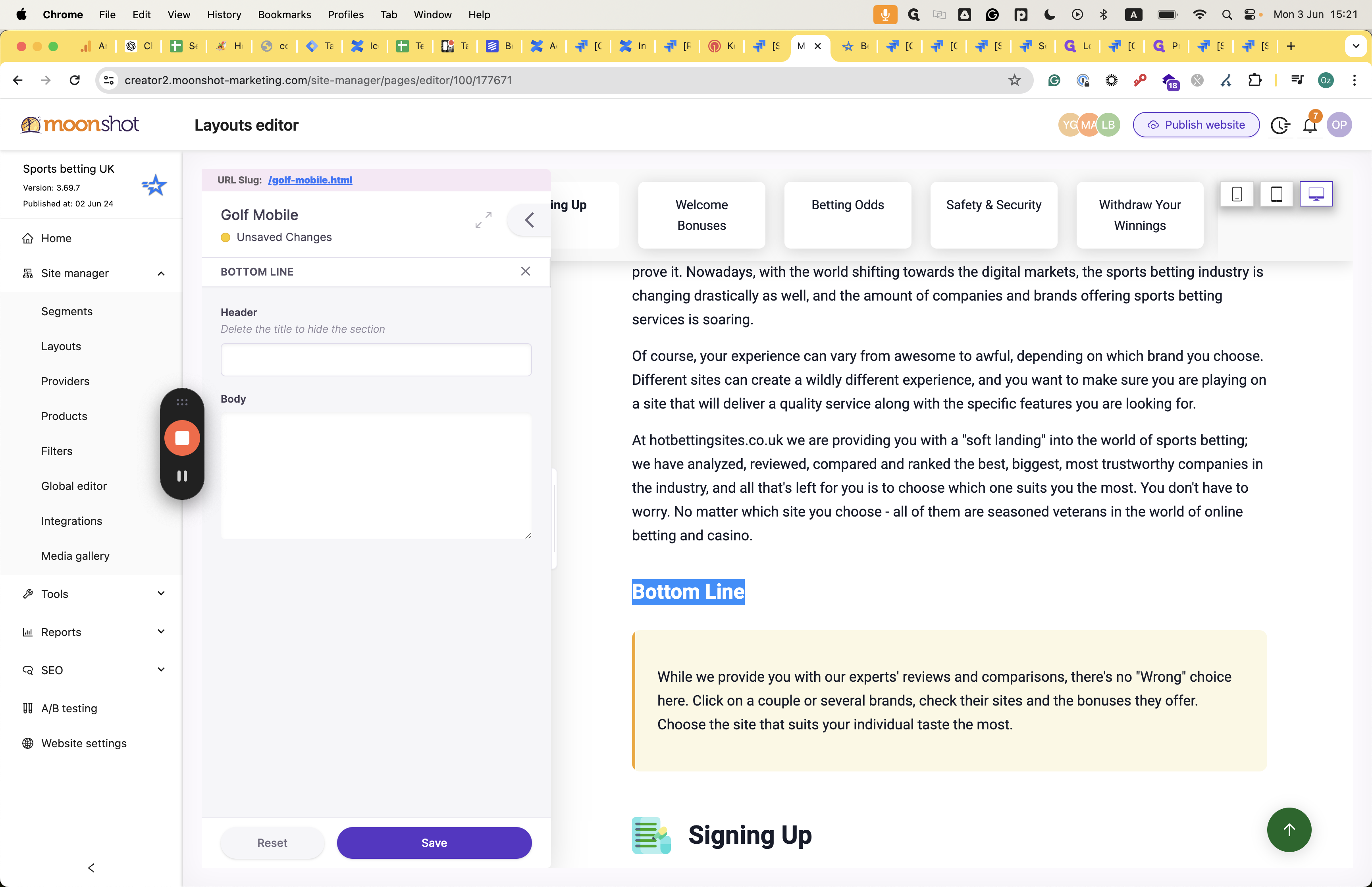
Add a header to this section.

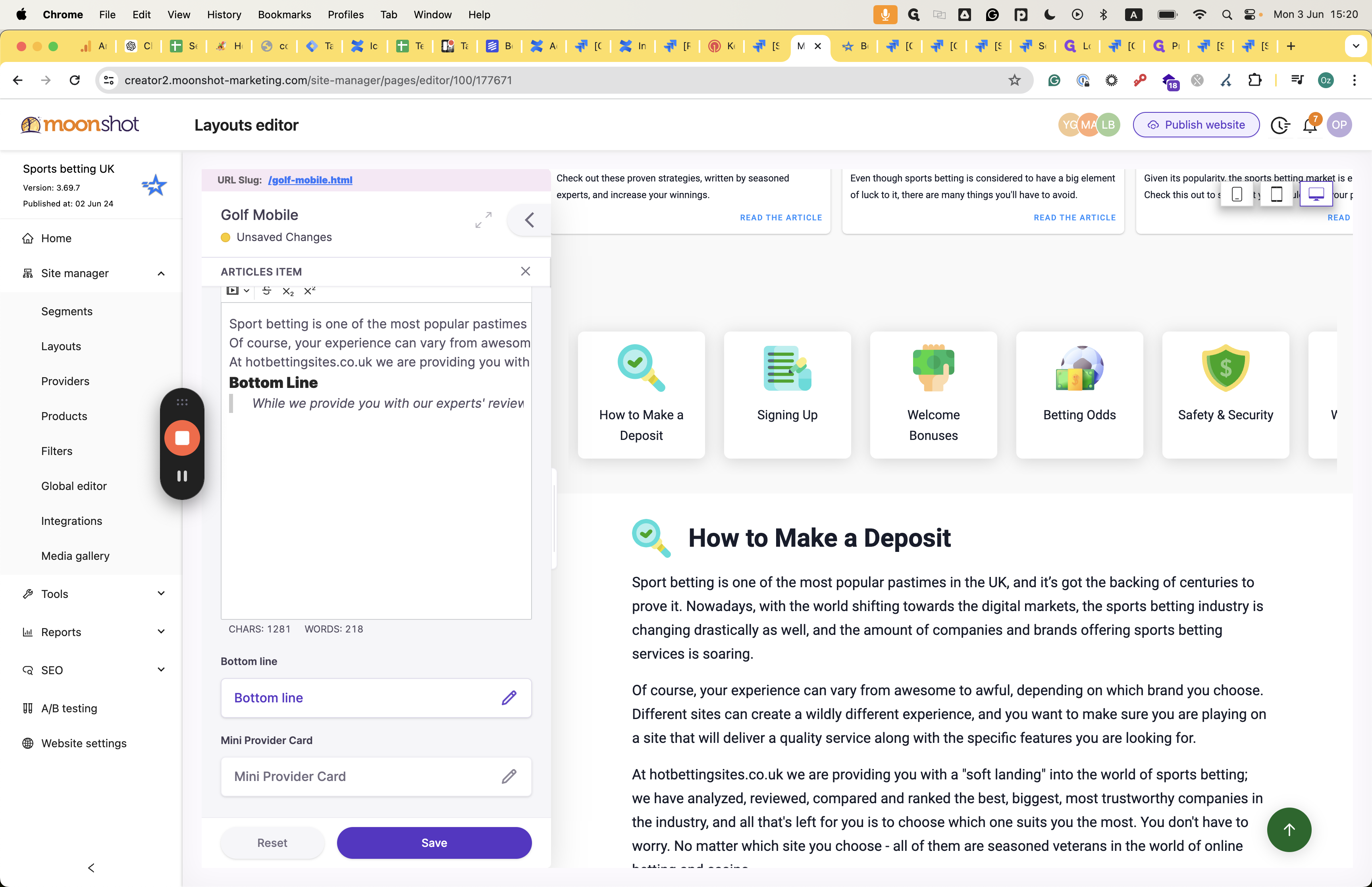
You can also add a mini-provider card below the mini-provider card asset.
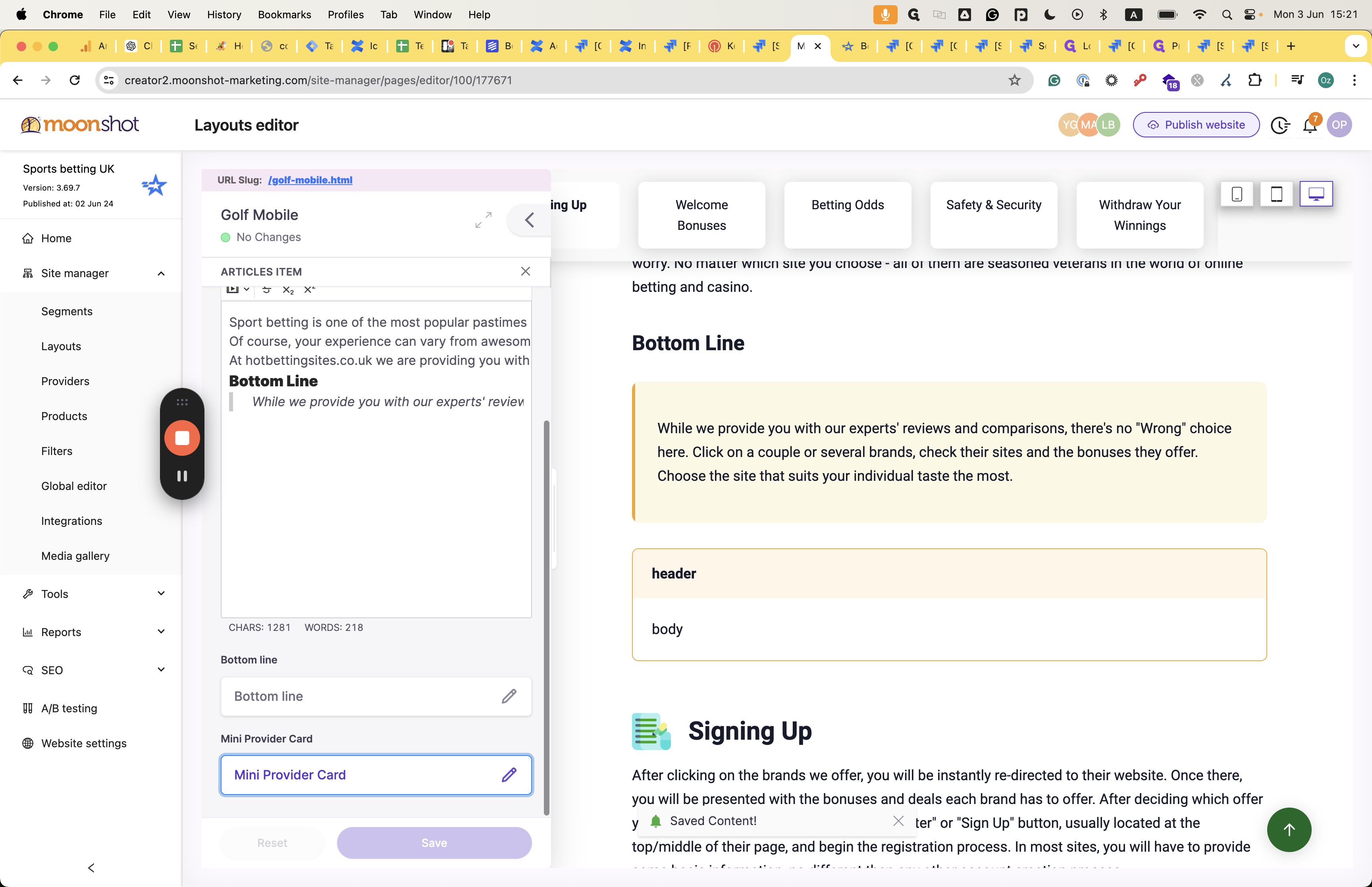
To present that, toggle on the "Enable Provider Mini Card" toggle.
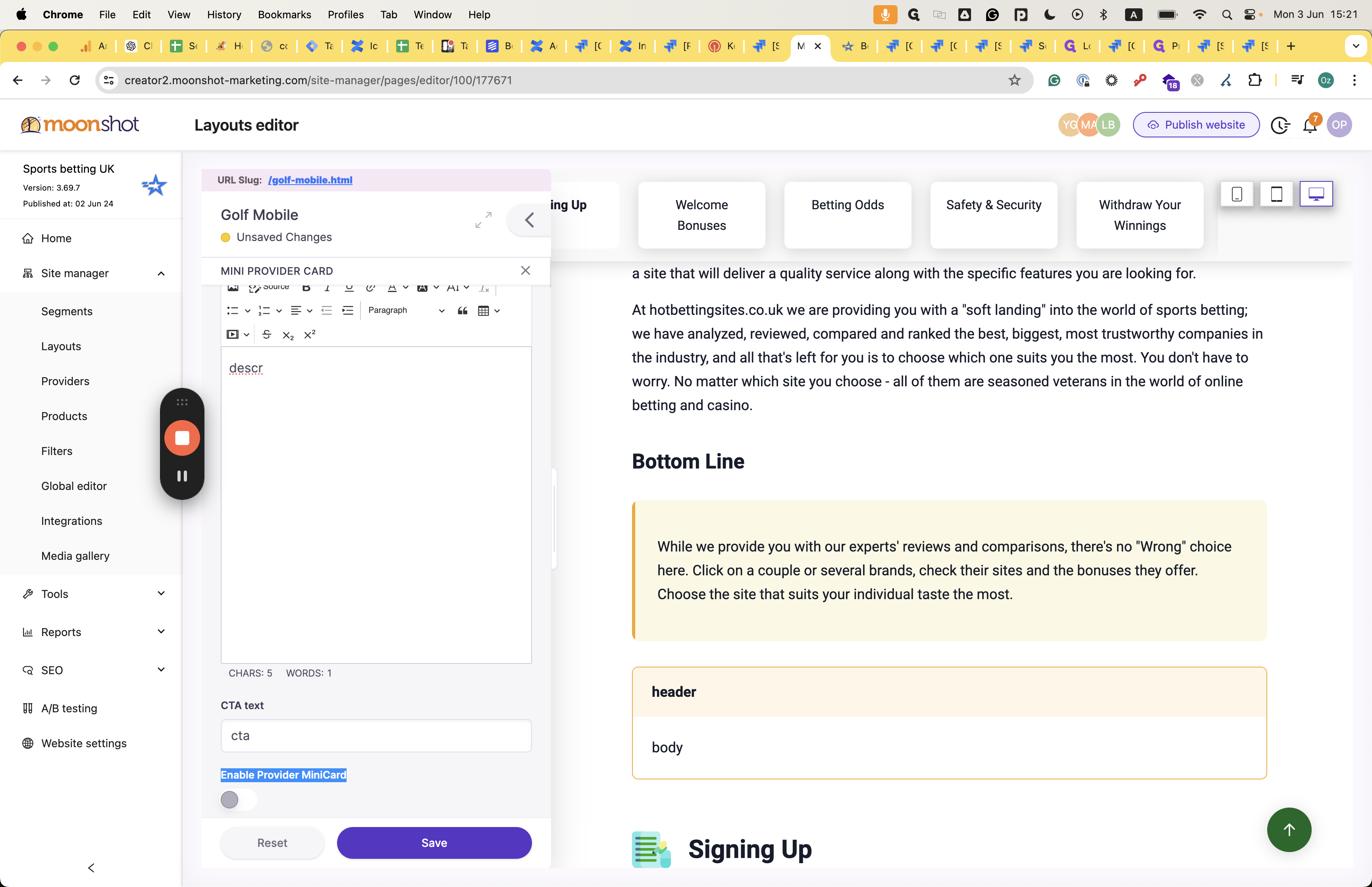
The mini card CTA takes the colors and design aspects from the global level.