Read summarized version with
I spent three hours writing what I thought was the perfect SOP.
Every step meticulously detailed. Clear, comprehensive text explaining exactly what to do. I distributed it to my team at Simpo feeling pretty proud of myself.
Then I watched someone try to follow it.
They squinted at the screen, scrolling back and forth between paragraphs. Trying to match my words to what they were seeing in the software. Getting confused. Making mistakes. Taking twice as long as they should have.
That’s when I realized: I was making people translate words into actions when I could just show them what to do.
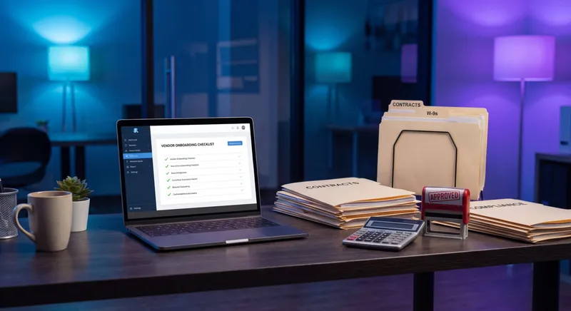
I’m Yuval, founder and CEO of Glitter AI. After building multiple companies and watching countless teams struggle with documentation, I’ve learned something critical: the format of your SOPs matters just as much as the content. Here’s why visual SOPs consistently outperform text-only documentation, and how to create them. For the full playbook, grab our free guide to writing effective SOPs. If you’re new to the format, it also explains what a video SOP actually is and when to use one.
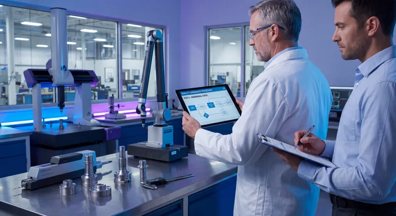
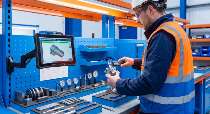
Teach your co-workers or customers how to get stuff done – in seconds.

The Science Behind Visual Learning
Here’s a fact that changed how I think about documentation: 65% of people are visual learners.
But it’s not just about learning styles. The human brain processes visual information fundamentally differently than text.
Your Brain on Images vs Text
The brain processes images 60,000 times faster than text. When you see a screenshot showing exactly where to click, your brain instantly understands. When you read “Click the submit button in the upper right corner of the dialog box,” your brain has to:
- Decode the words
- Build a mental image of what that means
- Search the actual screen for what matches that image
- Verify you found the right thing
That’s a lot of cognitive work. And every step introduces potential for error.
I see this all the time. Someone reads “select the third option from the dropdown menu” and clicks the wrong thing because they counted differently or there were two dropdowns they could’ve chosen from.
A screenshot with an arrow pointing to the exact option? No confusion. No counting. No guessing.
Visual Retention Is Dramatically Higher
People remember 80% of what they see and do, compared to just 20% of what they read.
Think about the last time you followed IKEA instructions. You probably barely read the text, right? You looked at the pictures and figured it out. That’s not because you’re lazy - it’s because your brain is optimized for visual information.
When I started creating visual work instructions instead of text-heavy SOPs, I watched training time drop by nearly half. Not because the process got easier, but because people could actually absorb and retain the information.
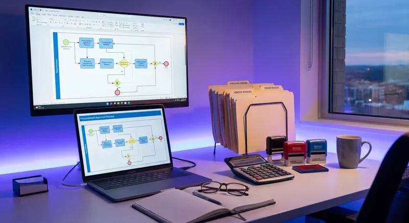
Record once, get step-by-step guides with screenshots automatically
How Visual SOPs Improve Comprehension
Text-only documentation creates what I call the “translation problem.” You’re asking people to convert your words into mental images, then match those mental images to reality.
Visual SOPs skip the translation step entirely.
Screenshots Show Exactly What to Do
When you include a screenshot in your SOP, there’s no ambiguity. No interpretation required. No wondering if you found the right button or menu or field.
I learned this lesson the hard way at Simpo. I had written SOPs for our customer success process that said things like “Navigate to the customer dashboard and locate the engagement metrics panel.”
Sounds clear, right? Except our dashboard had multiple panels, the layout changed based on screen size, and new team members had no idea what “engagement metrics” actually looked like.
One screenshot with a red box around the right panel solved all of that instantly.
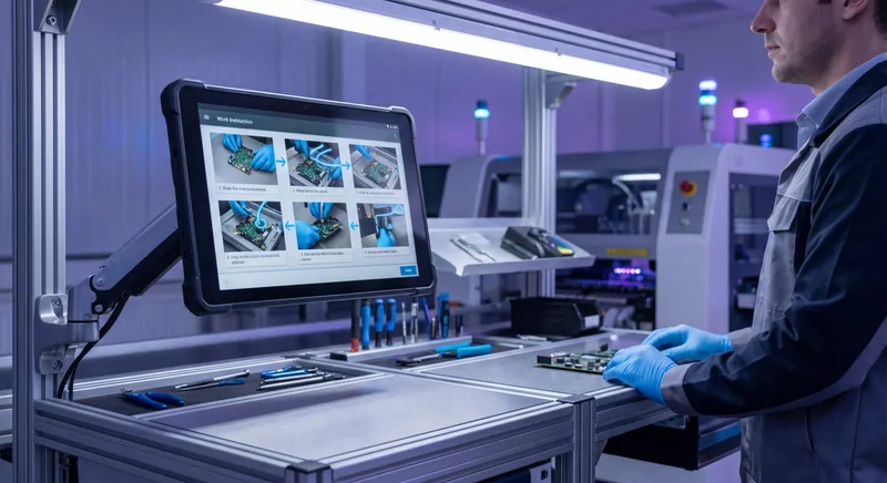
Screen Recordings Capture Movement and Context
Some processes involve sequences that are hard to describe in text, which is exactly why click-by-click capture tools like the Windows Steps Recorder exist. Where you click, in what order, how the interface responds.
For these, a screen recording is invaluable. A 30-second video can communicate what would take several paragraphs to explain, and do it more clearly.
I built Glitter AI specifically to make this easier. You just perform the process once while recording, and it automatically captures everything and generates the documentation, which you can then refine in the transcript editor if a step needs rewording. No more trying to describe complex workflows in words.
Annotations Guide Attention
The power of visual SOPs increases dramatically when you add annotations. Arrows pointing to specific elements. Numbered sequences showing the order of steps. Highlighted areas drawing attention to critical details.
These visual cues guide someone’s eyes to exactly the right place. With text-only SOPs, people have to search the screen themselves, and they often look in the wrong spots.
Faster Training With Visual SOPs
Every company I’ve worked with that switched from text-only to visual SOPs reported significantly faster training times.
New Employees Get Productive Faster
When I onboarded people at Simpo using text-heavy documentation, it took weeks before they felt confident with our processes. They kept coming back with questions because the written instructions didn’t match what they saw on screen.
After switching to visual SOPs, new hires were productive in days. They could follow along step-by-step, matching what they saw in the documentation to what was on their screen.
The difference was dramatic. Training time dropped by about 40%, which meant new team members started contributing value way sooner.
Less Time Asking Questions
Here’s something I didn’t anticipate: visual SOPs reduced the number of interruptions for experienced team members.
When documentation is text-only, people constantly get stuck and need to ask for help. “Which button is the export button?” “What does ‘finalize the record’ mean?” “Where’s the settings menu?”
With visual documentation, most of these questions evaporate. The screenshot shows them exactly which button. They can see what the settings menu looks like. There’s no ambiguity.
My team could focus on their work instead of constantly answering basic questions about where to click.
Self-Service Learning Actually Works
I’m a big believer in self-service training. I want people to be able to figure things out themselves instead of always needing hand-holding.
But self-service only works if your documentation is clear enough to follow independently. Text-only SOPs rarely meet that bar. They’re too ambiguous, too easy to misinterpret.
Visual SOPs, especially with screenshots and annotations, enable genuine self-service learning. People can work through them at their own pace and actually succeed.
Check out my complete guide on how to create SOPs employees follow for more on this.
Teach your co-workers or customers how to get stuff done – in seconds.
Reduced Errors When Visuals Show Exactly What to Do
Mistakes are expensive. Rework wastes time. Errors frustrate customers. Compliance failures can cost you serious money.
Visual SOPs dramatically reduce error rates compared to text-only documentation.
The Error-Ambiguity Connection
Most errors in documented processes don’t come from people being careless. They come from ambiguity in the instructions.
“Click the submit button” is ambiguous if there are three buttons that could plausibly be submit buttons.
“Enter the customer reference number” is ambiguous if there are multiple fields and you’re not sure which one is the reference number field.
A screenshot eliminates the ambiguity. You can see exactly which button. Exactly which field. No guessing required.
Precision in Complex Processes
The more complex the process, the more critical visual documentation becomes.
I’ve worked with operations teams managing logistics SOPs where a single mistake could delay shipments or cost thousands in fees. Text-based instructions led to regular errors because there were too many details to keep track of.
Adding screenshots and annotated diagrams cut those error rates significantly. When people could see exactly what a properly filled form looked like, or exactly which option to select from a complex dropdown, mistakes dropped dramatically.
Research backs this up: visual work instructions can reduce human error by 23-30% in manufacturing environments. I’ve seen similar improvements in office work and software processes.
Consistency Across Team Members
Text documentation leaves room for interpretation. Different people read the same instructions and do slightly different things.
Visual SOPs create consistency because everyone sees the same reference. There’s less room for personal interpretation when you’re literally showing them what to do.
This is especially important for quality-critical processes where variations in execution can affect outcomes. Standard operating procedures that include visual elements ensure everyone performs tasks the exact same way.
Visual SOPs Break Language Barriers
If you have a multilingual team - and most organizations do these days - visual documentation is a game-changer.
Images Are Universal
A screenshot of where to click works the same regardless of whether someone speaks English, Spanish, Mandarin, or Hindi.
Obviously you still need some text to explain context and sequence. But the heavy lifting of showing what to do happens visually, which means language barriers matter much less.
I’ve talked to documentation managers at global companies who maintain SOPs in six or seven languages. That’s an enormous translation burden. Adding more visuals reduces how much text needs translating, cutting both cost and the risk of translation errors.
Lower Literacy Requirements
Not everyone has the same reading level, even in their native language. Dense, text-heavy documentation can be challenging for people with lower literacy skills.
Visual SOPs are more accessible. Someone can follow a process by looking at pictures and minimal supporting text, even if they struggle with complex written instructions.
This isn’t just about inclusion - it’s about effectiveness. You want your documentation to work for everyone on your team, regardless of their background.
Real Examples: Visual vs Text-Only SOPs
Let me show you the difference with actual examples.
Example 1: Software Navigation
Text-only version: “To access the reporting dashboard, click on the Analytics menu item in the left navigation panel. From the submenu that appears, select Monthly Reports. On the reports page, use the date range selector to choose your desired time period, then click the Generate Report button.”
Visual SOP version:
- Screenshot 1: Left navigation panel with arrow pointing to “Analytics”
- Screenshot 2: Expanded submenu with “Monthly Reports” highlighted
- Screenshot 3: Date range selector annotated with “Select dates here”
- Screenshot 4: “Generate Report” button circled in red
The visual version is faster to follow, impossible to misinterpret, and requires almost no reading.
Example 2: Equipment Setup
Text-only version: “Ensure the power switch is in the off position before connecting cables. Insert the USB-C cable into the port on the left side of the device, ensuring it is fully seated. Connect the power adapter to the port on the rear panel. The indicator light should illuminate green when properly connected.”
Visual SOP version:
- Photo 1: Power switch in off position (annotated “Start here”)
- Photo 2: USB-C cable being inserted, with arrow and “Left side port” label
- Photo 3: Power adapter connection to rear panel, annotated with exact port location
- Photo 4: Green indicator light illuminated, labeled “Success - you should see this”
The photos show exactly what each component looks like, where it goes, and what success looks like. Someone following this has almost zero chance of making a mistake.
Example 3: Data Entry Process
Text-only version: “Begin by entering the customer’s full legal name in the Primary Contact field. Next, input their email address in the designated email field, ensuring proper formatting. Select their region from the dropdown menu. Finally, click Save to commit the changes.”
Visual SOP version:
- Screenshot 1: Form with “Primary Contact” field highlighted, example filled in
- Screenshot 2: Email field highlighted, showing proper format (name@domain.com)
- Screenshot 3: Region dropdown expanded, showing where to select
- Screenshot 4: Save button location marked with arrow
The visual version shows exactly what a properly completed form looks like. Someone can match their screen to the screenshot and know they got it right.
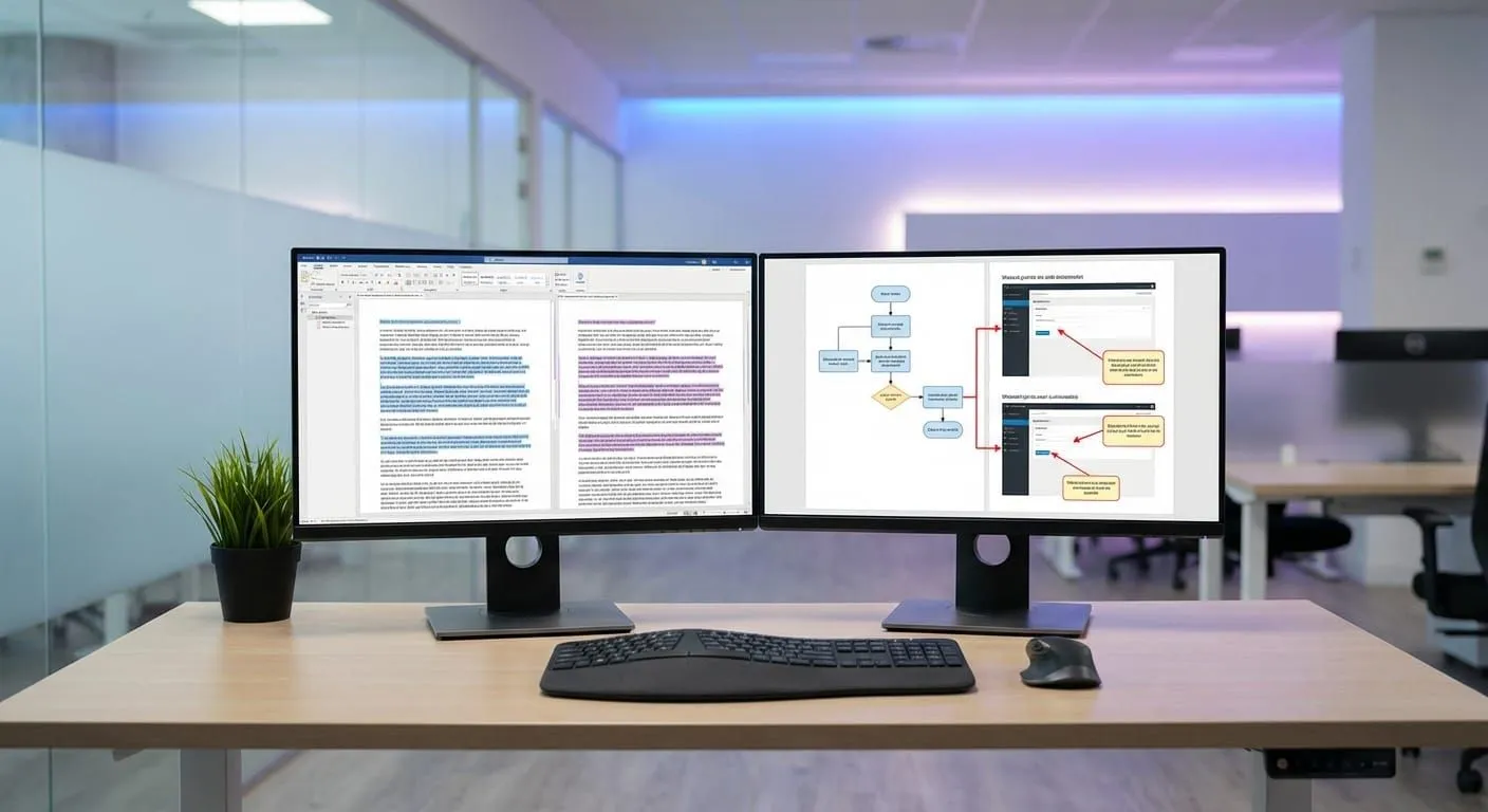
How to Create Effective Visual SOPs
Creating visual SOPs isn’t complicated, but there’s a right way to do it.
Capture Screenshots as You Work
The easiest way to create visual documentation is to capture your screen while you’re actually performing the process.
I do this with Glitter AI - I just record my screen while doing the task, and it automatically captures screenshots at each step. But you can also use basic screen capture tools and grab screenshots manually.
The key is to capture every significant step. When in doubt, take the screenshot. You can always remove extras later, but it’s hard to recreate the exact state of a screen after the fact.
Annotate to Guide Attention
Raw screenshots are better than no screenshots, but annotated screenshots are dramatically more effective.
Add arrows pointing to where someone should click or look. Circle important buttons or fields. Number elements when there’s a sequence. Use text callouts for critical details like “Enter 10-digit number only” or “This should say ‘Complete.’”
I use red for things that are critical or warnings, green for success states, and blue for general navigation. Consistent color coding helps people process your documentation faster.
Keep Text Minimal and Action-Oriented
Visual SOPs still need text, but the text should support the visuals, not replace them.
Keep it short. Start each step with an action verb: “Click,” “Select,” “Enter,” “Verify.” One or two sentences maximum per step.
The visual does the explaining. The text just provides context and confirms what they’re seeing.
Test With Real Users
This is the step most people skip, and it’s crucial.
Hand your visual SOP to someone who knows the process well and watch them follow it. Don’t help. Just observe. You’ll immediately see where the documentation is unclear or incomplete.
Then - and this is even more valuable - give it to someone who’s never done this process before. Watch what confuses them. Watch where they pause. Watch where they click the wrong thing.
That feedback is gold. Use it to refine your visual SOP until someone can follow it successfully without asking questions.
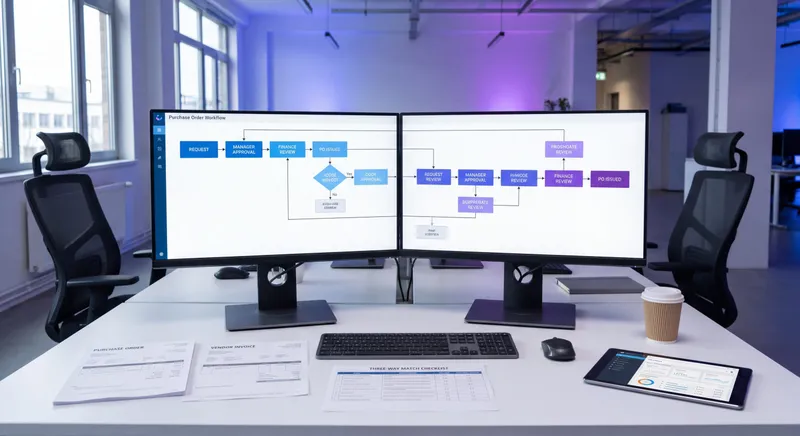
Glitter AI turns screen recordings into step-by-step visual guides automatically
The Tools You Need
You don’t need fancy equipment to create visual SOPs, but the right tools make it much easier.
Basic Approach
At minimum, you need:
- A way to capture screenshots (built into Mac and Windows)
- Image editing software to add annotations (even PowerPoint works)
- A platform to organize and share your documentation
This works fine if you’re just getting started or only creating a few SOPs.
Streamlined Approach
If you’re creating visual documentation regularly, specialized tools save enormous time, and it’s worth seeing how a recording-heavy option stacks up in this Camtasia and Glitter AI breakdown.
I’m obviously biased, but I built Glitter AI because I was frustrated with how long manual documentation took. Now I just record my screen while performing a process, and it automatically:
- Captures screenshots at key moments
- Generates step descriptions
- Creates annotations and highlights
- Organizes everything into a clean, shareable guide
What used to take hours now takes minutes. And because it’s capturing what I actually do, not what I think I do, the documentation is more accurate.
Screen Recording Best Practices
Whether you use an automated tool or capture manually, some practices improve results:
Clean up your screen first. Close unnecessary tabs and applications. You want focus on the process, not distractions.
Go slowly. Pause at each step to ensure the tool captures clean screenshots. Rushing leads to blurry or transitional captures.
Speak as you work. Many tools can use your audio to generate better step descriptions. Even if you edit it later, it gives you a starting point.
Do it the right way. Don’t take shortcuts or use workarounds. Document the official process you want people to follow.
Common Mistakes to Avoid
I’ve made most of these mistakes myself, so learn from my pain.
Too Many Screenshots
More screenshots isn’t always better. Every image should serve a purpose. If a screen hasn’t changed from the previous step, you probably don’t need another screenshot.
Too many visuals can overwhelm just as much as too much text. Be selective.
Poor Image Quality
Blurry screenshots, bad contrast, or images that are too small to see clearly undermine your documentation.
Make sure your screenshots are high-resolution and clearly show what’s important. If something is hard to see, zoom in or crop to highlight the relevant area.
Inconsistent Formatting
When every SOP uses different annotation styles, colors, and layouts, users waste mental energy figuring out the format instead of focusing on the content.
Create templates and stick to them. Consistent formatting builds familiarity and makes your documentation easier to follow.
No Update Process
Screenshots go out of date when interfaces change. If you don’t have a process to keep visual SOPs current, they’ll become misleading and people will stop trusting them.
Digital documentation is easier to update than PDFs or printed materials. With tools like Glitter AI, you can re-record a process and update the SOP in minutes.
Forgetting Mobile Users
If people access your SOPs on phones or tablets, make sure screenshots are still readable on smaller screens. Test your documentation on the devices your team actually uses.
Visual SOPs in Different Industries
While I see the biggest impact in office and software environments, visual documentation works across industries.
Manufacturing and Quality Control
Assembly instructions, equipment operation, safety procedures - manufacturing has used visual work instructions for years. Companies like Toyota pioneered this approach.
The principles translate to any hands-on process. Show people what components look like, how they fit together, what properly completed work looks like.
Healthcare
Medical procedures, equipment sterilization, patient intake processes - healthcare documentation benefits enormously from visual SOPs.
When precision matters and errors have serious consequences, showing exactly what to do reduces risk.
Customer Service and Support
Support teams use visual SOPs for troubleshooting, ticket management, escalation procedures, and software walkthroughs.
Screenshots showing exactly where to find customer information or how to process a refund eliminate confusion and speed up service.
Logistics and Operations
Warehouse processes, shipping procedures, inventory management - logistics teams rely heavily on visual documentation.
With high turnover and seasonal workers, visual SOPs dramatically reduce training time.
Measuring the Impact
How do you know if visual SOPs are working better than text-only documentation?
Track these metrics:
Training time. How long until new employees can perform the process independently? This should decrease significantly.
Error rates. Are mistakes going down? Track defects, rework, and corrections.
Support tickets. Are people asking fewer questions about documented processes?
Time to complete tasks. Do people work through processes faster once trained?
Employee feedback. What do team members think? Are they actually using the SOPs?
The organizations I work with typically see 30-50% reductions in training time after switching to visual SOPs. Error rates often drop by similar amounts.
Teach your co-workers or customers how to get stuff done – in seconds.
The Bottom Line on Visual vs Text Documentation
Text-only SOPs made sense in a world where capturing and sharing images was difficult and expensive.
That world doesn’t exist anymore.
Today, creating visual documentation is easier than writing comprehensive text instructions. And the results are dramatically better across every metric that matters: comprehension, retention, training time, error rates.
Your brain processes images 60,000 times faster than text. People retain 80% of what they see versus 20% of what they read. These aren’t small differences. They’re game-changers.
If you’re still creating text-only documentation, you’re making your team work harder than they need to. You’re extending training time unnecessarily. You’re accepting higher error rates than you have to.
Start with one process. Create a visual SOP with screenshots and annotations. See what happens.
I’m willing to bet you’ll see immediate improvements in how quickly people can follow the instructions and how many mistakes they make.
And if you want to create visual SOPs without spending hours on manual screenshot capture and formatting, that’s exactly why I built Glitter AI. Record once, get visual documentation automatically.
Yuval Karmi, Founder & CEO, Glitter AI
Frequently Asked Questions
Why are visual SOPs more effective than text-only documentation?
Visual SOPs are more effective because the human brain processes images 60,000 times faster than text and retains 80% of visual information versus only 20% of text. Screenshots eliminate ambiguity by showing exactly what to do, reducing errors by 23-30% and cutting training time by 30-50%.
What makes a good visual SOP?
A good visual SOP includes clear screenshots or photos for every significant step, annotated with arrows and callouts to guide attention, minimal action-oriented text starting with verbs like Click or Enter, consistent formatting across all documentation, and regular updates when processes change.
How long does it take to create visual SOPs?
Manual creation of visual SOPs can take several hours per process. Modern tools like Glitter AI reduce this to minutes by automatically capturing screenshots and generating documentation from screen recordings. The time investment depends on process complexity and whether you use automated tools.
Do visual SOPs really help with language barriers?
Yes, visual SOPs dramatically reduce language barriers because screenshots are universal. While some supporting text is helpful, the visuals do most of the communication. This is especially valuable for global teams or workforces with varying language proficiency levels.
Can I create visual SOPs without expensive software?
Yes, you can create basic visual SOPs using built-in screenshot tools and simple image editors like PowerPoint. However, specialized tools like Glitter AI dramatically reduce creation time by automating screenshot capture, annotation, and formatting through screen recording.
How often should visual SOPs be updated?
Update visual SOPs immediately when processes or interfaces change. Also review documentation quarterly to ensure it reflects current best practices. Digital tools make updates much faster than static documents, allowing you to maintain accuracy without massive effort.
What's the ROI of switching to visual SOPs?
Organizations typically see 30-50% reduction in training time, 23-30% decrease in error rates, fewer support questions from team members, and faster time-to-productivity for new hires. These improvements translate directly to cost savings and operational efficiency.
Should I replace all my text SOPs with visual ones?
Start with high-impact processes that are performed frequently, have high error rates, or involve complex software navigation. Test visual SOPs with real users to validate effectiveness. Gradually expand to other processes based on results and team feedback.