Read summarized version with
The first SOP I ever wrote was a wall of text. Twelve paragraphs. No headings, no screenshots, one lonely bullet list buried near the bottom. I sent it to a new hire on her first day and watched her quietly close the doc about six minutes in.
That was when it clicked: the format of an SOP matters as much as the content does. You can have every fact right, but pick the wrong layout - linear when you needed a flowchart, prose when you needed a checklist - and nobody follows it. Format is just one piece of getting a standard operating procedure right. The broader question of how to create SOPs that actually get used comes down to structure plus adoption.
I’m Yuval, founder of Glitter AI. The last few years I’ve watched ops, HR, and IT teams wrestle with this exact problem. Below is what I’ve picked up about choosing the right SOP format, plus the structural pieces every procedure needs no matter which layout you go with. If you are starting from zero, it pairs well with my step-by-step guide to writing an SOP. Once a draft exists, the wider set of SOP best practices is what drives real adoption.
Teach your co-workers or customers how to get stuff done – in seconds.

The 5 Main SOP Formats (And When to Use Each)
There isn’t one “best” SOP format. The right call depends on what you’re documenting: how complex it is, how often it branches, and who’s actually reading it. Here are the five formats I see working in practice.
1. Linear / Step-by-Step
This is the classic SOP layout. A numbered list of steps that flow from start to finish, with no decisions or branches.
Visual example:
1. Open the invoice in the accounting system
2. Verify vendor details match the PO
3. Match line items against the PO
4. Approve the invoice
5. Schedule payment
Best for: Simple, sequential tasks where every run plays out the same way. Processing an invoice. Onboarding a SaaS account. Closing the till at end of day.
When NOT to use it: Anything with branching logic. The moment your steps start saying “if X, do Y; if not, do Z,” linear format buries the decision points and people miss them.
Common mistakes:
- Cramming sub-tasks into a single step (“Process the invoice” isn’t a step, it’s a paragraph)
- Skipping the “why” - readers need just enough context to handle the small surprises
- Passive voice that hides who actually does the thing (“The invoice is approved” - by whom?)
Tools that work well: Word, Google Docs, Notion. Anything that handles numbered lists cleanly.
2. Hierarchical
A nested structure with parent steps and indented sub-steps. Useful when a task has natural phases, each with its own mini-procedure.
Visual example:
1. Prepare the workstation
 1.1 Sanitize the surface
 1.2 Lay out tools in order of use
 1.3 Verify safety equipment is in reach

2. Execute the procedure
 2.1 Confirm patient identity
 2.2 Walk through informed consent
 2.3 Begin the procedure
Best for: Complex tasks with several phases, especially in regulated settings (healthcare, manufacturing, lab work). Also useful for SOPs that need to map onto a compliance framework.
When NOT to use it: Short tasks. If your hierarchy only has two or three sub-steps under each parent, you’re adding visual noise without buying clarity.
Common mistakes:
- Going more than two levels deep (once you hit 1.1.1.1 you’ve lost the plot)
- Inconsistent depth - some sections nested four levels, others not at all
- Treating the hierarchy as decoration instead of structure that means something
Tools that work well: Confluence, Notion, Word with built-in outline numbering.
Teach your co-workers or customers how to get stuff done – in seconds.
3. Flowchart / Decision Tree
A visual diagram that maps the process as a series of nodes and arrows, with decision diamonds for branching logic.
Visual example:
[Customer requests refund]
 ↓
 < Within 30 days? >
 ↙ ↘
 Yes No
 ↓ ↓
[Approve] < Defective product? >
 ↙ ↘
 Yes No
 ↓ ↓
 [Approve] [Escalate to manager]
Best for: Anything with branching logic. Refund processing. Support escalation. Incident response. Anything where the path through the SOP depends on the situation in front of you.
When NOT to use it: Truly linear tasks. A flowchart with zero decision diamonds is just a vertical list cosplaying as a diagram.
Common mistakes:
- Leaving out the decision criteria (“Is this a high-priority ticket?” - high priority based on what?)
- Letting the chart sprawl across pages without clear entry points
- Forgetting the “default” path for when none of the decision criteria match
Tools that work well: Lucidchart, Miro, Whimsical, draw.io. Skip PowerPoint past about five nodes - it falls apart.
4. Checklist / Annotated
A clean checklist where each item is a single verifiable action, often with a brief note or reference underneath.
Visual example:
☐ Lock all entry points
 → See doors A, B, and C on floor plan

☐ Set the alarm to "away" mode
 → Code is in the manager's safe

☐ Verify cash drawer count matches register report
 → Discrepancies over $5 require manager sign-off
Best for: Repeatable QA work, opening/closing procedures, pre-flight checks, audit walkthroughs. Anything where the point is not skipping steps rather than explaining the nuance.
When NOT to use it: Training material for someone doing the task for the first time. A checklist assumes you already know how to do each item - it’s a memory aid, not a teacher.
Common mistakes:
- Mixing checks and instructions in the same doc (pick one)
- Items that aren’t actually checkable (“Be careful” isn’t a checklist item)
- Annotations that run longer than the items they annotate
Tools that work well: Notion, Google Docs, dedicated checklist apps. Anything with real checkboxes, not just bullets.
5. Hybrid Video + Text
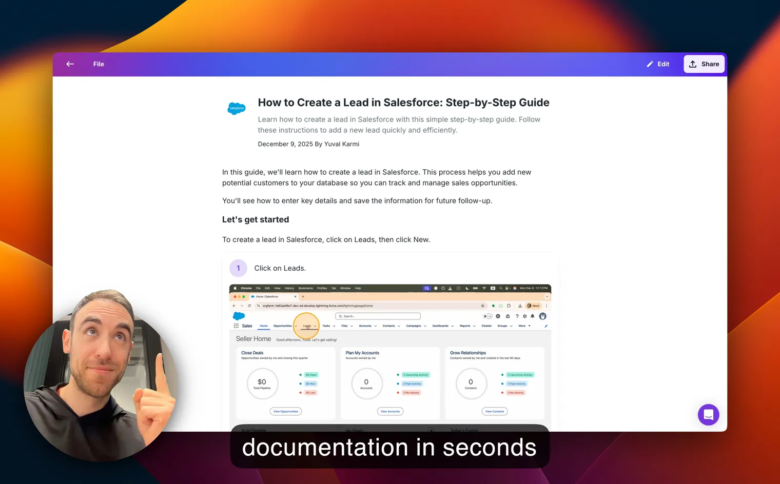
A doc that pairs numbered written steps with annotated screenshots, short clips, or embedded video walkthroughs. This is the format I’ve spent the most time on, because it’s where most software documentation actually lives in 2026.
Visual example: Numbered written steps, each paired with a screenshot showing exactly where to click, arrows or highlights pointing at the right UI element. Sometimes a short embedded video clip for a tricky moment.
Best for: Software workflows. Anything with a UI. Training someone who has never opened the tool before. This is Glitter’s specialty - you record yourself doing the task once, and Glitter generates the written steps, grabs the screenshots, and stitches the whole thing into a hybrid SOP automatically.
When NOT to use it: Physical-world processes where there’s nothing to screenshot. Also overkill for things your team does daily - nobody needs a screenshot to “click the Send button.”
Common mistakes:
- Screenshots without annotations (now you’re making readers play I-Spy)
- Videos with no written backup (search engines and AI assistants can’t read video)
- Outdated screenshots that don’t match the live UI - the silent killer of hybrid SOPs
Tools that work well: Glitter for record-and-generate. For manual creation, Notion plus a screenshot tool, or Google Docs with embedded images.
Teach your co-workers or customers how to get stuff done – in seconds.
Required Sections (Regardless of Format)
Whichever format you pick, every solid SOP needs the same backbone. Skip these and the format alone won’t save you.
- Title - Specific enough to tell this SOP apart from similar ones. “Refund Process” is bad. “Refund Process - Customer-Initiated, Online Orders” is good.
- ID and Version - A unique identifier (something like
OPS-014) plus a version number. Lets you reference SOPs across systems and audit changes. - Purpose - Two sentences on why this SOP exists. The outcome it produces and the risk it heads off.
- Scope - What’s covered and, just as important, what’s NOT covered. Saves people from following the wrong SOP.
- Roles - Who does what. Use role names, not people’s names - people change roles, SOPs outlive them.
- Prerequisites - Tools, access, training, materials, or upstream conditions you need before you start.
- Steps - The body of the SOP, in whatever format you picked.
- Decision Points - If your format isn’t a flowchart but the process still has decisions, call them out plainly with the criteria.
- References - Links to related SOPs, policies, forms, or external regulations.
- Change Log - Date, author, and a short description of every revision. Auditors love this, and so will future-you.
For a longer walkthrough of these structural pieces, see my standard operating procedures guide.
Visual Best Practices
Format alone doesn’t make an SOP usable. Visual presentation pulls a lot of weight too.
Number your steps
Always. Even in a hybrid layout with screenshots between every step, the number anchors the reader. “Step 7 isn’t working” is a sentence I’ve heard a thousand times - make sure that sentence is possible.
Annotate your screenshots
A raw screenshot is basically a Where’s Waldo puzzle. Add an arrow, a circle, or a highlight pointing at the exact UI element the reader needs to click. This one change probably doubles the success rate of any software SOP.
Respect the 7±2 rule
Cognitive science says people can hold about 7 items (give or take 2) in working memory at once. If a section runs past 9 steps, split it. Use sub-sections, separate SOPs, or natural breakpoints.
Use action verbs
Every step should start with a verb naming a concrete action. “Click,” “Enter,” “Verify,” “Confirm,” “Submit.” Skip mushy verbs like “handle,” “manage,” or “address.”
Avoid passive voice
“The form is submitted” hides who’s doing it. “Submit the form” tells the reader what to do. Active voice is shorter, clearer, harder to misread.
For more on writing the actual step content, see how to write an SOP.
Length Recommendations
A question I get all the time: how long should an SOP actually be? It depends on the tier of the task.
- Tier 1 - Routine, daily tasks → Under 1 page. If you can’t fit “process a refund” on one page, you’re either over-explaining or trying to document too many edge cases in one place.
- Tier 2 - Moderate complexity → 2 - 5 pages. Enough room for context, prerequisites, a few decision points, and screenshots. Still scannable in a single sitting.
- Tier 3 - Complex, multi-team workflows → Multiple linked docs with a table of contents. ERP cutover procedures. Incident response runbooks. Quarterly close. These should be modular: a master SOP that links out to sub-SOPs for each phase.
When in doubt, split rather than lengthen. Two focused SOPs always beat one sprawling one.
Putting It All Together
If you’re staring at a blank doc trying to pick a format, here’s the cheat sheet I use:
- Sequential, no branches → Linear
- Sequential, with phases → Hierarchical
- Has branching decisions → Flowchart
- Memory aid for someone experienced → Checklist
- Software workflow with a UI → Hybrid video + text
Then no matter which one you pick, give it the required sections, number your steps, annotate your screenshots, and split anything over 9 steps in a section.
If you want a faster path than starting from a template, record yourself doing the task once and let Glitter generate the hybrid SOP for you. That’s the whole reason I built the Glitter SOP generator. I got tired of writing SOPs the slow way.
For a deeper dive into standard operating procedure fundamentals, or a ready-to-use SOP template, check the linked guides.
Teach your co-workers or customers how to get stuff done – in seconds.
Frequently Asked Questions
What is the best SOP format?
There is no single best SOP format. The right choice depends on the task. Use linear for simple sequential work, hierarchical for complex phased tasks, flowcharts for branching decisions, checklists for repeatable QA, and hybrid video+text for software workflows.
What are the 5 main SOP formats?
The five main SOP formats are linear/step-by-step, hierarchical, flowchart/decision tree, checklist/annotated, and hybrid video+text. Each fits a different kind of task based on complexity, branching, and audience experience.
What sections does a standard operating procedure need?
Every SOP needs a title, ID and version, purpose, scope, roles, prerequisites, steps, decision points, references, and a change log. These sections work regardless of which visual format you choose.
How long should an SOP be?
Routine tier-1 tasks should fit on under one page. Moderate tasks fit in 2-5 pages. Complex multi-team workflows should be split into multiple linked documents with a table of contents. When in doubt, split rather than lengthen.
When should I use a flowchart format for an SOP?
Use a flowchart whenever the process has branching logic - different paths based on conditions like refund eligibility, ticket priority, or escalation criteria. If your SOP has zero decisions, a flowchart adds visual noise without value.
What is the 7 plus or minus 2 rule for SOPs?
It comes from cognitive science: people can hold roughly 7 items (give or take 2) in working memory at once. If an SOP section has more than 9 steps, split it into sub-sections or separate SOPs to keep it usable.
Should SOPs use active or passive voice?
Always use active voice. 'Submit the form' is clearer than 'The form is submitted.' Active voice names the actor, shortens the sentence, and reduces the chance the reader misinterprets who does what.
What is a hybrid video and text SOP?
A hybrid SOP combines numbered written steps with annotated screenshots or short embedded video clips. It's the best format for software workflows because it gives readers both quick visual reference and searchable written instructions.
What tools are best for creating SOPs in 2026?
Word and Google Docs work for linear SOPs. Confluence and Notion are good for hierarchical ones. Lucidchart and Miro handle flowcharts well. For hybrid software SOPs, Glitter generates them automatically from a screen recording.
What is the most common SOP format mistake?
Picking a linear format for a process that actually has branches. The decision points get hidden inside paragraphs, readers miss them, and the SOP fails silently. If your process has any 'if this, then that' logic, use a flowchart or call out the decisions explicitly.